Sorry about missing last week. I was setting things up for the Retro City Festive console museum that I was in charge of and it took the whole weekend to get set up, run, and then pack back up so it was a very long weekend. It’s mostly this weeks comics with a few thrown in from last week to try and catch up a little. So here we go…..

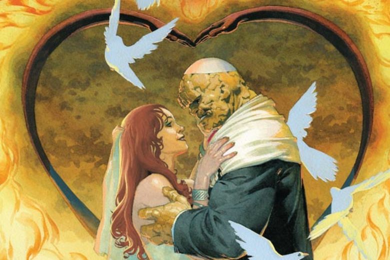
Batman Kings of Fear #6
DC Comics Writer Scott Peterson, Artist Kelley Jones, Colorist Michelle Madsen, Letterer Rob Leigh
This spot on mini series comes to a close in all of the right ways. Peterson and Jones have deliver quite a ride with this story and this final chapter does so many things right in finishing it out. Instead of dragging out the story to the last few pages Peterson actually does something here that most writers rarely do. He wraps up the story in the first six pages and where the story really shines is the aftermath that is left of the broken pieces of both Bruce and Gotham. What I loved about this story was that it was in many ways more about Bruce and Gotham than it was a traditional Batman story. In a simple way it was a day in the life of Batman’s nightmare and the one thing that it did very well was elevate Scarecrow as a villain to a very strong adversary that he had never quite attained before. Peterson really went deep into not only Batman but his long mythology but never let it overwhelm the story and kept it focused and well paced. The biggest surprise for me was the conversation with Alfred at the end of this issue that was quite out of left field but made perfect sense in the story. Jones continues to prove that he is the current artistic king of the Dark Knight and this might be the best artwork of the series but for reasons that may not stand out at first. While the first five issues had big bombastic visual elements this final issue has a much more subdued story that allowed Jones to bring a more intimate visual elements that really drove this final chapter home. It really shows how much of a collaborative effort that this book has been between Peterson and Jones. I must continue to praise Madsen’s color work on this series and the way that she brought a different approach to this final story really shows what a great colorist she is. the scene in the Batmobile is quite impressive and she complements Jones line work and heavy blacks perfectly.
Is this book worth your time and money? I have said it before and I will say it again, that if you haven’t been reading this mini series then you have missed one of the best and more off beat Batman stories in years. Peterson and Jones to both risks and different approach to this story and has paid off handsomely. With this final chapter wrapping the story up to a very satisfying conclusion that far exceeded my expectations and with Jones on the book you know that bar is set very high for me. What made this book work so well is that it didn’t try to be more than it was, meaning that Peterson and Jones didn’t set out to make to try and make the greatest Batman story ever. They simply told a solid story that went down a path that hadn’t really been seen before. This is a truly must read book and gets my HIGHEST RECOMMENDATION!
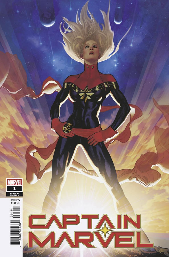
Captain Marvel #1
Marvel Comics Writer Kelly Thompson, Artist Carmen Carnero, Colorist Tamra Bonvillain, Letterer Clayton Cowles
I will give Marvel credit for getting this new comic out well before the movie comes out this spring. While not the biggest Captain Marvel fan but was looking forward to this comic because of writer Thompson who has really done some great work with Hawkeye and West Coast Avengers and was intrigued to see what she could bring to this one. The good news is that she keeps her sly sense of humor and brings a lot of fun to the book that is a nice change of pace. She also does well with the pacing of this first issue that starts off with a nice action sequence then starts to set things up for this first story arc. Carnero does a nice job with the artwork on the book and she puts some nice detail into the book. She also does a nice job on the facial expressions that really sell Thompson’s script at key times. Overall the book is off to a good start and is very new reader friendly that is a good thing with the interest in the Captain Marvel film coming out soon.
Is this book worth your time and money? Thompson and Carnero get things off very well for a first issue and while it’s too soon to tell how its going to turn out they do give you a good reason to come back for more with the cliffhanger at the end of the issue. I will say that I liked it but didn’t quite love it out of the gate but does show promise. It’s well worth checking out though.
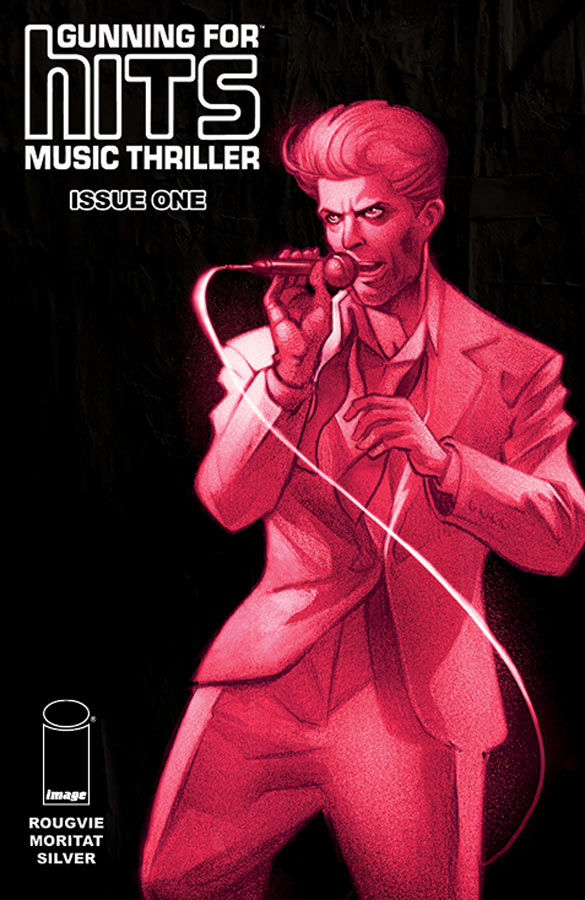
Gunning For Hits #1
Image Comics Writer Jeff Rougvie, Artist Moritat, Colorist and Letterer Casey Silver
At first flipping through this book didn’t necessarily pop out at me but the Bowie cover did strike my fancy and boy am I glad that I did. What Rougvie does so well here is take a trip back in time to the late 1980’s where new bands were coming fast and furious and the beginning of the CD revolution. What made this story work so well is that it starts off a pretty much a history lesson and how record companies make money and how bands rarely actually make any money. He frames the story around Martin Mills a talent agent looking for new talent and comes across Billy and his girlfriend Diane (who is also his “manager”) and the story unfolds with how it all works. At first your reading it and the level of detail that Rougvie ie puts into this first issue is overwhelmingly impressive and he adds some sly humor into the mix but where he gets you is the twist ending that changes the whole set up and is a great WTF moment and that is where he gets you hooked on the book and that is where it all comes together at that point. The other big win for this book is Moritat’s wonderful artwork that has a great retro quality that brings this story to life. Where he really shines is during the explanation of how the music industry works with a cartoony advertising look that gives the book a great charm and really helps sell the whole thing visually that few artist would have been able to pull off. Great bonus to the book is Rougvie’s history of how he worked in the record industry and how his love of comics helped make it all blend together.
Is this book worth your time and money? On the surface describing this book would come off as pretty dry but Rougvie and Moritat totally sell the hell out of this book and really make it work perfectly. The other thing is that the story has a lot of room to grow as it goes along because this first issue sets the stage up so well. I was really impressed with this book and really hope that Rougvie and Moritat are able to build upon this great first issue. HIGHLY RECOMMENDED!
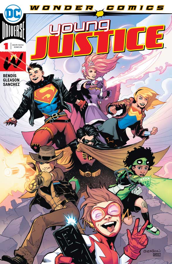
Young Justice #1
DC Comics Writer Brian Michael Bendis, Artist Patrick Gleason, Colorist Alejandro Sanchez, Letterer DC Lettering
I wasn’t sure what to make of this book that is the first of a new pop up imprint under Bendis that seemed to be aimed at a more younger crowd and in a way it is and is not at the same time. This first issue is a bit on the heavy exposition side but does a decent job of introducing the cast of characters and wrapping it in a simple action outing for this first issue. While the book is aimed at an all ages crowd it was however a pleasant read and has a lot of fun built into it. The one thing that Bendis does instill into the book very well is charm and on that level the book scores very high. The only downside is that there is not a lot of story here in this first issue and that was a little disappointing but when you have a fairly large cast that tends to eat up story space to get the exposition out-of-the-way. Gleason was the perfect choice for the artwork on this book because he is able to go to both the classic hero style but also swing to the cartoony style as needed that gives the book a great look. He also wasn’t afraid to play with the layouts of the story that gave it a really nice pop art feel and never let the book just have a static look. Visually the book is never dull that is for sure.
Is this book worth your time and money? It’s a little hard to tell how this book is going to be because it pretty much just introduces the cast but shows little of where the story is going to go. While that is not fatal at this point because it’s a first issue it not enough to really form a solid opinion at this point. The artwork does really great job of visually making the book exciting but we will have to see where the story is going to land. Worth checking out but hard to give a stronger recommendation on just this first issue.
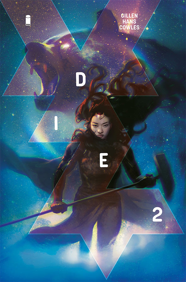
Die #2
Image Comics Writer Kieron Gillen, Artist Stephanie Hans, Letterer Clayton Cowles
I was quite impressed with the first issue of Die and thankfully the second issue keeps things moving along nicely. While I’m no a big D&D player Gillen takes that into account and make sure that readers that are not familiar with that or other similar type of board games are not lost in the story. The story stands well on its own and Gillen did such a good job os setting both the story and the characters up in the first issue that he hits the ground running with this second outing and builds nicely upon that. He also raises the stakes for the characters and their plan of go in and come out quickly is out the window. The other thing that the story does well is show how the past can come back to haunt you and that is going to affect them as they try to get out of the game. Hans artwork on the book continues to impress with the level of detail and her wonderful color work to her art really adds a lot to both the script and the visuals of the game world. She also brings a great visual sense of danger to the world that has great emotional impact as you read the story and really gets the reader to connect with it.
Is this book worth your time and money? This issue really impressed me with the great forward momentum of the story and that there is a lot of story ahead in the book. Gillen keeps things focused that is impressive because the game world is quite vast but he keeps it centered on the characters and that is why this book is working so well. Throw in Hans gorgeous artwork and this book is a strong and satisfying read. RECOMMENDED!
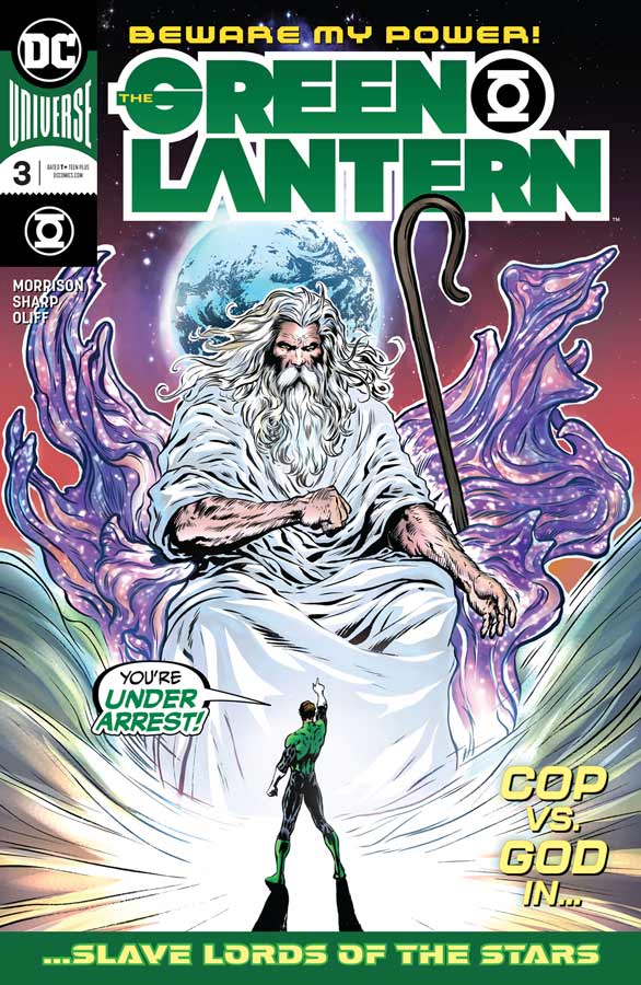
Green Lantern #3
DC Comics Writer Grant Morrison, Artist Liam Sharp. Colorist Steve Oliff, Letterer Tom Orzechowski
Leave it to Morrison to have Hal Jordan meet God. Wow did that take some balls but as with every Morrison story things are not always what they seem and that is the case here but there is more to it than just a “religious” angle. There is a lot to take in with the story in this issue and Morrison blurs the lines between good and evil and that is what is making this book so good is that things are not alway simple and emotions play a huge part in what decisions that we make in life. While some might say that Morrison is changing Green Lanterns but he really is just going back to his roots of a normal man have been given the powers of a god and what and how that can affect you. Sharp continues to visually take this book to new heights and the level of detail that he is able to put into each panel is mind-blowing. But that is what is giving this book such great emotional impact is that he is able to capture all of the big and small details of Morrison’s script is one major reason that this book is working so well. There is so much packed into each issue so far that you really have to take your time to let it all soak in.
Is this book worth your time and money? This is the Green Lantern comic that I have been waiting on for years. Hal Jordan is the first Green Lantern and the best in my opinion. One of the best things about this book is that it stands on its own and gets back to what make this comic great in the first place. VERY RECOMMENDED!
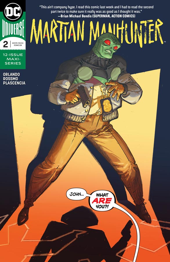
Martian Manhunter #2
DC Comics Writer Steve Orlando, Artist Riley Rossmo, Colorist Ivan Plascencia, Letterer Deron Bennett
The first issue was good but I struggled with the Mars parts of the story but thankfully Orlando has smoothed that all out and the present story on earth and the past on Mars flows together a lot better in this second issue. There is a lot to take in here and Orlando shows the struggles that J’onn deals with in both cases. He wants to fit in on earth and now his cover is blown with his partner that changes everything. We also see his struggles with his family and job on Mars that as a policeman that there is a grey area to society that he is discovering that things are not always what they seem. While I love this story its Rossmo’s artwork that brings this book together. He gives it a look like no other mainstream superhero comic and it really stands out with its bold and unique look that gives it a flavor that is making this book work so well. The level of detail that he puts into the book and he is not afraid to stretch and squish the characters to make it work. Plascencia’s color work on the book complements Rossmo’s line work into a spectacular color palette that really makes this book stand out.
Is this book worth your time and money? I love that Orlando is giving J’onn a solid origin story but does not negate any of the previous cannon. He is just adding new story elements that complement what we know and is making this book exceptionally exciting and bold. Throw in Rossmo’s stunning artwork and if they are able to continue keep this pace up this might just be the biggest surprise from DC Comics this year. VERY RECOMMENDED!
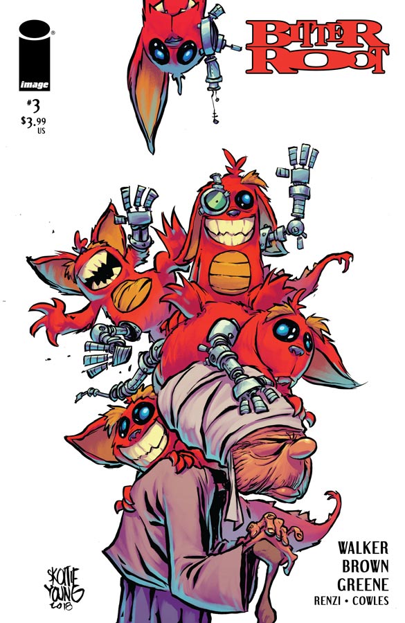
Bitter Root #3
Image Comics Writers David F. Walker & Chuck Brown, Artist Sanford Greene, Colorists Rico Renzi & Sanford Greene, Letterer Clayton Cowles
This book continues to impress and each issue goes deeper into the mythology of the story. I have to give credit to Walker and Brown that they are balancing three storylines at once and while that does prove to be a challenge it does however cover a lot of ground each issue. There is a lot going on here and its interesting how each story is connected and yet on its own path. This issue starts to blend them together well and we start to see how they are connected. We also learn more about the Jinoo monsters that are popping up in both the past and the present. Walker and Brown story is fictional but does deal with the difficult subject of racism and there are many times where the N word is used and while I do not like that word, they don’t over use it and is appropriate for the timeline and location. One of my favorite parts of this issue was Grandma beating the snot out of a Jinoo that was priceless. Greene continues to deliver on the artwork and really helps keep the flow of the three storylines together visually that does help the reader keep track of everything. There is a lot going on here and Greene does a great job of capturing both the action and the drama very well here along with the spot on facial expressions.
Is this book worth your time and money? This book crams a lot of story into each issue and while its very dense it’s a satisfying read. Walker, Brown and Greene are going for the long game with this story and while its a great read its hard to grasp it all in a monthly book at times. By the end of the issue you want more but in a way that is a good thing. RECOMMENDED!

Champions #1
Marvel Comics Writer Jim Zub, Artist Steven Cummings, Colorist Marcio Menyz and Erick Arciniega, Letterer Clayton Cowles
Champions is one of those mainstream superhero team books that has a lot going for it but ends up not adding up to very much. Zub spend the whole issue introducing the very large cast of characters and while that is not necessarily a problem it ends up being a very boring read because not a lot happens in the end. The story pretty much goes through the usual motions and there is the typical story tropes that are used but where it struggles is that it really doesn’t bring much new to the table. Zub’s story goes through the motions but never leaves you with much to care about with the characters. There are so many in the cast of characters that none end up standing out much and there is the usual smart ass, angry, and frustrated leader that you have read far too many times before. The other issue is that there are way too many references to previous story elements that doesn’t help new readers feel as welcomed as one would have liked. On the plus side Cummings artwork does it best to keep track of all of this and he does really help things along visually but in the end nice artwork can’t save a so-so story.
Is this book worth your time and money? The big reason I was disappointed with this book is that it really adds up to nothing. There are simply too many characters running around and you end up not really caring about them or pretty much of anything going on. Zub simply bit off more than he can chew here and it really falls flat. The book is not bad but doesn’t bring anything new to the over populated genre. SKIP IT!

Murder Falcon #4
Image Comics Writer/Artist/Letterer Daniel Warren Johnson, Colorist Mike Spicer, Letterer Rus Wooton
So the band is back together now and we would believe that they would be able to defeat Magnum Khaos but Johnson throws a great twist in the story that bring the dark past of Jake’s life into the picture and while the battle with Khaos is lost the war is far from over. I find this comic fascinating because in a lot of ways its pretty silly on the surface but Johnson infuses the story with such a great emotional core that gives you great reason to care about the characters and that is what makes this book so great. I always say that you can have the craziest story but as long as you care about the characters then you can do almost anything because the reader will go with them on the journey. Johnson delivers a lot of emotion in this issue that I wasn’t expecting but that is what is making this book so damn good. Johnson’s artwork on the book is amazing that he is able to capture the grand scope of this invasion but is able to keep the emotional core of the story front and center and that is a mark of a great artist.
Is this book worth your time and money? I love this book and it really delivers on so many levels that make each issue a joy to read and look at. Johnson has delivered not only a great story but a strong emotional core to a great visual comic. There is so much to like here and is a must read comic book. HIGHLY RECOMMENDED!
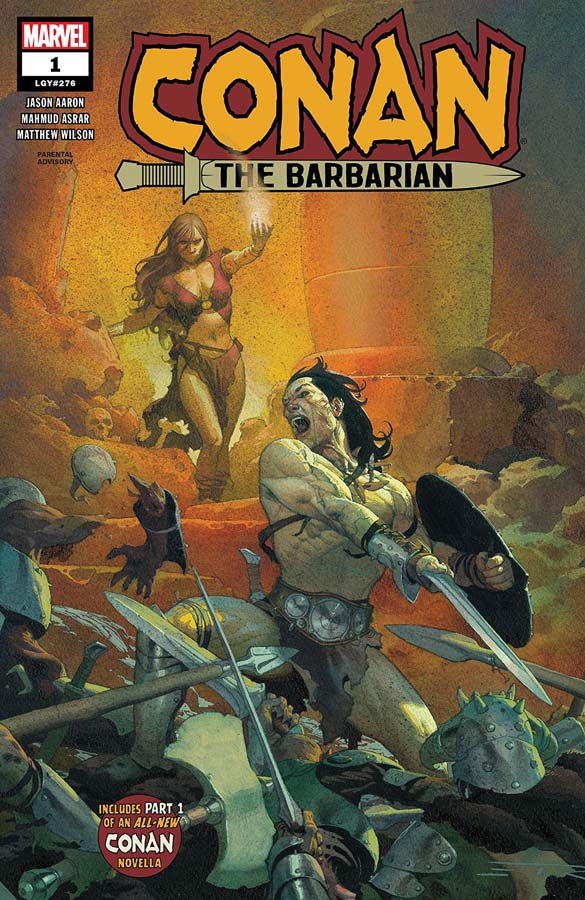
Conan the Barbarian #1
Marvel Comics Writer Jason Aaron, Artist Mahmud Asrar, Colorist Matthew Wilson, Letterer Travis Lanham
Conan is back at Marvel and the first book out of the gate is very strong. The wisest thing that Aaron does here is not try to reinvent the wheel. This story is simply classic Conan and if you like him then you’re going to love it. He wisely makes this first issue a great jumping on point for new readers but is not boring to long time readers. He makes sure that you get up to speed quickly and sets up a nice story for this first arc. The story hits all of the right beats and while it’s not going to blow you away it does however satisfy you as a reading experience. The big win for this new series is Asrar’s gorgeous artwork that does a great job of capturing the world of Conan and never shies away from the blood bath that the characters bring to the mythology.
Is this book worth your time and money? Aaron and Asrar have crafted a solid Conan story here and if you have never read a Conan comic then this is a great place to start. Sure there is nothing shocking about the story but you get what you pay for here and if feels like classic Conan and delivers what it promises.


0 Comments