Kamandi Challenge #1

DC Comics Writers Dan Didio & Dan Abnett, Artists Keith Giffen, Scott Koblish, & Dale Eaglesham, Colorist Hi-Fi, Letterer Clem Robins
This year is the celebration of Jack “The King” Kirby’s 100th Birthday and DC is kicking off its celebration with a year-long maxi-series with an all-star line up of creators. Each issue is done by different creative teams and they leave a cliffhanger for the next creative team. In the mold of a book from 1985 that was a round robin experiment with the same set up. This first issue kick off with a 12 page Prolog set up story by Didio, Giffen and Koblish that gives a nice set up to the basic plot that will run through the series of Kamandi trying to find his parents to save the world. Abnett and Eaglesham take the cliffhanger and open it up to the post apocalyptic world and gives new readers a great cliff notes version of what the premises of Kamandi is. Abnett does a nice job of balancing all of these things and still tells a compelling story. While Giffen and Koblish do their impression of the Kirby style that is nice, I’m glad that Eaglesham sticks to his own style. What impressed me the most is that both Abnett and Eaglesham capture the power and scope that Kirby brought to Kamandi when he created it back in the 1970’s and was his version of Planet of the Apes that DC wanted to adapt but couldn’t get the rights. Not only is the book big and loud but all the creators make sure that there is heart put into Kamandi.
Is this book worth your time and money? Look I’m a huge Kirby fan and I think that his DC work in the 1970’s is some of his best. Kamandi has alway fascinated me and as a kid I had stumbled across some of the original series. What this new book does is bring some of the best creators in comics to play the amazing Kirby sandbox that he created. What will make this series fun is how each creative team will solve the cliffhanger from the previous team. This first issue is simply fun and that is what I hope that each upcoming issue keeps up with this good start. VERY RECOMMENDED!
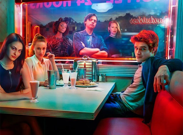
Batman ’66 Meets Wonder Woman ’77 #1
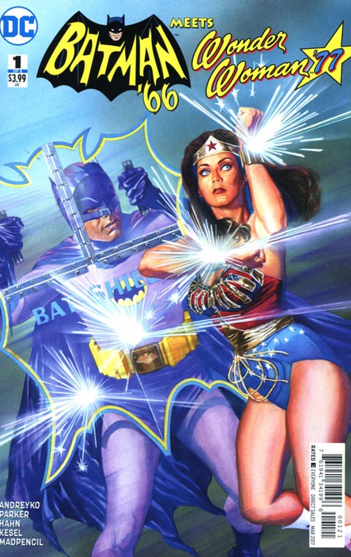
DC Comics Writers Jeff Parker & Marc Andreyko, Penciller David Hahn, Inker Karl Kesel, Colorist Madpencil, Letterer Wes Abbott
There have been a lot of crossovers with Batman ’66 but this might be the one that tops them all. Both the Batman ’66 and Wonder Woman ’77 are the key reasons that we have superhero television and films today. They truly paved the way for inspiring generations with their colorful and fun takes on these classic characters. Parker and Andreyko have come up with a fun little story here and while they come up with a way to have the time periods work with starting the story during WWII and having a young Bruce Wayne meet Wonder Woman that is a pretty ingenious story element. Because Wonder Woman ages differently than mortals this was a pretty smart hook. This also allows the use of Nazis and who doesn’t like superheroes kicking Nazi ass. They wisely dispense with exposition of the main cast and hit the ground running with the story and a nice set up to the mini series. They also meshed the feel of each show together nicely and it flows together quite well. Hahn and Kesel’s artwork is very nice here. There is a nice cartoony style that fits the story well and they do a nice job of capturing the look of the actors from their respective shows.
Is this book worth your time and money? This is simply a fun little book that while fur sure is fan service the creative team doesn’t relies on nostalgia only here. Parker and Andreyko have written a smart little story here and thrown a lot of great things from both shows into the mix. I loved the art by Hahn and Kesel that gave the book a nice saturday morning style and feel that fits very well with the fun story. If you’re a fan of these two shows and who isn’t, this is a no brained fun book that was a real treat to read. RECOMMENDED
Animosity The Rise #1
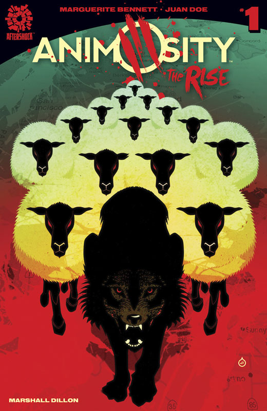
Aftershock Comics Writer Marguerite Bennett, Artist & Colorist Juan Doe, Letterer Marshall Dillon
I’m a big fan of this book and this book is a side story to the regular series. While it doesn’t necessarily bring a lot of new elements to the overall world of Animosity, but it does tell a good story that made for a nice read. Bennett script is good and we get to see more of the animals side in this story that is a bit of a departure from the regular series. I guess that the only complaint that I have with the story is that while it’s an enjoyable read I really don’t understand why Aftershock felt the need to have this as a separate series. If you haven’t read the regular series you might be a little lost and for regular readers there is some previous ground covered just from another point of view. So I’m just not sure how this fits into the overall storyline of the regular series. The artwork by Doe does a nice job of capturing the animals attacking the humans and they look really good. On the other had the humans are a bit too simplistic at times and there is a real lack of backgrounds throughout. The artwork is certainly not bad by any means just feels rushed and slightly unfinished at times.
Is this book worth your time and money? I did find that the story was a decent read but there are a few problems that I had. First the where does this story fit in beyond a nice side story. The other bigger issue is that at the end of the story it says “look out for more of the rise later this year”. I mean were in January and putting out the second issue of a book months from now is a terrible mistake. There is no way that most readers are going to remember anything that happened in this book months from now. So as long as you know what you’re getting into here then you will be OK but, if it’s your first issue then you should go and just buy the regular series.
Loose Ends #1
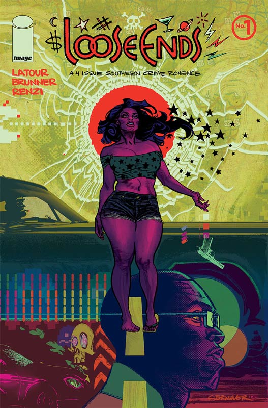
Image Comics Writer Jason Latour, Artist Chris Brunner, Colorist Rico Renzi
While I like Latour’s Southern Bastards series I was not overwhelmed by his new mini series. I think the biggest problem is that there are some good ideas here but the structure of this first issue is simply a mess. The story is all over the place and your simply not sure what is going on most of the time. The other flaw is that you’re not sure of who the main character really is through most of the first issue so you really not sure what is happening. That is a serious flaw in the book because if the reader doesn’t have any one that they should follow then you really start to not care about anything. And this is what happened to me after reading this book. On the plus side I did like Brunner’s artwork on the book. It had a real kinetic look and feel that visually helps the book but with all of the script flaws there is little he is able to do to save this.
Is this book worth your time and money? This book is not terrible by any means but you simply don’t care about anyone or anything that is happening. The story is very disjointed and by the end of the issue you don’t know or simply care about anything. It might be a good story as a whole but if this first issue is any indication, I seriously doubt that. SKIP IT!
Odyssey of the Amazons #1
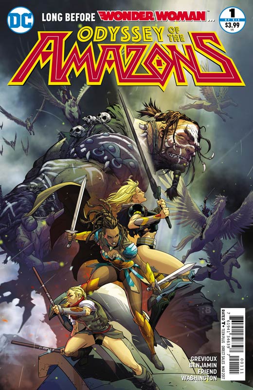
DC Comics Writer Kevin Grevioux, Penciller Ryan Benjamin, Inker Richard Friend, Colorist Tony Washington, Letterer Saida Temofonte
This is one of those books written by a non regular comic book writer (in this case an actor) that unfortunately has some good ideas but doesn’t quite understand how to structure a first issue. I will say that there are some good ideas here but the first issue is too frenetic and not a lot of character set up that really hurts the first issue. The other problem with the script is that the focus of the story is just not tight at all. The last part of the issue is the best but with the lack of any real set up it ends up falling a bit flat. The thing that nearly saves the book is Benjamin and Friends artwork that is very nice and they handle both the action and the dialog scenes very well. The only problem is that there are numerous times where they have to try to fit the art in when the characters stand there and spout endless dialog and there is little that they can draw to save those scenes.
Is this book worth your time and money? I think that Grevioux has some good ideas here but with the story bogged down with dialog and the lack of real structure in this first issue really hurt this book out of the gate. While I can’t really recommend it, I am willing to at least give the book a second issue because there are a few bright spots but unless the second issue performs a miracle then it’s not going farther than that.
Dead Inside #2
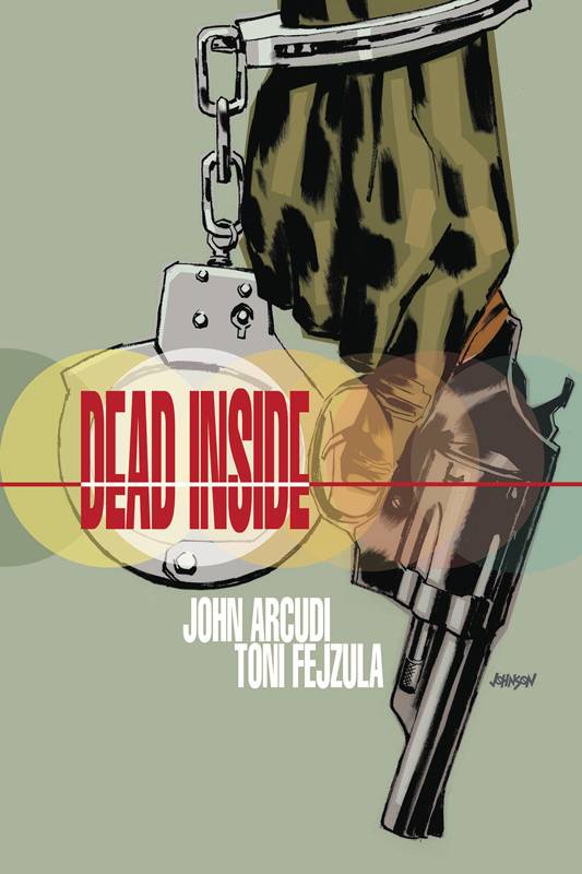
Dark Horse Comics Writer John Arcudi, Artist Toni Fejzula, Colorist Andre May, Letterer Joe Sabino
I really enjoyed the first issue of this book and thankfully the second issue proves that it was no fluke. What I really love about this book is the way that the story is unfolding. Arcudi has done a really great job of not only setting things up in the story but giving the reader a reason to care about the characters. While on the surface the story is a basic murder mystery but he has done a few nice twist on the tried and true story. First setting it up in a prison not only opens a lot of possibilities but it also confines it at the same time. The other win for this book is Linda Caruso who is a smart detective that uses her gut and doesn’t take any crap. Another plus for the book is its pacing that some would find slow but in an age where speeding through a story trumps quality this comic is really nice to see. Fejzula continues to impress with his moody artwork on the book. It’s giving the book a nice visual tone that blends perfectly with Arcudi’s script.
Is this book worth your time and money? I’m a big fan of this book and this second issue really seals the deal on it. Arcudi and Fejzula are crafting a book that is really delivering a great reading experience. They are taking a formula and simply telling the story well. They don’t need to add bells and whistles to something that is working so well. VERY RECOMMENDED!
Wonder Woman #15
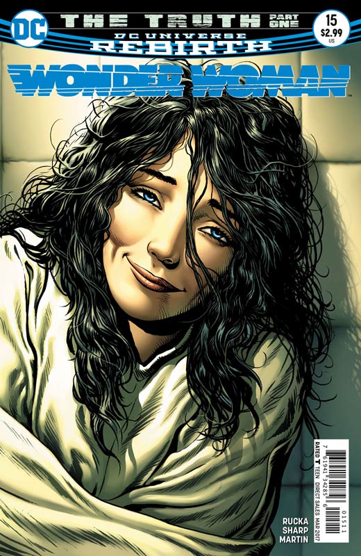
DC Comics Writer Greg Rucka, Artist Liam Sharp, Colorist Laura Martin, Letterer Jodi Wynne
Were now at the second story arc of the Rucka/Sharp side of the Wonder Woman run and really does a great job of building upon the first story line. Rucka has thrown quite a curveball into the story with putting Diana in a mental institution. What I love about the way Rucka unfolds the story is how he can tell multiple story lines at the same time and blend them together so they all fit together so well. There is a lot to digest in this issue but that is what is making it work so well. He always finds a way to keep the readers on their toes and things are not always what they seem. One of the best scenes in this issue is the breakdown of Diana talking to a worm that shows how deep she has gone and it won’t be an easy or simple road back. The other nice thing to see is the Etta and Steve story line moving into a very interesting direction. They are on their own and trying to survive and running out of options and friends. There are few artist today that have made an impact on Wonder Woman like Sharp has. The care and detail that he infuses every panel with is simply amazing. Each issue he seems to go even further than before. He simply brings the book a classic feel that you rarely see in superhero book today.
Is this book worth your time and money? This is the best Rebirth book that DC has going right now. Rucka and Sharp have brought Wonder Woman back with style and grace that is a rare combination in comics. Very few mainstream superhero comics surprise me anymore, but Wonder Woman continues to simply do that every issues. VERY RECOMMENDED!
Ether #3
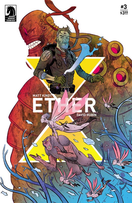
Dark Horse Comics Writer Matt Kindt, Artist and Letterer David Rubin
Ether is one of those rare comics that really creates a new and fresh story that takes reality and bends it into a way that you never know what is around the next corner. Kindt takes a simple murder mystery and takes it to a whole new level. There are so many twist and turns that in a lesser writers hands would end up not making any sense but Kindt has a real knack for writing some of the strangest stories and yet there is always a grounded element that makes them feel normal at the same time. The thing that this book reminds me of is the film Cool World that had some of the same story elements but Kindt finds the right hook and tone that sadly the film never fulfilled. Sometime you get that perfect blend of collaborators on a comic that hits the jackpot and Rubin brings this story to life-like no other artist could have. He is able to blend, bend and squish his style to fit every panel perfectly. His bold use of layouts along with the stunning color palate that he brings to the book is like a pop tart for your eyes.
Is this book worth your time and money? This is a book that simply keeps getting better every issue. As the mystery unfolds you are taken deep and deeper into a wonderful and stunning world that continues to surprise and intrigue. This is simply a must read book that I can wait to see how it all ends. HIGHLY RECOMMENDED!
Frostbite #5
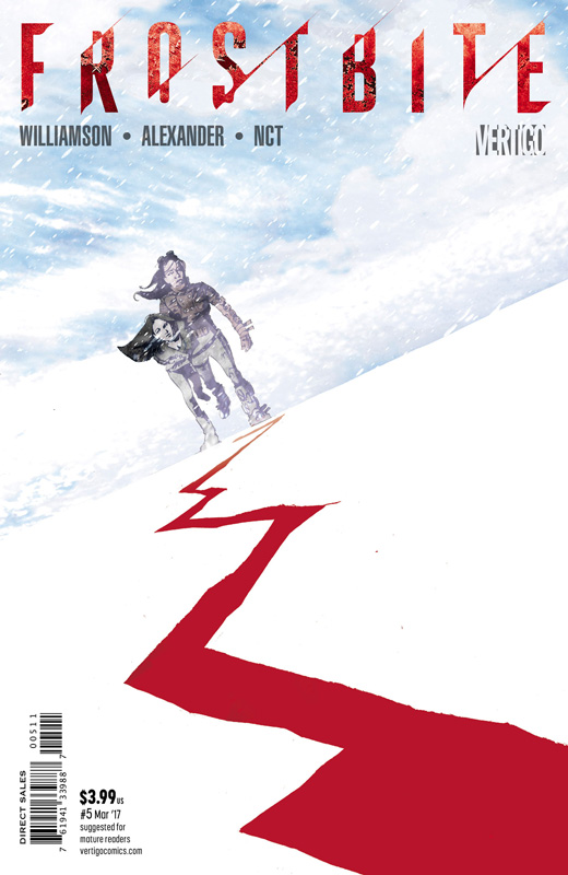
Vertigo Comics Writer Joshua Williamson, Artist Jason Shawn Alexander, Colorist Luis NCT, Letterer Steve Wands
Frostbite is a book that on the surface doesn’t wow you but that is why it’s working so well. Williamson script is one that continues to wash over you as you read it and you are simply exhausted after every issue because of the feeling you are left with at the end of each issue. What I like about how Williamson is unfolding the story is how this could have simply been an over the top post apocalyptic Mad Max on ice blowout but that would have been too easy. This is not to say that the concept is mind-blowing but why it works so well is that the fact that a lot of it is low-key and simple. He is taking a basic story and simply telling it well here. This issue does a nice job of setting things up for the final stage of the story and there is a polar bear getting punched so what more could you ask for in a comic. Alexander’s art is the thing that is really bringing this story to life. He brought a look that is giving this story the scope that it requires but captures the simple and subtle moments perfectly. A shout out to the colorist Luis NCT is taking Alexander’s line work and giving it a painted look that really makes this book shine.
Is this book worth your time and money? Frostbite is one of those books that is simply fun to read each month. Williamson and Alexander is delivering a book that doesn’t try to be bigger than it is. It tells a simple well thought out story well with simply gorgeous artwork. I can’t wait to see how it turns out.
Doom Patrol #4
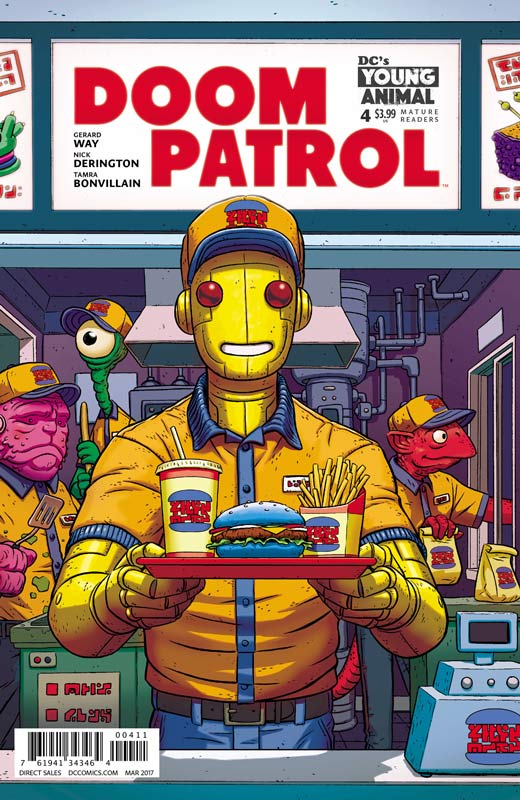
DC’s Young Animal Writer Gerard Way, Artist Nick Derington Colorist Tamra Bonvillain, Letterer Todd Klein
Doom Patrol is starting to find it’s voice. It’s not that the book has been bad but Way has finally broken from the bonds of being in the shadows of Morrison’s run of Doom Patrol. One of the initial problem that I had with this book was that Way was trying to write like Morrison and that didn’t work out so well. This issue he seems to have found his footing on the book and the story is starting to come together. While I’m still not totally sold on the book yet, I am starting to warm up to it. It’s not that Way need to be more linear with the stories but he needs to put thing into a bit better focus. What has really keep me going on this book is Derrington’s artwork on the book. He has such a wonderful style that has a beautiful simplicity to it that is very inviting. It also has a slight cartoony style that gives it a great flow while your reading the book. This is a great looking book.
Is this book worth your time and money? I like the book but just not in love with it. I will give Way points for getting a better hold of the story and this issue was a solid read. Derington continues to save the day visually and delivering great artwork on the book. Hopefully the momentum of this issue keeps it on track.
Wonder Woman ’77 Meets The Bionic Woman #2
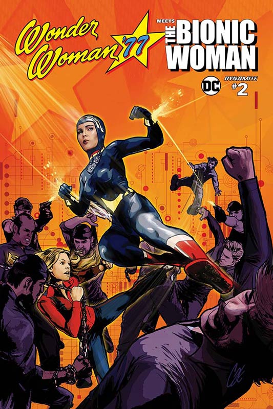
Dynamite/DC Comics Writer Andy Mangels, Artist Judit Tondera, Colorist Roland Pilcz, Letterers Lois Buhalis & Tom Orzechowski
The first issue got off to a fair start and was a bit hampered by exposition but this second issue gets the book on a better footing. Mangels script is still setting things up that is both good and a bit of a miss. In his defense there is a lot of elements in play with the huge cast of characters from the two shows. As with most crossover book there this is not War and Peace level of storytelling but what Mangels does here is keep it light and fun. That is becoming the books best asset. The one thing that I very much appreciated that he did was that a lot of writers come up with some insane story element that has the two heroes battle each other and wisely Mangels doesn’t let the book fall into that trap. Having them work together make very much sense for these two female heroes. One of my favorite moments in this issue is when Jaime tells Diana that her alter ego didn’t fool her and used the old Clark Kent glasses joke to seal the scene. The pacing hopefully will pick up a little better than the first two issue have. Tondera’s art is a bit better this issue and while she does a nice job on the character’s faces to match the actors some of the other artwork suffers a bit. She still struggle a bit with perspective but overall the book looks better than average for a Dynamite title.
Is this book worth your time and money? The main appeal of this book is going to be fans of the original series that this book is based on. I do wish that Mangels had made this a little more new reader friendlier but overall it’s a decent read. I wish the book had moved forward a little better this issue but I hope that the third issue will finally get moving a little better.


0 Comments