So while you all were celebrating the 4th of July I was slaving over this weeks hot new comics to read and give you these reviews. Don’t get me wrong I love helping you decide what to spend your hard earned money on. I hope you all had a safe and sane holiday and so let get going on the reviews.

Sea of Stars #1
Image Comics Writers Jason Aaron & Dennis Hallum, Artist Stephen Green, Colorist Rico Renzi, Letterer Jared K. Fletcher
There is something really charming about this book in that it’s like a children’s storybook but in a more traditional comic book form. Aaron and Hallum have done a nice job here on this first issue with setting the story and the characters up and you immediately fall in love with Kadyn because you easily relate to him in his sadness and child like wonder. It’s a story that while your reading it your thinking that this is cute and fun but by the time you get to the end your totally sold on it. The big key to the book working so well is Green’s artwork that really captures the spirit of Kadyn and the stuff that kids do and the emotions that he captures on both him and his father really seal the deal on this comic.
Is this book worth your time and money? The one thing that you will say to yourself after reading this book is that it’s not super deep or blows you away, but that is not what its trying to do here. It simply wins you over with it’s charming snappy script and spot on artwork. It also gives you a good reason to come back for more in the next issue. I had a lot of fun with this book and is well worth checking out. RECOMMENDED!
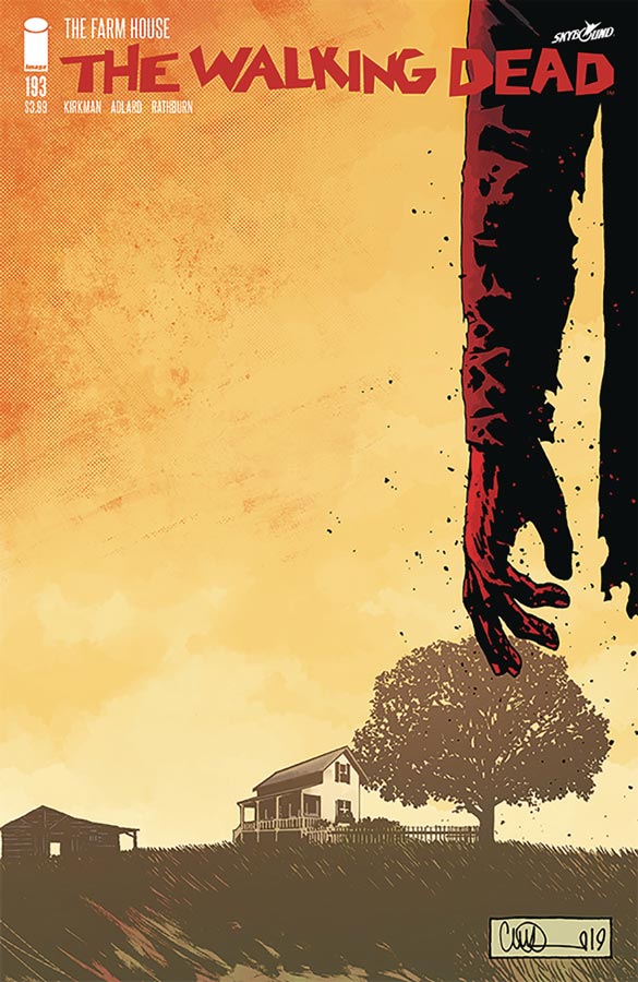
The Walking Dead #193
Image/Skybound Comics Writer Robert Kirkman, Penciller Charlie Adlard, Grey Tones Cliff Rathburn, Letterer Russ Wooton
So the final issue stealthily released bring to a close one of the most successful comics that has spawned a hit television series and merchandise sails off into the sunset after a 16 year run with a bittersweet ending. I have not read the book in years but I will say that as long as you know the main characters and that Rick Grimes has passed you can read the story fine. Instead of a big blow out at the end Kirkman has wisely chosen the path of wrapping the story up emotionally and that has always been the strong trademark of the series. While on the surface the story seemed to be about the zombie apocalypse but it never really was. It was about the fight for survival but also to regain humanity. That is why the book has always worked so well on time. In a lot of way the story never really end but is about closing the final chapter on the characters and riding off into the sunset. Adlard had been only the second artist to draw the series (Tony Moore was the original artist and sadly left the book after issue six) but though thick and thin Adlard was the artist that drew the book and that is a testament of a great artist. While there have been many great issues that he has drawn this final outing might just be his best because of the way that he captured the deep emotions to this final chapter. There is also the grey tone work of Rathburn that adds greatly to Adlard’s line work. He started with issue six and along with Adlard made this comic work so visually well.
Is this book worth your time and money? Well I guess if you have been living under a rock for the last 16 years and have never read the comic or seen the television show this is certainly not the place to start with. If your a lapsed reader of the book there are some subtle plot elements that you will probably miss but otherwise you’ll be fine. Is it the greatest ending to a comic book ever, no but those are exceptionally rare but the one thing that this one does do is satisfy and that is what the book has pretty much done throughout its run and on that level it works very well. RECOMMENDED!
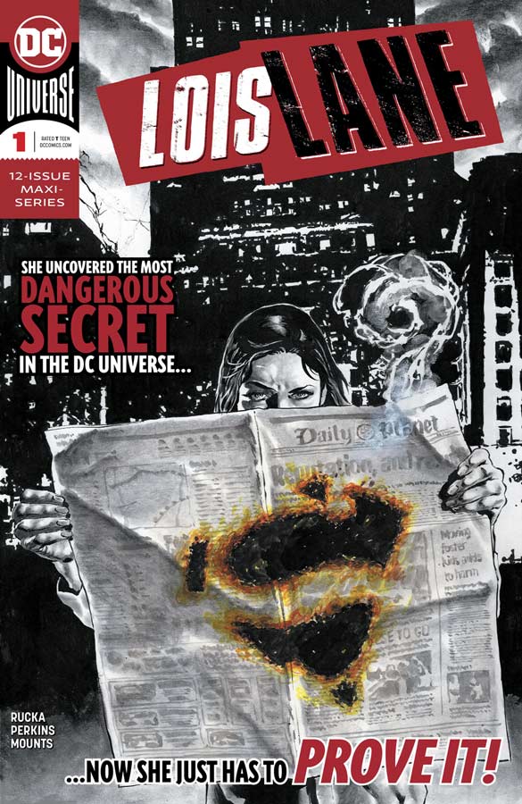
Lois Lane #1
DC Comics Writer Greg Rucka, Artist Mike Perkins, Colorist Paul Mounts, Letterer Simon Bowman
This book has been a long time coming in that Rucka had proposed a Lois Lane series years ago but after a falling out with DC with the proposal rejected he went back to his creator owned books but came back to revive Wonder Woman to both great critical and fan reaction (if you haven’t read his run then run out immediately and just buy them). While I am sure that this series is very different from his original story, in a lot of ways I think the timing of this series couldn’t be better. Rucka has a great knack for combining great stories with current events and he really takes advantage of it here. This is one of the few times where Lois really steps out of the shadow of Superman but Rucka wisely makes sure that Clark is part of the story and that adds a great deal of tone to the story. What is most amazing about this first issue is that on the surface there are no big scenes in the story but there is so much subtle undertones that is what made this such a great read. Perkins artwork here is simply stunning and he is able to capture the grittiness of Rucka’s story but also the emotional core of the character of Lois that is far to often not used effectively. His style has a great noir tone that is another big win for this comic and Mounts does a great job with the color work that complements Perkins line work beautifully.
Is this book worth your time and money? Rucka has always written strong female characters and he is the perfect writer for this series. While some of the subject matter may be timely, he makes sure that it’s just as timeless so that it’s not just current. This is a really deep story and with only this first issue, I’m totally sold on it and it has shot to the top of the must read pile for sure. HIGHLY RECOMMENDED!
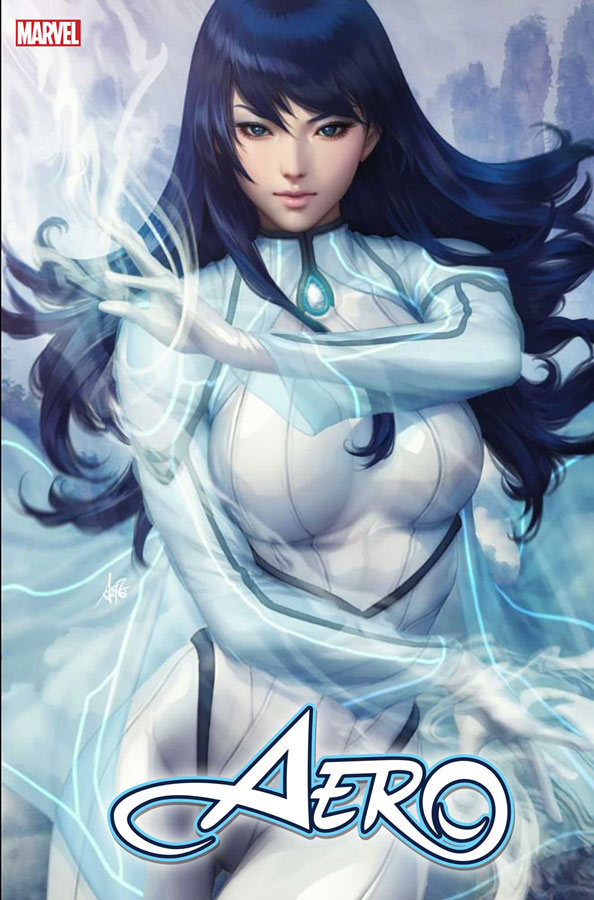
Aero #1
Marvel Comics Writer Zhou Liefen, Artist Keng, Adaptation Greg Pak, Backup Story Writer Greg Pak, Artist Pop Mhan, Colorist Federico Blue, Letterer Joe Caramagna
This is one of those superhero comics where the visuals are the main event with the story being on the simple side but while not a super deep comic, it does however work well for what it is. Touted as the “breakout star” of War of the Realms and if this is what Marvel considers break out the bar for that is pretty low. Liefen’s script is pretty much by the numbers affair here and there is really not much character development in the main story about Aero and there is no origin in either the main or backup story. Visually the comic looks great with the artwork from Keng that adds greatly to the big battle scene but that is about the high point of the main story. The backup by Pak and Mhan is a much more traditional American comic style that is well done but as like the main story not very memorable. It does tell the origin of Wave but not much else and eludes to other characters in the story but pretty thin at best.
Is this book worth your time and money? It’s not to say that this comic is bad but it doesn’t really do much ether. The biggest problem is that it’s simply forgettable and with so many other comics to choose from this type of book is just not going to cut it. SKIP IT!
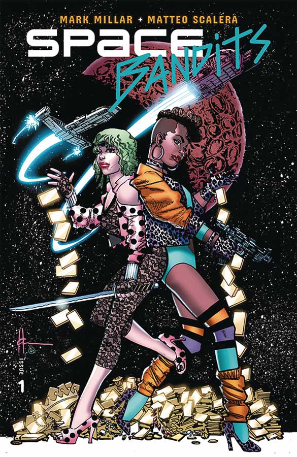
Space Bandits #1
Image Comics Writer Mark Millar, Artist Matteo Scalera, Colorist Marcelo Maiolo, Letterer Clem Robins
Another in the continuing long line of Millar pilots for Netflix comes Space Bandits that I will give him that it’s better than his last few outings and marginally more original meaning that you cant say that its just a rip off of such and such. With all of that being said it was a decent read and did have a nice charm to the story. Think of it like as Tango and Cash but with criminals instead of cops and at the end of the first issue they meet up in prison. The story is not very deep and I wouldn’t say that there is a huge compelling reason to come back for more but it did have some moments that made it a fun read. Scalera’s artwork really helps elevate the simple story and helps move it along well. Visually the book is better than the story so you tend to be a bit more forgiving of it because of that.
Is this book worth your time and money? In the end this is a pretty average comic that is neither good nor bad but is about 10 minuets of entertainment and thats about it. In the long run there are simply better comics out there than this one. SKIP IT!
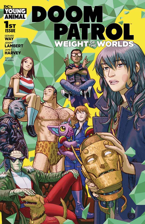
Doom Patrol: Weight of the World #1
DC’s Young Animal Writer Gerard Way with assistance from Jeremy Lambert, Artist James Harvey, Colorists James Harvey and Sajan Rai
The book is touted as a #1 issue, it is really in fact issue #13 and takes place from the previous run. The good news is that most of this first issue has lots of notes to help new readers get up to speed. There are some things that if you haven’t read the previous series that your not going to totally get at least your not totally lost coming into this story. Way also keeps this issues story pretty basic so that you can get the gist of who and what the characters are. I have been a fan of the team from its original series back in the 1960’s that was really great but there have been many takes over the years it was Grant Morrison’s late 1980’s run that really changed the game for this title and obviously Way was heavily influence by that version. I enjoyed Way’s original series with the only issue being that the book was constantly late and that impacted the reading experience that will hopefully not be the case in this run of the book. While this first issue didn’t necessarily blow me away but in a lot of ways its not supposed to but gives you a flavor of what he is trying to do with the book. Adding Lambert to the mix with the script has given this new series a fresh approach that still has the same tone but feels more loose and brighter than the previous series. Harvey takes over the artwork duties from Nick Derington and while I loved what he delivered in the previous run, I have to give Havey that he brings a fresh new visual approach that build on Derington’s designs very nicely. Harvey has a bit of cartoony style but it fits perfectly into this version of the Doom Patrol and his color work (along with Rai) really makes this book pop in all of the right ways.
Is this book worth your time and money? The thing that I really liked was that instead of a continuation of the first two Way series, this one keeps the cast but has a fresh feeling that is not better or worse just different. This story has more fun and is a bit looser that gives it a bit more mainstream feel but keeps all of the quirky nature that has been a key ingredient that is still there. I like where this story is going and excited to see where they take it from here. RECOMMENDED!

No One Left to Fight #1
Dark Horse Comics Writer Aubrey Sitterson, Artist & Colorist Fico Ossio, Letterer Taylor Esposito
At first glance it looks like a box of florescent markers exploded when this book was printed but you know that once you read the issue, it all makes sense. The creators say that some of the inspiration for the book comes from Dragon Ball Z (that I have never fully seen but aware of) but also resembles 2D fighter video games. Sitterson script does one thing that I didn’t really expect and that was that was he gives these characters pretty good depth considering the simple premiss of the story. While not the deepest reading experience you will get this week it was an enjoyably surprise. The one thing that the story does well here is have a lot of charm to it and you care about the characters and that was nice to see. I was a bit skeptical at first of Ossio’s artwork because at first glance the color work on the book is pretty intense but not in a good way, but once I read the story I get where he was going with the book visually because of the visual inspiration the colors are meant to be bright and a tad garish but once you read the story you totally get why he made those choices. The other surprise was the emotional expressions that he gave the characters that really help sell this story and that is why it works so well.
Is this book worth your time and money? Sometimes the comic that you don’t expect to impress you is the ones that sneak up on you but in this case it kind of visually attacks you but in a good way once you read it. Sure it’s a pretty simple story but there is a charm with both the story and artwork that just works and is well worth checking out this week.

Captain America and the Invaders #1
Marvel Comics Writer Roy Thomas, Artist Jerry Ordway, Colorist David Ramos, Letterer Joe Caramagna
Talk about a blast from the past in this loving nostalgia dripping comic book that is a love letter to Thomas’s 1975 Invaders series but with the addition of Ordway’s artwork bring back memories of their work on DC Comics All-Star Squadron. The thing that I love about these Marvel 80th Anniversary one shots is that is allowing creators from the past to bring back some great memories and it also shows how wonderful those comics were. Sure this is a pretty basic Captain America story but he has always worked best in the WWII era and there is something about him beating up Nazi’s that always makes you feel good about him punching them in the face. Thomas knows these characters and time period so well and that makes this book a solid reading experience and he also keeps the story simple and to the point. Ordway is one of the best artists around and is sadly underused in todays comics. The amount of detail that he puts in to this book really is impressive and gives it the visual punch that the story delivers. He gives the book a realistic look but keeps it grounded in the superhero look at the same time. I loved his visual take on both Cap and the Human Torch that was especially great when he flamed on was stunning.
Is this book worth your time and money? For longtime comic book readers like me this is a real dream book that takes me back to a time in comics where they were just solid and fun and while I appreciate modern comics just as well, I do feel that there is room for stories and creators like Thomas and Ordway to do more comics like this. For newer readers I hope that they give this book a chance to see what old school comics used to be like and maybe they will go and pick up some books by this talented team. I loved every minute of this book and cant praise it enough. HIGHLY RECOMMENDED!

Test #1
Vault Comics Writer Christopher Sebela, Artist Jen Hickman, Colorist Harry Saxton, Letterer Hassan Otsmane-Elhaou
I should have know what I was getting into with this book considering a few week ago that Sebela delivered the Trust Fall train wreck a few weeks ago. I honestly don’t get what readers see in his scripting. This book has the same issue that Trust Fall had in that there are ideas here but the story is so convoluted and confusing that by the time that your done reading it you honestly could care less about it. Look I like weird comics but the problem that Sebela has is that if your going to tell a non linear story you need to give the reader characters that you can follow along with but as with Trust Falls your just dropped into the story and know nothing about the characters nor do you actually learn anything about them. The story just goes along and you have no idea what or why anything is happening you simply stop caring after a while and I simply finished it to do this review. I have to give Hickman props for being able to actually deliver artwork that tries to help things here but even she cant save this mess of a script. She does some nice artwork here and it does marginally help try and make sense of this story but it was a goner before she showed up to do the artwork.
Is this book worth your time and money? I really don’t understand what Sebela thinks when he writes comics. You would think to have a story that resembles a coherent structure but after this second misfire I’m done with any of his comics. SKIP IT!
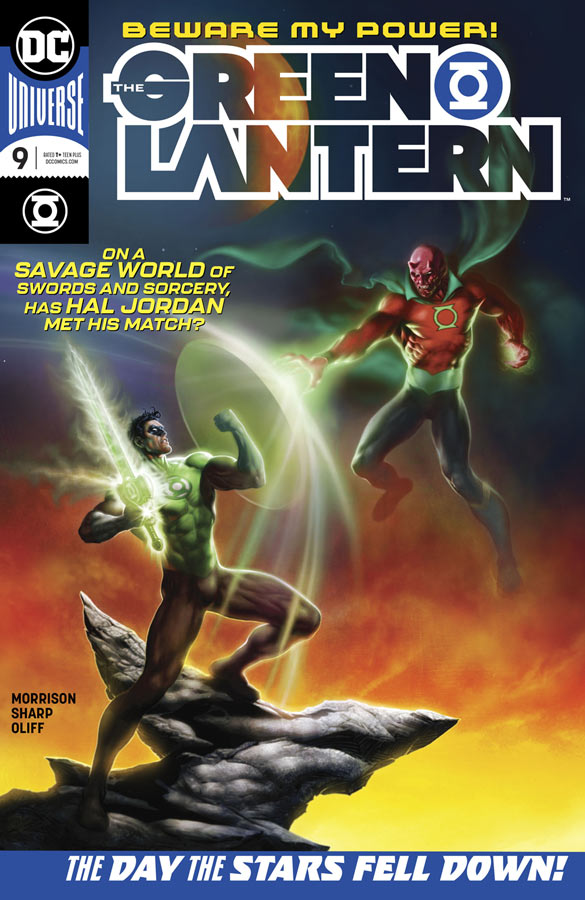
Green Lantern #9
DC Comics Writer Grant Morrison, Artist Liam Sharp, Colorist Steve Oliff, Letterer Tom Orzechowski
When I was first reading this issue I thought I had missed an issue because the story seemed to continue from a previous issue but no it was just the way that Morrison structured the story and once I got that I really loved what he did and what he set up with it. Morrison continues to push the boundaries of what a mainstream superhero comic can and should be. I know that I sound like a broken record every time I review an issue but with each one he finds a way to change the game and yet still keep the momentum of this ongoing story moving forward. He also continues to make you think that you might have figured things out but then he goes and adds twist and turns to keep you on your toes. There are some great changes that he throws into this issues stories (no spoilers but your going to be blown away) that changes previous continuity but without dissing the past but making this version all his own. The one thing that never changes is the stunning artwork that Sharp continues to provide for the book. What makes it even better is that Morrison knows how to push him and what he is able to visually bring the scripts to life. The level of detail that he is able to deliver each month really shows what an amazing talent that Sharp is. I’m sure that a lot of readers are going to be impressed with his big action scenes that he is great at but for me it’s the emotions that he captures in the characters that is what I love in his work on this book.
Is this book worth your time and money? This is a comic that is that you must be reading. While a lot of the times readers fall into two camps, straight up mainstream superhero readers or edgy independent readers but this comic proves that you can satisfy both at the same time. Morrison and Sharp are on fire with this book and each issue continues to top the previous one. HIGHEST RECOMMENDATION!
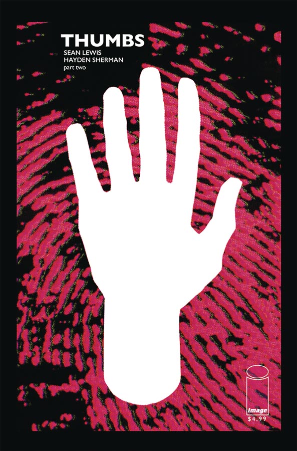
Thumbs #2
Image Comics Writer Sean Lewis, Artist Hayden Sherman
I was quite intrigued with the first issue of this title and thankfully the second issue really hits the ground running and builds nicely from the first. Lewis delivered a great cliffhanger to the first issue of this story and in this second outing keeps it moving in a great direction. What I like about Lewis’s story here is that you as the reader are discovering the world at the same time Charley is and that gives the story a great flow while your reading it. He is slowly peeling back the layers of the mystery of the current world and how Thumbs is trying to save his family. Sherman’s artwork is really impressive because he brings a great visceral look and feel to this dystopian world that has shades of influences but he puts his own spin on it to give it a fresh look and feel. His use of color continues to impress and gives this book a stand out look that is hard to beat.
Is this book worth your time and money? This book has been a nice little surprise and continues to deliver a strong story and great artwork. I love the pacing of the story that keeps you on the edge of your seat as to how the story is going to continue to unfold and how Charley is going to save his family. RECOMMENDED!
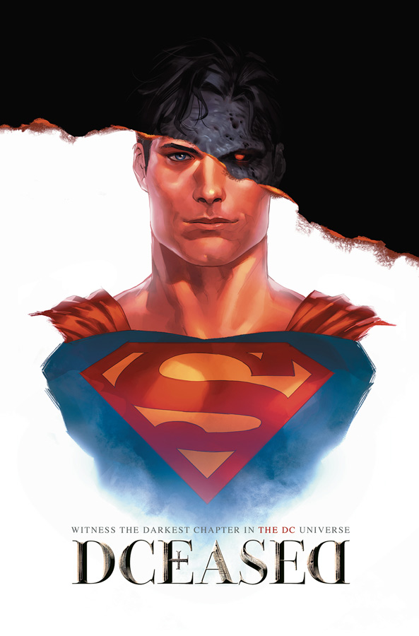
Dceased #3
DC Comics Writer Tom Taylor, Penciller Trevor Hairsine, Inker Stefano Gaudiano, Colorist Rain Beredo, Letterer Saida Temfonte
Just when I thought that this was just going to be another fun zombie fiesta, Taylor has to go and pull some heartstrings this issue and really upped the game on this book. While it’s still not the deepest read but what Taylor is building each issue is showing that there might be more to this story that I first thought. Sure there are many influences here and the structure is still pretty basic but its the little subtle elements that Taylor is bringing to this story that is making it feel fresh and different. There are a lot of emotional ups and downs this issue and I certainly wont spoil them here but I will just say that the final few pages will really get to you. Hairsine continues to impress with the artwork on the book and while he delivers the creepy zombies with disturbing spot on horror, its the emotional heartfelt moments in this issue that he really impressed me with.
Is this book worth your time and money? This comic has really taken me by surprise in that it started as one thing but is developing into something that I wasn’t quite expecting. It’s turned from a guilty pleasure to something more with this issue. I cant wait to see where Taylor takes the story from here. This comic is well worth checking out.
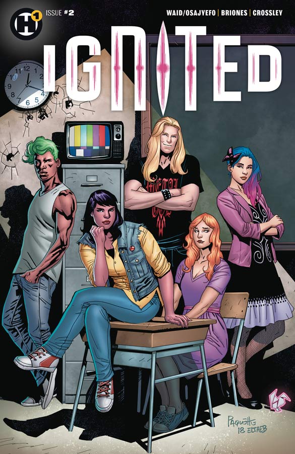
Ignited #2
Humanoids Writers Mark Waid and Kwanza Osajyefo, Artist Phil Briones, Colorist Andrew Crossley & Phil Briones, Letterer A Larger World Studios
I wasn’t blown away by the first issue of this series but was willing to give it a chance to see if they could build on the concept of the story and its still a bit of a mixed bag here. I think that the big problem that I’m having with this book is the pacing of the story. I think that Waid and Osajyefo has some good ideas here but I had hoped by this second issue that it would have moved forward more at this point. The disappointing part is that there are some really good ideas in the story but the slow burn approach to the story is just not quite cutting it here. The other issue is that I haven’t got a great connection to any of the characters and that is where I think that the book falls apart. We get the whole current school shooting undercurrent to the story but you need a reason to care about the characters and the story that goes with it and it’s just not connecting. Briones artwork is really good and he honesty is doing the best he can to visually help the story but there is just not enough there that his really nice artwork can make the story better.
Is this book worth your time and money? Sadly I tried to like this book and it’s far from terrible but it’s simply treading water after this second issue and Waid and Osajyefo don’t give a great compelling reason to keep going. Good ideas will only float a book for so long. SKIP IT!

Superman: Up in the Sky #1
DC Comics Writer Tom King, Penciller Andy Kubert, Inker Sandra Hope, Colorist Brad Anderson, Letterer Clayton Cowles
DC promised that they would reprint the new stories that were in the Wal-Mart exclusive comics and this is the first of those to come to comic shops. King script here is quite good because he tell a more emotional story that is not just your standard superhero fare that is very accessible and shows that there is more to modern comics than just beat em up stories. Some of the best Superman stories have been more outside the box and that is why this one works so well. Having him try and save this one girl might seem like the needs of the one is out weighing the needs of many but it captures the human side of Superman that is what makes him such a great character. Kubert was a great choice for this story because he is able to capture all of the emotions in Kings script perfectly. He also brings a nice classic style that would be pleasing to a new reader and that it why this story works so well for both new and more seasoned readers and should please both.
Is this book worth your time and money? My only complaint is that they are charging a dollar more ($4.99 compared to $3.99) for 22 pages that are reprints at this point and only have one more page than a regular DC comic book. I applauded them for trying to get comics to the outside world and the Wal-Mart location was a good one because they are in a lot of smaller communities that don’t have local comic shops. I’m glad that they kept their promise to reprint the new stories from those books, it does feel like a bit of a cash grab a little bit. With that being said I don’t think that it’s a terrible deal and the story and the artwork are worth the price of admission here. Just know that there are five more issues to go on this one.


0 Comments