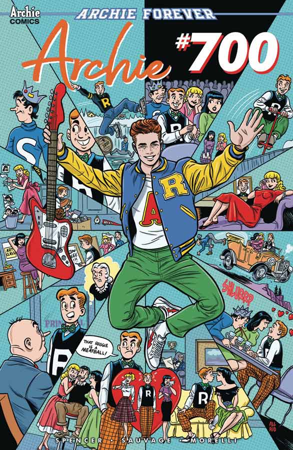
Archie #700
Archie Comics Writer Nick Spencer, Artist Marguerite Sauvage, Letterer Jack Morelli
After a great run with writer Mark Waid it was going to be tough going for any new writer to take over the reins of this book and still keep the momentum and the quality of this book on track. Spencer’s first outing is off to a good start and while there is not a lot that happens in this first issue because he is setting things up here in this soft reboot. This first outing suffers a bit from heavy exposition but Spencer does his best to keep things moving along well. He does have some nice twists that he slips into the story and is a great jumping in point for new readers and he does a nice job of introducing the entire cast in this first story that is a big plus to get new readers on board. The big win for this book is Sauvage’s gorgeous artwork on the book that really elevates this to really stand out. This modern version of Archie has had some really great artists on this book over the past few years and Sauvage keeps this tradition going with her spot on artwork that delivers some really eye-popping visuals to both Riverdale and the Archie gang. Her artwork alone is worth the cover price on this book and is a great addition to the creative team.
Is this book worth your time and money? This is definitely a first issue and does fall into the not much happens because of the setting up of the story here. But it does show promise and Spencer does give you a reason to come back for a second issue. The big win for this book is Sauvage’s beautiful artwork that graces this book is where it really shines and once the story starts to ramp up this book appears to be on solid footing. If you haven’t bee reading these new modern takes on Archie then this is a great starting point to jump on. While this first issue wont blow you away it does however give you a good taste of what this new version is like and worth checking out. RECOMMENDED!
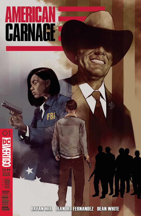
American Carnage #1
Vertigo Comics Writer Bryan Hill, Artist Leandro Fernandez, Colorist Dean White, Letterer Pat Brrosseau
With the relaunch of Vertigo has had both ups and downs with both the regular and the Sandman Universe book rollouts and now we have up American Carnage that gets off to an interesting start Hill tackles some really timely social commentary with this story that taps into the current division of America with many uncomfortable story elements here but that’s what makes it so intriguing that he takes those and runs with them in this book. There is a fair amount of exposition here in this first issue but Hill does a nice job of balancing it while still moving the story along. There are many mysteries that he plants the seeds that you can see will become important later in the story arc and that gives you a good reason to come back to read more. I like Fernandez’s artwork on the book and that a lot of times he takes a more minimalism style that lets both the story and the artwork breath. This book is pure drama that is difficult to capture from an artwork standpoint but he captures both the big and smaller details in the story with ease.
Is this book worth your time and money? I liked this first issue and the book shows a lot of promise. While the story touches nerves with the current atmosphere in America, it also doesn’t take a side quite yet but doesn’t shy away from ripping the band-aid off either. There is a lot to take in here with this first issue but I like where Hill and Fernandez are taking the book and if you’re looking for something with a bit more bite to it then you should check this one out.
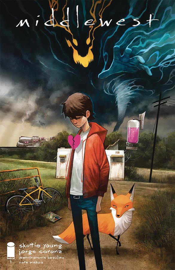
Middlewest #1
Image Comics Writer Skottie Young, Artist Jorge Corona, Colorist Jean-Francois Beaulieu, Letterer Nate Piekos
I have to give Young that he is really on a hot streak here with Bully Wars and now Middlewest that gets off to a very good start here. Telling a story that is fictional but yet is deeply rooted in both characters and mid western setting can be a very tricky thing to try to pull off but Young is able to capture both the realism and the fantasy elements quite well here in this first outing. One of the best assets of this book is that he does a great job of introducing Able in the story so that the reader is able to care about him so when strange things start to happen you care about the character and that is why this first issue is very strong out of the gate. The other thing that I liked is that he never really explains that Able has a talking fox and you simply go with it because Young just throws it in and it simply works. He does a great job of capturing the spirit and mannerisms of a boy struggling with living in a small town and an abusive father that could have been forced but he gives this story such a great flow that makes it all come together very nicely here. Its one thing to have a good story but you need an artist to bring it to life and luckily for both Young and us Corona brings this book to life visually in so many great ways that it simply blows you away while your reading it. The detail that he puts into every panel really pays off with the emotional core of the story. He is able to pull off everything so well here that is one of the main reasons that this book works so well.
Is this book worth your time and money? I really fell in love with this book visually with Corona’s gorgeous artwork on this book but Young really delivers a great concept with solid groundwork with a story that not only works great in this first issue but gives you great reason to come back for more. There is a lot to take in with this book and will have you wanting more by the end of the issue. This is a must buy book this week. HIGHLY RECOMMENDED!
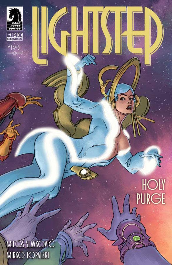
Lightstep #1
Dark Horse Comics Writers Milos Slavkovic & Mirko Topalski, Artist Milos Slavkovic
Visually this book is simply gorgeous but the story while interesting was a bit convoluted and dense that kept it from take off as well as the visuals. One of the big problems here is that Slavkovic and Topalski has created a grand story here but unfortunately the characters are not developed well enough to be engaging to the reader and that is the flaw of this book lies. I will give him that there are some interesting ideas here but with the story not being flushed out well and there are times where the dialog is thick and overwhelming that it becomes a chore to read and gets pretty boring quickly. This also causes things in the story to be confusing because of story elements that are not explained that well and you become lost in the story. The sad part of it all is that as an artist Slavkovic is brilliant and is one of the best looking books of this week and with that alone you really want to like the story but good artwork will only get you so far with at convoluted and weak script.
Is this book worth your time and money? It’s a real shame about this book because I do think that there are some good ideas here with the story but with it being all over the place and the lack of characters motivations there is simply nothing left but gorgeous visuals that make it all that much more disappointing. SKIP IT!
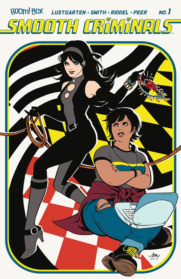
Smooth Criminals #1
Boom Box! Writers Kurt Lustgarten & Kristen Smith, Artist Leisha Riddel, Colorist Brittany Peer, Letterer Ed Dukeshire
I like the idea of Boom Box titles that are trying to get more diversity into comics but unfortunately a lot of them have good ideas but somewhere in the execution they simply don’t pan out very well. I don’t think that the book is terrible and there are some good ideas in the script from Lustgarten and Smith but I think that they disappointment comes from that this first issue is simply pretty boring and the characters are just not developed enough for the reader to care about them. Part of the problem is that Brenda is simply two-dimensional and simply is too cliché for you to care about. The other thing that didn’t work that well was the whole Corsair story element of frozen and waking up in the future didn’t really seem all that interesting and didn’t seem to bring much new to the story trope. Riddel’s art story was a bit to manga inspired for my taste but was not too bad. The only big issue that I had with it was that she had some really inconsistent artwork throughout this first issue that was a bit too noticeable and was distracting while reading the book.
Is this book worth your time and money? I don’t think that the book is bad by any means but there is just not enough here to really recommend it either. There are a few decent story elements here but unfortunately this first issue really doesn’t do much to grab you or give you a good reason to come back for a second issue. SKIP IT!
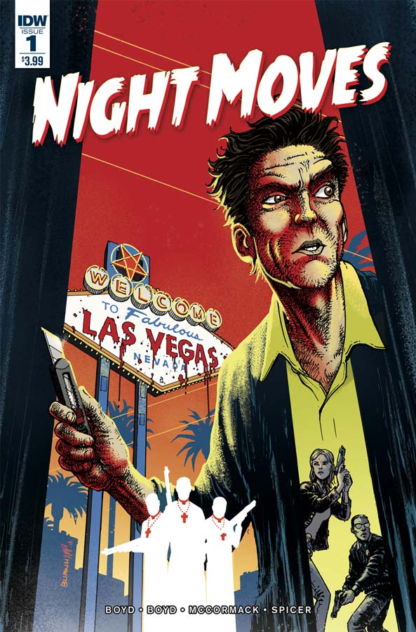
Night Moves #1
IDW Writers V.J. Boyd and Justin Boyo, Artist Clay McCormack, Colorist Mike Spicer, Letterer Shawn DePasquale
I almost didn’t pick this book up when flipping thorough it but I am certainly glad that I did because it was quite a pleasant surprise. Boyd and Boyo have taken a nice twist on the typical hard-boiled detective story and given it a nice spin here and made for a compelling read with this first issue. There are a lot of things that they got right here and one of the strongest was the characters and took the time to let the reader get to know them but still keep the flow of the story moving along. They also do a nice job of setting up the mystery of the story and mixing different genres with the story. The only minor gripe was that on page 17 the dialogue was so think that you could cut it with a knife and it really slowed the story down but thankfully it was only one page and the rest of the script did not have this issue. McCormack’s artwork fits nicely into the story here and while it may not be flashy, it doesn’t however get the job done well. The one thing that he does bring to this book with the artwork is a nice mood and noir look that complements the story quite nicely.
Is this book worth your time and money? Boyd and Boyo deliver a solid story here with some nice twist to the genre and give a good reason to come back for more. With nice artwork from McCormack it a nice little surprise here and well worth checking out.
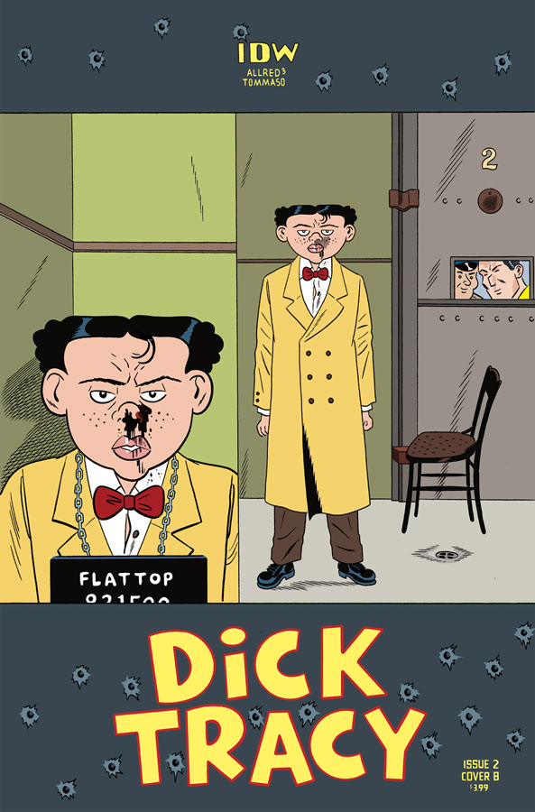
Dick Tracy #2
IDW Writers Lee Allred & Michael Allred, Penciller Rich Tommaso, Inker Michael Allred, Colorist Laura Allred, Letterer Shawn Lee
I was very impressed with the first issue of this new revival of Dick Tracy and thankfully this second outing does not disappoint. What Lee and Michael have done here is create a great balance of past and present to this story and that has been very impressive. I’m sure there are very few current comic book readers that are familiar with the characters and the story does a very good job of balancing that with both exposition and moving the story forward. While some would call this book old fashion, I say yes because they use all of the elements that made the characters great in the first place but also are not trapped by the past either. This second issue has a lot of great detective elements that showed how Tracy has to use his skills when there are obstacles in his path. This issue also opens the floodgate on his rogues gallery of villains that was a real joy to see. The one thing that the script does here is keep a strong pacing to the story and that is one of the books best assets. I don’t think there is a better artist to draw this book than Tommaso because his art style really lends itself to Dick Tracy comic strip roots drawn by Chester Gould but very much his own style. His detailed and clean line work really makes this book pop and has a great energy to the artwork. What I love about his art is the simple way that he is able to capture subtle looks and feels in the story and make them seem so effortless in the flow of the book. Of course having one of the best colorist in the business Laura on this book because she is the glue that holds it all together and that is what a good colorist does. She complements Tommaso’s line work beautifully and adds a nice comic strip feel to the book that other colorist might not be able to capture like she does.
Is this book worth your time and money? The best thing about this series is that the book is simply fun and that is one of its best assets. Team Allred and Tommaso don’t try and make this book bigger than it is. They are simply delivering a solid, fun, and wonderfully beautiful comic that is a hell of a fun ride that is simply a joy to read. HIGHLY RECOMMENDED!
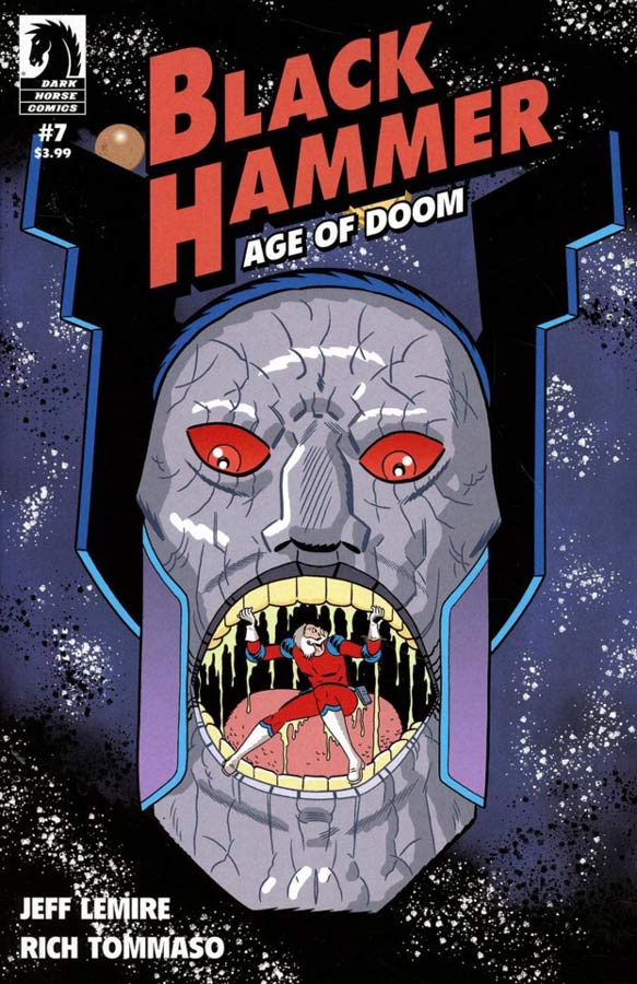
Black Hammer: Age of Doom #7
Dark Horse Comics Writer Jeff Lemire, Artist/Colorist/Letterer Rich Tommaso
What has been one of the best assets to the Black Hammer books is its ability to tell side stories that have a great impact on the overall mythology to this universe but stand very well on their own. I love that Lemire tells these stories because they add such a great richness to the main characters as much as it does for the story. This two-part story adds so much to the Colonel’s story and yet introduced so many new side characters that may still see the light of day (no spoilers here) because of what a great writer Lemire is he able to have a pig, rabbit and goose be the center of a story and you are able to go with it because of the care that he infuses into them. That has always been the books best elements is the care that he puts into each character no matter how big or small their role is. That is the great rewards that this book continues to deliver each month. It was a real treat to see Tommaso draw this two-part story because of the Golden Age spin to the story. My favorite thing about this story is the way that he bring such great emotions to the animal character is quite impressive for an artist to pull off and Tommaso does it here with ease.
Is this book worth your time and money? Simply put the Black Hammer books are must read and Lemire continues to deliver some of the best superhero comics around. Each issue is a treat and keeps unfolding the mysteries and stories of this universe that will satisfy readers. HIGHEST RECOMMENDATION!
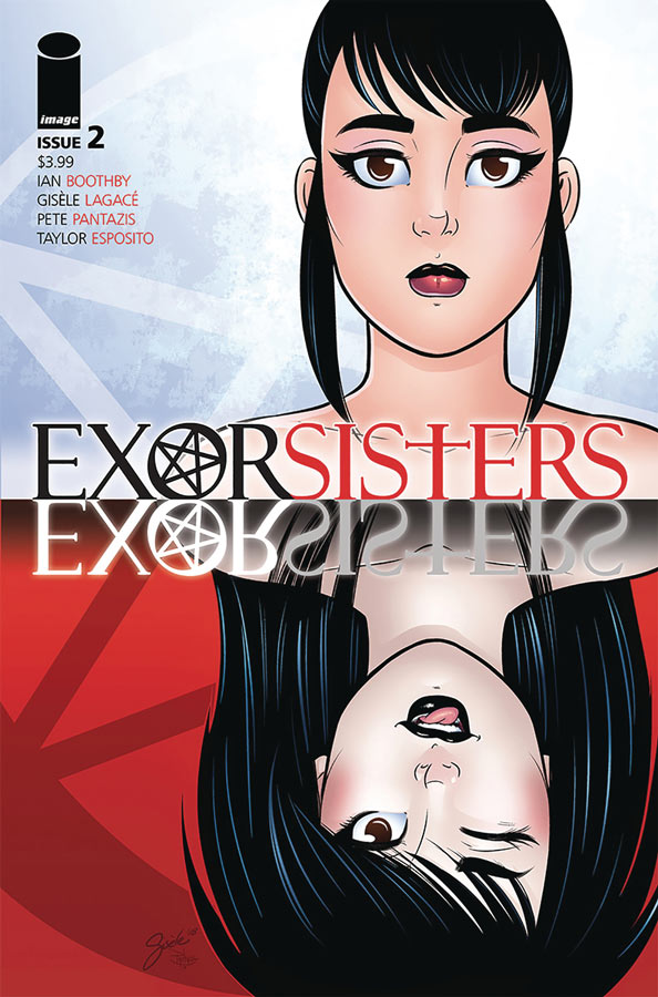
Exorsisters #2
Image Comics Writer Ian Boothby, Artist Gisele Lagace, Colorist Pete Pantazis, Letterer Taylor Esposito
I’ll be honest that I like some of the ideas that the first issue of this book had but wasn’t totally sold on it but I will say that this second outing did give me a reason to give the book a few more issues. One issue that I had been that there was not much character development and I didn’t feel a good connection to them and that was not the best way to start the book off. Thankfully he has fixed many of those issues here. The one thing that the book does well is have a sly sense of humor and a lot of the time this veers into dark humor that is alway fun to add to a story. The pacing of the story is nice here as we start to learn about the sisters and their story but also their mother. The only thing that Boothby still hasn’t done is give the names to the characters that well. We still don’t know the mothers actual name but she is just referred to as mother. This is a real pet peeve of mine that you need to be able to connect to characters and the strongest way is to know their names and this is a flaw in the script. With that minor issue said overall I was much happier with this issues story. Lagace’s artwork is very nice here and her cartoony style fits the story very nicely. The one thing that she really does well with this book is the characters facial expressions that really sell the emotions of the script quite nicely here. She nails the emotions of the characters and helps you believe all of the craziness of it all.
Is this book worth your time and money? This second issue was a big improvement and gives me a reason to stick around for more. While there are some minor missteps in Boothby’s script overall the story this issue was good and he gave a good reason to come back for more. Lagace has been the real anchor on this book with her wonderful artwork that captures the emotions of the characters quite well. I’m warming up to this book.
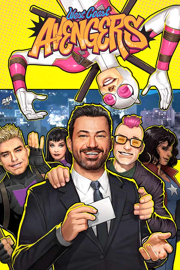
West Coast Avengers #4
Marvel Comics Writer Kelly Thompson, Artist Stefano Caselli, Colorist Triona Farrell, Letterer Joe Caramagna
The first story arc of the West Coast Avengers comes to a close and Thompson and Caselli show what a great ride this book is going to be. First and foremost Thompson makes sure that this book is simply fun and never forgets to have fun with it and this is the books strongest assets. What gives this book a great charm is that it takes a rag-tag team and makes it all work somehow and that is a great testament to Thompson’s scripts. While the book takes a light tone she always make sure that the characters are grounded and feel real and that is why the book works so well. Even with all of the team being from different backgrounds they come together as a team and that is what drives this book. They look out for each other even when sometimes it doesn’t seem that way. Caselli continues to impress with his artwork on the book. One of the things that I love about his art on the book is how he is able to pick up on the little story elements of the script and really got to town with them. He gives this book the visual punch that makes it works so well. He makes this book work on every level so well.
Is this book worth your time and money? I really love this book and Thompson and Caselli are have a fun time with it. Its charming, funny and some great super heroics to boot. This is a solid read and buy each month and is well worth your time. RECOMMENDED!
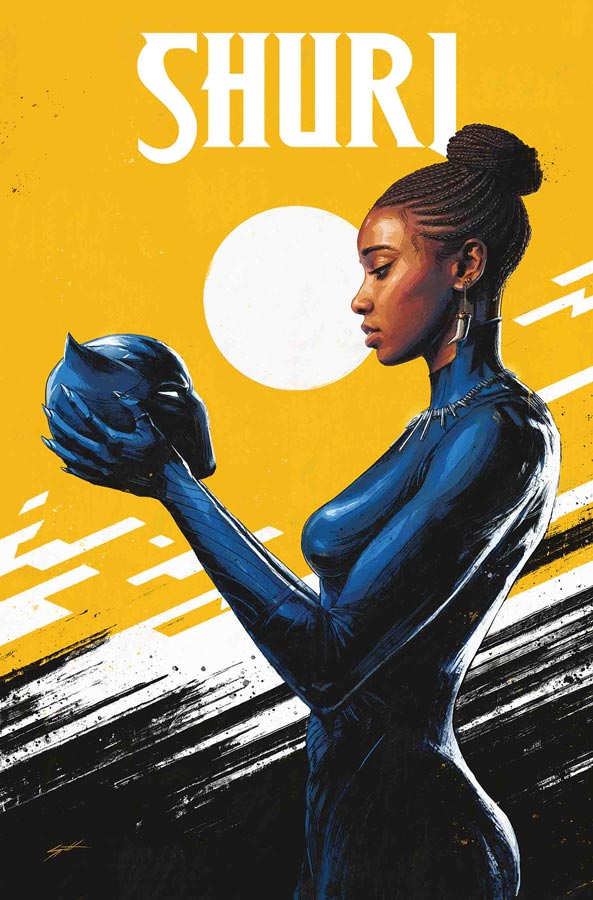
Shuri #2
Marvel Comics Writer Nnedi Okorafor, Artist Leonardo Romero, Colorist Jordie Bellaire, Letterer Joe Sabino
I enjoyed the first issue of this book but the second issue did get a bit bogged down with exposition and tended to be dragged out a bit. It’s still a fairly good read but Okorafor didn’t keep the momentum of the first issue going well here. I felt that she was trying to drag some of the story elements out and the pacing on this issue was simply not that good. That is not to say that the book has taken a huge nosedive but it didn’t quite have the momentum set up in the first issue. There are still some good story elements here and I will still give the book a chance but it’s definitely on thin ice after this issue. On the plus side Romero delivers the goods with the artwork and makes the slow pacing of the story a bit more bearable. His art style really brings this book to life and he give great emotional core to the characters.
Is this book worth your time and money? I was pretty disappointed with this second outing but not enough to drop it yet. I will still give the book a chance because I like the characters but Okorafor is really going to have to get the story back on track and pick up the pace with the story. Romero saves the day with the visuals but he can’t save a slow story.


1 Comment
If you want to discover more about artist Gisèle Lagacé, I recommend the indepth interview on TrueNorthCountryComics.com
https://truenorthcountrycomics.com/2018/12/04/gisele-lagace-outlines-future-plans-for-exorsisters-menage-a-3-and-more/