Well with New York Comic Con going on this week it’s a huge shipment of new comic books that are rushed out just like the week of SDCC. So there are a ton of comics to get through so I am going to try an squeeze as many in as possible.
Cage! #1
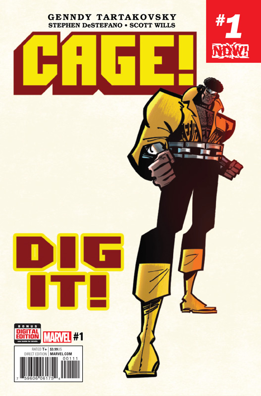
Marvel Comics Writer & Penciller Genndy Tartakovsky, Inker Stephen DeStefano, Colorist Scott Willis, Letterer Clayton Cowles
It only took 8 years for this book to finally hit the shelves and this is one time where is so worth the wait. Tartakovsky the genius behind Samurai Jack, Dexter’s Laboratory and Hotel Transylvania brings his unique style to Marvel’s Luke Cage and is probably the best it will ever get. The best way to describe the book is as if this were an adaption of a Cage animated series. Wisely Tartakovsky sets the book in the 1970’s and gives it a flavor that very few books actually deliver when they set a comic series in past. It allows him to do two things first he gets to soak up the style and feel of the era that Luke Cage works very well in and secondly he gets to throw continuity to the wind. There are a ton of nods and winks to those who grew up in the 1970’s but never lets that get in the way of readers that are not familiar with it. The one thing that I really loved about this first issue is that he has a great balance of both comedy and great comic book action and blends everything together perfectly. The artwork with DeStefano’s inks brings an animation style to the book that really adds to the fun of the book. Visually it’s a real tour de force that really makes this book work so well.
Is this book worth your time and money? This is one of those rare books that while your reading it you will have the biggest smile on your face. This book is pure comic book gold and is one of the best Marvel comics that they have put out in years. It’s a book that works on so many levels but simply put it’s the most enjoyable read that I have had in recent memory. The only complaint that I have is that I have to wait a whole month to read the next issue. HIGHEST RECOMMENDATION!
Shade the Changing Girl #1
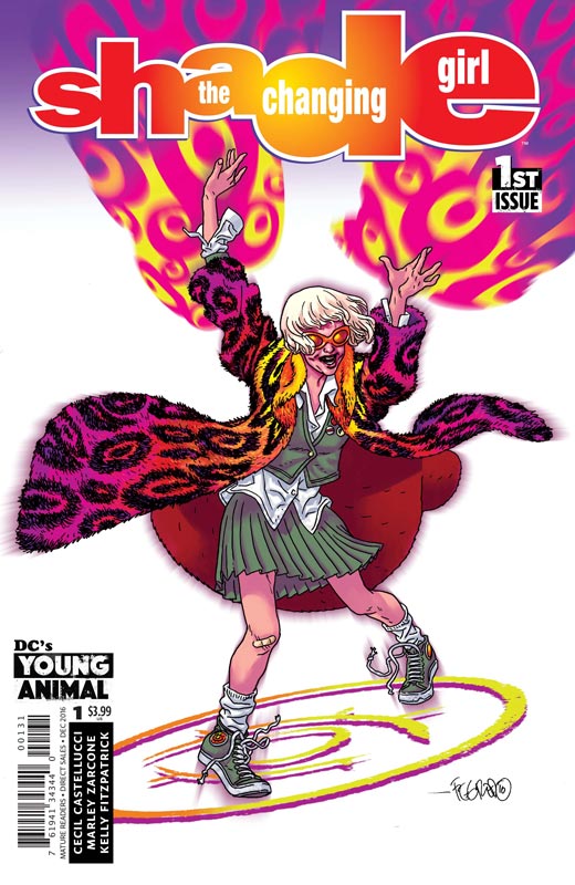
DC’s Young Animal Writer Cecil Castellucci, Artist Marley Zarcone, Colorist Kelly Fitzpatrick, Letter Saida Temofonte, Back-up story Writer & Penciller Natalia Hernandez, Writer & Inker Gilbert Hernandez, Colorist Laura Allred.
The second Young Animal title lands and the book gets off to a pretty good start. Writer Castellucci draws a lot of inspiration from the Peter Milligan Vertigo run of the book but still remains the shell of the original Steve Ditko created character. The story bounces between Meta and Earth and this is where the two world collide with the theft of the M-Vest and Loma inhabiting Megan who was in a coma. Castellucci script has some good ideas and a nice set up the only problem that I had been that there was a few time in the story where it becomes a little too disjointed and a little hard to follow. This seems to be a bit of a problem for writers of novels when they write comics. She does pull the book to a good set up at the end of the issue and the book shows a lot of promise. I really like Zarcone’s art style on the book and she brings a pop art look to the book that works well with Castellucci’s story.
Is this book worth your time and money? While the book gets off to a bit of a mixed start, overall there is more to like here. While the script struggles a little in the beginning it has a nice finish and shows a lot of promise. There is a nice little bonus Space Ranger and Cryll back up story by Natalia and Gilbert Hernandez that gives a fun little bonus to the first issue. I think that the book is definitely worth checking out but a little early to make a final call yet.
Angel City #1
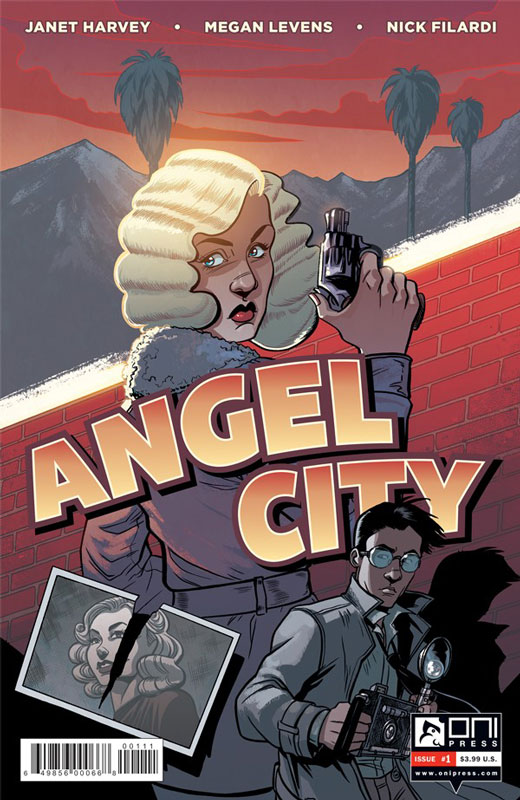
Oni Press Writer Janet Harvey, Artist Megan Levens, Colorist Nick Filardo, Letterer Crank!
There have been quite a few noir comics lately and this new one from Oni is nice but not as good as I would have liked. Harvey story is decent but the bigger issue is that she really doesn’t bring anything new or exciting to the genre. The story is pretty basic and there are simply no surprises in the story. On the plus side Levens brings a nice art style to the book that has a bit of a cartoony look but it actually fits the tone of the story nicely. I really wanted to like this book more than I did but there is not enough here to justify it.
Is this book worth your time and money? With so many good noir comics out there now, it’s a real shame that this one didn’t bring anything new to the table. It’s a pleasant read but in the end it’s not very memorable. SKIP IT!
Champions #1
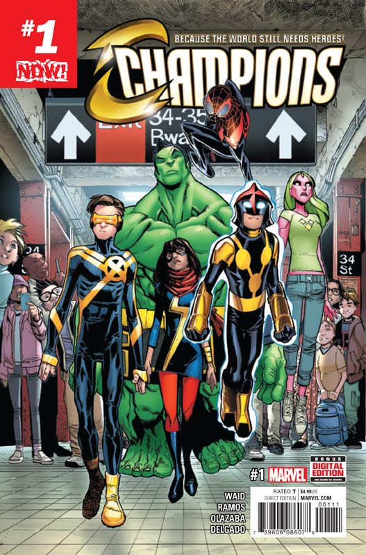
Marvel Comics Writer Mark Waid, Penciller Humberto Ramos, Inger Victor Olazaba, Colorist Edgar Delgado, Letterer Clayton Cowles
I have always found these type of team books to be rather odd. It’s one thing when you have a book like X-Men that starts off as a group book but when you have solo characters getting together it comes off a bit strange. I have to give credit to Waid for making this book a lot better than it should be. It’s best asset is that it starts off really solid with the younger Marvel heroes getting fed up with being in a team that doesn’t care about the aftermath of a battle. That is a really interesting idea and that moves the book along nicely for the first half. But it’s when they actually become a team that the book starts to flounder. It becomes very formulaic and average superhero comic that while likable become rather pedestrian by the end of the issue. The worst part is that they become a hashtag at the end and then just falls flat at that point for me. I love Ramos and Olazaba’s artwork on the book and they give is a fresh style that really fits the young spirit of the book. They really capture each of the characters looks quite well and keeps them in the style of their individual books but makes them all fit together visually here.
Is this book worth your time and money? While the book was a pleasant read in the end it’s a team book that is really unnecessary and unneeded. Waid’s script is a good by the numbers affair here and that is where the problem lies, an average comic that while enjoyable while your reading it but nothing memorable. SKIP IT!
Archie Meets the Ramones #1
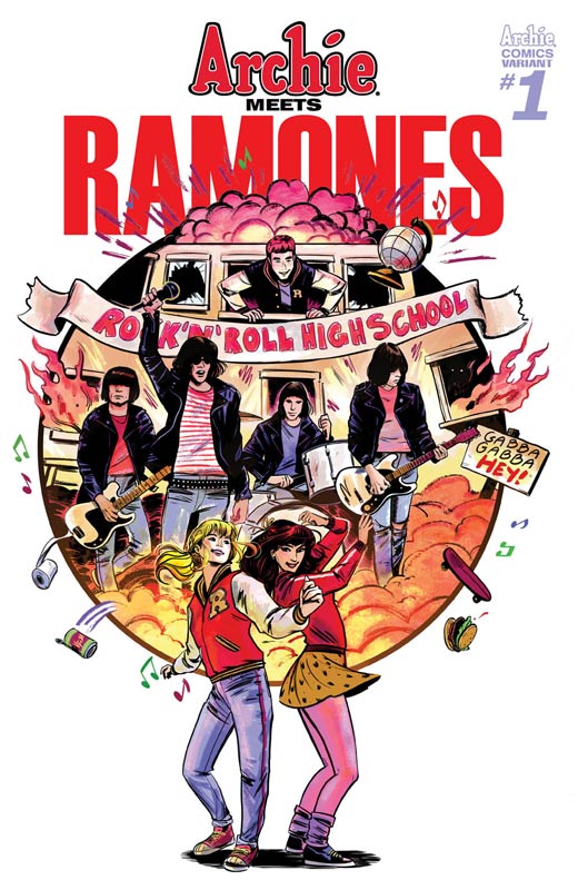
Archie Comics Writers Alex Segura and Matthew Rosenberg, Artist & Letterer Gisele Lagace, Colorists Victor Robado & Digikore Studios
Crossover books are a real crapshoot. Archie seems to have had more crossover than nearly any other comics. Sometimes they are really good like Archie Vs. Predator and then sometimes they are simply awful like Archie Vs. Sharknado. Having Archie meet the Ramones on the surface seems like an unusual and not a big draw for an average comic reader. But Segura and Rosenberg have crafted a script that captures both the Archie gang and the spirit of The Ramones. Now if you’re not a fan of either of these two things then move along because this comics is not for you. Now if your like me and grew up with both Archie and The Ramones (mostly due to my love of Rock ‘n’ Roll High School) then this book is a nice homage to them both. While the premiss of the story is pretty basic, I have to give credit to Segura and Rosenberg that comes up with a good reason for them to come together. The key to this is the music that brings them together and a sweet and sentimental angle to the story that was a really nice touch. Lagace’s artwork is in the classic Archie style but she does a great job of capturing the likeness and spirit of The Ramones. While most of the story is set in 1976 she wisely doesn’t rely on too many visual tropes of the period and simply focuses on the story.
Is this book worth your time and money? I really enjoyed this crossover and while it may not be earth shattering it was a sweet and nostalgic read that captures both The Ramones and Archie perfectly in both the story and the art. RECOMMENDED!
Deadman: Dark Mansion of Forbidden Love #1
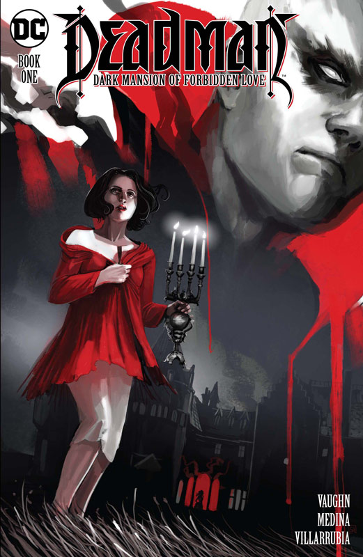
DC Comics Writer Sarah Vaughn, Artist Lan Medina, Colorist Jose Villarrubia, Letterer Janice Chiang
One of DC greatest supernatural characters Deadman has been brought back to life in this new mini series. While this first issue may not necessarily knock your socks off, it does however do a very nice job of setting up the story. I was a big fan of Vaughn’s Image series Alex + Ada that she co-wrote and she brings a nice moody sensibility to this story. She has crafted a nice old fashion horror story that instead of relying on blood and gore of todays horror comics, it is a great throwback to the more classic thriller atmosphere that you rarely see today. The key to it working is that she takes the time to introduce both the characters and the back story that really moves the story along at a nice methodical pace. Where the book really comes together is with Medina artwork and Villarrubia’s color work that makes this book ooze with mood and tone. They really capture the feel that Vaughn’s script needs to work visually and reminds me of the DC horror comics of the 1970’s.
Is this book worth your time and money? While this first issue is a set up to the story there is a lot of mood that really makes it work well. I love the slow burn approach that Vaughn takes with the story and that is what makes it really work. Top notch artwork makes this a good old fashion DC horror comic from the past. Well worth checking out.
Moonshine #1
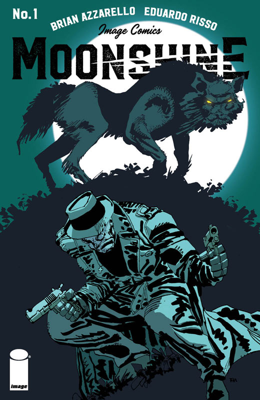
Image Comics Writer Brian Azzarello, Artist & Colorist Eduardo Risso, Letterer Jared H. Fletcher
The 100 Bullets team is back with their new book Moonshine that is set during the prohibition era of 1929 that has moonshine and gangsters. Azzarello asks more questions than answers in this first issue and is dripping with mood and darkness. While you’re not quite sure what is really going on that is what makes it so intriguing. There are a lot of layers that he brings to the script and he unfolds them slowly and methodically in a way that is very satisfying. I love the slow burn to the story that really hits you on a visceral level. Risso really brings his A game here and with both his line art and color work deliver the visual mood that Azzarello’s script needs to come to life. This is a damn fine-looking book.
Is this book worth your time and money? There is a lot going on here and Azzarello and Risso deliver an intriguing tale that has a lot of twist and turns for a first issue that has you wondering and wanting more all at once. They keep a lot of the story close to the vest but the set up is a good one. RECOMMENDED!
Betty Boop #1
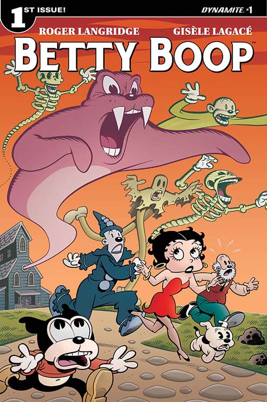
Dynamite Writer Roger Langridge, Artist & Letterer Gisele Lagace, Colorist Ma. Victoria Robado
I’m a big fan of Langridge’s work and was excited to hear that he was writing Betty Boop. While I’m a big fan of the Max Fleischer Betty Boop cartoons but while I liked this book, I didn’t fall in love with it like I thought I would. I will give it that it does hit all of the right beats that you would expect but there just didn’t seem to be the magic that his other books have. This is not to say that the book is bad by any means but just misses the mark a bit. Lagace who also did this weeks Archie Meets The Ramones turns in really fantastic artwork on the book and perfectly captures the Fleischer animation style but gives it her own spin that gives it a fresh new look but doesn’t veer too far from it. What really makes her artwork pop is Robado’s color work that gives it a very monochromatic type look of black and white but put color here and there to great effect such as Betty’s dress is red along with her lips that really make the art pop.
Is this book worth your time and money? I have to give Langridge that he does really capture the spirit and tone of the Fleischer Betty Boop and while I might have not loved it, I did like it. If you’re a fan of Betty Boop then you should be pleased with this book. I will give it a few more issues to see where it’s going to land.
The Flintstones #4
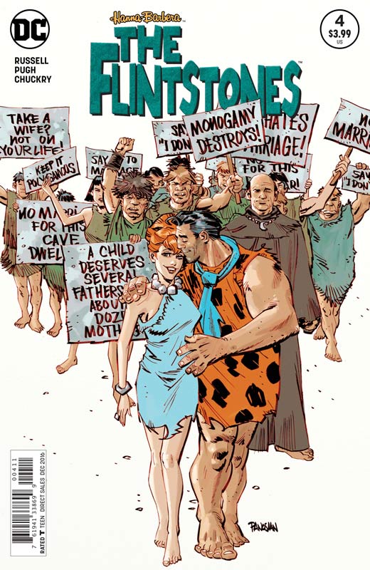
DC Comics Writer Mark Russell, Artist Steve Pugh, Colorist Chris Chuckry, Letterer Dave Sharpe
This book keeps getting better and better each issue. Russell always seems to surprise me with where he is going to take this book each issue. I love that he does a done in one type story but has continuous story threads that continue to run in each issue. One of the best aspects of this book is that Russell takes controversial subjects and molds them into stories with The Flintstones and somehow makes them super entertaining. This issue he tackles both traditional marriage and gay marriage and make it both sweet and funny without making fun of the subject. That is a very hard thing to do but Russell has a real knack for that. I also loved the “Toy Story” subplot with the animal appliances and objects that come to life while Fred and Wilma are gone. He delivers a deep and yet simply satisfying story that continues to impress with each issue. How can I praise Pugh’s artwork again on this book? What really impresses me with his artwork on this book is that he really captures the little subtle moments in the story. He also perfectly captures the emotions in the script that really brings this book home each issue.
Is this book worth your time and money? If you’re not reading this book then you are missing one of the best books that DC is currently publishing. I am a huge fan of the original animated series and this book captures what I loved about the show and really expands on it. It really delivers a stories that are both timely and endearing. HIGHEST RECOMMENDATION!
Cannibal #1
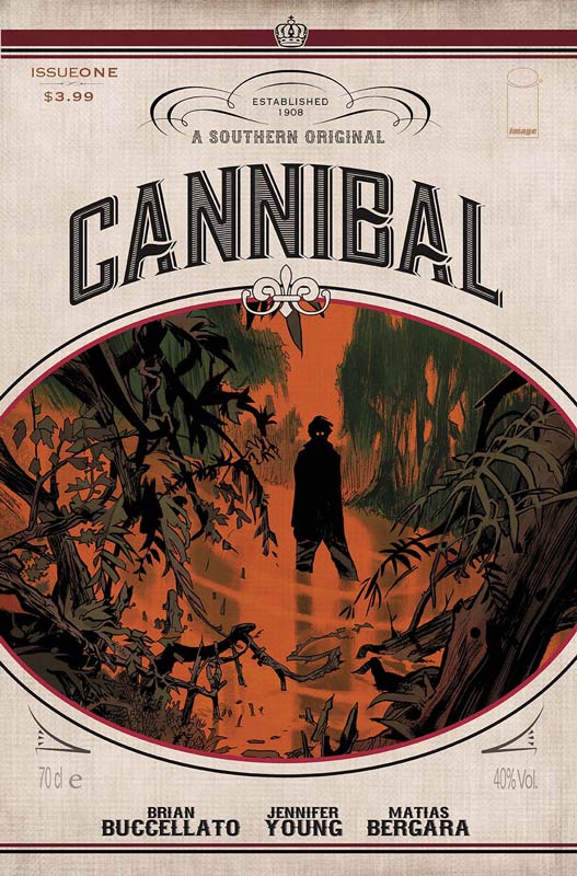
Image Comics Writers Jennifer Young & Brian Buccellato, Artist Matias Bergara, Colorist Buccellato, Letterer Troy Peteri
This first issue has some really good ideas that it presents. While it didn’t 100% sell for me quite yet, I am however intrigued with the concept. While on the surface this seems like a by the numbers zombie story what makes it interesting the characters and their reactions to this epidemic. The one thing that really works in the books favor is the setting of the story in Florida Everglades. One of the story elements that works well is the small town atmosphere along with the location that gives the story and the characters a different spin on the typical apocalyptic nature of the concept. I have to hand it to Young and Buccellato that the dialog in the book felt really natural and captures a tone that helps the book quite well. Bergara’s artwork is quite nice here and has a nice simple yet detailed style that fits the tone of the script very well. He also has some quite nice facial expressions on the characters that really bring you into the story nicely.
Is this book worth your time and money? The key to this book is going to be the next couple of issues. This first issue was good but was missing just a little something to put it on the must read list. I am willing to see where they take the book and hopefully keep it out of the story tropes of the apocalypse that we have seen far too often in comics lately.
Jessica Jones #1
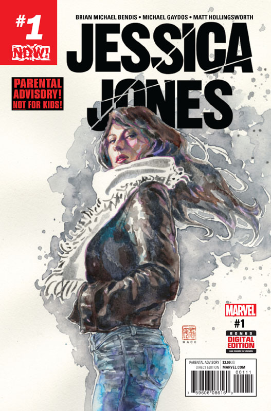
Marvel Comics Writer Brian Michael Bendis, Artist Michael Gaydos, Colorist Matt Hollingsworth, Letter Cory Petit
I have to first say that I have never read the original Jessica Jones series and have not seen the television version either. So I am coming in a completely new reader as I am sure that a lot of others are too. One thing as a new reader I though Bendis didn’t do a good job of doing was helping new readers with a little back story to who Jessica is and where she is at in the current story. A recap page at the beginning would have helped that greatly. Considering that it’s been over 10 years from the original series you would think that there would be new readers coming onto the book. The story is pretty straight forward but there are so many questions that as a new reader that I felt very lost by any of the back story that was going on in the script. One of the things that I had heard about the original series was the edginess of the original series. Sadly this new series in neither edgy or fresh. Bendis script seems to hit predictable story post along the way and by the end of the issue I didn’t really connect with her beyond the basic private eye elements. Gaydos does deliver some nice artwork on the book and captures the subtle facial elements of the script that was nice to see and was a nice plus to the otherwise so-so script.
Is this book worth your time and money? With all of the hype surrounding this book from its previous run and the television show, I certainly expected a lot more here. What you end up with is a story that if you’re not familiar with are completely lost with knowing what the hell is going on beyond the basic private eye surface story and even that is not that exciting. I found this to be a real misstep with this book. For new readers this book is a big miss. SKIP IT!
He-Man/Thundercats #1
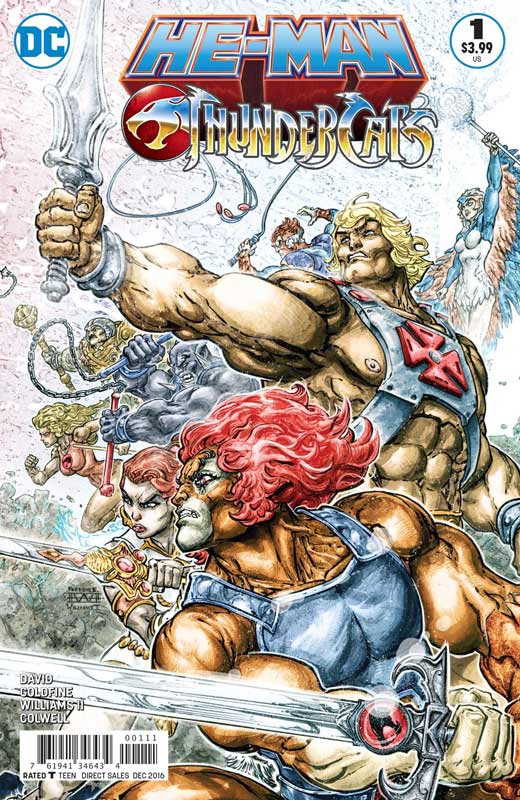
Writers Rob Davis & Llyod Goldfine, Artist Freddie E. Williams II, Colorist Jeremy Colwell, Letterer Deron Bennett
I was never the biggest He-Man or Thundercats fan but did enjoy the original animated series back in the day. As far as the comics of them, they have been a little less than desirable. Mostly they are average stories that seem to be mostly for die-hard fans of the series. That’s why I was pleasantly surprised how much I liked this crossover book. While not high art Davis and Goldfine has crafted an interesting story that is a lot darker than the usual comics of both of the series but that is what I liked about it. They were willing to go outside the box with the characters and give the book a bit of bite to it. I never expected some of the things that happen in this first issue. Williams delivers some really impressive artwork here and give the well-known characters a bolder style than you normally see with them. He really went to town with some of the layouts for the art that was very bold and visually impressive. I have to mention that colorist Colwell really made this book stand out with some really wild and bold color choices that were top-notch.
Is this book worth your time and money? I found this book to be a really pleasant surprise, and not anything that I expected. They did a nice job of blending the two different universes together and while I doubt that this is going blow anyone away, I found it to be a nice little read and worth checking out.
Triggerman #1
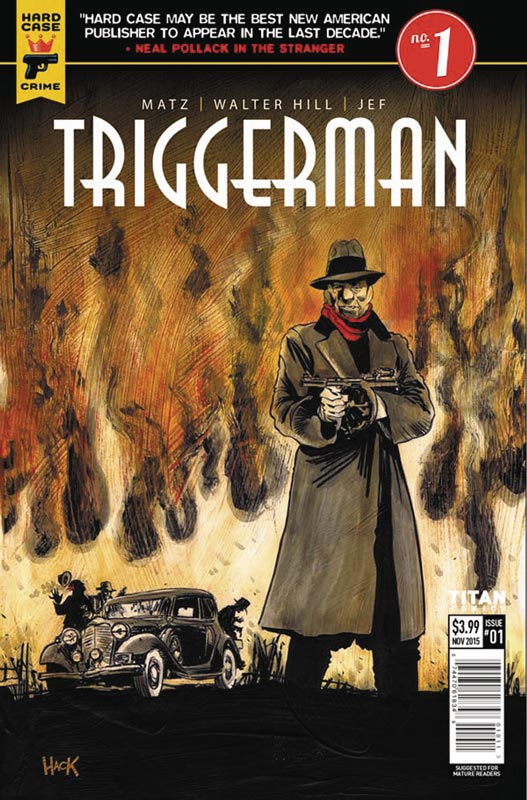
Titan Comics Original Story By Walter Hill, Writer Matz, Artist Jef, Translation Edward Gauvin
The main reason that I picked up this book is because I’m a huge fan of Walter Hill’s film work and was intrigued to see what he would do in comics. Where Angel City failed with noir this week, Triggerman shows how it can be done well. Matz script hits all of the right beats for a first issue by giving the reader enough information to get to know what and who is the story setting up but not revealing too much but making sure that you want to come back for more. While the basic concept is not original, it does however give a nice spin on the genre that made for a good read. One thing that Matz does well with the story is it’s pacing that is perfect. The artwork by Jef is very nice and really captures the mood and feel of the era. He captures both the action and the drama with ease and gives really brings the script to life.
Is this book worth your time and money? I was quite taken with this book and if you’re a fan of noir and the 1930’s then you should really check this book out.
Midnighter and Apollo #1
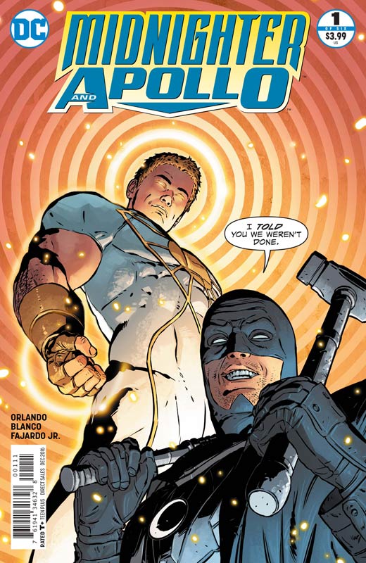
DC Comics Writer Steve Orlando, Artist Fernando Blanco, Colorist Romulo Fajardo Jr., Letterer Josh Reed
This series picks up from the Midnighter series but Orlando makes sure that new readers are brought up to speed fairly well. He gives new readers a digest action setup at first then hits the ground running with a good story and a wild cliffhanger ending to the first issue. Orlando doesn’t pull any punches with the script but it never feels forced or overly done with the action or the drama. This first issue is a fair amount of exposition but Orlando keeps the pacing going nicely so it moves along nicely. Blanco’s artwork has a few stiff moments but overall a nice job of handling all of the story elements.
Is this book worth your time and money? I was a fan of Orlando’s recent Midnighter series and it’s nice to see him back with the book. If you’re looking for a little more edge to your superhero diet of comics then this is well worth checking out.
Shipwrecked #1
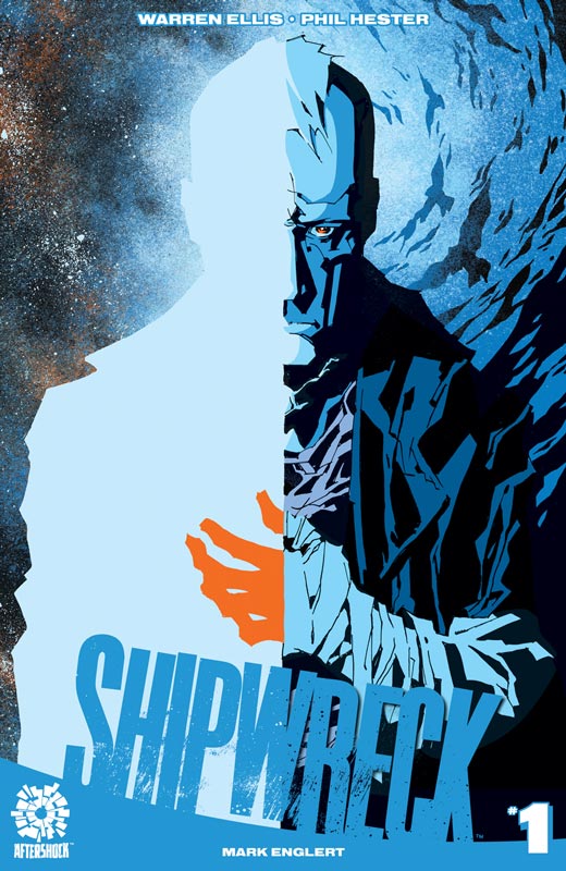
Aftershock Comics Writer Warren Ellis, Penciller Phil Hester, Inker Eric Gapstur, Colorist Mark Englert, Letterer Marshall Dillon
Ellis is a writer where you either seem to really hit the mark or not connect with it. Sadly it’s the latter on Shipwrecked. The script is simply a mess and while you can get away with that if you have an interesting character to lead you though it but there is not that here. The book is like reading a dream that sounded great when you were dreaming it but after you wrote it down it’s completely incoherent. While I enjoy books that try to push the boundaries this one just doesn’t give you any reason to care what it going to happen. The only thing that made this book worth even reading was Hester’s wonderful artwork that really tries to help to bring it together but he simply can’t save this train wreck.
Is this book worth your time and money? NOPE! SKIP IT!
Future Quest #5
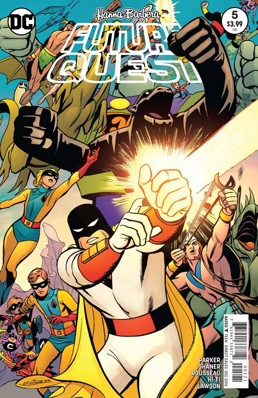
DC Comics Writer Jeff Parker, Artist Evan “Doc” Shaner & Craig Russeau, Colorist Hi-Fi & Jeremy Lawson, Letterer Dave Lanphear
I was very critical of the last issue of this book because I don’t mind multiple stories in the book considering the size and scope of the characters that are in the book but Parker needed to separate them better. Thankfully this issue solves that problem. The first half is the main storyline with Shaner back on full art duties and it’s nice to get back to the main story even if it’s only 12 pages. As long as they can deliver that each issue I’ll be thrilled. Parker keeps adding new elements that is making the main story very impressive and including lots of twist to the original animated versions that I’m really digging. Shaner delivers some wonderful artwork and it’s nice to have him back. He is simply perfect for this book and hopefully is able to catch up and do a full issue. The backup story gives a new origin story to Parkers version of The Impossibles that take the basic premiss of the animated version and gives it a fresh and intriguing spin that I liked. With the huge cast in the book doing these back up stories is a really good idea and allows Parker to jump-start the cast without interrupting the main story. Rousseau’s artwork is perfectly suited for this story and keep the quality of the rotating cast of artist very nicely.
Is this book worth your time and money? This is still a fun book and hopefully last issues mistakes were just a slight bump in the road. While I wish that the main story was moving along faster, I do like the back up stories and the guest artists have been a nice bonus. Still a winner! RECOMMENDED!
Death of Hawkman #1
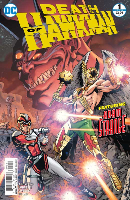
DC Comics Writer Marc Andreyko, Penciller Aaron Lopresti, Inker Levesay, Colorist Blond, Letterer Josh Reed
I’m a huge Adam Strange and Hawkman but this book just didn’t work for me. I’m a fan of Andreyko’s work but this first issue really treaded water badly and felt very drawn out in the story department. The whole Adam trying to get back Rann brought this book to a screeching halt and seemed very repetitive. There were some of the other story elements that I liked but became really frustrated with the book by the end of the issue. Lopresti and Levesay’s artwork seemed a little bland compared to his other recent work. It just felt as if they were going through the motions of the story. It’s not bad artwork just run of the mill looking.
Is this book worth your time and money? At 4 bucks it’s really hard to justify coming back after this misfires of a first issue. If this first issue seemed to drag on I hate to see how five more issues is going to look. I honestly wanted to like this book but it was just not worth it.


0 Comments