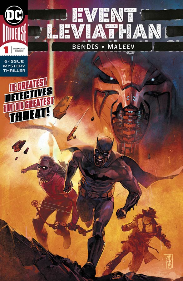
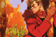
Event Leviathan #1
DC Comics Writer Brian Michael Bendis, Artist Alex Maleev, Letterer Josua Reed
I was mixed on the Event Leviathan special a few weeks back but was willing to see where Bendis would take this story and after reading this first issue it wasn’t bad but simply really boring. Bendis spends far too much time on setting things up that the story ends up not really going anywhere and there is not really much explanation to what is going on just a bunch of backstory that just rehashes the same idea over and over that something bad is happening and we should find out what is going on later, much later as in not even an idea of what the hell is going on here. Even beyond the fact that the plot doesn’t really go anywhere but the dialog is overall pretty clunky. I like Bendis’s other DC work but this is simply not up to par. The only thing that marginally helped things here was Maleev’s wonderful artwork that is simply wasted here on this mess of a story. The thing that is most impressive about his artwork is that he is able to help you slog though this overlong setup and tries to help it move along but there is little that he can do to help that one.
Is this book worth your time and money? I had hoped that with Bendis and Maleev involved with this event book it might rise above the usual mediocrity of most event comics but sadly it ends up being boring and pointless. While its not a total train wreck it doesn’t really give you any reason to come back for more. The only thing that saves it from being a total loss is Maleev’s great artwork that can’t even save this one. SKIP IT!
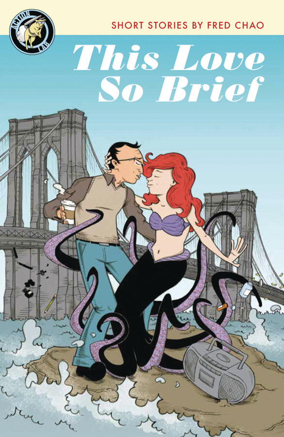
This Love So Brief
Action Lab Writer & Artist Fred Chao
Every once in a while you stumble across a comic that really impresses you and This Love So Brief not only impressed me but was a real emotional reading experience. What make this comic so special is that just from the cover your not quite sure what to expect but once you get done with the first short story your totally hooked. There are four separate stories that all have a connection to love but in very different ways and in fact love is only one facet of each of the stories. At first you think that they are going to be sappy love stories but this is far from what they are. There are many ways to express love and it is one of the most basic core emotions that we have. There are many things that we may love but to find love with another person is the hardest one there is and what Chao has done here is tell each story about finding love but from a varied perspective. With each passing story the emotions that Chao’s stories stirred inside you as you read it is where this book really shines. While all of the stories are great the last one “Stupidities of the Head and Heart” is the the most touching of the stories and is a real emotional rollercoaster While Chao says that the stories are fiction you can tell that there are little pieces of himself in each story and that is what great art is all about is telling stories from your heart and this collection will truly touch yours. Not only are the stories great but his artwork has a simple cartoony style that makes the story all that more charming. He captures the emotions spot on with each panel that makes the stories work all that much better.
Is this book worth your time and money? There are few comics that I read that truly surprise me and this is one of them. Chao has captures the long lost art of romance comics but not in the sappy romance novel approach but in a truly heartfelt way that will touch you and fill your heart with emotions. He keeps both the stories and artwork simple because he has stripped away any unnecessary elements and keeps them to the point. This comic really impressed me. HIGEST RECOMMENDATION!
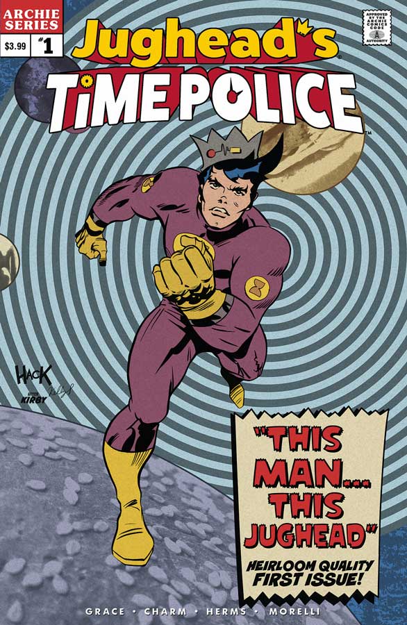
Jughead’s Time Police #1
Archie Comics Writer Sina Grace, Artist Derek Charm, Colorist Matt Herms, Letterer Jack Morelli
For those who have missed the classic Archie style of stories this new mini series is a hybrid of the new and the old and it mixes together quite well. Grace does a great job of keeping the story simple but never feels dated and fits into the more modern take with the Archie gang. This first issue is a set up to the story it works well for a first outing. What makes this book so much fun is that we all know that Jughead is a genius but Grace take that to a whole new level here with him building a time machine and how it came to be is where this story really shines. Charm as always delivers the perfect artwork for the Archie comics but I like that this story really let him loose with a more whimsical story that the regular series and he really captures the charm and fun of Grace’s script. And when you throw in that he gets to draw Jughead’s dog Hotdog then you know this is going to be a fun ride.
Is this book worth your time and money? What makes this book work is that it doesn’t try to be more than it sets out to be. It’s a light, fun and charming story with spot on artwork that gets things off to a good start and it looks to be a fun ride ahead and is well worth picking up.
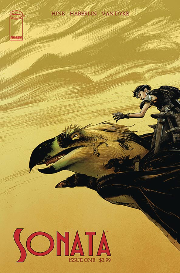
Sonata #1
Image Comics Writers David Hine & Brian Haberlin, Artist Brian Haberlin, Colorist Geirrod Van Dyke
This is one of those comics that I can’t quite say that I liked it but I am intrigued from this first issue. Hine and Haberlin tell a pretty straight forward story of a new planet to take the place of the dying earth concept and then have the conflicts that destroyed the world brought to the new one. While the story has been told many times before they do give it some nice twist and turns to make it feel that it’s not too familiar. I will say that this first issue didn’t blow me away but there is something that is there that give the story a chance to build out from here and it does have a pretty good cliffhanger at the end of this first issue. The artwork by Haberlin is quite good but there were a few times where the perspective of the characters was quite strange where their hands were bigger than their heads and there were also some odd limb placements. While they were a little distracting overall the artwork really gives this book a good boost to help it along.
Is this book worth your time and money? I’m still a bit on the fence on this one. The book does show a promise but on the other hand I’m not sure if there is enough to differentiate it enough to make it stand out. I’m willing to give the book a second issue because there is more positives than negatives but it’s a little too early to call on this one.
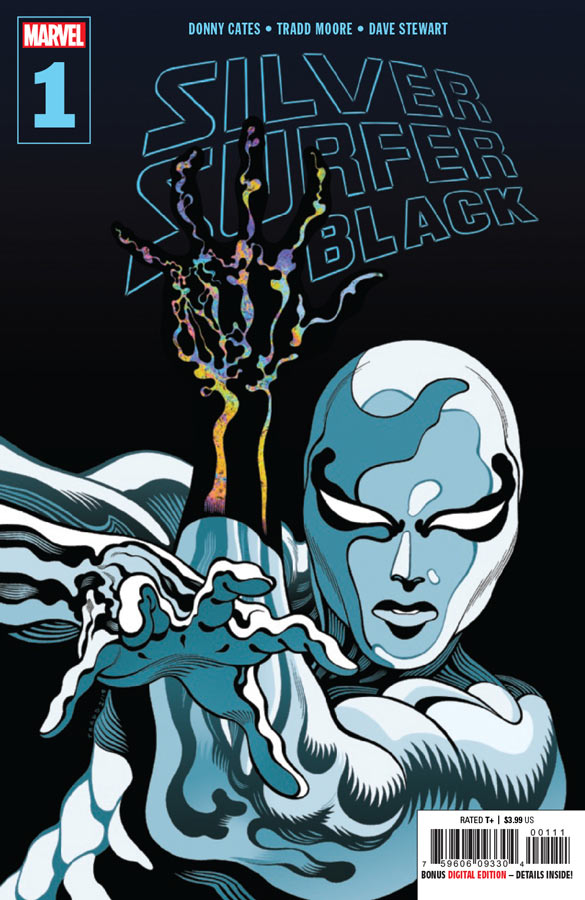
Silver Surfer Black #1
Marvel Comics Writer Donny Cates, Artist Tradd Moore, Colorist Dave Stewart, Letterer Clayton Cowles
Following a great run on Silver Surfer by Allred and Slott is going to be a very tough act to follow but this first outing gets off to a decent start. I will give Cates that the story feels very cosmic but there is not a lot of story to really sink you teeth into here. Cates keeps things moving along but only after a bit of a slow start that it gets going towards the end of the issue mostly due to the battle with the three guards at the gate. The other gripe I have with this is it’s not the most new reader friendly start to a series. I understand that you have to rehash his story a bit here and that part works but the references to two other books is not going to convince readers to go out and pick them up with the confusing plot threads that are included here. With that being said this first issue has some good ideas and is paced pretty well. The real story here is Moore’s artwork that really captures the cosmic aspect in a whole new way that is very much Moore’s style but you can see that there are many Ditko inspired visuals that he draws an influence that adds greatly to the visual look and feel of the book. Moore really helps keeps the story from getting too bogged down and helps Cates thin story some greatly added heft that it needs.
Is this book worth your time and money? I’m not sold on this mini series from this first issue but will be willing to give the second issue a chance solely on Moore stunning artwork on the book. The story just kind of sits there but visually it grabs you right away.

Trust Fall #1
Aftershock Comics, Writer Christopher Sebela, Artist Chris Visions, Letterer Hassan Otsmane-Elhaou
Hot Mess doesn’t even begin to try and make heads or tails of this comic book. Sebela mistake here is that the story is all over the place and makes absolutely no sense. He introduces characters in the story and yet there is no emotional connection to any of them and the story doesn’t seem to really connect together in any sort of rational narrative that makes any sense. The only thing that I could make of the story is that there is a mob concept here but with a science fiction elements thrown in but that is about all that I could make of this mess. I picked this book up because visually Visions artwork has a wild kinetic energy that is a visual feast of line work and color but it sadly become a distraction because the story is all over the place and the frenetic artwork just adds fuel to the fire of this mess. I’m certainly not saying that Visions artwork is bad on the contrary, it’s really good but in this book it ends up just making the book that much more confusing because he is trying to visually tell a story that makes no sense in the first place.
Is this book worth your time and money? NO! AVOID THIS BOOK!
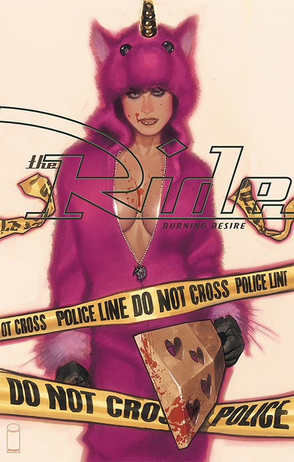
The Ride: Burning Desire #1
Image Comics Writer Doug Wagner Artist Daniel Hillyard, Colorist Laura Martin, Letterer Ed Dukeshire, Back Up Story Artist & Colorist Adam Hughes
This on and off again title is back with the basic premise of a character and their car with lots action and violence and doesn’t make any apologies for it. The main story by Wagner and Hillyard sets up Samantha’s story of a cop gone bad and it makes for an OK story. The set is decent but there is not really much bite to the story and never really grabs you to care either way. Hillyard’s artwork gets the job done but is a little on the stiff side and kind of matches the so-so story and is pretty forgettable. The back up story with artwork by Hughes is the only saving grace of this book. It’s a simple story but Hughes is such a great artist that he really makes this story pop much better than it is. It’s amazing that it’s only six pages but much more satisfying than the main story.
Is this book worth your time and money? There have been a couple of mini series over the years with this title and this one is by far the weakest one yet. The main story just is not that compelling in either the story or artwork and with so many other comics to buy this one is just not up to snuff. SKIP IT!
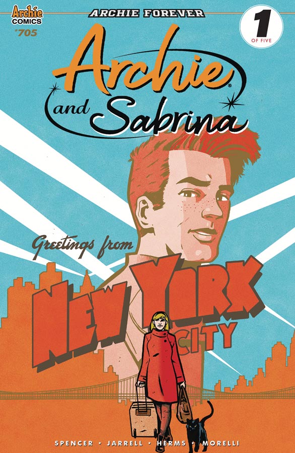
Archie #705
Archie Comics Writer Nick Spencer, Artist Sandy Jarrell, Colorist Matt Herms, Letterer Jack Morelli
A mini series within a series is the first part of an Archie and Sabrina crossover and that could make for an interesting story but this first chapter is pretty slow in getting things started. One big problem is that the have slapped a big #1 on the cover but if you haven’t been reading the book the story somewhat continues from the previous issues and while I like this book it does feel like the book is spinning it’s wheels a bit from the previous relaunch incarnation. Spencer script seems to go through the motions but there is just so little spark to the book like it used to have. It didn’t help that the entire issue is set up and yet nothing really happens and that is a huge problem here. I really love Jarrell’s artwork on the book and she as always turns in a great job here. It’s just too bad that she doesn’t have a lot to work with in this issue.
Is this book worth your time and money? I’m still a fan of this book but this issue is a real opportunity to get new readers into the book. If this was the first issue I would be hard pressed to continue after reading this. For a story that touts a crossover with Archie and Sabrina, she only shows up in the last few pages and that was pretty disappointing. I will give the book a chance next issue but really can recommend it to new readers because even I was disappointed.


Five Years #1 & #2
Abstract Studios Writer/Artist/Letterer Terry Moore
Moore’s big crossover with his creator owned characters is a very interesting concept considering that the book are so different from each other but have the same DNA because Moore does them all himself. The first thing is that if you have not read the individual books you are going to be totally lost here because your not going to know who any of these characters are and their individual stories. For long time readers of Moore’s work I’m OK but for new readers this is a very big problem. I was hoping that this would be a gateway for new readers to sample Moore’s brilliant work but that is not the case here. With that out of the way how is the book, they are really good and deep and I like that he so far is using each issue to devote to a specific title. The first issue centers on Strangers in Paradise and the second is Rachel Rising. What is really intriguing here is that there is a common subplot of a Phi Bomb that is connection all of these characters and that is quite clever because they are so different from each other. While we don’t know how and why this is all happening these first two issues are really good and deliver the mystery of the whole thing quite well here. As always Moore delivers in both the story and the art department and visually this book is one of his best. There is so much subtle visual layering that he brings to his work that is why his books are so great. He also uses black and white visuals so perfectly that is a very rare talent.
Is this book worth your time and money? I really like what he is setting up here and the methodical pacing of the story is allowing each set of characters to be introduced into the story and really let the book breath and not just throwing them into a situation quickly that kills so many crossover stories. I had wished that this book was a bit more reader friendly but on the other hand if your willing to try this I do think that it is a gateway to his other great books. RECOMMENDED!
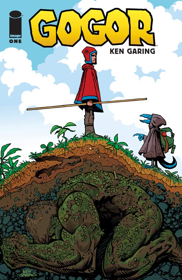
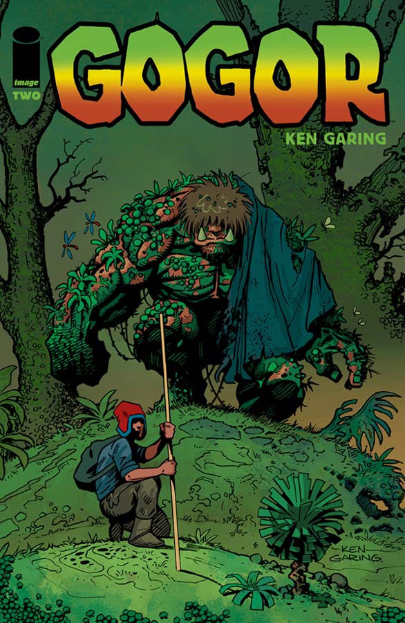
Gogor #1 & #2
Image Comics Writer/Artist/Colorist/Letterer Ken Garing
This is basically a retelling of the Golem story but with a twist and is making for a charming little book. Garing sets things up nicely in the first issue by taking the time to get to know the cast of characters but keeps the story moving along nicely. While not a hugely deep story Garing does give it some nice depth that gives more seasoned readers a little more to chew on so to speak. The story gives some really nice twist and turns to the Golem story that is familiar and makes it all his own here. The one things that this book does very well is with Garing’s great visuals for the book. He has given this story such a great visual epic quality that makes you go wow a lot. But as much of the big elements in the visuals it’s the smaller more intimate moments in the story where he captures the emotions of the characters is most impressive. It’s a great marriage of both story and artwork that really won me over.
Is this book worth your time and money? This is a wonderful all ages book that works well for a seasoned reader because there is a lot of depth to this simple little story that makes it work well. Garing really builds nicely from the first issue to the second and gives you a great reason to come back for more. This is one of those books that may not blow you away at first but will win you over and makes for a nice read each month. VERY RECOMMENDED!


0 Comments