A big week with both Batman and Captain America land together on the Fourth of July for a different type of fireworks that usual. There are a lot of books to get to this week so I will try to squeeze them all in.
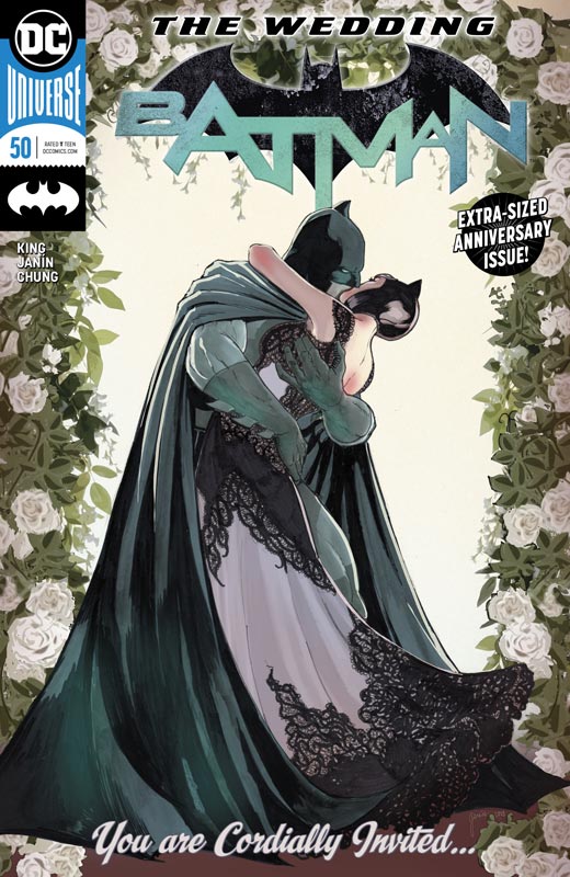
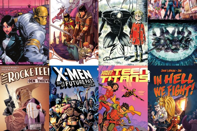
Batman #50
DC Comics Writer Tom King, Artist Mikel Janin, Colorist June Chung, Letterer Clayton Cowles, Guest Artists Jose Luis Garcia-Lopez & Trish Mulvihill, Becky Cloonan, Jason Fabok & Brad Anderson, Frank Miller & Alex Sinclair, Lee Bermejo, Neil Adams & Hi-Fi, Tony S. Daniel & Tomeu Morey, Amanda Conner & Paul Mounts, Rafael Albuquerque, Andy Kubert & Alex Sinclair, Tim Sale & Jose Villarrubia, Mitch Gerads, Clay Mann & Jordie Bellaire, Ty Templeton & Keiren Smith, Joelle Jones & Jordie Bellaire, David Finch & Jordie Bellaire, Jim Lee, Scott Williams & Alex Sinclair, Greg Capullo & FCO Plascencia, Lee Weeks
OK, big shocker here for anyone who actually thought that Bruce and Selena were actually going to get married in this story has obviously never read a comic book in their life. These “Big Event” stories usually are mostly a bait and switch scenario and in a way that is what this might seem on the surface here. King has been leading up to this story for months and some are going to be upset at the ending of this story you have to remember that he is a writer who goes for the long game with his stories. The question was never that they would get married, the real story was could they ever actually get marred and that is the question that remains at the moment. One of Batman’s biggest stories was when Bane broke his body but what King does here is try to break his spirit and that is a deeper wound to heal for both of them. One thing that he plays up is the opposites attract element of the story and that does work well here. In some ways there is not a lot going on in the story on the surface but a more subtle approach to this chapter. The one thing that you have to understand is that this story is not the actual ending of the story but a chapter in the overall storyline. The one thing that this story does well is with the artwork. Janin handles the main story line with an always outstanding job and this issue is no exception. What makes this issues artwork so unique is that an all-star line up of artists show different aspects of Bruce and Selena’s relationship over the years and blends it all together nicely with Janin’s. At first it takes you out of the story for a short beat but after you read the first one it all makes sense how King structured the story to take advantage of the guest artists. It made for a nice reading experience.
Is this book worth your time and money? First and foremost if you are a new reader and haven’t been following the storyline up to this point then your surely going to be disappointed because the chapters that lead up to this give the story a bigger picture than you see just here. Also for those who expected this to be a monumental life changing issue you are going to be disappointed because you’re looking at this chapter of the story the wrong way. With that being said is this the best issue of King’s run, certainly not but it’s only one aspect of the overall story so in that case I enjoyed this issue and am intrigued to see where he takes it from here. The artwork on this book alone is worth the price of admission here but overall the story worked for me and if you picked Batman regularly then you will probably enjoy it too.
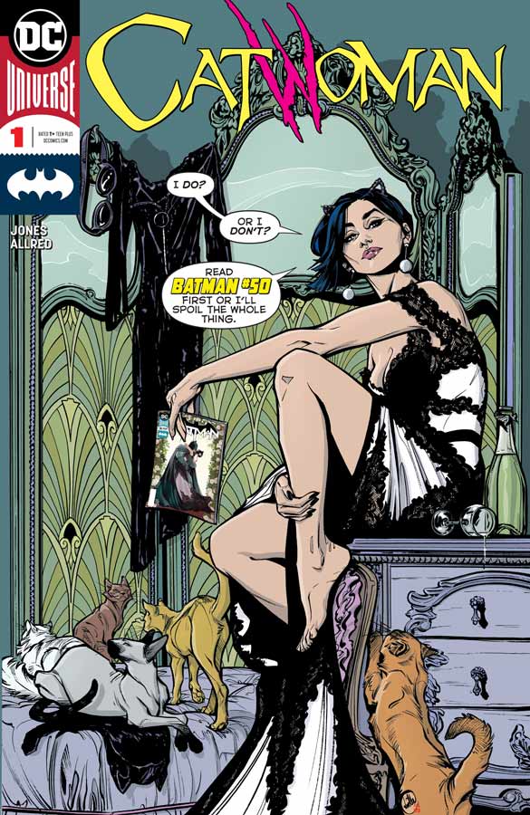
Catwoman #1
DC Comics Writer and Artist Joelle Jones, Colorist Laura Allred Letterer Josh Reed
As the cover warns you need to read Batman #50 before you dive into this one and yes you will be glad you did. Jones has done a nice job here of setting this story up post Batman #50 and while this first issue didn’t necessarily blow me away but it does intrigue for sure. What she does very well here is set up lots of story elements that will move the story forward from here and that is the win for this comic. She gives you a great reason to come back for the next issue and that’s the big key for a first issue. What I loved about her script is that she didn’t try and go for the big overblown story but more of a low-key murder mystery that keeps things simple out of the gate. One of the best parts of the story was the clever chase scene that showed just how perfect of a choice that Jones was to both write and draw this book. Her artwork has a great visceral style that gives this book a gritty look but also perfectly captures the smaller dramatic moments just as easily and it gives the book a great non mainstream look that sets it apart from the pack.
Is this book worth your time and money? Even if this book didn’t take place after the events in Batman #50 it would still work very well and that is a great testament to Jones script and artwork. Catwoman has always been a tricky title to pull off as a regular series but Jones seems more than ready with this first outing that is well worth getting this week. RECOMMENDED!
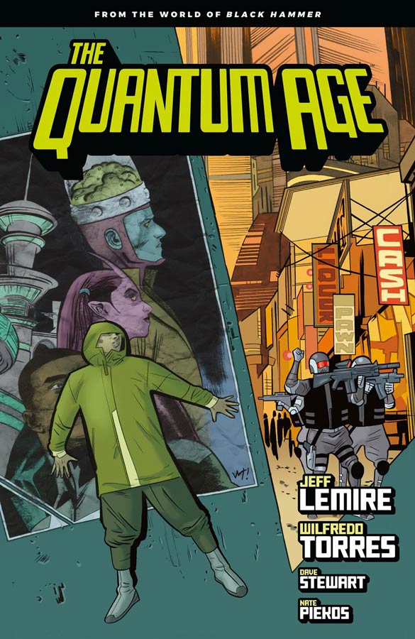
The Quantum Age #1
Dark Horse Comics Writer Jeff Lemire, Artist Wilfredo Torres, Colorist Dave Stewart, Letterer Nate Piekos
I’ve been singing the praises of Lemire’s Black Hammer Universe and new mini series didn’t wow me as much as the last few but does show some promise. There is no doubt that this is Lemire’s take on the Legion of Superheroes and he doesn’t even try to hide it and that’s fine because as with most of the heroes in the Black Hammer Universe they are takes on familiar comic book heroes. The thing that disappointed me a bit with this first issue was that the set up story was a little too familiar and didn’t stand out compared to his other stories. There were a lot of stereo typical story elements that did take me out of the story and hampered the reading experience at times but I will give him that the cliffhanger for this first issue does give me hope that the overall story will end up being stronger than this first chapter. It’s not to say that this is not good but at this point I honestly expect more from Lemire and the Black Hammer stories because they have started off better than this. The big plus on the book is Torres artwork that gives the book a nice pop look that make it work well in the superhero group genre. His nice clean style is perfect for this book and helps it move along too. I wish that he would have done a bit more with the backgrounds on the book but that minor complaint aside this is a good-looking book.
Is this book worth your time and money? I really wished that this book would have come stronger out of the gate but it’s certainly not bad but with the high standard that Lemire has set with these books that is why I felt a bit letdown with it. It does come together better at the end and is still a lot better than most comics out there now. I have faith that Lemire has a plan here and I will stay for the whole story because I love the Black Hammer Universe so much. I would still recommend getting this book but a bit weaker than the rest at least in this first issue but compared to most other superhero comics it’s still far above the average.
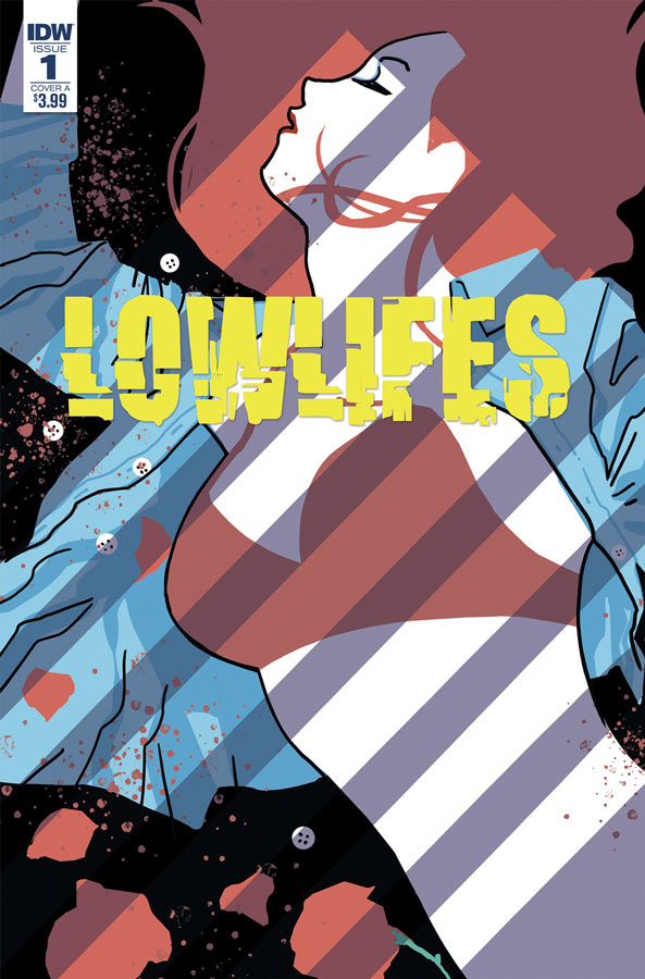
Lowlifes #1
IDW Writer Brian Buccellato, Artist Alexis Sentence, Letterer Neil Uyetake
I’ve been a fan of Buccellato’s writing and he has been out of the picture for a while in comics but he’s back and has an intriguing story with this book. It’s a comic that doesn’t grab you at first but washes over you as it goes along. There were a few issues with the script in it’s pacing and there are some familiar story tropes that have a Quentin Tarantino style to it but there are also some good ideas here and there. I think that the big problem is that you never quite relate to the characters and while you sympathies with them you don’t necessarily connect as well as you should have. I think that there is a good story in here but this first issue stumbles a little out of the gate. I did however like Sentence’s artwork on the book. He put a lot of nice detail into each panel and spends the extra effort to make sure that the backgrounds are there that is always appreciated. He definitely gives the story a boost as best he can but art will only take a comic so far.
Is this book worth your time and money? I will give Buccellato that there are some good ideas here but overall I found the story to not grab me as much as I would have hoped it would have. There were both structure and character issues that the book struggled to overcome. It wasn’t a bad read but wasn’t compelling enough to recommend or come back for a second issue. SKIP IT!
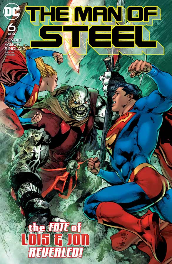
The Man of Steel #6
DC Comics Writer Brian Michael Bendis, Artist Jason Fabok, Colorist Alex Sinclair, Letterer Josh Reed
This final chapter of this set up story for Superman #1 and Action Comics #1001 wisely doesn’t answer all of the questions that Bendis put forth here but does a nice job of closing the main story out but leads very nicely into his ongoing run. The one thing that has impressed me the most with this opening story is that Bendis gets what the core of Superman is and yet is able to bring him to a new audience but doesn’t forget the past continuity of the characters and what their core values are. He wisely doesn’t try and re-invent the wheel here but simply brings Superman back to a book that you actually want to read. The one thing that I loved about this story is the emotional core that the book had with its solid foundation and footing that helped the story immensely. There is a lot to build from this story and that is what it set out to do was to build a new Superman but keep the elements that make him a great superhero. Fabok finishes out the final chapter with the artwork and he brings it to the finish line very nicely here. He certainly doesn’t skimp on any detail here and really brings his A game to this final story. The double page of the Kandor tribute brought a tear to my eye. Is this the greatest Superman story that you have ever read, no but at least it didn’t feel trapped in the 1990’s like the recent Jurgens run on the book. It’s still too early to tell where Bendis is going to take the new series but this lead up to it has been a nice surprise.
Is this book worth your time and money? Was this book worth the hype? Both yes and no. Bendis never set this story out to be the end all Superman story of all time but where this book works so well is that he fixes the ship of Superman that had some rough seas over the past few years and gets it back on track and shows a lot of promise of what the book can be. I am not the biggest Bendis fan and there was a lot riding on this book for me because I love Superman and for me he has given me a reason to pick up the books again. Time will tell if this new direction works but I really liked it so far. RECOMMENDED!
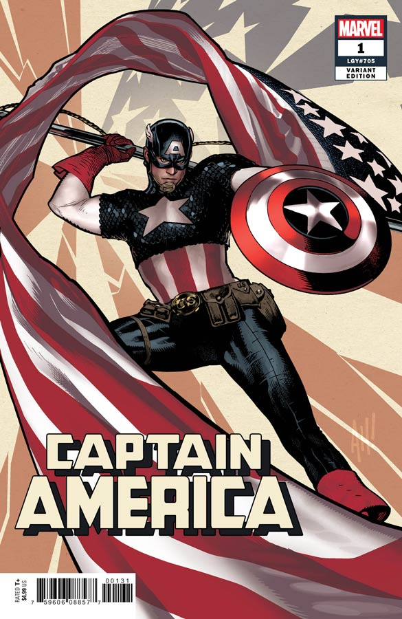
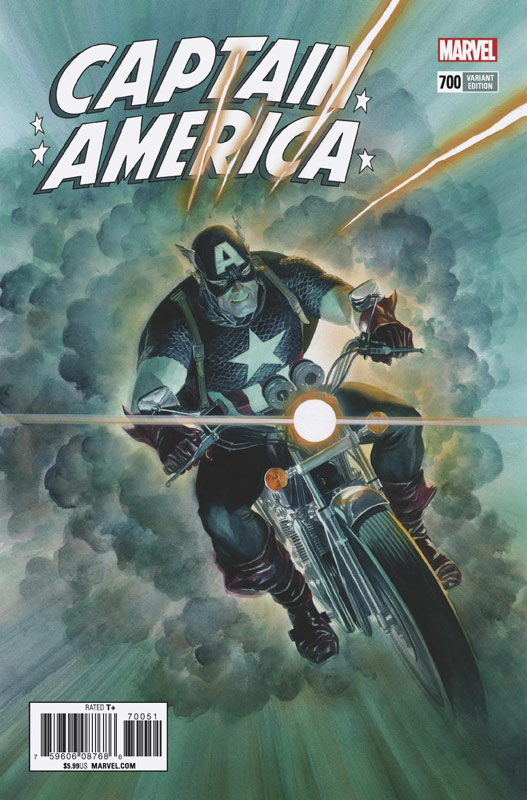
Captain America #1
Marvel Comics Writer Ta-Nehisi Coates, Penciller Leinil Francis Yu, Inker Gerry Alanguilan, Colorist Sunny Gho, Letterer Joe Caramagna
I will admit that Mark Waid’s recent short but sweet run on Captain America was a wonderful set of stories that brought Cap back to basics and delivered some really solid stories. I was willing to give this new creative team a chance even though I haven’t been really wowed by any of Coates other series like Black Panther. The first issue is OK but never really made me go wow this is really a good story. It was more like that’s nice but meh. I get that he is starting things fresh here and this first outing is a simple story to set things up but that is where some of the problem lies. It’s too simple and ends up not being very compelling. The script goes thought the motions of basic story structure with Cap trying to get his credibility back, Bucky being the loyal sidekick, Sharon trying to be SHIELD sort of and Hydra being the typical bad guys. It’s all there but there is simply nothing that you can’t see coming or really care about. It’s like Coates read a handful of Captain America comics and said OK that’s what it should be and he wrote a story that hits the right beats but he never really infuses any life into it. It’s not bad just pedestrian at best. The art by Yu is serviceable but lacks much detail and the backgrounds are for the most part non-existent and it makes the book feel flat and not very exciting. Don’t get me wrong he’s a good artist but there just seems to be little effort beyond the basics here and I would have expected more here.
Is this book worth your time and money? Honestly for five bucks I really expected a lot more than this. Coates story is nothing that you haven’t read before and doesn’t bring anything new to the characters or the legacy. It’s not a bad read but there was really no compelling reason to come back for more after I read this first issue. Yu artwork is a real letdown because I have seen better artwork from him. Overall this was a real disappointment and sad to say this is my first and last issue of this new run. SKIP IT!
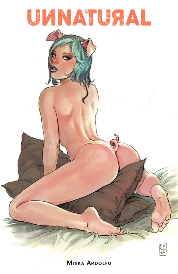
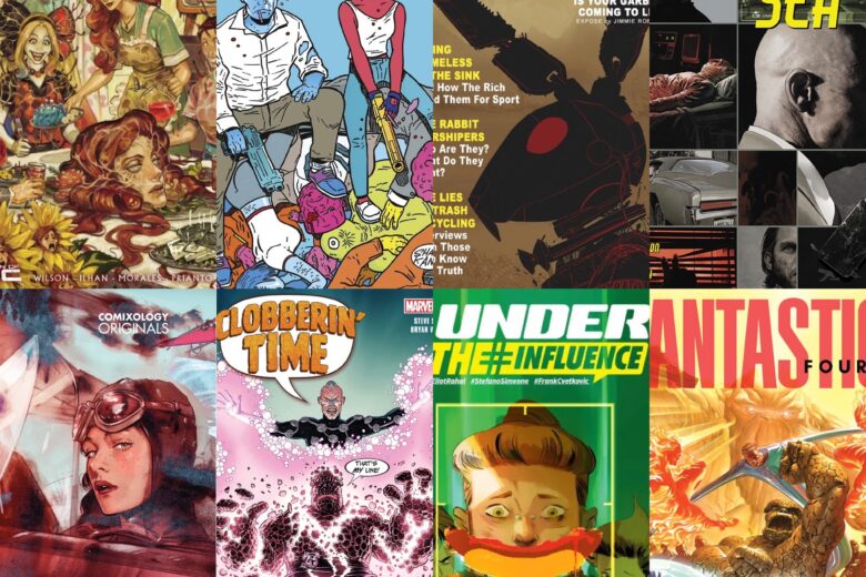
Unnatural #1
Image Comics Writer, Artist and Colorist Mirka Andolfo, Color Assistant Gianluca Papi, Letterer Fabio Amelia
I usually does go for the cheesecake comics with T & A as the big selling point but beyond the racy covers I hoped that there was a deeper story here and this comic turned out to be quite a great surprise. There is no grey area that this is an adult comic but it’s done very tastefully and the book is not just about sex. Andolfo uses some very timely story tropes with this book and the whole militant state angle is used very well here. What works so well here is that she takes the time to introduce the characters and we get to know Leslie very well and that is one of the big reasons that the book works so well. There is a great balance of all of the story elements that pay off so well as your reading the book. It’s smart, funny, touching and sexy but all in great balance with each other. I think one of the biggest assets the book has is that it’s from a woman’s point of view so it doesn’t try and be anything but honest with the story. All of the characters are so well-rounded and fleshed out that they have such a normalcy about them and that makes them so relatable to the reader. She really captures that slice of life but wraps it in a fantasy story that gives it a really nice kick. The other big win for this book is Andolfo’s gorgeous artwork that really sets this book apart from others in the genre. Sure there is a lot of cheeky moments with the visuals but it never feels out-of-place in the story. It’s used when needed and never as a cheap thrill. This is one of the best looking comics that I have seen in quite a while.
Is this book worth your time and money? Every once in a while a comic comes along and really surprises you and that is just what Unnatural did. It’s one of those rare books that take a normally less than stellar genre of cheesecake comics and gives it a great story and artwork that is much more than you would ever suspect. It’s takes a very honest look at many subjects that most people feel uncomfortable talking about but Andolfo takes all of that uprightness away with a beautiful story that will capture your heart with it’s great emotions. HIGHLY RECOMMENDED!
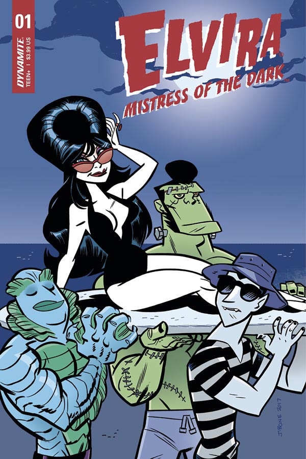
Elvira Mistress of the Dark #1
Dynamite Entertainment Writer David Avallone, Artist Dave Acosta, Colorist Andrew Covalt, Letterer Taylor Esposito
I grew up watching Elvira on local So Cal television and have always been a big fan of her humor and love of the horror genre. I went into this book with hesitation because of two things, lest be really honest here that most Dynamite comics are less than spectacular most of the time and would they be able to capture the quirky humor of Elvira herself. Well shockingly they did well on both counts. I have to give Avallone props for nailing her dialog and you can practically hear her voice while your reading the comic. The other thing was impressive about this book is the use of classic horror writers that she has adventures with was a very smart move. He could have just slapped some mediocre story together and called it good but it was a very smart move and gave the book a very nice boost. He keeps the story simple and the pacing swift that made for a nice little read here. Acosta’s artwork on the book is nice a bit of a Marvel style from the 1960’s and 1970’s era with shades of Don Heck and Gene Colan but still very much his own. There are a few inconsistencies here and there and it has a nice cartoony look at times that works well but over all it nice art that works well with the script.
Is this book worth your time and money? If you’re a fan of Elvira then this is a fun little book that captures her humor and fun and delivers a smart little story. Sure the book is not going to blow you away but it was an enjoyable read that is pretty rare over at Dynamite usually. I had a fun time and that is all you can really ask for here.
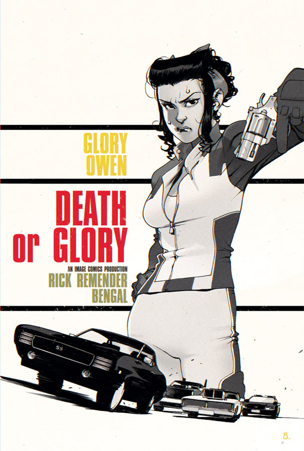
Death and Glory #3
Image Comics Writer Rick Remender, Artist Bengal, Letterer Russ Wooton
This book started off really strong on its first issue and while the second issue was good, it was a bit of a let down from the first. I’m very glad to say that this third issue really gets the book back on track and brings a lot of story elements together very well here. I will give Remender after reading this issue I understand some of the story choices that he made in the second issue. This is why you can’t always jump to conclusions from just one issue of a comic. That issue built things so that they pay off in this issue and the overall story. The big win for this issue is the back story of Red and Glory and how it fits nicely into the current events of the story. It leads quite nicely into the present story with Glory and Pablo and the disturbing elements that unfold this issue. The story just keeps going deeper and deeper so your always being kept on your toes as to what he going to throw at you story wise next and that is what is making this book a really good read. What really makes this book tick is the perfect blend of story and artwork and Remender and Bengal have found a great groove here. What makes this book work really well is Bengal’s artwork that has a great balance and is able to ebb and flow with the script from fun to serous with ease. It’s the small subtle details that Bengal infuses into each panel that pay off emotionally so well.
Is this book worth your time and money? This book has really become a must read comic and this issue really seals the deal on it. What makes this book really tick is that Glory is so grounded as a character that lets the reader go along with anything that is thrown at you. No matter how crazy things get you believe in her and that’s why it works so well. VERY RECOMMENDED!
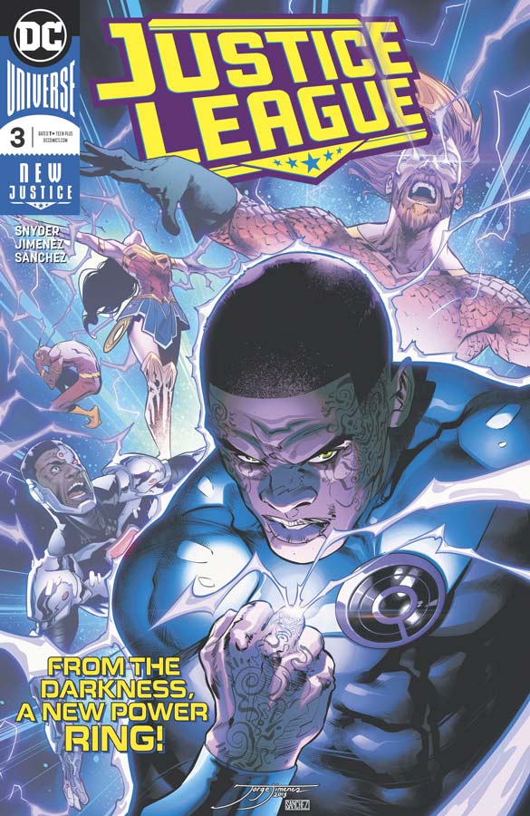
Justice League #3
DC Comics Writer Scott Snyder, Artist Jorge Jimenez, Colorist Alejandro Sanchez, Letterer Tom Napolitano
Sadly this new Justice League book has been a real disappointment so far and while this third issue is an improvement it’s still just not clicking with me. I get that Snyder is trying to tell this epic story but honestly it feels like watching grass grow. I get that stuff is happening but quite honestly it’s becoming a real slog to get through. I keep hoping that it will get better and at least this issue moved along a lot better than the previous two but there are still many issues here. I mean let’s get real here Snyder blows up the moon and it’s not till about the end of this issue that he mentions that Geo-Force is holding things together on earth. It something that you should have said a long time ago. You just can’t ignore common sense even in a superhero comic. I get that he is juggling a lot here but it simply doesn’t excuse sloppy plot holes. The other issue is that he makes such a big deal about every plot point that it’s like getting hit with a story hammer every few pages. It’s like Snyder is trying to make you gasp at everything but yet it ends up just being cliché at best. It also feel really disjointed each issue with everything and the kitchen sink being thrown at the story that isn’t helping either. The only thing that is saving this book so far is Jimenez’s gorgeous artwork that tries it’s best to help the reader make sense of this mess while their reading it. The level of detail that he puts into each panel is amazing but really seems wasted here sadly.
Is this book worth your time and money? It’s not that this book is awful but it’s like Snyder is trying to be Grant Morrison with all of the weird story elements and the story jumping around. The problem with this is that Snyder is no Morrison and has really overblown this story. I get that you don’t want to make this book a simple affair and it’s not that you didn’t understand whats going on. You just don’t really care after a while. Gorgeous artwork can only save a book for so long and I think this is about it for me. SKIP IT!


0 Comments