A bit of catch up here with comic books from the last few weeks to get to so lets get started on them.
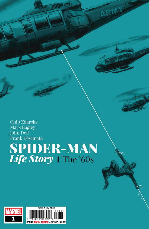
Spider-Man Life Story1 The ‘60s
Marvel Comics Writer Chip Zdarsky, Penciller Mark Bagley, Inker John Dell, Colorist Frank D’Armata
I was intrigued with the concept of this story of the mixing of Spider-Man with historical times and events that was a great concept. Sadly the concept was a bit better than the execution. It’s not to say that the book is bad, but I just felt that it didn’t really take the concept to a better level than it did. The problem with Zdarsky’s script here is that it never really embraces the actual concept of the idea meaning that it’s basically a regular Spider-Man story with a few minor history elements thrown in. It never really felt like the story was set in the 1960’s beyond the stereotypical visual elements. It felt more like a what if story that had no bite. It’s a real shame because the idea is a good one but Zdarsky never really ends up going anywhere with the story and in fact it felt like you had read it before meaning that he seemed to take story elements from the 1960’s John Romita era and throws in a few new elements here and there. I have never been a huge fan of Bagley’s artwork but that is not to say that he is not a good artist but never quite felt that spark from his work but I will say that his style does fit the period and I think that Dell is a good inker on him and gives this book a stronger feel. He does his best to visually capture the feel of the Romita period without trying to imitate his that was quite impressive. I might even say that this is some of the best artwork that I have ever seen of his.
Is this book worth your time and money? I felt that this book was a real missed opportunity. While the concept is not original the idea here was a good one but Zdarsky just didn’t take advantage of it. It simple was an average Spider-Man story set in the 1960’s with a few period elements thrown in but never quite goes beyond that. Bagley and Dell do there best on the artwork but there is little that they can do here to save it. The book is not bad and I’m sure that a lot of people are going to like it but I simple expect more when you have a good concept but poor execution simply sinks this one.
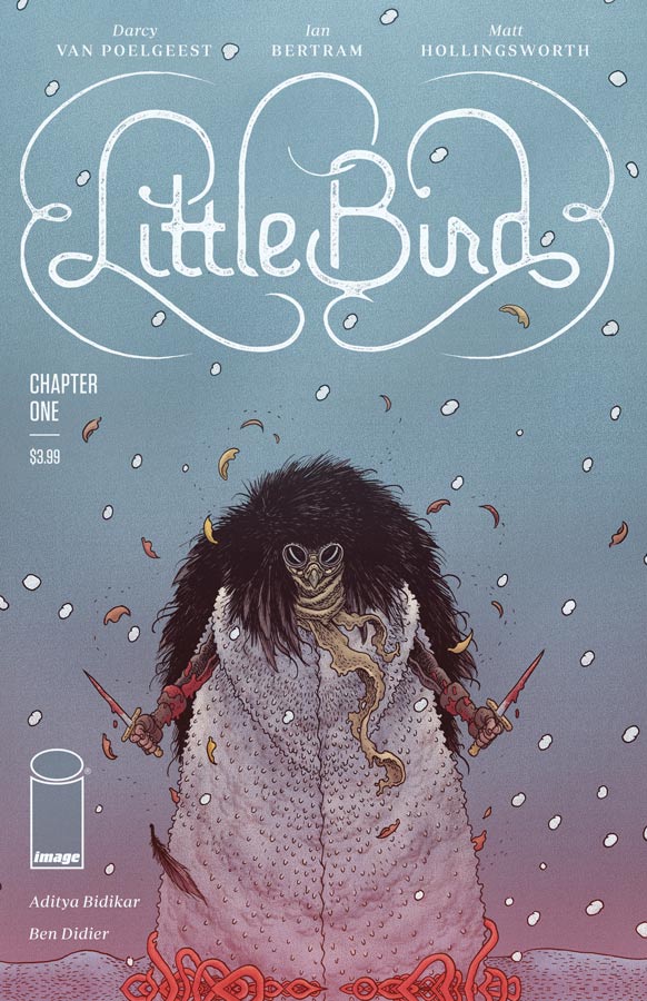
Little Bird #1
Image Comics Writer Darcy Van Poelgeest, Artist Ian Bertram, Matt Hollingsworth, Letterer Aditya Bidikar
Every once in a while there is a comic that comes along that really blows you away on many levels and Little Bird is one of those rare ones. I found it ironic that I compared it to Die, Die, DIe in that there is a fair amount of violence in this but but unlike Die, Die, Die there is a purpose for it in this story and has a point instead of using it to shock and titilate. What is most impressive is the story that Van Poelgeest has crafted here. He sets up both the story and the characters in this first issue and gives you great reason to not only care but sets up a great story right out of the gate. I really enjoyed the pacing of the story in this first issue that hits all of the right beats and made for a very smooth reading experience. It’s one thing to have a good story but you need an artist that can really breath life into it and that is exactly what Bertram does here. What is most impressive is the level of detail that he infuses into each panel of the art. It has a great European feel and look that complements the story greatly. What sets this book apart from other comics that deal with blood and violence is that while there is a lot of graphic detail Bertram never overplays it with the artwork and it more of a ballet instead of blood lust. This is a gorgeous looking comic that is a real visual feast.
Is this book worth your time and money? To say that this comic impressed me is an understatement. This is one of those rare comics where the story and art blend together perfectly to make a bold and exciting book. Not only does it get off to a fantastic start but gives you a great reason to come back to find out what they are leading the story to. This is a truly must read comic that is sure to impress. HIGHEST RECOMMENDATION!
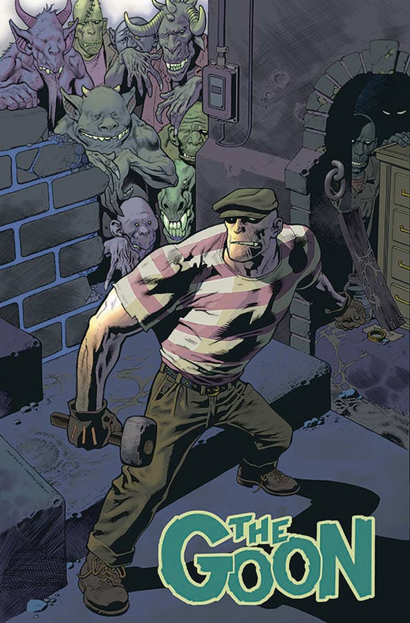
The Goon #1
Albatross Funnybooks Writer & Artist Eric Powell, Colorists Rachael Cohen & Eric Powell
The goon is back and better than ever with this new storyline. The really good news is that if you have never read the Goon before this is a great jumping on point to see what all of the hullabaloo is about. Powell has wisely started the book off with a pretty basic story that lets new readers get to know the main characters but also shows a bit of what to expect from it too. One of the things that has been a staple of the book from the beginning is that it does a great job of mixing humor and horror and has a great feel for classic monster movies. The book has always been a big charmer and this new book keeps that tradition going just as well as when it started 20 years ago. While the story is a pretty simple affair in this first issue the big draw to this book has been Powell’s wonderful artwork that is always a treat to see. It’s like seeing an old Universal monster movie but in comic book form. His use of both color and black and white gives this book a unique feel and look that sets it apart from the pack. He also infuses a great deal of EC Comic art into the book that gives it a great old school charm that is a great treat also.
Is this book worth your time and money? While long time readers might not be too overwhelmed with this first issue mostly because Powell is giving new readers a chance to jump into the Goon universe but, they will certainly be glad with the nice little set up at the end of this issue that is a solid cliffhanger and both new and old readers will be excited to see where he takes this story. I have alway had a soft spot for The Goon and glad to see that he’s back and is a great place to start if you have never read this book. RECOMMENDED!
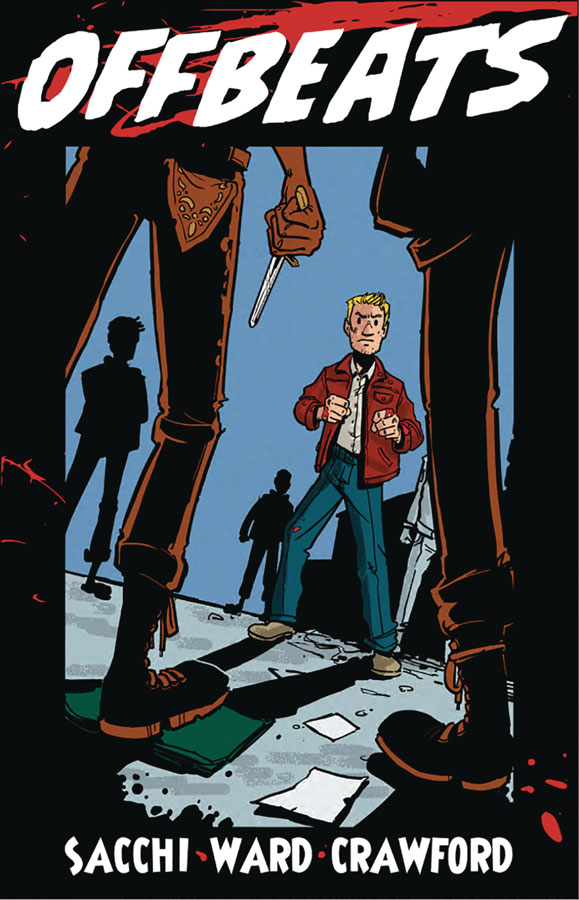
Offbeats #1
Antarctic Press Writer John Ward, Artist Giles Crawford, Colorist Dan Thompson, Letterer CBKB
I was intrigued by the artwork on this book this week and gave it a shot and sadly it a bit of a hot mess. The biggest issue that I had with it was the real lack of structure to the script by Ward. The characters are not set up well and the biggest issue is that the story doesn’t really have any focus. The story feels as if your in the middle of a story that is already going on. He doesn’t really set up the main character Jim very well and you don’t have much of an emotion attachment to him or for that matter any of the other cast. There is a lot of story elements that are thrown together here but they simply don’t connect to each other well and it made for a really frustrating read. I did like Crawford’s artwork on the book and while there were some inconsistencies here and there I like the slight cartoony look that it had. The color was a little on the flat side and I had wished that it fit the period a bit better because at times it had a garish look to it that killed the visual mood of the artwork.
Is this book worth your time and money? I wanted to like this book but there are simply too many flaws that you cant overlook here. The sad part is that I think that there are some good ideas that are here but they are buried under a lot of problems that are simply too hard to ignore. SKIP IT!
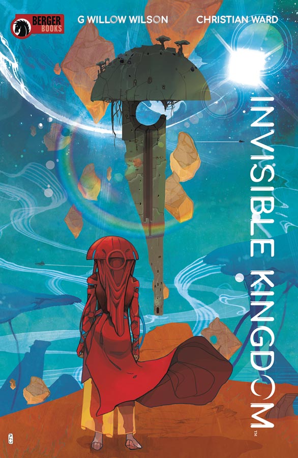
Invisible Kingdom #1
Dark Horse Comics /Burger Books Writer G. Willow Wilson, Artist Christian Ward, Letterer Sal Cipriano
Berger Books has struggled to get a book that has caught my fancy yet but they may had succeeded here with getting Wilson into the fold with a solid debut with this comic. At first as I was reading through it was good but not overwhelming but as it went along there were little moment here and there that made the story come together when you get to the end of this first issue. What I liked about it was that it unfolded nicely and it flowed very nicely over you as your reading it While your left a bit in the dark and you do not fully get to know the cast yet, there was a sense of attachment that you do have for them here. It very obvious that the two stories of Vess and Grix connect somehow but were not quite sure either how or why but I will say that’s part of the fun here. What really makes this book is the amazing artwork by Ward in not only his line art but his color work that makes this comic really pop. He really makes this feel not only like an alien worlds but also makes sure that it feels grounded and feels familiar at the same time that is a nice trick.
Is this book worth your time and money? It’s nice to see Wilson get back to her more indy roots and reminded me a lot of her first series Air at Vertigo. While at first your not overwhelmed with at first glance but once your done reading this first issue you will certainly be intrigued to see where they take this story. Throw in the gorgeous artwork by Ward and this is a comic to keep and eye on. If your looking for something a little different this one is well worth checking out.
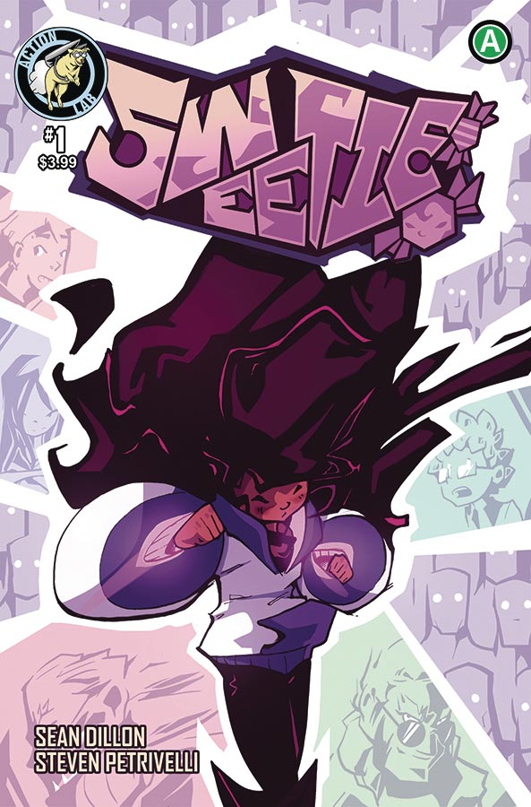
Sweetie #1
Action Lab Entertainment Writers Sean Dillon & Steven Petrivelli, Artist Sean Dillon
My comic shop sold out of this book initially but I got to see a copy and found it visually intriguing. So finally getting more copies, I hoped that the story would be as good as the visuals and thankfully it was a nice little surprise. I think that the big win for this book is that it doesn’t try and be more than it is. It tells a simple little story that will charm you and put a smile on your face. One of the reasons that it works so well is that it sets the story up well but give a strong introduction to Sweetie. You get to know both her and the family and that was a wise choice by Dillon and Petrivelli. The other thing that was smart here was not bog the story down with a lot of over dialogue in the story. With Dillon on both the story and artwork he along with Petrivelli do a lot of visual storytelling here and it really pays off with the action and the drama because it all blends together perfectly. They also infused it was both humor and fun that makes it a really good all ages book that has a strong young female lead that is nice to see. The whole reason that I picked up this book is because of the kinetic artwork style of Dillon. He gives this book a real refreshing look and feel that really makes it stand out of the crowd. The only minor complaint is the limited color palette that he uses and I had wished that he would have used a bit more color here and there but thankfully that is very minor.
Is this book wroth your time and money? Overall I was pretty impressed with this book. Dillon and Petrivelli keep the story simple and moving along well and with the spot on artwork this was an impressive start. This is a very fun all ages book and I cant wait to see where they take the story. RECOMMENDED!
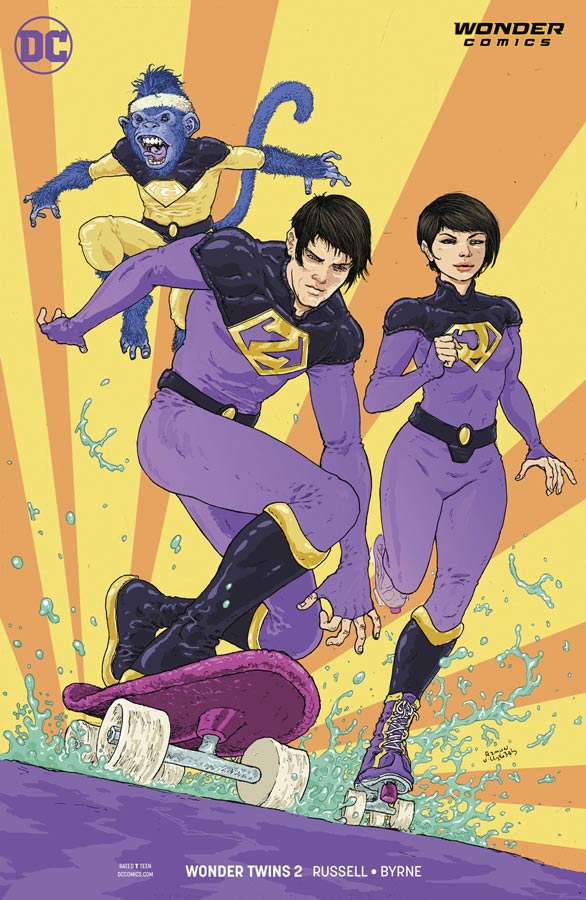
Wonder Twins #2
DC/Wonder Comics Writer Mark Russell, Artist Stephen Byrne, Letterer Dave Sharpe
At first I was a little worried about this second issue because it seemed to get off to a slower start after the fantastic first issue. But I should have trusted Russel to come though and he did with a solid story that continues to impress as much as it entertains. What makes this comic so great is that its simply fun and Russell keeps that first and foremost. He has captured not only what it’s like to be a teenager but also shows the struggle of being a foreigner in a strange land and how they are trying to cope with it. This issue really shows that maybe Zan’s water power might not be that stupid (ok its still a bit stupid) and actually makes it work in a story for a change and that is a true feat of a good writer. He also takes a page from his wonderful Flintstones series and has Gleek show up just at the end of this issue. This is to make sure that the main characters have been set up and fleshed out and on solid footing before you get to the monkey. I love that he has infused the story with moral dilemma that adds so much depth to characters that were throw away side kicks on a Saturday morning cartoon. While the book poses these and other questions, Russell makes sure that this continues to be a rock solid all ages book and this is a great thing. I love Byrne’s artwork on this book that has a slight cartoony style but is perfect because of their cartoon roots. He never makes it look to exaggerated but gives this book a perfect look that visually captures Russell’s script perfectly. He also does wonderful facial expression on the characters that adds great emotions to the story.
Is this book worth your time and money? Who would have ever thought that there would be a comic book starting the Wonder Twins let alone one that is a must read. What I love about Russell is that he doesn’t do big mainstream comics but picks projects and characters that nobody wants and that allows him to be both bold and creative because there are no restraints and that lets him go in any direction he needs to make it all work. When you add in the fantastic artwork of Byrne you have yet anther winner here! HIGHLY RECOMMENDED!
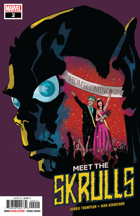
Meet the Skrulls #2
Marvel Comics Writer Robbie Thompson, Niko Henrichon, Colorist Laurent Grossat, Letterer Travis Lanham
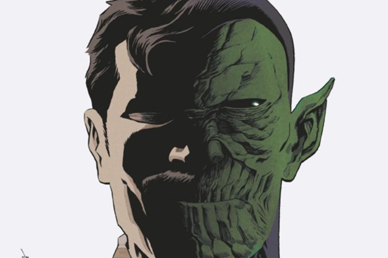
Ok lets get this out of the way that Thompson is taking a lot of this book from Tom King’s Vision series and that is a good thing because if your going to use someones idea make sure that you use a good one. But in his defense he is adding his own spin on the story and that is helping it out greatly. The one thing that I like is that this book is sort of a spy novel type story but adds in teen angst and men in black for good measure. While the basic story is not original I will say that Thompson has made sure that the heart of the story lies in the strong characters that he has created here. He makes sure that no matter what the facade that they take is not where the story is but the heart and soul of their true self is where the story lies. The story is smart and cleaver and that will only get you so far in a comic and he is lucky that Henrichon’s artwork brings this story to life quite well. Most of this story is pure drama so you need an artist that is able to capture all the subtle details that make this book work and Henrichon delivers. A spot on visual to bring this book all together.
Is this book worth your time and money? Is this story original, no but thats not the point. It’s all in how you deliver it and Thompson and Henrichon have delivered a solid comic book here that has a great emotional core that delivers a really solid read. RECOMMENDED!




0 Comments