So two weeks in a row is a new record at this point. The holiday this week kind of threw off the schedule and a rough week at work delayed getting the reviews up on Friday but the good news with that is that I was able to get some of the backlog of comics in this weeks reviews so we are nearly caught up (well as nearly as I can get and still get some sleep and Diamond Comics still not getting all of the comics to the shop) So it was a light week for new comics but there are some recent ones that you might still want to check out.
Before we get started I just wanted to plug the local comic shop where I get my comics from is Pulp Fiction Comics in Long Beach CA. It’a great shop run by Mike, Ryan and Anny. On Sunday nights Ryan and myself go over the final order cut off of comics that are due along with talking about new comics and sometimes have live sales on their Facebook page around 5:30 PM PST. So if you are not busy and want to join the fun tune into that. So make sure that you support you’re local comic shop!
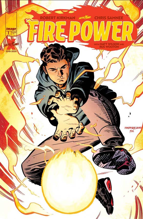
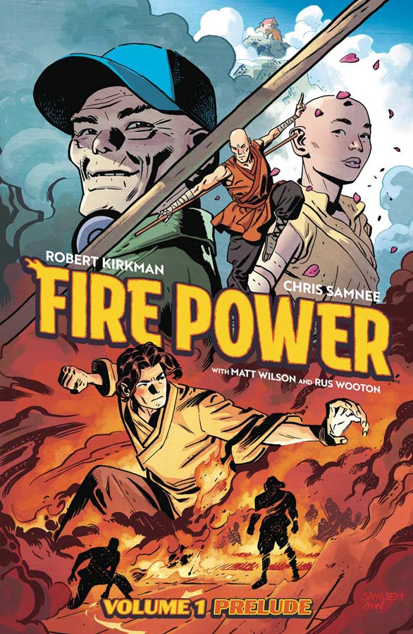
Fire Power: Prelude & Fire Power #1 FCBD
Image Comics Writer Robert Kirkman, Artist Chris Samnee, Colorist Matt Wilson, Letterer Russ Wooton
So these comics were supposed to come out in April and May but with the closing of the comic book industry the best laid plans went to hell and a hand basket. So both book got released on the same day so you get both at the same time. Now you could just read the FCBD #1 and be fine but you would be missing the best part of the story if you don’t read the prelude. Lets start off with that first because the prelude is not just the first five or six issues collected into a trade it is actually a whopping 154 pages of original material that does a fantastic job of setting up the story of Owen Johnson and his quest to find out about his birth parents and he ends up learning more than he ever imagined. What I really enjoyed about this book is that Kirkman really took the time to let the story unfold and you get to know all of the characters on Owen’s journey. It also helps that with the huge page count and that it not being told in monthly installment that it give the story room to breath and unfold and a natural pace that allows it to wash over you that is pretty rare in comics today. While I will admit that there are cliches and obvious influences to the story but the thing that sets it apart is Owen’s story resonates very well with the reader and that is what impressed me the most about the script. Getting Samnee to do the artwork on this book was a stroke of genus. I was already a huge fan of his artwork but he really lets loose here and not just on the big scenes in the book. One of his greatest assets is the smaller dramatic scenes and that is for me where his artwork really shines. There is so much in this prelude that is so great that its truly bursting at the seams. Now on to the first issue that takes place fifteen years later and Owen is married with a family and at first it was a bit of a let down after the high bar of the prelude but upon reflection it does work well just in a very different way. One thing that hurt it is that I read it right after the prelude and originally it would have been a month later and that would have let more time of the prelude sink in and allow the story to stand more on its own. With that being said the first issue is nice a low key allowing you to settle into Owen’s suburban life and how he has tried to put the temple in his past but you can’t always do that. The one thing that I did really like in this first issue is that Kirkman continues to let the story unfold at its own pace and allowing for the story and characters to breath. While the issue may be short on action there is still a lot to take in here. Samnee again shows why this book would simply not work without him as an artist. One of my favorite things this issue that he did was the race of Owen and his daughter to the supermarket that was simply perfect. I do want to point out Wilson’s color work on the books really is impressive and adds greatly to Samnee’s beautiful line work.
Is this comic worth you’re time and money? Well the first issue is free so that is a pretty easy answer but is the prelude worth $10 bucks, Hell yea it is. I’ll admit that Kirkman has been more miss than hit for me but I have to say that his team up here with Samnee is one of the better comics that he has done. Sure there is obvious influence in the basic set up of the story but unlike some of his other books he doesn’t lean too hard on them here and really gives the story time to breath that is a big plus. Having Samnee on the book not only gives this some of the best visuals that a comic could get, I feel that he also is adding greatly to the storytelling as a whole compared to other Kirkman books. Not only is this off to a great start each of the two have great endings that will want you coming back for more. HIGHLY RECOMMENDED!

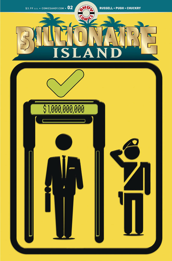
Billionaire Island #1 & #2
Ahoy Comics Writer Mark Russell, Artist Steve Pugh, Colorist Chris Chuckry, Letterer Rob Steen
Reuniting the Flintstones team or Russell and Pugh and Russell is fresh off of Second Coming comes the newest comic reuniting them again goes to show that they are a well oiled machine and there is a lot going on here. Russell who has a great knack for delivering biting social commentary this time decides to go after the 1% of the 1% again this time and its off to an interesting start. What is interesting here with Russell’s story is that there are two storylines running parallel but seem to be connected but not quite yet. There is the gun for hire that is looking to take Rick Canto and his Billionaire Island down for revenge and Shelly Bly who is a reporter who ends up trapped on the island for asking too many questions to Rick. These first two issues are setting up the story and while all of the pieces of the puzzle have yet to fit into place there is still a lot to like here. One of Russell’s best assets as a writer is to take a very basic concept of corrupt rich people and he takes that and throws it to the extreme such as locking up Shelly in a rat cage literally and that is what is making this story interesting is that sly and subversive humor that makes a somewhat depressing social commentary and making more palatable. Pugh artwork really captures the realism of the concept and then exaggerates it to and absurdity level that gives the book its wild charm and fun when it should be dark and depressing. It’s the little subtle elements of the artwork that makes the story work so well and I can see why Russell wanted to work with him again on a book.
Is this comic worth you’re time and money? This story touches on a lot of things and if your looking for something simple and mainstream you have come to the wrong place. Russell and Pugh have put together an intriguing take on the rich and so far in these first two issue there is a good set up here. While the story is a bit on the slower side that is working well he by peeling back the layers of the story to let it wash over you and not revealing things too quickly. I like that pacing here and love Push’s artwork on the book. There is a lot going on here and it will be interesting to see where they take it from here. RECOMMENDED!
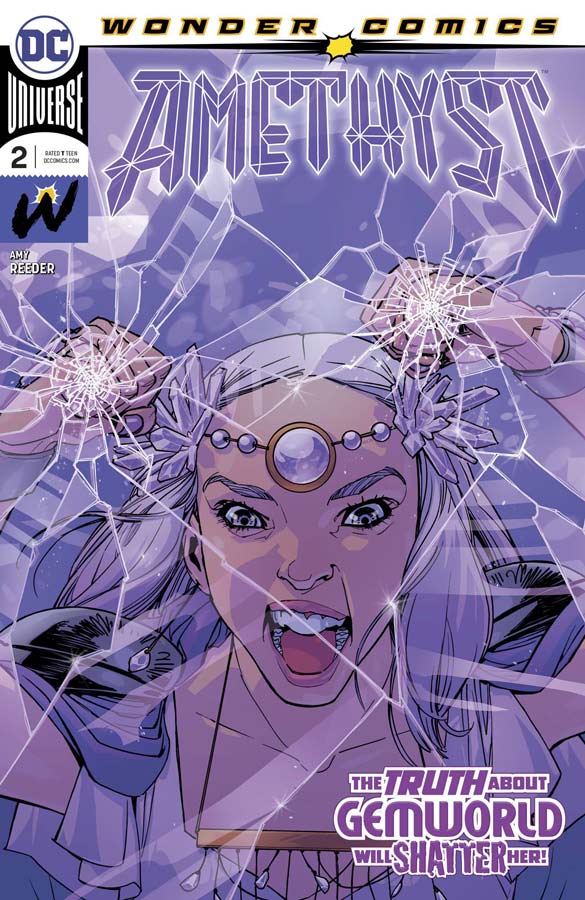
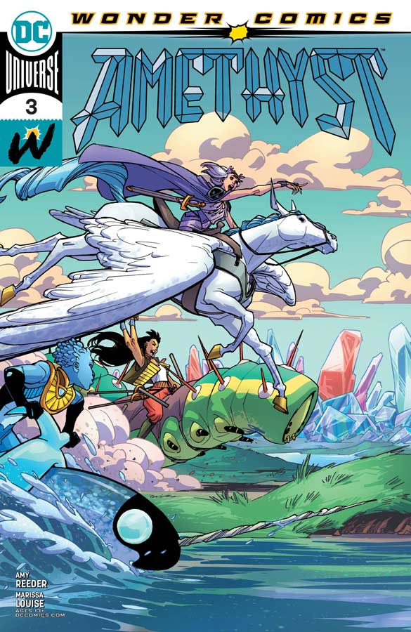
Amethyst #2 & #3
DC Comics/Wonder Comics Writer/Artist/Colorist Amy Reeder, Letterer Gabriela Downie
I really like the first issue of this book and the second and third are even better. What ha impressed me the most about this comic so far is that how faithful that it is to the original 1983 series and yet Reeder has built on that original concept and made it her own here. On the surface its a basic mystery plot of Amy trying to find her parents and the mystery surrounding their disappearance but its the journey to find them that is making this book so great. Reeder also does a great job of not only the scope of Gemworld but all of the different kingdoms and showing their differences and trying to bring them together. Having her travel companions on this journey is alway a wise choice and it adds greatly to the adventure and who hasn’t fallen in love with Stan the caterpillar. Reeder gives a nice balance to all of the elements of the story that is making for a very nice reading experience. Reeder’s artwork is a real beauty to behold here because the level of detail that she infuses both with Gemworld and all of the characters is very impressive. The way that she infuses expressions into the characters is simply breathtaking and adds so much texture and flavor to the overall reading experience and pulls it all together.
Is this comic worth you’re time and money? I have really enjoyed the Wonder Comics line and they are so important right now. Having great all ages mainstream comics is a chance to open the world to younger readers and in this case for strong female characters to inspire more readers to comics. Reeder has created a wonderful world here that has a great story and gorgeous artwork. This is one of those rare comics that is a great all ages book but has a lot of depth for older readers too. Each issue just gets better and better. HIGHLY RECOMMENDED!
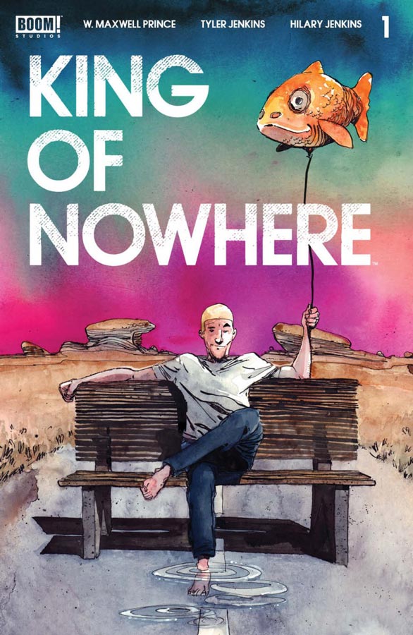
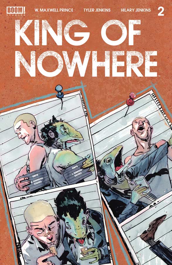

King of Nowhere #1, #2, & #3
Boom! Studios Writer W. Maxwell Prince, Artist Tyler Jenkins, Colorist Hilary Jenkins, Letterer Andworld Deisign
Whenever there is a new comic with artwork by Jenkins is always something that I look forward too and was intrigued by the premiss of this story. Prince takes a Twilight Zone episode and adds a murder mystery to it and that is the basic concept of King of Nowhere. The story of Denis waking up in this bazaar world and believing that its a dream is definitely a weird set up and after reading the first three issues In some respects I’m not quite sure what to make of it. While Prince has been slow to reveal what is the problem with Nowhere the one thing that is working is the characters and that you do care about. The one issue that I have so far is that the story is unfolding very slowly and while that made pan out on the story as a whole, I’m not sure that its working well for a monthly and I read three issues at once and was still a bit confused as to its pacing. There is no doubt that the artwork by Jenkins is fantastic and is helping the story out greatly. All of the strange inhabitants of Nowhere are simply amazing and very unique and gives the book a great look. He also does a great job on capturing the weirdness of it all that Prince puts into the scripts.
Is this comic worth you’re time and money? This one is a tough one because I like a lot of the ideas that Prince has in the story here but I would have likes the story to have gotten a bit farther than it had gotten by the third issue. There is a lot to like here and of course Jenkin’s artwork is the one thing that really is driving this comic for sure. I am going to keep reading because the cliffhanger at the end of the third issue does change things up and shows that there appears to be something big on the horizon with the story. So I would say if you are looking for something off of the beaten path you might want to give this a shot.
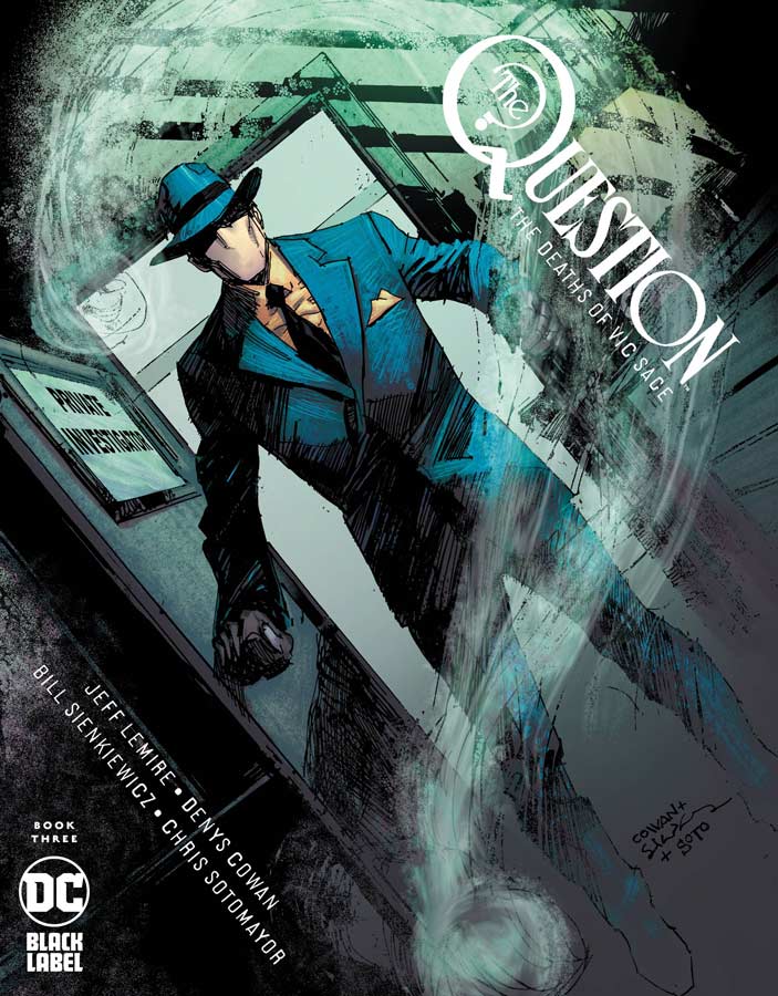
The Question: The Deaths of Vic Sage #3
DC Black Label Writer Jeff Lemire, Penciller Denys Cowan, Inker Bill Sienkiewicz, Colorist Chris Sotomayor, Letterer Willie Schubert
It’s been a while from the last issue because of the bi-monthly schedule of the book and the closing of Diamond made waiting for this third issue even harder that usual. After the events of the second issue going to the Wild Wild West, I was intrigued where Lemire was going to go with this third issue. The story was a bit of a slow down from the action of the second issue but there is a lot to digest from that and having Vic back in the real world to try and discover who he is and the mystery surrounding the cult and there are even more twist and turns as the story goes along. Lemire has crafted a really great story here and digs even deeper into it with this issue. There is a lot to take in with the story in this issue as we start to get closer to finding out who Vic really is. Cowan and Sienkiewicz continue to deliver some of the best artwork out there in comics currently. The mood that they bring to this book is amazing and they blend together so well even though their styles are very different and that is what makes this mini series even more special. There is a lot of drama in this issue and they capture all of the small subtle elements so perfectly that does a great job of complementing Lemire’s great script.
Is this comic worth you’re time and money? This has been one great comic and continues to get better and better with each passing issue. Lemire, Cowan, and Sienkiewicz are firing on all cylinders with this book and this third issue starts to put the pieces of the puzzle together and we start to see the groundwork in the previous issues start to come together. With a top notch story and gorgeous artwork it doesn’t get much better than this. HIGHLY RECOMMENDED!
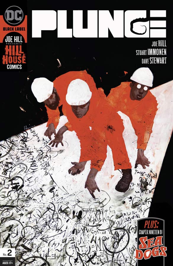

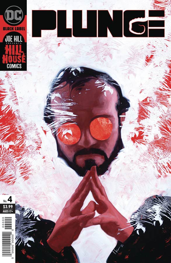
Plunge #2, #3, & #4
DC Black Label/Hill House Comics Writer Joe Hill, Artist Stuart Immonen, Colorist Dave Stewart, Letterer Deron Bennett
I have been very impressed with the Hill House line of comics and they saved one of the best for last. I had previously reviewed the first issue way back when it came out in February and was very impressed with it. Because of my lateness and delays in the releases I was finally able to catch up with the next three issues and as each issue went along it just got better and better. The most impressive thing about this book is how Hill unfolds the mystery and horror at a very good pace that keeps you intrigued as well as creeped out on what is happing with the crew on the island. You can feel a lot of influences in the story from other mediums but what Hill does best is make them all his own meaning that you feel the influences but don’t necessarily go “oh that reminds me of…” all of the time while you are reading it. Hill does a great job of peeling back the layers and it just gets creepier and creepier as it goes along. I also like how he folds in social commentary about big corporations and greed at no matter the cost and it adds a nice added layer to the uneasiness of an already scary story. I can see why he was able to get Immonen to do the artwork on the book because it’s a bit out of his wheelhouse of superhero fare but what he brings to the table is that he captures all of the emotions of the characters and especially the horror of the situation that put the readers right there with them. He has a great way of underplaying the horror elements so that they are more subtle and less over the top horror that greatly enhances the story. Adding greatly to the mix is the always great color work from Stewart and I can see why they went to him to color the book because there is so much going on here that color plays a big part of the subtle feeling in the scenes that complements Immonen’s line work perfectly.
Is this comic worth you’re time and money? I have been a huge fan of all of the Hill House comics and this one is a grand one. It’s a story that just gets better as it goes along and there is so much to take in as it goes along. Adding to the great story is gorgeous artwork that captures every moment perfectly and you have one of the best horror comics that I have read in a long time. HIGHLY RECOMMENDED!
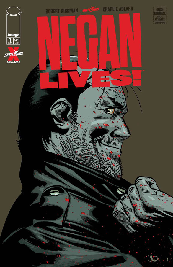
Negan Lives! #1
Image Comics Writer Robert Kirkman, Artist Charlie Adlard, Gray Tones Cliff Rathburn, Letterer Rus Wooton
So you thought that the Walking Dead was actually over? Well it was but then there was a world wide pandemic that shut Diamond Comics down and so Kirkman wanted to help the comic stores out so what better way that they could help out struggling comic shops. So along with artist Adlard they did the comic for free and even covered the cost of printing and production themselves so that is the story behind the comic. Now that is great but is the final product worth it? There are going to be a lot of people that may not be current with the storylines in the regular series and that is OK here because this is a stand alone story and as long as you know that Negan is pretty much pure evil and you are pretty much all set. Story wise this is pretty thin but enjoyable for what it is. In some ways it brings a bit of a lighter side to him and that was a bit surprising. Adlard’s artwork is very nice here because it’s for the most part drama and dialogue that he has always handled well over the years.
Is this comic worth you’re time and money? As a one shot it was OK. There wasn’t anything monumental that this story covers but on the other hand its’ not something that you expect either and that was a nice surprise. In the long run its a nice side story to the regular comic and is a good stand alone story for anyone that is interested. If you are a Walking Dead fan then you are already buying it but if you are a casual reader then it’s a nice side story and that is all it was ever meant to be and on that level it was pretty decent.
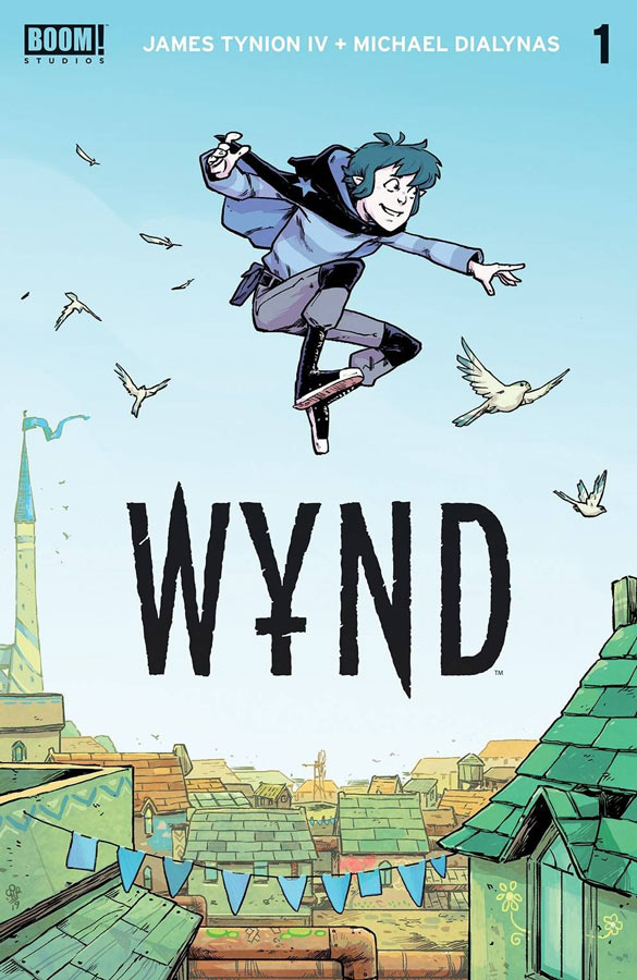
Wynd #1
Boom Studios Writer James Tynion IV, Artist & Colorist Michael Dialynas, Letterer Aditya Bidikar
Most people know of Tynion as the writer of Detective and Batman comics over at DC Comics but there is no doubt that he has a fascination with fantasy stories and his new series Wynd has a lot of those elements here. It’s obvious from this first issue that Wynd is hiding that he is not supposed to be in the kingdom and yet we are not sure why that is the case. Tynion sets up a lot here in the first issue but doesn’t reveal too much here even as a double sized issue. What he does do fairly well is set up the main characters in the story and we get to know them a little bit. The only problem with the story is that there is not much here in a lot of ways, I meant the story is OK but there wasn’t a whole lot that was very compelling once I had read it. On the plus side the artwork by Dialynas was very nice and had a bit of a cartoony style that fit the world well and helped move things along well. The one thing that I like that he did very well was the humor in the story that his artwork captured very well.
Is this comic worth you’re time and money? I was sadly underwhelmed with this book in that it was a double sized issue and yet not really much happens and Tynion never seem to get the story beyond the basics here. It’s not that it’s bad but there was not much that had me wanting to come back for a second issue. The artwork was nice but Dialynas could only do so much here. The story could get better but if you can’t convince me with a first issue then you lost me. SKIP IT!
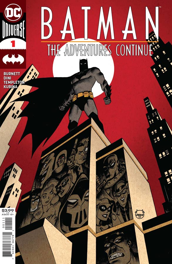
Batman: The Adventures Continue #1
DC Comics Writers Alan Burnett & Paul Dini, Artist Ty Templeton, Colorist Monica Kubina, Letterer Josh Reed
If you are like me in that Batman the Animated Series is seminal work then you have come to the right place to relive that magic all over again but in comic book form. This new series is written by two of the main writers on the show and it’s a great continuation of where the show last left off at. There are two things that are very impressive about this first issue, 1) that there is a reference to the Batman/Superman crossover episodes that was a nice touch and 2) that it’s a self contained story but there is a subplot that is quite intriguing that will continue in the next issue that is rare for this type of comic. Even with this being a great all ages comic there is no doubt that it’s not dumbed down for kids but something that is truly all ages. Burnett and Dini capture all of the magic of the series but it very much feel like a comic book because that is the medium that they are working in and they have both written comics before. They truly blend both of the mediums together very well here and that is what makes the story so good. There is very few artist that are able to capture the animated series style and yet be able to make in work on the printed comic book page the best two were Mike Parobeck who sadly passed away in 1996 and the other was Templeton and thankfully he decided to do the book and it really shows his love for the style and characters. His artwork has that right balance of cartoony and realistic that was a great trademark of the show. He had previously worked on the Batman Adventure comics back in the 1990’s so it was great to hear that he would be doing the artwork on this book and it couldn’t have looked any better.
Is this comic worth you’re time and money? Sure it was a digital first comic but holding a real comic in you’re hand is what its all about and this one was a real gem for sure. It has all of the perfect elements with the story and artwork that was not only greatly nostalgic but just as current today as it was 28 years ago from the Batman Adventure comics. This one is a must buy for both young and old and those still young at heart. HIGHLY RECOMMENDED!
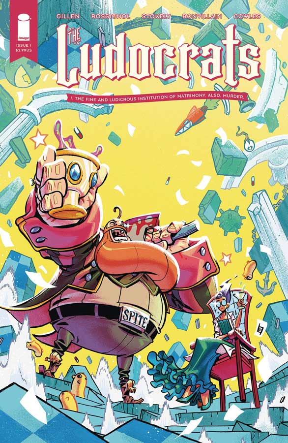
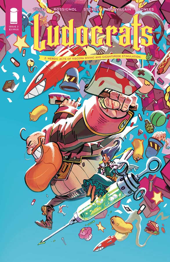
The Ludocrats #1 & #2
Image Comics Writers Kieron Gillen & Jim Rossignol, Artist Jeff Stokely, Colorist Tamra Bonvillain, Letterer Clayton Cowles
Wow where do I start with this one. At first glance I was intrigued with the artwork on this book and once I read it that was about all that I like about this book. The first issue is nearly unreadable because it’s so disjointed and chaotic that trying to read it is a real chore and not a pleasant one. There is really no cohesive plot in the first issue and the second one fairs marginally better (more on that later) but Gillen and Rossignol throw characters into the story and you have no idea who they are and after a few pages you simply don’t care anymore because there is no point to the story at all. So in the second issue there is at least some semblance of a story that is a huge improvement but that is saying that the bar is so low from the first issue that complete sentences are a win at this point. It’s like they are trying to do a Monty Python type story but have only see one sketch that they did and then write a whole story about it. It tries to be funny but it just crashes to the ground with bizarre humor and random gags that are marginal at best. The only thing that I found to be good about this whole mess is Stokely’s artwork that has a great visual charm but is so wasted here on poor storytelling that his nice visuals are simply lost in the mess.
Is this comic worth you’re time and money? I really find this hard to believe this is such a huge mess considering that Gillen write Once & Future that is really great. I haven’t figured out what happened here but simply put this comic is a really mess with the writing and simply not worth you’re valuable time or you’re hard earned money. AVOID THIS COMIC!
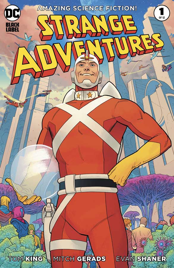
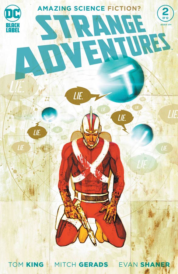
Strange Adventures #1 & #2
DC Black Label Writer Tom King, Artists & Colorist Mitch Gerads and Evan “Doc” Shaner, Letterer Clayton Cowles
You know that from reading Mister Miracle that there was a very high bar for this new series from King and Gerads and I am happy to say that they do not disappoint here. They also bring Shaner to the party and the dual artists works out very well for the story. What make this story fascinating is that there are two different storylines going on at same time and that is why there are two artists Gerads is handling the Earth story that is more real life based and Shaner is doing the Rann story that is more classic superhero style and that is what makes this book so interesting is that there are two stories that are different and yet totally connected to each other. While there are many similarities to the Mister Miracle series on the surface this book is so different and really deals with the duality of superheroes. At first glance things seem pretty straight forward with King’s story and as you get to the end of the first issue things take quite the turn. In the second issue you start to learn that the two stories are very much connected and that Adam might no be the man that everyone thought he was. What is great about the book is how King dives deep into what a superhero is and how we perceive it and there is also the duality of it that comes into play that makes this pure character study. Having Gerads and Shaner team up on the artwork is a stroke of genus because Shaner’s art style is classic superhero so it make senes that he would handle the Rann part. Having Gerads handle the “real life” parts is very much in line with the excellent work that he did on Mister Miracle. Even though their art styles are very different it make the story work better because of it and really amplifies the story perfectly.
Is this comic worth you’re time and money? So the real question here is if you have not picked up this comic yet my question is WHY? Just as with their Mister Miracle book this is a comic that is setting up something very special and is showing that it was no fluke. These first two issues are amazing and there is so much more to come. HIGHEST RECOMMENDATION!


0 Comments