Dark Nights: Metal #1
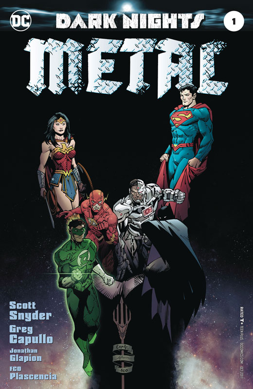
DC Comics Writer Scott Snyder, Penciller Greg Capullo, Inker Jonathan Glapion, Colorist FCO, Letterer Steve Wands
The bar was set pretty low for this book for me because the two prelude books were not very good and very drawn out to get the story going. While this first issue of the story was a grand improvement it ended up being a decent read but not spectacular. Snyder at least keeps the story pretty focused and moving along nicely here but the bigger problem is with this and other event comic series is that they try to make a big deal out of things and make the secrets reveals overly dramatic. One of the problem that I have with the script is that it feels forced and the story doesn’t seem to unfold naturally. It always seems to try to one up itself all the time. I would have hoped that Snyder would have got this issue off to a better start but it does still drag out the setup for a third time here and at this point it should have hit the ground running. Capullo & Glapion’s artwork is good and keeps a consistency that the preludes had with the multiple artists. They do there best to keep the story moving along here but with not a lot happening beyond the drama and dialog that they simply can only do so much with what they were given. There are som nice action scenes where they get to punch the visuals but there is not much of that in this first issue.
Is this book worth your time and money? While the book is not terrible for five bucks I really wish that this had been more story driven than yet another set up story. We’re now at three issues and the story really hasn’t moved forward that much here. The story is decent and the art is good but in the end there is not too much that is really memorable after your done reading it. It’s certainly not a train wreck or anything but with so many comics out there, it’s hard to justify spending five buck on this book. SKIP IT!
Mage: The Hero Denied #1
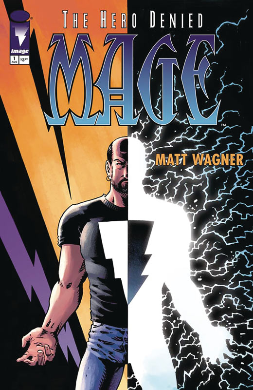
Image Comics Writer and Artist Matt Wagner, Colorist Brennan Wagner, Letterer Dave Lanphear
With the #0 issue as a set up this first issue starts to get to the meat of this third chapter. If you have never read Mage before, I highly recommend buying the first two chapters and then diving into this. While new readers wont be totally lost there are plot lines and characters that won’t have the same impact without knowing the past. With that being said this first chapter gets off to a great start and definitely note the passage of time and take place about 10 years after Hero Defined. There are many changes in Kevin’s life and has yet to truly embrace his destiny or even understand it. Wagner script has a great way of dealing with both the past and the present and how they always relate to each other. Throwing in a family life is taking the story to a whole other level that will certainly change the tone of this final chapter. He hits all of the right beats with this first issue and gets things off to a great start here. As always Wagner’s artwork is nice to see again. Over the years from the last chapter he has done much more writing than artwork so it’s great to see that he still hasn’t lost his touch with his work. His son Brennan has developed into quite a good colorist and does a very nice job on the book here.
Is this book worth your time and money? This first issue gets off to a very solid start and there are some really nice twist that Wagner has thrown into the mix. The story sets things up nicely here and definitely leaves you wanting more. Coming back to Mage after all of these years is like reconnecting with an old friend that you have lost touch with but are able to pick right back up where you left off. RECOMMENDED
Kaijumax Season 3 #2
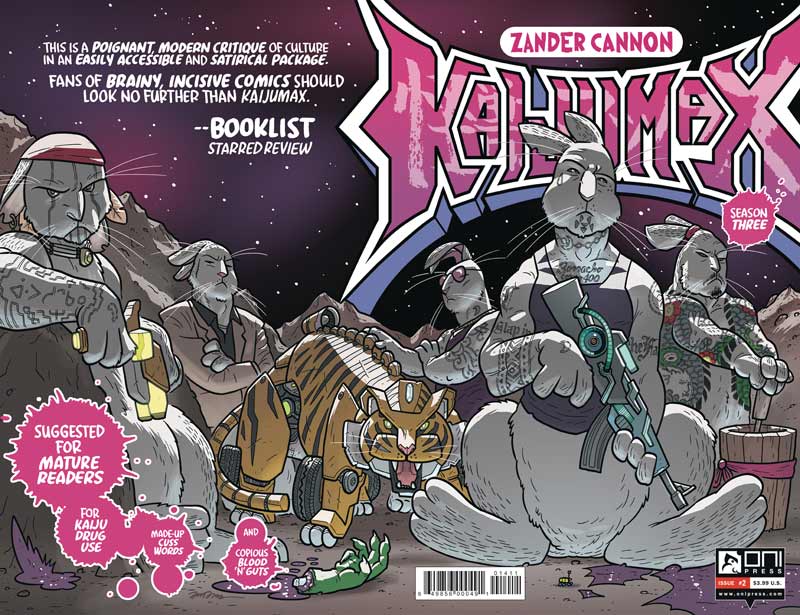
One Press Writer, Artist, Colorist & Letterer Zander Cannon, Color Assists Jason Fischer
Cannon got the thirst chapter off to a great start in the last issue and continues to build the momentum of the book very nicely. What I love about the book is that the world is so big and vast and yet he is able to focus on just a few characters while still keeping the larger world in-tacked. The fine line that he keeps between the monsters and the humans is where the heart of the this story is and showing that things are not always black or white. The constant shifting of the prison gangs and now with the changes with the gangs on the moon really is keeping readers on their toes with the story. Cannon always keeps things fresh with throwing new monsters and situations in to keep things fresh and fun. As weird as things can get he never loses sight of the heart and souls of the characters that you can alway relate to that always makes this book so refreshing and good. I have always been a fan of his artwork and his work on this book is some of his best. He is able to capture the big moments but its the subtle dramatic moments and expressions that is what I love most about this book. It’s the visual emotions that make this book work so well. I really must mention his color work on the book along with Fischer that give his line work so much more life.
Is this book worth your time and money? I have been a fan of this book from day one and it simply gets better and better with each passing issue. Reading this book is always a sheer pleasure and always keeps me coming back for more. VERY RECOMMEND!
Sandman Special #1
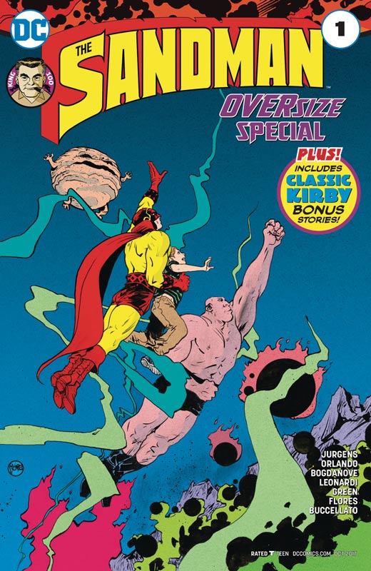
DC Comics Writers Dan Jurgens & Steve Orlando, Artists Jon Bogdanove & Rick Leonardi & Dan Green, Colorists Madpencil & Steve Buccellato Letterers Willie Schubert & Wes Abbott
The third Kirby 100 special from DC Comics is a really treat. This issue has two main stories with five Kirby back up shorts. The first story by Jurgens and Bogdanove is pure Kirby homage and is a real hoot. Jurgens keeps the story simple and to the point and gets straight to the action and heart of the story. There are so many nods and winks in the story that made it that much more fun to read. I loved that Jurgens kept the story short and sweet and as with any good short story got straight to the point. It’s a really snappy script that was simply perfectly. Bogdanove simply blew me away with his art on the book that was pure Kirby homage and even threw in some photo background that simply blew me away. Even though he does an homage to Kirby it’s still very much his own style at the same time. You can never go wrong with throwing in a bunch of Kirby Crackle. The second story by Orlando, Leonardi and Green tell a slightly similar tale but they give it a nice twist that you don’t see coming. Orlando also keeps his story short, sweet and to the point with lots of action but in the end its the heart of the story that will win you over. Leonardi and Green do a bang up job on the artwork here with lots of homage to Kirby but making it their own.
Is this book worth your time and money? I have loved the two previous Kirby 100 specials but there is something about this one that really won me over. I think that both stories are so charming and full of warmth and love to Jack Kirby that they will win you over too. This book is a treat for both old and new fans of Jack Kirby. With solid stories and amazing artwork make this a great way to celebrate the King. HIGHLY RECOMMENDED!
Spy Seal #1
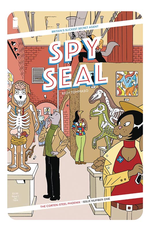
Image Comics Writer/Artist/Colorist/Letterer Rich Tommaso Back up story by Joey Weiser
I was a big fan of Tommaso’s Dark Corridor so I was really looking forward to his new book Spy Seal. Not only was I impressed but this book might just be one of my favorite ones of the year. The story is a nice throwback to film noir/crime films from the 1930 or 1940’s and has a nice European flavor to it that makes it work that much better. The set up to the story is very good here and he does a great job of introducing the cast but a grand job of setting up the story too. There is a lot to set up here in the story but it never feels overly filled by exposition and moves along at a very nice pace. He also has a great balance of action, humor and drama that blends together perfectly here. The one thing that I had to do while reading it was to slow done and let it all seep in while you’re reading it. So many comics today rich things along but Tommaso’s work is one that washes over you and that is why it works so well. His visual style really makes this book pop. On the surface it may look simple but there is so much to take in on every panel that really gives it a rich texture that makes this book really stand out and add in his great color work on the book and you have the perfect package. As a great added bonus there is a back up story by Weiser that is a charming short story that is both fun and charming and is a very nice addition to the main story.
Is this book worth your time and money? Rarely does a comic pack this much in only the first issue but Tommaso has crafted a grand and wonderful story here that gets off to a resounding start. It’s also a comic that satisfies and yet has you craving more that is a very rare feat. With wonderful artwork that transports you to a unique and exciting world that its simply going to be very difficult to wait for the next issue. HIGHEST RECOMMENDATION!
Future Quest Presents: Space Ghost #1
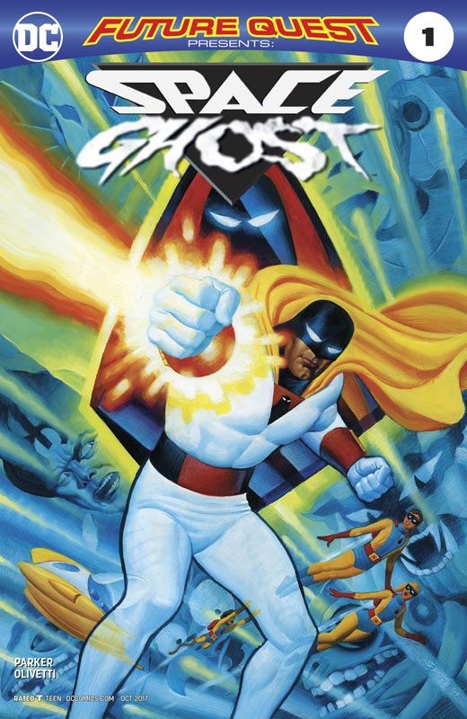
DC Comics Writer Jeff Parker, Artist Ariel Olivetti, Letterer A Larger World Studio
Spinning out of the Future Quest series is the first solo stories of the Hanna-Barbera characters in what appears to be rotating stories. Parker does a nice job of making sure that new readers are in the loop from the events of the series with the needed story details so new readers wont feel lost. The story takes place after the Future Quest series and continues the stories but they focus on Space Ghost and the Herculoids in this story. He continues the threads of the mystery of how he is dealing with the loss of his fellow space force colleagues and how he wants to rebuild the force. What Parker is so good at with these characters is that he is developing deeper stories that the original animated series was unable to do back in the 1960 but he makes sure that they still feel the same. It’s so close that you can actually hear the original voices from the show as your reading the book. He also makes sure that the book keep the simple and fun tone of the original series but really expands the scope of them. The big win for this book is the lush and gorgeous artwork by Olivetti who’s painted art is truly breathtaking. One of the problems that the Future Quest series struggled with was the rotating roster of artist that while the book always looked good it was always a shame that Shaner was unable to do the book consistently. Olivetti is an obvious choice considering that he drew the Space Ghost mini series back in 2005. His painted artwork takes the book to a whole new level and reminded me of the Jonny Quest comic back in the 1980’s with the first few issues drawn by the animated series artist Doug Wildey that gave the comics the same lush artwork. What he also brings is the detail in the colors in the artwork that standard color work rarely attains. The mood that Olivetti brings with the color in the painted work is a marvel to look at.
Is this book worth your time and money? I’m a huge Hanna-Barbera fan and fell in love with their superhero series. Parker has not only brought then back brilliantly but somehow not only makes them timeless like the original series but brings them up to date at the same time. With Olivetti stunning artwork makes this book a real no brainer. If you’re an old or new fan this is a great all ages comic that will please and excite both and a must buy! HIGHEST RECOMMENDATION!
Winnebago Graveyard #2 & 3
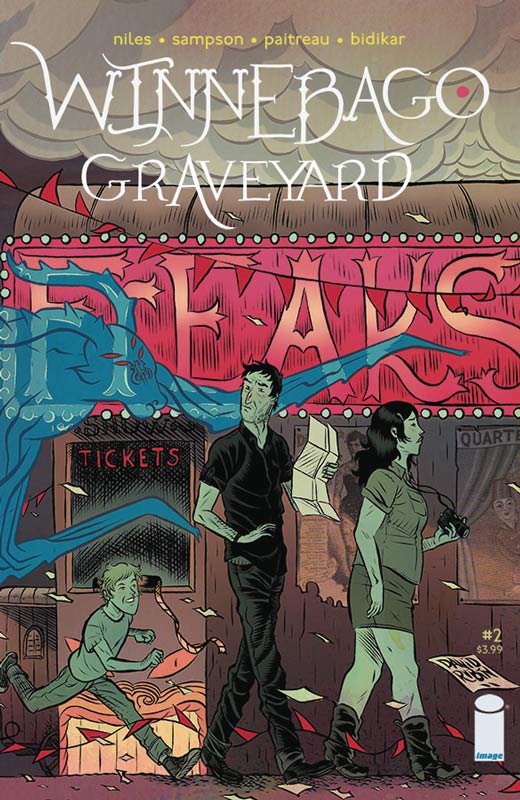
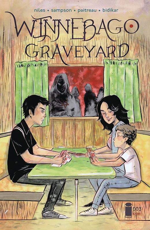
Image Comics Writer Steve Niles Artist Alison Sampson, Colorist Stephane Paitreau, Letter Aditya Bidikar
I didn’t get a chance to review issue two because of SDCC so I will catch up with both issues this time around. Niles has crafted quite a gripping tale with this book and while it will work very well in one reading the only complaint that I have so far is that I have to wait a month while being left on the edge of my seat while reading the book now. Niles is the best horror writer in comics now and this book is one of his best yet. What is making it so good is the slow burn to it that is making it more unnerving than going for cheap shocks. The story does follow some basic horror tropes but as always Niles always finds a way to put new spins on those stories. He does one thing that I have always said it’s not that your story can’t be one that has been done before it just has to be good and well told and that is what Niles has done here in telling a good and compelling tale. He also doesn’t rely on excessive gore and while there is some great blood-letting in the third issue it fits into the tone of the story at that point. The second issue has one of the best chase scenes in a comic that I have seen in quite a while. It got my hear racing and does a great job on building the tension of the book. In the third issue we all of the elements that Niles has laid out start to come together and we see that no one is safe and that the family might not make it out-of-town. He delivers a real sense of danger by the end of the third issue and has me on the edge of my seat to find out how is going to warp it up in just one more issue. The other thing that is working in this books favor is the top-notch artwork by Sampson that is visually bringing great mood and tone to the story in her work here. She is delivering a real visceral experience that is a great complement to Niles script and really captures the emotions that the characters are experiencing. Without giving anything away the last act of the third issue is brutal, horrific and amazing because of the way that Sampson captures it in her line art. Paitreau’s color work on the book pulls all of the elements together with Sampson’s line work and makes this book look great.
Is this book worth your time and money? Horror is hard but horror comics are even harder but Niles I’ve never been disappointed with his work and this continues his winning streak. This is one of those books where the entire creative team is in perfect sync. If you’re looking for a great horror story then this is the road trip for you. RECOMMENDED!
Sheena Queen of the Jungle #0
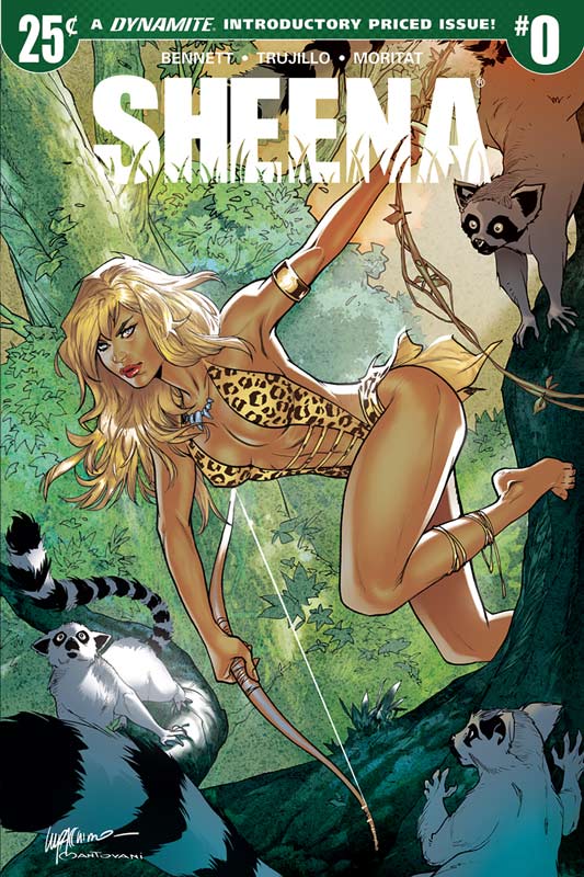
Dynamite Entertainment Writers Marguerite Bennett & Christina Trujillo, Artist Moritat, Colorist Andre Szymanowicz, Letterer Tomas Napolitano
This special 15 page zero issue for 25¢ is a pretty good deal on paper but does it make you want to come back next issue at full price, kind of yes and no. Bennett and Trujillo script does a decent job of telling a short story that introduces Sheena but while it’s nice it never really does much beyond the basics here. It goes through the motions of introducing Sheena and telling a by the numbers intro story. While the story is nice while your reading it, there wasn’t much to compel me to want to buy the first issue. Honestly I’m getting tired of taking older characters and trying to fit them in the current world. Dynamite has done this with nearly every licensed comic and at this point it’s really getting old. The “surprise” at the end of the story is simply boring and you could see it coming a mile away. The only saving grace to the book is the artwork by Moritat that is good but sadly not some of his best. While there is some really good work there are some panels that seem rushed and inconsistent. He usually does better art than here but it far better than the average Dynamite comic that can be pretty bad so in the long run this is a big win for the book.
Is this book worth your time and money? Well it is only a quarter so at that point you can’t really go wrong with buying it to try the book. It’s not a complete loss but it didn’t leave a compelling reason to buy the next issue at full price. The problem with the book is that it’s pretty average and it today’s market that is simply not good enough.
The American Way: Those Above and Those Below #2
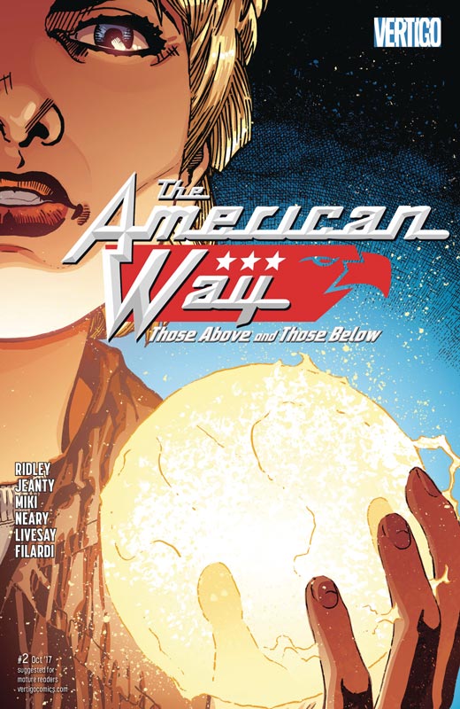
Vertigo Comics Writer John Ridley, Penciller Gerorges Jeanty, Inkers John Livesay & Danny Miki, Colorist Nick Filardi, Letterer Travis Lanham
Talk about a comic that has impeccable timing. While the original America Way series was timely when it came out in 2006 but with the current political and world issues this is more reality than fiction. Ridley script could be on the news at any moment and while it’s hard to read with current events it makes it that much more powerful because both this new series and the original show that the undertones of the story are nothing new and have boiling up for years. What Ridley does best in the script is not necessarily take a side and that the answers are not so simple. He shows that the world is mostly a grey area and that most people are under the impression that its simple black & white or right or wrong and is simply is not. It does however show that the actions of one can dramatically change things. There are no simple solutions to these questions and he leaves it to the readers to come up with both questions and answers. Jeanty art is good but I think that the inking was a bit of problem this issue. It gave the artwork a bit of an inconsistent look this issue, that by no means was bad but it did break the flow a few times but overall it did its job and the book is still good-looking. The one thing that Jeanty does very well is in the facial emotions of the characters and in a book like this that is a key element.
Is this book worth your time and money? This book has become a difficult read for all of the right reasons. Sometimes the toughest stories are the ones that hit too close to home and the timing of this book is very ironic but also needed at the same time. Ridley asks the tough questions that we sometimes don’t want to answer but sometimes you have to look at the way things are and not the way you wish them to be.
Silver Surfer #13
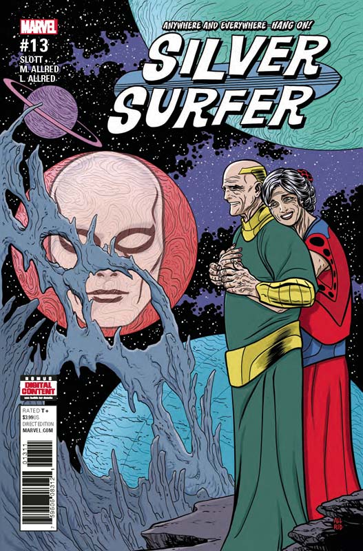
Marvel Comics Writers Dan Slott & Michael Allred, Artist Michael Allred, Colorist Laura Allred, Letterer Joe Sabino
We are coming to the end of the cosmic journey or Norris and Dawn and this issue is very bittersweet. As with all good stories the must come to an end to truly work well and Slott and Allred have taken us to the far edges of the universe and it’s been a great ride so far. But the toughest stories are the ones that have sad endings and this issue is a real tear-jerker. Sometime what we want and what we get are two different things and this story is just that. This issue shows why this book has been working so well and while on the surface it’s been a grand cosmic adventure but it’s the characters that have been the heart and soul that has made this such a memorable run. It also show the perils of time travel in that you may want to try to change things the universe has a way of protecting itself and the outcome is not what you think it will be. The story deals with endings and what will the real ending be is not so sure by the end of the issue. Knowing Slott and Allred they still have a big trick up their sleeve and this issues ending is far from being set it stone. Allred really pulls out the stops with the artwork on this issue. While he is known for his wild and wacky style, it was nice to see the more subtle emotions that he delivered in this story. He delivers some of his most emotional work here and it will truly touch your heart.
Is this book worth your time and money? It’s been a great ride and this issue was simply perfect and that is saying a lot. While most of the time the big event comics are the ones that get the most attention but as with most they are superficial and rarely stand the test of time. This series will be long remembered after most and Slott and Allred have delivered a very heartwarming story that has even surprised me. VERY RECOMMEND!


0 Comments