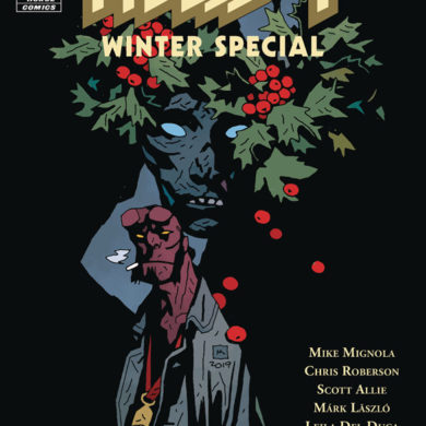
So here is the scoop of why there haven’t been reviews for the past few weeks. There was my nieces wedding in Indiana that wiped out that weekend. Then after getting back to California I got a really nasty cold that I’m still trying to shake and it really wiped me out so bad that trying to write last weeks reviews was a total disaster. So I will get though as many of this weeks comics as I can, then try and do catch up next week if all goes well.
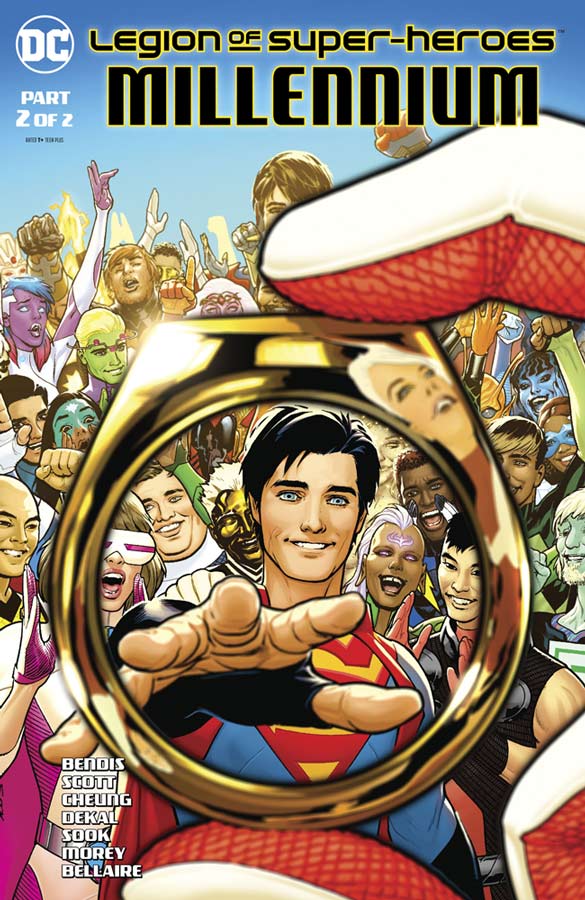
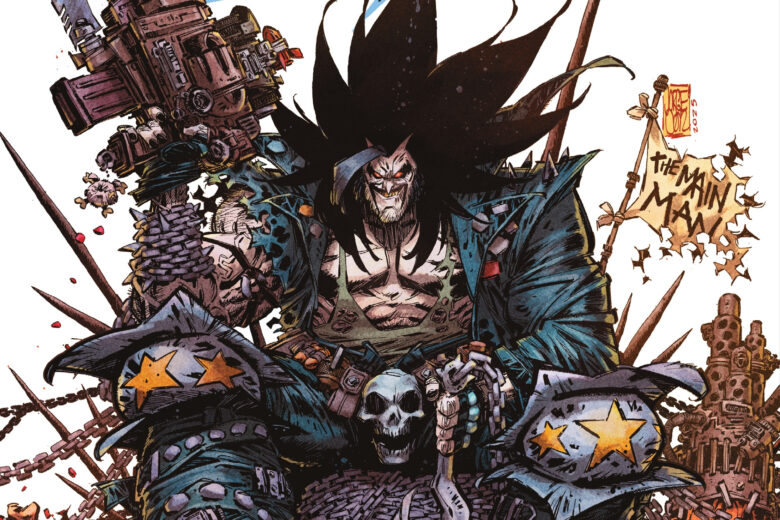
Legion of Super-Heroes: Millennium #2
DC Comics Writer Brian Michael Bendis, Artists Jim Cheung/Jeff Dekal/Ryan Sook/Nicola Scott, Colorist Jordie Bellaire & Tomen Morey, Letterer Dave Sharpe
To say that I was underwhelmed with the first issue of this lead up to the new Legion of Super-Heroes series that comes out next month was an understatement but sadly things really don’t improve much on this second outing either. The problem with both issues is that there really isn’t a story here Bendis apparently felt that having Rose/Thorn bounce around in time would connect things together but that is not how it turns out. Thing of a bunch of short story that seem to go together but end up not really saying much of anything and you pretty much get the gist of this mess. The sad part is that there is some really great artwork he to look at and thats about it. The oddest thing about this comic is that there are no credits for any of the creators on any of the pages and that is not only weird but a huge mistake considering that I may not like the comic but the people who worked on it deserve credit no matter what you think of the final product.
Is this comic worth you’re time and money? I was really hoping that Bendis could turn this one around in this second outing but as with the first issue there is simply no reason to bother to buy let alone read this mess as a primer for the new series coming next month. The saddest thing is that the artists did a really great job here but were totally wasted. SKIP IT!
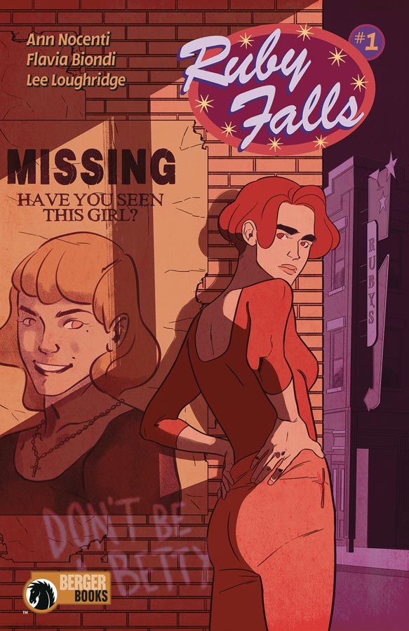
Ruby Falls #1
Dark Horse Comics/Berger Books Writer Annie Nocenti, Artist Flavia Biondi, Colorist Lee Loughridge, Letterer Sal Cipriano
The best way to describe this book is that it’s a lot like Twin Peaks in structure but thankfully builds it’s own story beyond the resemblance. The one nice thing that Nocenti does well in this first issue is balance the exposition of introducing the characters and the story but doesn’t let the story get bogged down so it doesn’t seem like its a tedious read. In fact its quite the opposite in that because of the way that she unfolds the story and that you get to know the characters is a huge plus for this comic. Nocenti does a great job of unfolding the mystery of the town that will have you wanting to come back for the second issue. Biondi’s artwork does a nice job of capturing the emotions of the cast and give the them and the town a nice air of mystery that captures the mood of Nocenti’s script. It’s hard to pull of visual drama in a comic but Biondi does it quite well here.
Is this comic worth you’re time and money? I was pleasantly surprised by this book and was glad I gave it a chance. The only complaint that I had was the cover. Now I’m not saying that the cover is bad and once you read the issue the cover make sense but when you first see it on the stand with all of the other comics it doesn’t scream out buy me, so in this case don’t judge the book by it’s cover and give this one a chance. RECOMMENDED!
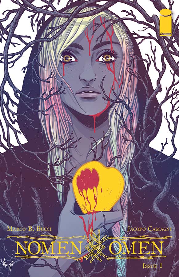
Nomen Omen #1
Image Comics Writer Marco B. Bucci, Artist Jacopo Camagni, Letterer Fabio Amelia
This is one of those comics that after reading the first issue you’re not quite sure what to make of it and yet there is something intriguing about it that you can’t quite put your finger on what you didn’t like about it. One of the things that I did struggle with was the structure of Bucci’s story that I can see what he was trying to do but it did come off on the confusing side. When you do a time jump in a first issue you have to be very clear on who is who and that is where the story kind of lost me. I get that the story is basically angels vs demons but he didn’t keep the story as focused as much as in the first half of the story. The first half is solid but the back half is where it kind of fell apart for me a bit. The artwork by Camagni is quite nice here and does a really good job with the color work on the book that did try and help with the two halves of the story. The black and white part of the book was visually great but I had wished that the script has been more focused to go along with the artwork.
Is this comic worth you’re time and money? I did like a lot of the ideas that Bucci set up here in this first issue but with the book not coming together from the first half to the second half really lost the momentum of the story for me. I still think that I will give the second issue a chance because of the good ideas that are here but I can’t give a strong recommendation either way on this one.
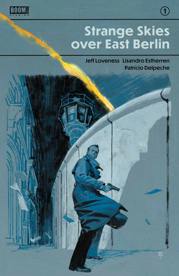
Strange Skies Over East Berlin #1
Boom! Studios Writer Jeff Loveness, Artist Lisandro Estherren, Colorist Patricio Delpeche, Letterer Steve Wands
This comic is one of the biggest surprises of the week. There is something about a story set in the cold war era in the 1970’s especially in East and West Germany. Then throw in a science fiction twist to the story and you really get an intriguing story here. Loveness has done a nice job of capturing the feel for the era in both the story and feel of the time that is a strong reason why this was such a good read. He also is able to capture the undertones of the cold war and how that affect the entire world and not just East and West Germany. Where this comic really kicks is the science fiction aspect that he throws into the mix and gives this spy story a great hook that delivers a great cliffhanger in this first issue. Estherren’s artwork does a great job on capturing the look and feel of the period and the tensions of the situation that Herring is stuck in. The other thing that really helps the look of this comic is the color work that Delpeche adds to Estherren’s line work really gives the visual a great punch that brings this whole comic together perfectly.
Is this comic worth you’re time and money? I really enjoyed this first issue and Loveness gives you a great reason to come back for more. With both strong story and artwork this comic is off to a really great start. VERY RECOMMENDED!
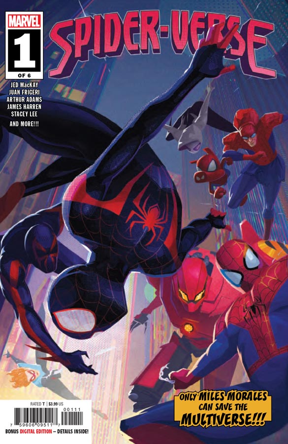
Spider-Verse #1
Marvel Comics Writer Jed MacKay, Artists Juan Frigeri & Carlos Lopez, Stacy Lee, Arthur Adams & Federico Blee, James Harren & Dave Stewart, Dike Ruan & Carlos Lopez, Sheldon Vella Letterer Joe Sabino
With the huge success of the animated Spider-Verse film it was inevitable that Marvel would do a comic based on the idea and while this comic is not bad, it never really quite elevates above average. MacKay spends the entire issue going to different universes but he forgot to have it move the story forward and that is where the book fails. While it’s neat to see all of the different universes it’s really ends up that the tow pages reveal what the point of the story is and by that time I didn’t really care. The book is like a different candy every few pages that is sweet and fun but is not very filling and your left with an empty stomach. The only reason that you don’t get board with the book is the different artists that help move things along visually that you don’t really notice that there is not much of a story here. The best is seeing Art Adams draw more than a cover lately that was a treat but that was the high point for me.
Is this comic worth you’re time and money? While Spider-Fans are probably going to eat this one up the problem here is that there is just not much of a story here and there needs to be a reason to come back to read more but that sadly doesn’t happen here. MacKay threw in a few good ideas here and there but without a story there really isn’t much point to this book. SKIP IT!
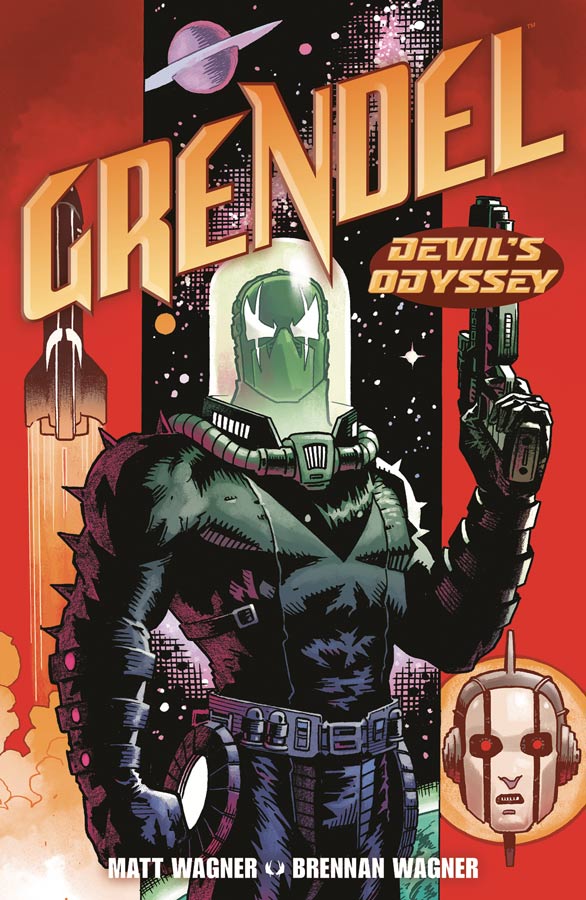
Grendel : Devil’s Odyssey #1
Dark Horse Comics Writer and Artist Matt Wagner, Colorist Brennan Wagner, Letterer Dave Lanpear
One of the best things about the Grendel comics over the years is that Wagner does self contained stories a lot of the times and this one stands on it’s own nicely and is great for new readers to jump right in. There is a nice little recap on the inside cover that is worth a quick read for new readers but you can just start to dig into this one. Wagner set this story up nicely in this first issue and lets you settle in to where he is going to take this story. Telling a space soap opera is always a fun idea and he plays with it quite nicely here. Wagner gives you enough of the mystery to get going but still keep a lot of things hidden so that there is a good reason to see where he takes it. His artwork here is top notch and sense its been a while for a Grendel story that he has drawn you can see that he is having a lot of fun with getting back to it and it really shows here in this first issue. This is some of his best work I have seen and that is saying a lot because the final Mage story was gorgeous.
Is this comic worth you’re time and money? I have been a big Grendel fan for a long time but it’s great that Wagner is making this story a great jumping on point for new readers to join the fun. Setting the story in space is going to give this story a wide latitude to go in both the story and visually that should be a lot of fun. I really enjoyed this first issue and if you new to the book this is well worth checking out. RECOMMENDED!


0 Comments