Happy New Years and the first week of new comic books this year is a bit of a mix but thankfully no real clunkers in the bunch.
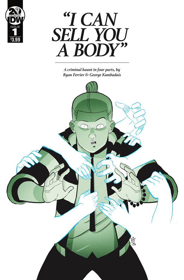
“I Can Sell You a Body” #1
IDW Writer Ryan Ferrier, Artist & Colorist George Kanbadais, Letterer Ryan Ferrier
At first I wasn’t going to pick this one up this week because at first glance visually it didn’t grab my attention but its nice to be proved wrong once I actually read it. Ferrier sets up an intriguing story here that at first seems a bit silly but that is one of the reasons that it works well is that it has a nice dark humor going for it and that gives the comic a nice little charm that makes it work so well. Ferrier does a nice job of setting things up well in the story for this first issue but keeps the pacing of the story moving along nicely here. Kanbadais’s style at first glance looks a bit on the simple side but as you read the story you will see why it works well here. His cartoony style fits the story quite well here and add a nice visual charm to the story and that is why it works so well. He also does a nice job here with the color pallet that gives both the real and the ghost world a nice distinctive look that adds greatly to the enjoyment of the story.
Is this comic worth you’re time and money? This is a comic that will not blow you away but it’s not trying to either. This is one of those comics that just works well for what is a good story with nice artwork to complement it. Ferrier story has a lot of potential to build nicely from this first issue and Kanbadais’s artwork effectively brings it all together. This one was a nice little surprise this week and is worth checking out.
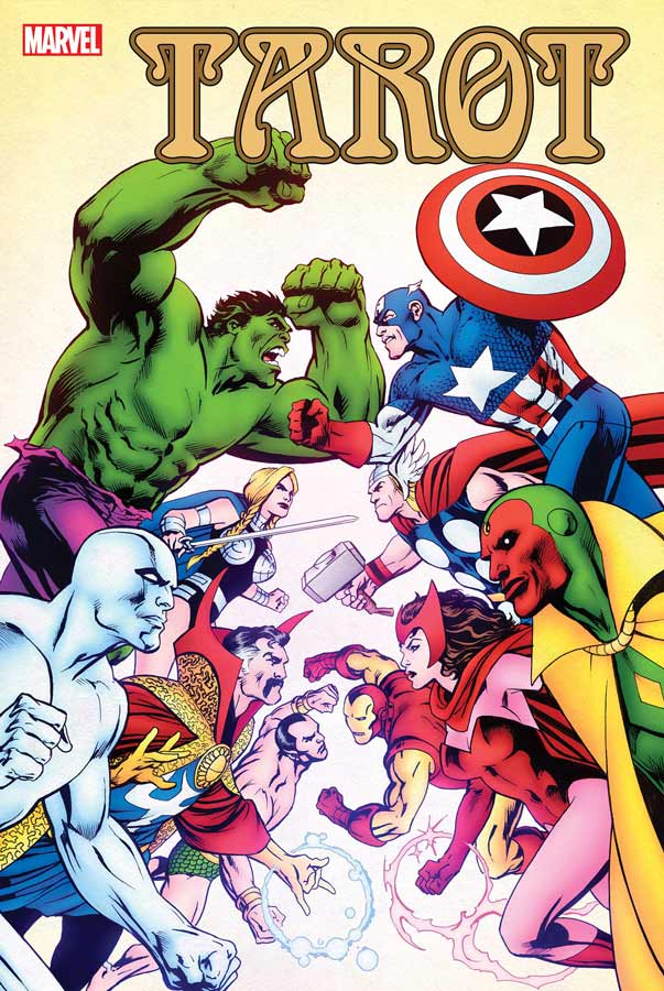
Tarot #1
Marvel Comics Writer Alan Davis, Artist Paul Renand, Colorist Paul Mounts, Letterer Clayton Cowles
As you know I’m a huge Alan Davis fan and was excited for this mini series but was disappointed that he was not doing the artwork for it but was willing to still give it a chance and I’m happy to say that Renand has done an admiral job of the artwork. The story is a nice what if type of story that is not ground breaking but it just tell a simple story very well. Davis script does a nice job of setting thing up here but keeps the story moving along at a nice pace that doesn’t end up being exposition heavy that made for a nice read. While I am not familiar with Renand’s artwork I suspect that Davis might have done the layouts for this book because there are many panels that resemble his artwork but you can tell that the overall artwork is Renand’s. The artwork is very nice here and he captures both the drama and big action scenes very well here and puts a lot of detail into each panel.
Is this comic worth you’re time and money? I rather enjoyed this book for what it is and that is a simple good old fashion superhero team up book with the Avengers and Defenders. Davis keep things on point and that is why it works so well here because it’s not over done like a lot of Marvel Comics have become and that made it really refreshing and that alone made it well worth buying this week.
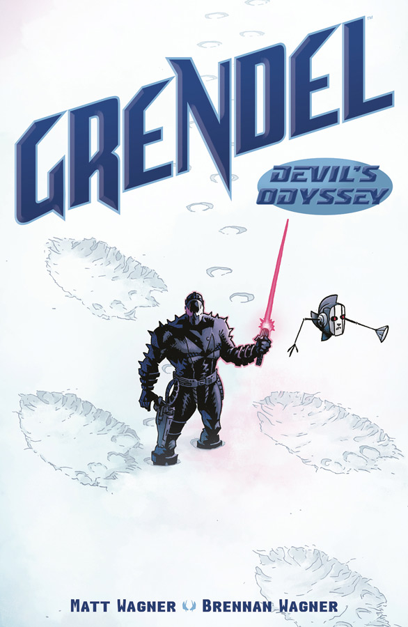
Grendel Devils Odyssey #3
Dark Horse Comics Writer and Artist Matt Wagner, Colorist Brennan Wagner, Letterer Dave Lanphear
This new story has really bene impressive so far but I have to give Wagner that this issue is really nice because instead of just telling a one issue planet story like the last issue this issue goes deeper with just the first part of this planets story and wow what a story it is. There is also a intriguing flash back to a previous war that is obviously leading up to something in the future story. Wagner is moving the story along at a nice pace and is getting deeper into the point that Grendel finding an inhabitable planet is not going to be that easy and it seems to be getting worse. As always Wagner’s artwork is simply amazing and he captures all of the big and small details with such precision that shows what a great talent that he is.
Is this comic worth you’re time and money? With only three issues so far its safe to say that Wagner has come up with one of the most epic Grendel tales to date and then add in that he is doing the artwork makes this an even bigger treat. While the story is grand there is a smaller personal tone to the story that makes it very satisfying to read. This is a must read comic. VERY RECOMMENDED!
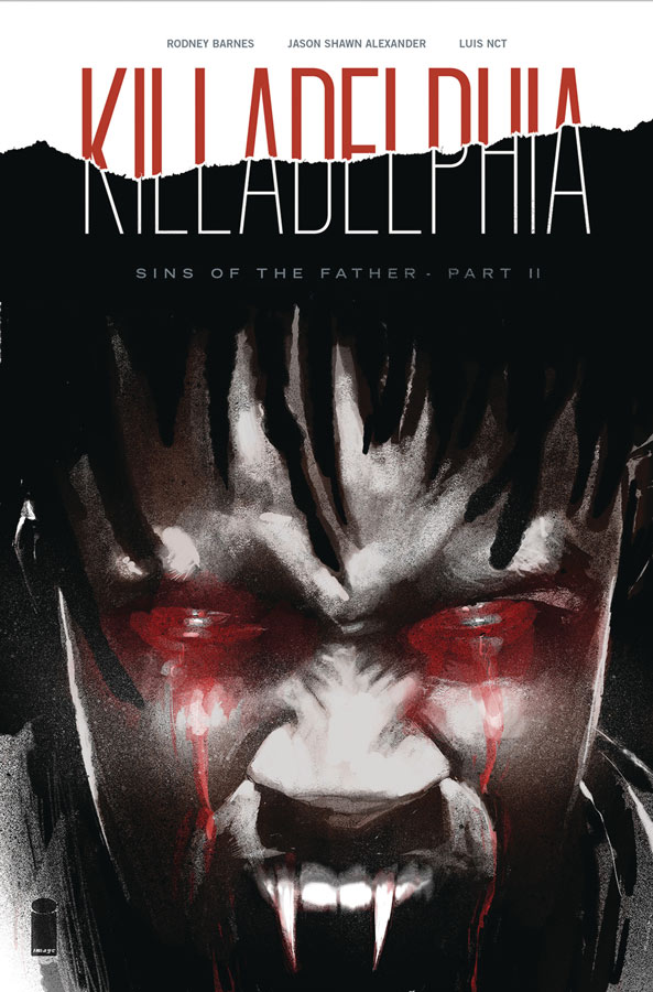
Killadelphia #2
Image Comics Writer Rodney Barnes, Artist Jason Shawn Alexander, Colorist Luis Nct, Letterer Marshall Dillon
The first issue was very intriguing and a nice twist on the vampire genre and this second outing builds very nicely on it. Barnes picks up from the impressive cliffhanger of Jimmy discoing that his dad is still alive but as a vampire but also is able to continue the case of what are the vampires up to and he reveals it here and it is certainly not what you were expecting and the reveal is quite impressive. What I like that Barnes has done here is that the vampires are not just mindless drones and that they are not all necessarily with the big plan of the head vampire and that gives the story a unique feel and tone. Alexander continues to impress with his artwork in the book that captures the tone and mood of Barnes script quite well here. The thing that he does well here is the emotional drama of the characters and their facial expressions that is one of the big reasons why this story is working so well.
Is this comic worth you’re time and money? I am really enjoying what Barnes and Alexander is doing here with this comic. While its deeply rooted in the horror genre, it is also not cliche that is making it stand out from the pack. There are some great twists and turns in the story that will keep you guessing as to what is going to happen and that is making this one quite impressive and is still worth checking out.
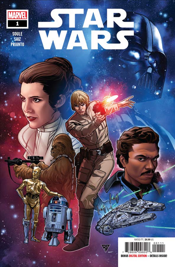
Star Wars #1
Marvel Comics Writer Charles Soule, Artist Jesús Saiz, Colorists Jesús Saiz & Arif Prianto, Letterer Clayton Cowles
Nothing sell like nostalgia and that is what Marvel is banking on here and with mixed success. I will give Soule that he knows his classic Star Wars quite well and does a nice job of making the characters feel like the original actors are in this story and that is not the easiest thing to pull off in a licensed story. The biggest question is this a story that really needed to be told and for me I’m not so sure. I will be really honest here that I’m pretty burnt out on the whole Star Wars fiesta and after the last movies I can honestly say that this comic is better than that but again that is not saying much. While reading this story I did find it fairly enjoyable but I don’t think that it’s was something that needs to be told either. I have to say that Saiz’s artwork on the book is very impressive and captures the actors perfectly and that is no easy feat. He does a great job of laying out the story so it doesn’t feel like a licensed comic but captures what a comic can do visually and that greatly impressed me. He handles the drama and big action scenes with ease and its a great looking comic book.
Is this comic worth you’re time and money? The bigger question is, does this in-between story need to be told and that is where I struggled with the story. It just simply feels to easy to go back to the well and somewhat rehash elements that are not truly necessary. I would have rather seen a side story that is within continuity but not beholden to it at the same time and that is where for me the comic kind of fails. This comic is simply for the people who will simply buy anything Star Wars and that is not enough for me any more. I will say that Soule and Saiz do a great job here and its a pretty good story with great artwork but I just don’t think it was anything amazing.
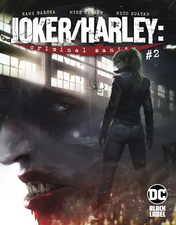
Joker/Harley: Criminal Sanity #2
DC Black Label Writer Kami Garcia, Artists Mike Mayhew and Mico Suayan with Jason Badower, Letterer Richard Starkings
I wasn’t overly impressed with the first issue of this story but I have to say that Garcia did a nice job of making this second outing a lot better than the first. I think that one of the problems with the first issue is that it just got off to such a slow start and was too exposition heavy that kept it from working well but this second chapter resolves a lot of those issues and starts to get to the meat of the story. The thing that this book does suffer from is that there are too many Joker and or Harley Quinn Black Label books rich now and this one is not quite as strong as some of the others. What really helped this issue is that this Joker is not the Joker that we are familiar with and the backstory that Garcia tells here is very impressive and give me new hope for this book. Mayhew and Suayan continue to make this book look great and with this second issue story finally giving the two artists better material to work with they both turn in very impressive work here. While their styles are different in a lot of ways they very much complement each other nicely. Suayan handles the black and white parts and Mayhew does the colored ones they both have a semi realistic style that adds greatly to the book. There are some pretty disturbing elements in this issue but both handle it with a great touch to get the point across but not dwell on it so that its overtly disturbing.
Is this comic worth you’re time and money? With this second issue much improved story the book is back on track and might turn out to be a good surprise after all. While I’m still not 100% sold on it yet I will say that after this issue I will give it a better chance from this point to say that its well worth checking out now.
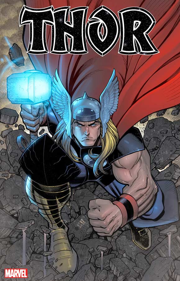
Thor #1
Marvel Comics Writer Donny Cates, Artist Nic Klein, Colorist Matthew Wilson, Letterer Joe Sabino
Yet another relaunch of Thor that makes it at least three over the last few years and the question is this a good or bad thing. The simple answer is maybe. Cates script has some moments and the one plus is that he injects some humor into the book that was a nice addition but most of the time it felt like he was trying to re-invent the wheel here that didn’t need to be re-invented. For me the measure of any Thor story is going to have to measure up to the Walt Simonson run on the book back in 1983 that took the book in a new direction but still kept the core of what and who Thor is. I will give Cates that his story was better than the past couple of reboots but where he kind of lost me was the twist cliffhanger ending to this first issue and it just seemed out of place and trying to be shocking for shock value. Without giving anything away is painfully obvious that this “change” will not ultimately last long and that is where Cates lost me. I will give it that he writes the book to welcome new readers to the series in that he gives enough exposition to get you to be able to jump right into the story without feeling like you were missing something. I have to say that Klein’s artwork really impressed me here and gave the book a great lift with the art. I think what helped it immensely was Wilson’s color work that really brought Klein’s line work to life and complemented it greatly. There is a lot of great wow factor to Klein’s artwork but its the more subtle dramatic moments that will really impress.
Is this comic worth you’re time and money? I will say that this new reboot gets off to a better start than I thought it would and its certainly not terrible by any means but, I just felt that the story never quite got me to the point of wanting to read the second issue. It starts off quite good but the ending just felt cheap and easy to get a shock out of readers and that really fell flat for me. Klein’s artwork might get me to give the second issue a chance but that would be about it for me on this one.
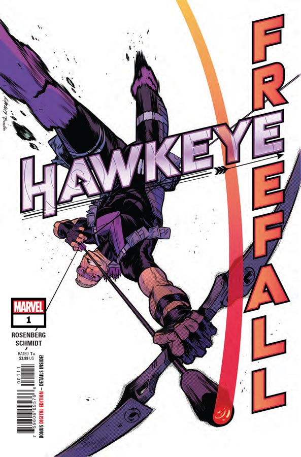
Hawkeye Freefall #1
Marvel Comics Writer Matthew Rosenberg, Artist Otto Schmidt, Letterer Joe Sabino
I was a big fan of Kelly Thompson’s take on Hawkeye in the last run and the West Coast Avengers with Clint’s character and was hoping that this new series was going to be able to keep it going and it does to a point. Rosenberg does keep the sly humor of the characters and that gave the story a fun read. I felt that the first issue was good but not quite great but it shows promise. There were a few times where the dialogue was a bit on the thick side but it thankfully didn’t drag the story down too much. I liked Schmidt’s artwork on the book that has a faint hint of cartoony style to it that adds a great visual charm to the humor of the book. He also has a lot of fun with facial expressions that adds greatly to the overall fun nature of the comic.
Is this comic worth you’re time and money? While this first issue didn’t blow me away it did however capture me with its fun charm and whit that made for a breezy read this week. I will give the book a few more issues to see if Rosenberg is able to build the story out from this first issue. If you are able to afford this comic this week you should give it a spin.


0 Comments