Nothing like the start of a new year and kicking it off with getting sick with a cold, ugh! I hope that things are going better for you out there. Well at least this weeks new comic books kept me company so lets get to the reviews.
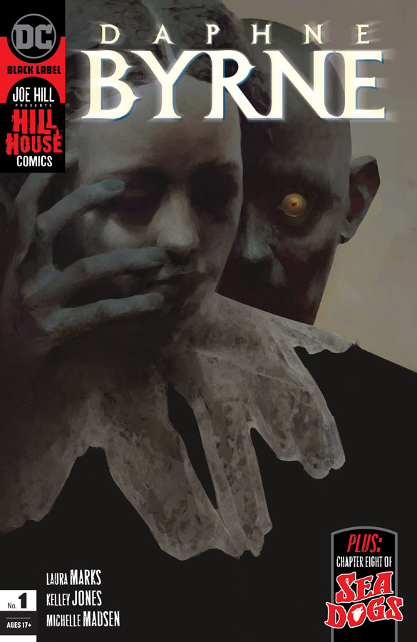
Daphne Bryne #1
DC Black Labe;/Hill House Comics Writer Laura Marks, Artist Kelley Jones, Colorist Michelle Madsen, Letterer Rob Leigh
The newest of the Hill House Comics brings the great Kelley Jones to the party and is off to a great start with this first issue. The story in this first issue is pretty exposition heavy but Marks does move things along well with the large set up to the story. She does a great job of introducing Daphne as a character and while were not quite sure what her dreams mean but you care for her and that is important here. She is a strong, smart and an outcast and yet you sympathize with her loss of her father and the strain on her and Marks gives you reason to care for her. One of the big reasons that the book starts strong out of the gate is with Jones’s gorgeous artwork on the comic that captures the horror elements so well but its the subtle emotions of Marks script is where it succeeds so well. He does a brilliant job of capturing the emotions that Daphne is going through and that is the core of what makes this comic so intriguing is that he invites you to go on the journey with her and to discover what is haunting her dreams and what they mean. Jones’s artwork is beautifully colored by Madsen who brings a perfect blend of color to his rich and moody artwork that complements his lush blacks and shading.
Is this comic worth you’re time and money? I really enjoyed this first issue but it’s defiantly a first chapter of a story meaning that there is still a lot to be revealed but the set up here is impressive even with the mysteries of the story that are yet to be fully revealed. As long as you know that you will enjoy this first chapter. Marks script is paced well here and having Jones artwork here brings this book to life perfectly. I’m intrigued to see where they take this story because there is a lot of questions that I can’t wait to see how they are answered. VERY RECOMMENDED!
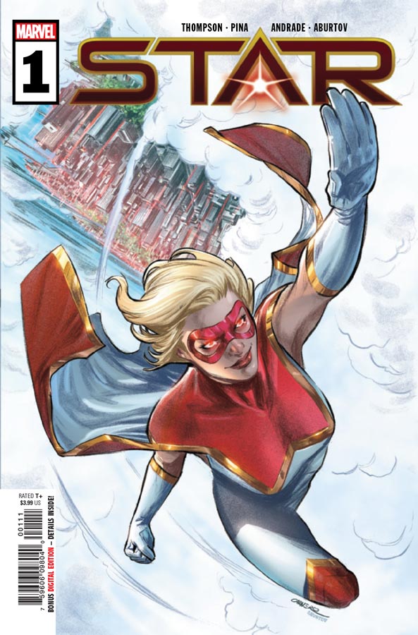
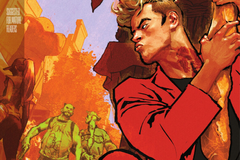
Star #1
Marvel Comics Writer Kelly Thompson, Artists Javier Pina with Philipe Andrade, Colorist Jesus Aburtov, Letterer Clayton Cowles
This is a comic that really shows that Marvel is simply flooding the market to retain their lead in overall shares because it’s not that this comic is bad but simply unnecessary. Look I’m a fan of Thompson’s writing and its not that this is poorly written but it simply is a really boring comic that doesn’t give you much reason to care about anyone or anything. One of the biggest problems with this title is that if you have not been following the regular Captain Marvel book you will be totally lost with most of the plot threads going on here. While its nice to see a new female character you would be hard pressed to bother reading past this first issue with such a lackluster story and convoluted continuity. So you are left to wonder is she a villain or a superhero and neither of those questions are answered by Thompson here. The only saving grace of the book is the artwork by Pina and Andrade that is quite nice her but overall wasted because you simply go through the motions of “reading” this story that ultimately goes nowhere.
Is this comic worth you’re time and money? The biggest problem is that this comic really is just filling shelf space and isn’t going to get even hardcore Captain Marvel readers to buy this one. I feel bad for Thompson here because she is better than this and its not unreadable but I feel that the bigger issue is that this character simply didn’t need her own book even for only five issues. This one is proof that good art can’s save a bad book. SKIP IT!
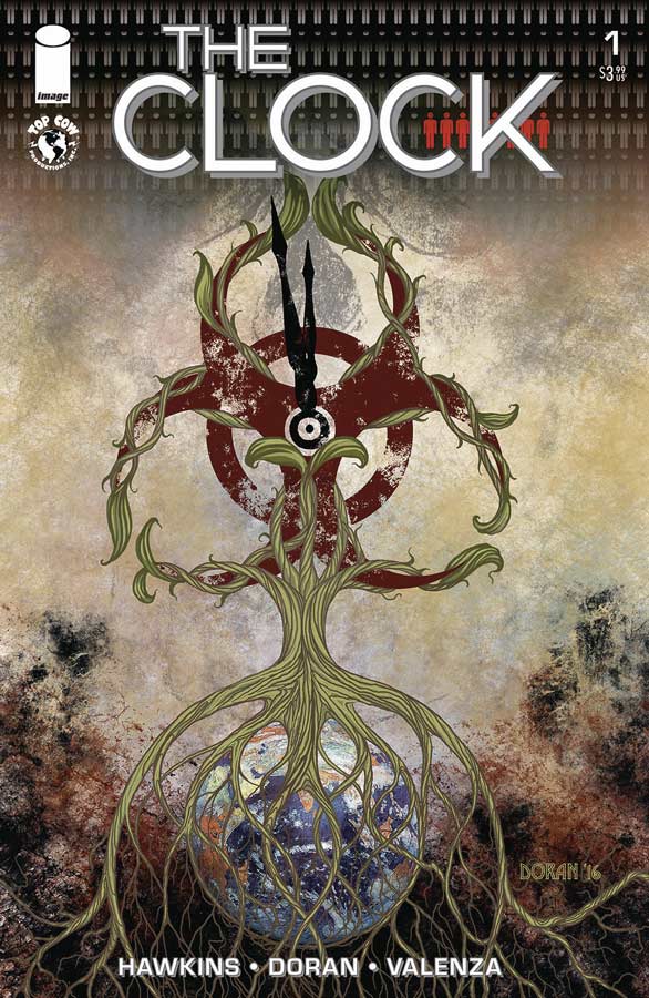
The Clock #1
Image/Top Cow Productions Writer Matt Hawkins, Artist Colleen Doran, Colorist Bryan Valenza, Letter Troy Peteri
At first glance this book wont necessarily stand out this week but a recommendation from my comic shop to read this was spot on. Hawkins script is spot on with its timely story that could be ripped from the headlines and as frighting this story could be he wisely keeps it from becoming too depressing. While there were a few pacing issues that I had with the story overall the concept is quite intriguing and the cliffhanger of the story could either be really good or fall off the rails but there is enough here to give the book a second issue chance. The exposition is pretty thick here and it does slow this first issue down but not fatally. It’s been quite a while since I have seen Doran’s artwork on a comic and while its far from her Distant Soil work look wise but that style wouldn’t fit this story. She gives it a more realistic look that complements the story quite well here and with the dialogue heavy story she moves the story along visually that helps it out greatly. What she brings to this book is the spot on facial expressions that deliver the emotions of this story.
Is this comic worth you’re time and money? This first issue is a bit rough around the edges there it does however show a lot of promise with its concept. It will be interesting to see where the second issue goes but there is enough here that you should give the book a chance.
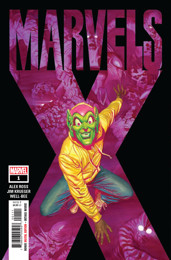
Marvels X #1
Marvel Comics Story Alex Ross & Jim Krueger, Script Jim Krueger, Artist Well-Be, Letterer Cory Petit
A prequel to the long ago Earth X series is a bit of a mixed bag that seems odd to do a followup series 21 years later and have readers jump into this continuity. With that being said the story does somewhat stand on its own but while it was a decent read there wasn’t an overwhelming compelling story here. Krueger script is very by the numbers and while it moves along well there is not much depth to the story or the characters. While you like David and sympathies with him there is not much to care about beyond the basics here. I really enjoyed Well-Be’s artwork on the book and he does a nice job with the visual continuity of the original Earth X artist John Paul Leon but visually makes this book his own. His artwork is the one thing that does really work well here. He does his best to elevate the story but he is only able to do so much with so little.
Is this comic worth you’re time and money? This comic is not so much bad but disappointing. If your going to do a prequel to a 21 year old comic you should at least set things up because so few readers are going to remotely remember the original. This is one of those that is good but simply not good enough. SKIP IT!
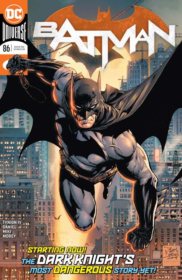
Batman #86
DC Comics Writer James Tynion IV, Penciller Tony S. Daniel, Inker Danny Miki, Colorist Tomeu Morey, Letterer Clayton Cowles, Epilogue Artist Gullem March
A new creative team takes over DC flagship Batman title and having to follow Tom Kings solid run on the book is no easy feat and this first issue is off to a so-so start. Tynion has been writing Detective Comics recently and as with that book tends to be dialogue heavy and that can be a good or bad thing depending on how it pans out and here it tends to be a distraction more often then not. Its not that the story is bad it just a pretty by the numbers affair here. There were a lot of readers who did not like what King was doing on the title but at least he brought something new to the table but Tynion seems to brought on to the book to get it back to more mainstream and less outside the box and that is where the book struggles because there is a real lack of momentum to the story. This is a story that you have read a million times before and that is not what I am looking for in a comic. Daniel’s artwork as always impresses and he is a solid Batman artist and I can see why they brought him back on the book because visually he elevates the book but as you read the story you find that while its visually impressive there is little impact that the story you are reading is average.
Is this comic worth you’re time and money? If you were not a fan of King’s Batman run then you are probably going to like this new direction but if you’re like me this is not going to impress you very much. Tynion was hired to put this book on a straight track and he has done that well here but both DC and readers should want more than just an average Batman book each month. So if that is what you are looking for then you will like this but if you want more then you will have to wait for the Tom King book coming in a few months.
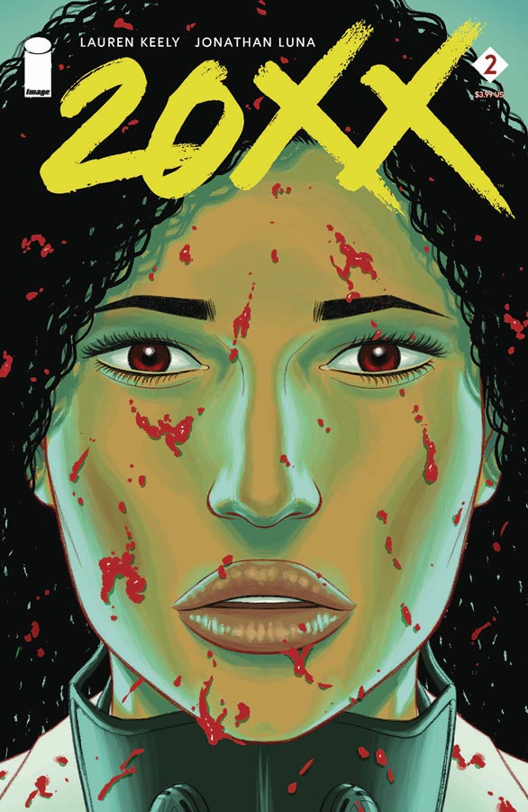
20XX #2
Image Comics Writers Lauren Keely & Jonathan Luna, Artist & Letterer Jonathan Luna
I was very impressed with the first issue of this title and while I liked this second issue I did however find the dialogue to be a bit too thick at times that slows the pacing of the story down a bit more than I would have liked. I think that Keely and Luna tried to fit way too much story into this issue and it does drag it down at times pretty badly and its not to say that the story is bad but it’s just that compared to the first issue that had such great pacing that this issue really is a tough read too many times. Because there is so much dialogue reading this issue is a bit of a slog and has me worried about this book. On the plus side Luna’s artwork is always spot on and he does a nice job of fitting in artwork in panels where there is more dialogue than artwork and because there is so much dialogue the are so many more panels than previously that makes it feel more cramped than it should be.
Is this comic worth you’re time and money? I was pretty disappoint with this second issue and not because it wasn’t good the story is still solid but it almost like it was reading two full issues at once and it really became an issue of pacing that hurt this second outing. I will still give the book a little more time because the overall story is still quite intriguing but hopefully the next issue will get things back on track.
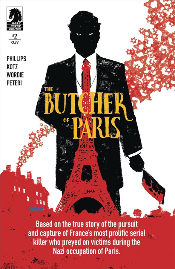
The Butcher of Paris #2
Dark Horse Comics Writer Stephanie Phillips, Artist Dean Kotz, Colorist Jason Wordie, Letterer Troy Peteri
This is an interesting story that blends real life events with fiction and is making for a wild ride. The second issue does a nice job of fleshing out the story from the first issue and we start to see that things might not quite be what they seem between the French and the Nazis and that the murders might have a connection to both sides. Phillips gives the characters nice breathing room here and we start to see the toll it is taking on Georges and Bernard to solve the mystery. Kotz gritty style nicely complements the story and gives the overall comic a strong visual that captures both the horror and the emotions of it all. The scene in the club in particularly well done and delivers great tension that is impressive.
Is this comic worth you’re time and money? I like the slow burn of this story and while it may not be a comic for everyone, I’m still intrigued to see where the story goes. There is a lot to take in with this book and if you are looking for something with more than a basic murder mystery you should give this one a try.


0 Comments