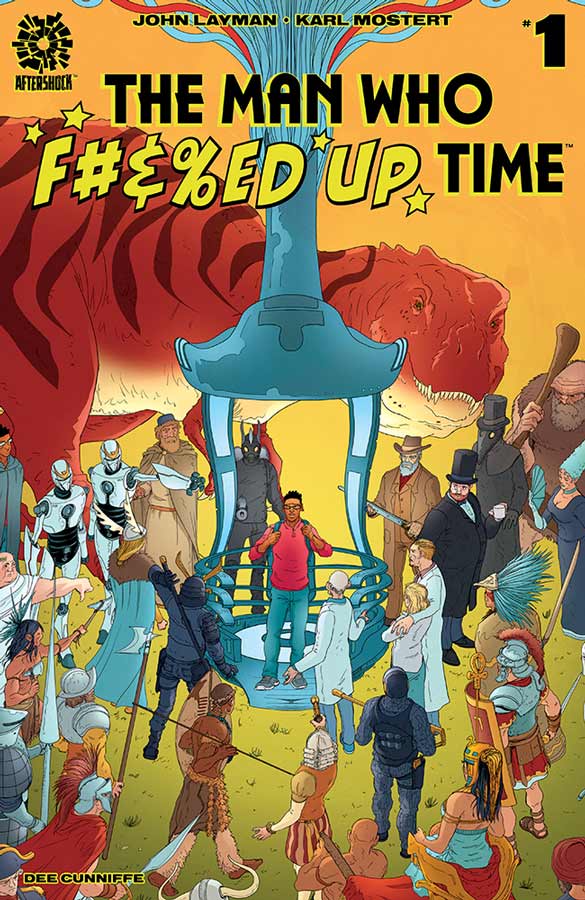
The Man Who F#&%ed Up Time #1
Aftershock Comics Writer John Layman, Artist Karl Mostert, Colorist Dee Cunniffe, Letterer John Layman
What I found most interesting about this comic is that nearly all of the plot points of this story you have read many times before but I will give Layman that he threw it all in a blender and made it fee fresh and new here. The basic premise here is be careful what you wish for story but he gives it a sly sense of humor and some nice twist to the story. Layman takes the time here to not only set up the story but to develop Sean as a character so that when he screws up time you can relate to it. Mostert’s artwork is nice here and while there were a few minor inconsistencies here and there overall he did a nice job of conveying the emotions of the characters and the scope of the story.
Is this comic worth you’re time and money? This first issue is a nice set up and shows a lot of promise the key is going to be the second issue to see where Layman takes the story. The cliffhanger at the end was a nice surprise and hopefully Layman will continue to surprise readers as the story goes along. While I wasn’t necessarily blown away by this first issue I did however finding charming and fun and is worth giving this comic a chance if you are looking for something a bit different.
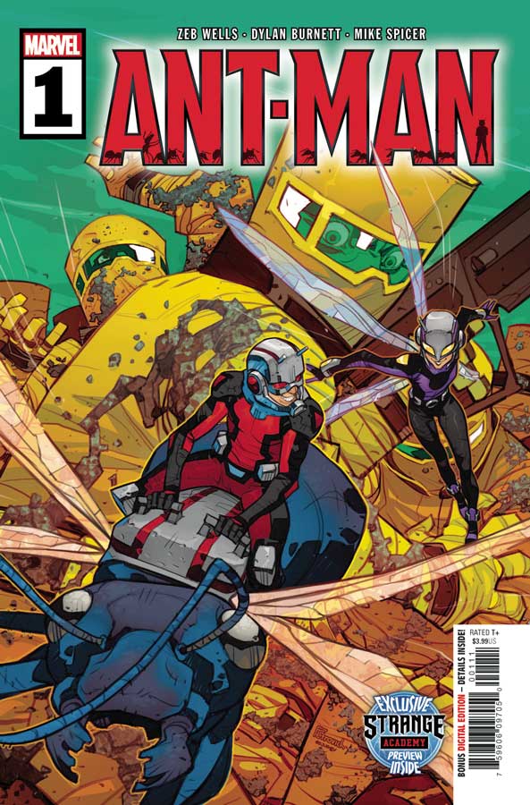
Ant-Man #1
Marvel Comics Writer Zeb Wells, Artist Dylan Burnett, Colorist Mike Spicer, Letterer Cory Petit
With the end of Squirrel Girl a few months ago there was a huge gap left in the Marvel line for a comic that was fun but a great all ages comic that was not aimed at kids. This new Ant-Man series is on the right track here to possibly fill the void. I love that Wells makes this silly and goody and yet delivers a solid first issue that sets things up nicely here and keeps a nice balanced of both fun and classic superhero adventure that blend together quite well here. The other thing that benefits the comic greatly is Burnett’s artwork that has a nice cartoony style that fits Wells script like a glove. He is able to capture all of the subtle humor of the story and at the same time deliver the superhero elements perfectly as well. I really have to point out the lettering by Petit that is nearly artwork itself at times that really makes this book pop.
Is this comic worth you’re time and money? I have to give credit to Wells and Burnett for delivering a surprisingly good comic book here. Ant-Man has always been a goofy character and they defiantly play with that here that is a big plus for this comic. Burnett’s artwork really impressed me here and added greatly to the enjoyment of this first issue. Lately most of Marvels new series have been quite disappointing but Ant-Man nearly washes those bad taste right out with this first issue and I cant wait to see where they take it from here. RECOMMENDED!
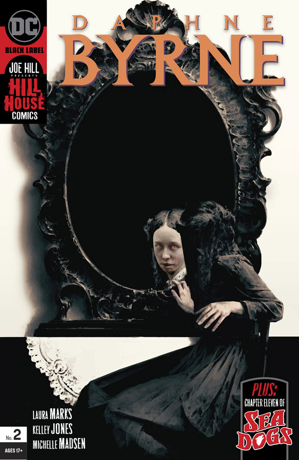
Daphne Byrne #2
DC Black Label/Hill House Comics Writer Laura Marks, Artist Kelley Jones, Colorist Michelle Madsen, Letterer Rob Leigh
I liked the first issue but it did get off to a bit of a slow start but there was a lot there to get started with but this second issue really hits the ground running and builds greatly from there. Martin does a great job of having the story unfold at a nice methodical pace that is allowing the story to wash over you and slowly seeps into you as you are reading it. I like how she peels back the layers of Daphne and the spirits that are either haunting her or helping her and that is what is making this story so intriguing. As we see this issue there is a lot more going on under the surface with her and that there is something inside her beyond voices. This is one of those comics where the story and artwork blend together perfectly because Jones is one of the few artists that can bring this story to life in a way that captures all of the big and subtle moments of the story. While the horror elements of the story are a given with him the thing that impresses me the most with his artwork is how he captures Daphne’s decent into madness because of the voices that are talking to her and that is why this book is working so well. There is so much to take in with each panel of artwork here that you want to take you’re time and savor every moment of it while you are reading it.
Is this comic worth you’re time and money? I wasn’t too worried about this book with the first issue because you could see that Marks and Jones were setting things up and there was a lot of exposition that they had to get out of the way and with this second issue all of that pays off and they build on it greatly here. This is another winner for the Hill House Comic line and with the cliffhanger at the end of this issue will really blow you away. HIGHLY RECOMMENDED!
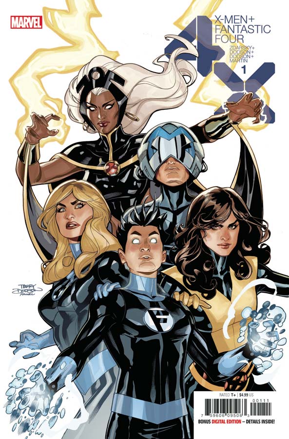
X-Men + Fantastic Four #1
Marvel Comics Writer Chip Zdarsky, Penciller Terry Dodson, Inkers Rachel Dodson, Dexter Vines & Karl Story, Colorist Laura Martin, Letterer Joe Caramagna
Let’s be honest here that these types of crossover books have pretty basic stories that have basic reasons to have heroes get together. There is a crisis that turns into a conflict between the teams and then they fight and then a villain shows up and that formula continues here. The question is always can a writer at least make all this basic and formulaic tropes deliver something that is mildly entertaining? Well at least Zdarsky tires his best here and while there are no big surprises here story wise its at least a pleasant read for at least this first issue. The main reason that this one is at least elevated above the average is because of Dodson’s artwork that adds class to the basic story here and while there are times where the detail in some of the panels are weak overall it has a nice look. I think some of the problems might stem from having three inkers on the book but when its good its really good but the weak spots are noticeable.
Is this comic worth you’re time and money? This is certainly far from terrible and if you go in knowing what you are getting into then for what it is, its a fun team up of the two teams. If you are expecting a brilliant comic book here then you have certainly come to the wrong comic folks. In the end it was a decent read with nice artwork.
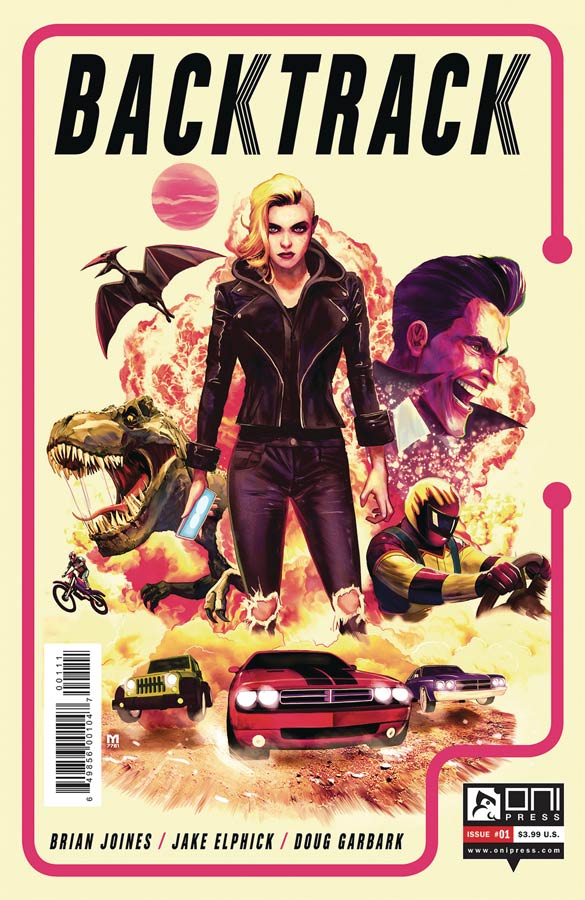
Backtrack #1
Oni Press Writer Brian Jones, Artist Jake Elphick, Colorist Doug Garbark, Letterer Jim Campbell
What happens when you mix racing with dinosaurs? Well this comic finally answers this burning question. Jones script is decent but there is this nagging feeling while you are reading it that its all too familiar and that is because it is. If you have ever seen Death Race or other stores with the same plot then that is what you get here. That is not to say that this comic is bad but its certainly not original by any means and that is where it lands and that is somewhere in the middle. I will say that when the dinosaurs start attacking the racers it makes for a pretty impressive visual scene thanks to artist Elphick. That is the one thing that does elevate this comic is the artwork that has a strong visual flare and helps you forget that you have read this story before.
Is this comic worth you’re time and money? The biggest problem here is that Jones doesn’t really bring anything new to the formula of this story and even the cliffhanger is pretty anticlimactic that sadly seals the deal on this one. It’s certainly not a bad comic book by nay means but while it has some moments while you are reading it, but it doesn’t leave you much in the end.
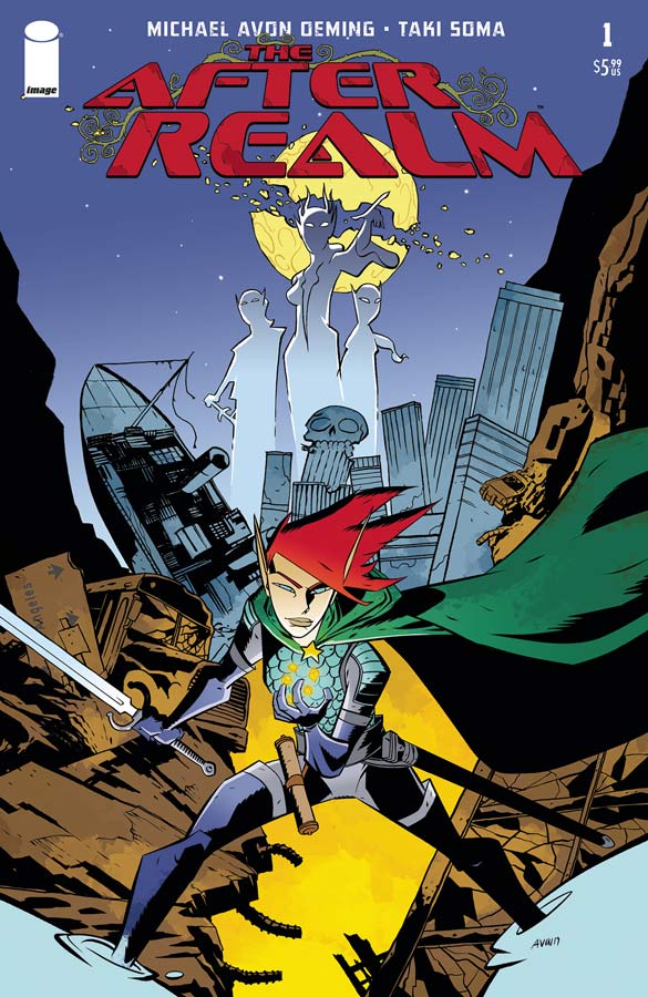
After Realm Quarterly #1
Image Comics Writer and Artist Michael Avon Oeming, Colorist Taki Soma, Letterer Shawn Lee
I am a huge fan of Oeming’s work and his new comic gets off to a bit of a rough start here. He takes a lot of different mythologies here and blends them into an intriguing idea with them but I found that the story ending up being a bit disjointed because of it. I think that my issue with it comes where he spends too much time on Oona in setting her character up and it becomes a bit on the repetitive side and that is where he kind of lost me. On the other hand there is a lot to like about this story and I did like the mythology for the world that he is building here. On the plus side his artwork is always solid and there is a lot to like here with the fantasy elements of the story that lets him go pretty wild with the visuals here. The only issue that I had with his artwork was the cover that was not the best choice here and doesn’t do the comic any favors to entice someone to pick this comic up off the rack.
Is this comic worth you’re time and money? This one was a bit middling for me because I felt that this first issue was bloated and didn’t move the story forward as well as it should have for a double issue. The story was also a bit confusing at times and lacked focus to keep it on track. With that being said I do feel that there is a good idea here but its unfortunately buried under too much. It’s a real shame about this comic because there is a good amount to like here but it never quite rises above its potential.

Adler #1
Titan Comics Writer Lavie Tidhar, Artist Paul McCaffrey, Letterer Simon Bowland
So basically what you have here is The of League of Extraordinary Gentlewoman in the Sherlock Holmes universe and shows promise here. This first issue is pure exposition that works well in setting things up here but doesn’t leave room for much else but in a lot of ways it does help readers that are not familiar with the cast of characters. Tidhar does a good job here of setting up the story and its players for the story. I would have liked a bit more than that here but it is only the first issue. The story moves along well and McCaffrey’s artwork helps it out quite well here. While there is a tad of stiffness to some of the artwork overall it has a nice clean look to it that fits the era that the story takes place in that is a big plus for the book.
Is this comic worth you’re time and money? This first issue will not blow you away but does set things up for the overall story. Tidar does a good job of introducing the cast and while it may not be the most exciting comic that you read this week it showed a lot of promise and will see what he brings for the second issue. McCaffrey’s artwork give the comic a nice period feel and look that helps it out nicely. If you are looking for something a bit different then you should give this one a chance.
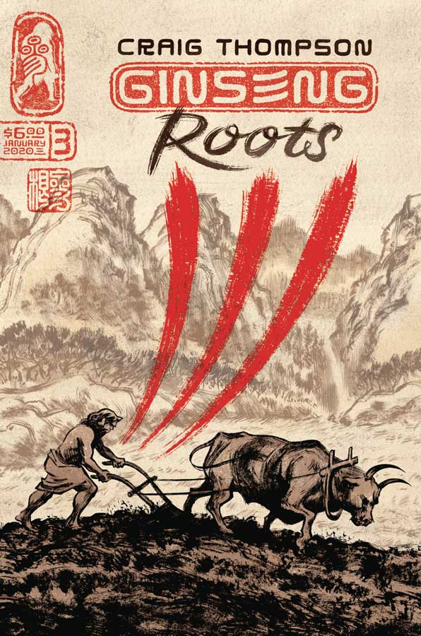
Ginseng Roots #3
Uncivilized Books Writer/Artist/Colorist/Letterer Craig Thompson
One of my favorite books continues to be inventive and amazing with each passing issue. There are so many things that Thompson is doing here with this comic that is so many things such as biography, history lesson and now Chinese mythology about Ginseng. Who knew that there was so much to know about this little root and that Thompson blends so many different things here in the story that makes it so fascinating to read. This third issue has so much packed into it that you really have to take you’re time reading this one. As always his artwork blends with the story perfectly here and I love his interpretation of the divine in human form. There is so much that he packs visually into each inch of artwork here that is simply stunning and you really have to take you’re time to take it all in.
Is this comic worth you’re time and money? I can not praise this great comic enough. Who knew that there was so much story in Ginseng? I certainly didn’t and yet there is so much more than that and Thompson is delivering a rare comic that will actually surprise you with each passing issue. This issue simply blew me away and it just gets better and better. HIGHEST RECOMMENDATION!


0 Comments