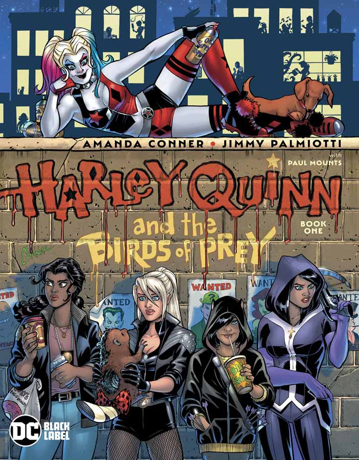
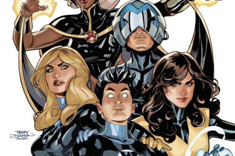
Harley Quinn and the Birds of Prey #1
DC Black Label Writers Amanda Conner & Jimmy Palmiotti, Artist Amanda Conner, Colorist Paul Mounts, Letterer John J. Hill
Amanda and Jimmy are back on the book that made them famous and this time the Black Label allows them to be a bit more racy than the regular Harley comic would allow and the question is this a good or bad thing with more leeway to be a bit more naughty? It kind of falls in the middle because for the most part this is an extension of their run on the regular title but with a bit more raunchiness to it that goes a little further but they wisely don’t go too far that it ruins the fun of it and it still has that charm but just a bit naughtier. This first issue gets off to a nice start with setting up that Harley has to go back to Gotham to get money to fix the hotel that has been burnt down and the Birds of Prey gang are along for the ride that is a big plus for the story because I love Harley but sometimes it can get repetitive when its just about her. Having more characters does spice things up here and gives the story some nice breathing room. It’s been quite a while when we have had the pleasure of Conner doing the interior artwork on a series and it was well worth the wait here. She really brings her A game and has a lot of fun putting in a lot of small and fun details into the art. The fight scenes are especially great because Conner gets to let loose and not hold back on the action or violence that goes over the top in a fun way that keeps the story moving along very well here.
Is this comic worth you’re time and money? While this series might not bring a lot of new things to the table that is ok because what it does do is bring the fun and insanity that only Conner and Palmiotti brings to Harley and the gang. With this being a Black Label comic it allows them to push the envelope farther but never at the expense of what makes the book fun to read. There is more language and violence but it never is gratuitous and that was a big plus. The story gets off to a good start and when you throw in Conner’s gorgeous artwork then you have a winner here. VERY RECOMMENDED!
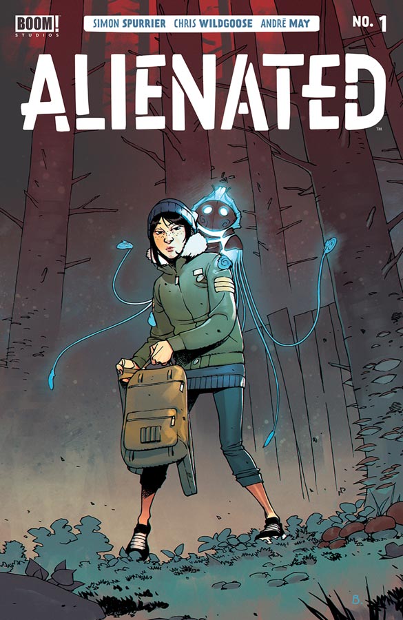
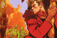
Alienated #1
Boom! Studios Writer Simon Spurrier, Artist Chris Wildgoose, Colorist André May, Letterer Jim Campbell
At first I was a bit worried about the story that is set up here because it felt a little sluggish with about the first half of the book but once things start to click I understood why Spurrier set things up this way and it really pays off by the end of this first issue. The one thing that he did really well here is set the characters up and that is always a challenge in a first issue and he makes sure that you get to know all three of the kids so that when the story twist happens you are able to go with it. Spurrier captures the kids in this story quite well that is hard to do convincingly in comics but he makes sure that there is a little bit of you in each one of them and who doesn’t remember the hell that high school was. The really big win for this comic is the gorgeous artwork by WIldgoose that really captures the subtle emotions of the kids and that really makes the story work well here. He made some really great layout choices here and if gives the book a unique feel and look that helps set it apart from the average comic. I also wanted to point out May’s color work on the book that not only complements Wildgoose’s line work but gives the artwork a perfect complement that adds greatly to the overall look of the comic.
Is this comic worth you’re time and money? I really enjoyed this first issue and it sets things up for and intriguing concept here. The one thing that I really liked is how the story in this first issue washes over you until the cliffhanger ending and that gave it a nice flow that made for a good read. This one is well worth getting this week. RECOMMENDED!
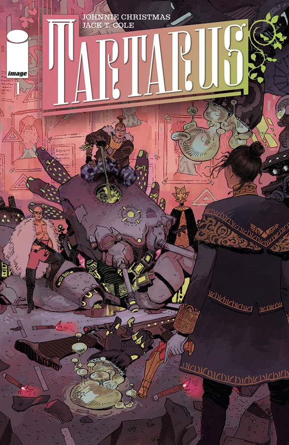
Tartarus #1
Image Comics Writer Johnnie Christmas, Artist Jack T. Cole, Letterer Jim Campbell
This is one of those comics that is a bit rough with this first issue but shows promise in the end. I think that one of the issues was that there is a lot to take in here and the structure was a little rough at times. There were a few times where the flow of the story was a bit inconsistent and felt too busy at times. The other thing is that the story itself is pretty overwhelming but that is not to say that is a bad thing here. Christmas packs a lot here in this oversized first issue and there is a lot to take in here but once you get to the end of the issue there is a nice twist that makes a lot of what he set up come together and sets the stage for the story. Cole’s artwork really packs in the detail in every panel of this book that can be overwhelming at times but really helps visualize the script to help you get what Christmas is telling here. The one thing that I really liked about the artwork was the more intimate scenes where he does a good job with the emotions of the characters.
Is this comic worth you’re time and money? This one is a tough call because its going to be a more specific audience that will get what they are trying to do here. The pacing of the story is tough at times but if you stick to the end a lot of it comes together better than I thought it would. This one is hard to recommend but if you are a science fiction fan and want something a little off beat then you might want to give this comic a try. I will give it a second issue to see where they take it from here.
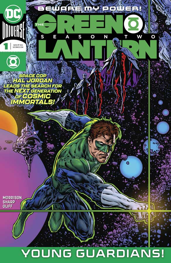
Green Lantern: Season Two #1
DC Comics Writer Grant Morrison, Artist Liam Sharp, Colorist Steve Oliff, Letterer Tom Orzechowski
It’s back for more and its been well worth the wait for this second half of the story that Morrison and Sharp have started. The good news is that if you have not read the first season (shame on you and go buy the trade to catch up) but you can pretty much read this issue and not be totally lost because Morrison gives you just enough information so that you can enjoy this story. What made this first issue so fascinating is that you think that the story is going to go one way and at the end there is a great twist that take you out of the comfort zone that you though you were going to be in and goes nope not this time. What I have loved what Morrison is doing here is getting to the heart of who and what Hal Jordan is and what makes him such a great character. He has taken him back to the basics and yet moved him forward in such a way that makes him relevant today as when he first appeared. The one thing that has always grounded this book is the incomparable artwork by Sharp that makes sure that no matter how wild the stories are that he keeps you visually on track so that you never feel lost or confused as to what is going on and you see that quite well here because he takes the time to make sure that they emotions of the story comes across in the characters expressions even when the character has two dots for eyes and a line fo the mouth such as RYK. Sure the big blowout scenes are spectacular but that is not where the heart and soul of this story is and Sharp always delvers much more than most comic today.
Is this comic worth you’re time and money? Simply put this is one of the best superhero comics going right now. Morrison and Sharp are firing on all cylinders on this one and the beginning of this second story ark truly exceed my expectations that were very high from the first season. This is what superhero comics can and should be, pure quality from all involved that shows what can be done in the big two. HIGHEST RECOMMENDATION!
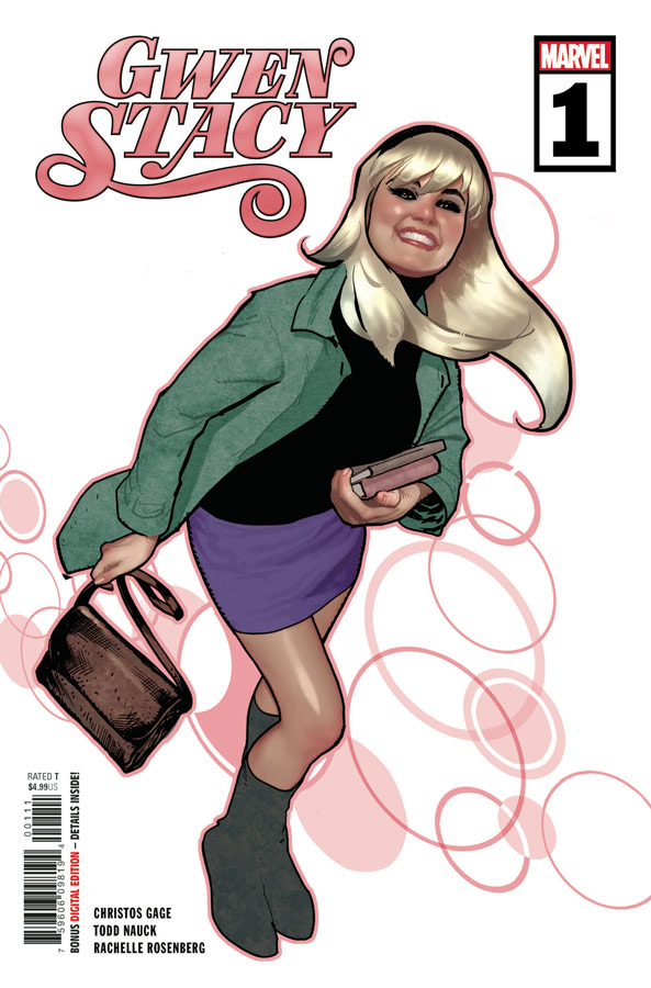
Gwen Stacy #1
Marvel Comics Writer Christos Gage, Artist Todd Nauck, Colorist Rachelle Rosenberg, Letterer Joe Caramagna
Spin off comics of secondary characters is something I try and give a shot to because you usually have a wide birth when it comes to the story and I was intrigued by this one because who doesn’t like Gwen Stacy? This is a comic that wont blow you away by any means but what it does do is deliver a simple and fun story that gets off to a good start here. Gage wisely uses a simple murder mystery to frame the story and uses a strong supporting cast of her farther Captain Stacy and Jean DeWolff among others that adds greatly to the nostalgia factor of this comic. What Gage does well here is have Gwen as a strong, smart and funny character that gives the story a nice heft that was very nice to see but doesn’t overdo it. Getting Nauck for the artist on this comic is one of its best assets. His art style has a great classic look that fits this story like a glove and what he does so well here is with the emotions of the characters that really brings this story to life. The artwork gives not only heft to the story but grounds it so well emotionally that I have always liked about Nauck’s artwork because he never overplays it and keeps the pacing of the story spot on perfectly. There is also a charming one page story by Sean Ryan and Gustavo Duarte that is a charming Little Rascals type gag strip that is funny and adorable and also a Gwen Stacy dress up cut out doll that was cute too.
Is this comic worth you’re time and money? As I said at the top this one won’t blow your away but that is not what Gage and Nauck are trying to do here. What they do is deliver a charming and fun story with great artwork that simply works well and sometimes simple is better and they prove that here. RECOMMENDED!
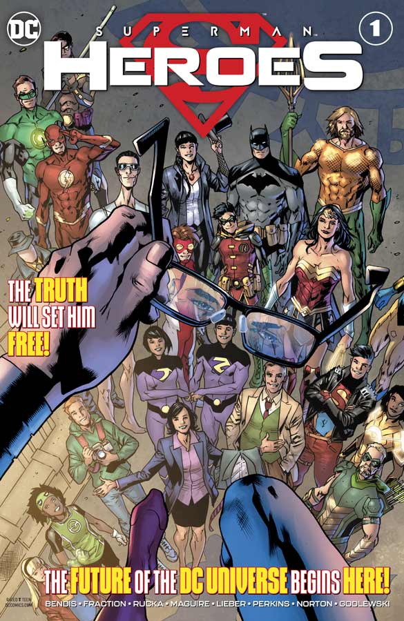
Superman Heroes #1
DC Comics Writers Brian Michael Bendis, Matt Fraction and Greg Rucka, Artists Kevin Maguire, Mike Perkins, Steve Lieber, Mike Norton, and Scott Godlewski, Colorist Paul Mounts, Gabe Eltaeb, Andy Troy, and Nathan Fairbairn, Letterers Troy Peteri, Clayton Cowles, and Simon Bowland
In a special one shot that shows the aftermath of Superman revealing to the world that he is Clark Kent it give readers a glimpse of the main Superman story along with the Lois Lane and Jimmy Olsen maxi series that if you have not been reading those two then you are really missing out on some great comics. While the writers and artist on this special are round robin style it actually flows together quite well here and that is always hard to do but when you have strong writers like Bendis, Fraction and Rucka you are always in for a treat. The book is sort of split up into chapters that deal with the repercussions of Superman identity reveal and how it affects them and while there is nothing here that is ground breaking they do however deliver some solid storytelling that made for a good read. The Rucka and Perkins Lois Lane story is a real standout here with the Fraction and Lieber being a close second for my favorites. While the artwork styles are different they each work well for their respective stories and any chance to use Maguire’s artwork in a comic is always a big win and he is perfect for the Justice League part of the story for very obvious nostalgia reasons.
Is this comic worth you’re time and money? This is a basic sampler comic that is a primer for the Superman current storyline and its a good chance for new readers to see what its been about. This is one of those comics that works well for what it is and on that level it does it very well. With nice samples of the stories and characters from the Lois Lane and Jimmy Olsen series that hopefully will draw more readers to those great books and if that works all the better. This is a good chance for new readers to catch up and for regular readers of the books this is a nice addition to their stories. It worth giving a try if you haven’t read Superman in a while to see what all the fuss is.

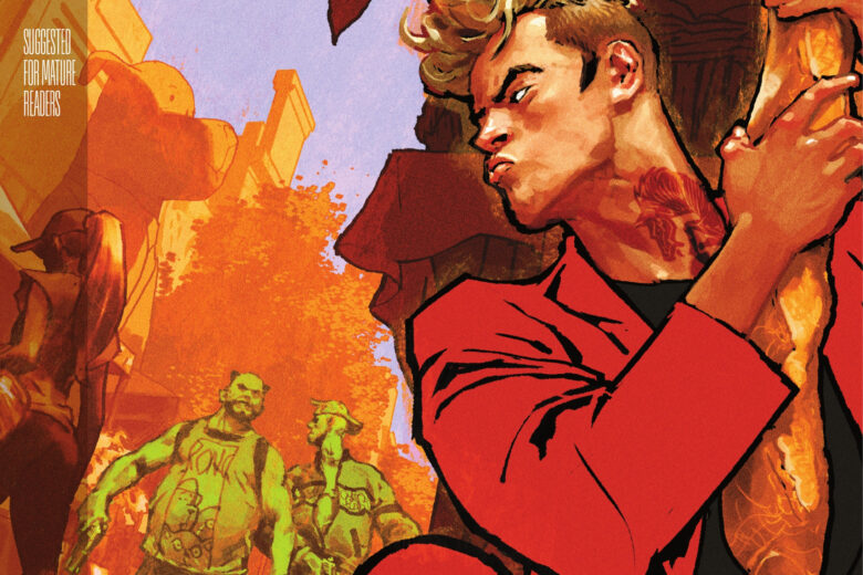
Undone By Blood Or The Shadow of a Wanted Man #1
Aftershock Comics Writer Lonnie Nadler & Zac Thompson, Artist Sami Kivelä, Colorist Jason Wordie, Letterer Hassan Otsmane-Elhaou
Every once in a while a comic comes along that truly surprises you and this is one of those rare ones. First off it brings back the classic western comics that is sadly hard to sell today and Nadler does something special here with that and then adding a modern twist and yet instead of modern day he sets in the 1970’s that gives this story and even bigger twists as the story unfolds. What is truly impressive here is how Nadler interweaves the two time periods that made this such a great read. Its obvious that they both have things in common and we Geta glimpse of that here. The script has a nice pace and unfolds very well for a first issue that is always a tough element to get over. While we are not sure of all of the mystery to the two stories Nadler gives you just enough to be very intrigued but keeps a lot of it close to the vest to unfold as the series goes along. One really nice touch here was after the story their is an excerpt of the Shadow of a Wanted Man novel that Ethel is reading on the bus that continues the story. Thompson’s artwork on the book is remarkable because he has to give each of the stories a different look but they have to flow together and he does that very well here. Each story has its own flavor but they flow in and out of each other without missing a beat that really was impressive. He also has to visually tell Ethel’s story without dialogue in a lot of parts and it really shows what a strong artist he is. This is a really good looking comic.
Is this comic worth you’re time and money? It takes a lot to surprise me in comics and this one was a real gem. It brings a lot of great elements together perfectly in both story and artwork that made for a really great read this week. Nadler sets up a great story here and leaves you wanting more that is a good indication that this is going to be a special comic. VERY RECOMMENDED!


0 Comments