DC Comics Rebirth week two hit with 5 new titles and lets see how they stack up.
Action Comics #957
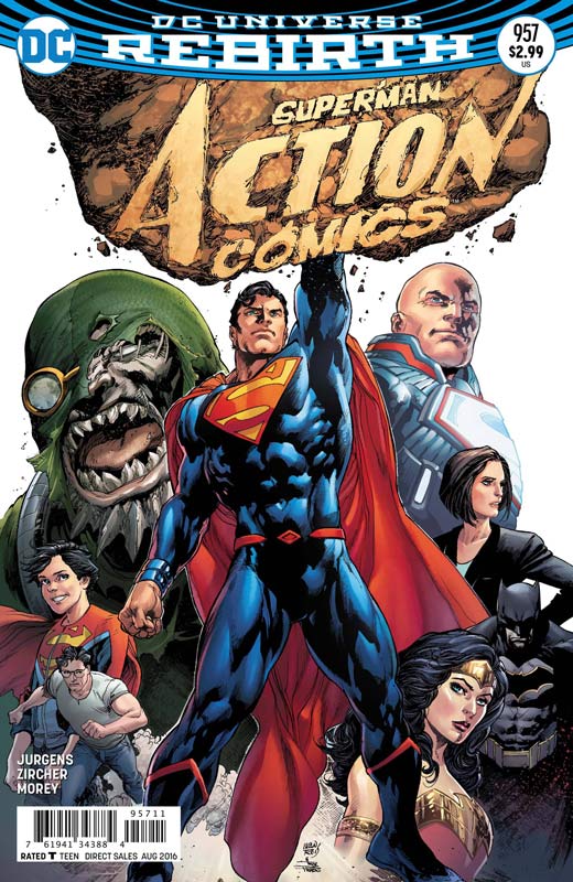
DC Comics Writer Dan Jurgens, Artist Patrick Zircher, Colorist Tomeu Morey, Letterer Rob Leigh
The one thing that I have never figured out with DC is that while Superman is a great character why they keep insisting on publishing so many titles with him or based upon him. I am delighted that DC has went back to the original numbering of the book (along with this weeks Detective Comics) but unfortunately the book is really so-so. While I get that back in the 1990’s Jurgens was not only a superstar artist but also a big time writer and in probably bet know for the Death of Superman story. While I liked his work on Booster Gold I was never one of his fans of his writing on Superman and time has not really changed that here either. While his story is decent it never is very compelling or fresh and just feels like a retread of the same stories that he was telling over 20 years ago. It tries to be exciting and slaps on a weak plot twist at the end that feels forced and very much been there and done that. While the story is somewhat new reader friendly, it never really explains why Superman is not Superman and why he has a son and moved away from Metropolis. The one thing that the book does have going for it is the very nice artwork of Zircher that make the overly done and flat dialog a little easier to swallow. In fact the art is about the only thing that gives the book much hope but sadly Zircher can only do so much with the weak story that he was saddled with.
Is this book worth your time and money? This rebirth title really falls short of the promise of a fresh start for Action Comics. Beyond not being more than a rehash of the Doomsday story line from 1992 DC still doesn’t get that nobody like the redesigned Superman outfit and then simply need to bring back his classic one. This book was a real chore to read and sadly really stumbles out of the gate. SKIP IT!
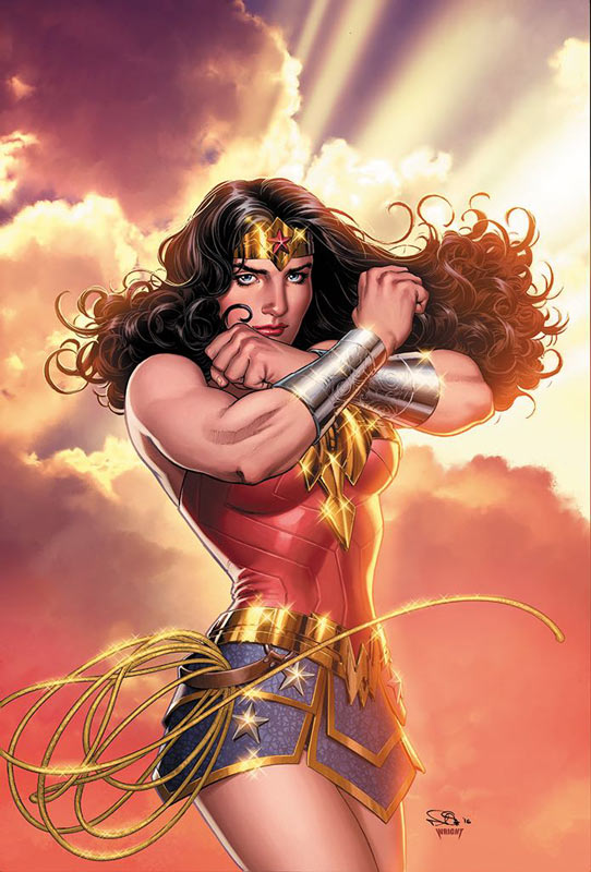
Wonder Woman Rebirth #1
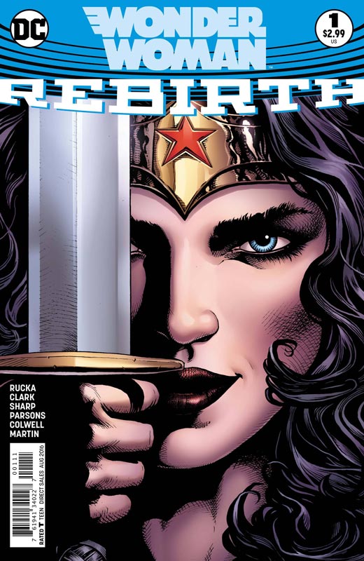
DC Comics Writer Greg Rucka, Artists Matthew Clark & Sean Parsons, Liam Sharp, Colorists Jeremy Colwell & Laura Martin, Letterer Jodi Wynne
Where Action fails is where Wonder Woman shines. I have to give DC props for being able to lure Rucka back to the title that he wrote so well back before the New 52 and his falling out with DC to focus on his creator owned projects. There are few that have been able to capture the perfect balance of who and what Wonder Woman is and should be and Rucka does a great job of getting this new series off to a good start for both new and old readers. While this issue focuses on not only telling her origin he does a great recap of the mythology behind her also. Rucka script while heavy with exposition finds a way to make it no feel so forced and boring like a first issue can suffer from and here he not only finds a great way to get new readers up to speed but finds a great hook to get the series off to a great start. He also ditches the mediocre revamped costume and gives her back a more classic and more fitting Amazonian feel that works better. The artwork by Clark and Parsons along with regular series artist Sharp gives the issue a nice visual impact that really complements the story. While Clark and Parsons do a nice job on the first part of the book it’s Sharp’s bold style and detail that gets me really excited for the book.
Is this book worth your time and money? Few writers have been able to find the right angle to Wonder Woman and Rucka is one of them. This first issue gets her off to a great start that gets you really excited for the character and sets up some really great concepts for the series. I also like the idea of alternating stories for the first story arc that will alternated each issue and is a bold idea that will give readers two different stories each month. This might be the best of the Rebirth titles and I doubt that many will come close to being this good of a start. HIGHLY RECOMMENDED!
Flash Rebirth #1
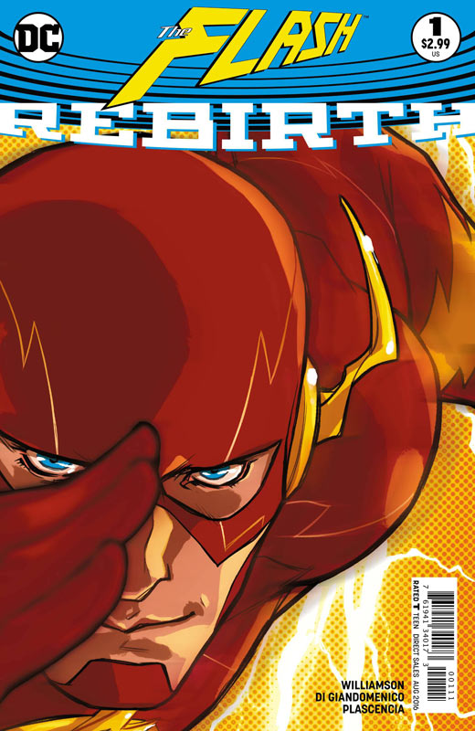
DC Comics Writer Joshua Williamson, Artist Carmine Di Giandomenico, Colorist Ivan Plascencia, Letterer Steve Wands
You could say that the Flash Rebirth is part two of the DC Universe Rebirth book from two weeks ago. It pretty much retells The Flash’s origin but follows up the plot threads from that story. Williamson’s script is good but a pretty by the numbers affair here. It does a lot of the things that a first issue should by giving his origin setting up the cast and putting things back from before the New 52. The only thing that he forgot was to make the book fun. I will give him credit for making the book very accessable for new readers that a number of Rebirth books have failed at but, there is very little spark when reading this issue. There was also no real payoff at the end of the issue to get readers to come back for more. Di Giandomenico artwork is interesting. There are times where the perspectives are a little strange and make the Flash’s anatomy rather odd-looking. It was a bit sketchy for me but there were some times where the artwork really stood out. Overall the art is pleasant but somewhat inconsistent at the same time.
Is this book worth your time and money? This is one of those first issue that while the book was a pleasant read overall it was pretty forgettable at the same time. I will give Williamson props for making the book very new reader friendly but it was a very by the numbers affair at the same time. The artwork was somewhat middling for me but I have seen far worse and there is some strong work at times. I really wish that the book had added some twist and turns to the issue that ends up being a decent but uninspired read overall.
Detective Comics #934
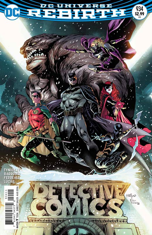
DC Comics Writer James Tynion IV, Penciller Eddy Barrows, Inker Eber Ferreira, Colorist Adriano Lucas, Letterer Marilyn Patrizio
Returning to its original numbering Detective Comics gets off to a nice start that was a very fun read. Writer Tynion is a solid writer that has had a lot of success with his Batman/TMNT book recently and has taken a lot that made that book fun and applied it here. This is one of those books that while the basic structure is a tried and true set up there was something about the book that was simply enjoyable. While the script is not very deep and there are some pretty basic clichés here, I found that the book is best described as a guilty pleasure read. The set up to this new group is decent the one thing that Tynion really delivers is simply a very fun script that moves along nicely. While some might be opposed to Clayface being in the book, I actually found that to be one of my favorite parts of the story. Tynion dose was many writers forget is that a good villain is a tragic character and he really nailed that here with him. I loved that he just wanted to see the movie that he starred in before he became Clayface and how he doesn’t quite fit in with the rest of the group. I really enjoyed Barrows and Ferreira’s artwork on the book and they put a lot of detail into each panel and handled both the action and dramatic scenes with ease. This is one of the better looking Rebirth titles so far.
Is this book worth your time and money? While on the surface this may seem like an unnecessary Bat book but I liked a lot of the ideas that Tynion brought to the story. While this book may not be the most original concept it was a really fun read that did one thing very well, and that was made a fun and enjoyable read that I hope will continue to be a good read. Well worth checking out.
Aquaman Rebirth #1
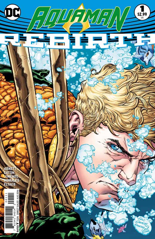
DC Comics Writer Dan Abnett, Pencillers Scot Eaton & Oscar Jimenez, Inkers Mark Morales & Oscar Jimenez, Colorist Gabe Eltaeb, Letterer Pat Brosseau
Aquaman has always been a tough nut to crack when it comes to a regular series and while Abnett gives it a decent shot this Prolog story falls into the average read category. One of the problems with the script is that it really seems to lack focus and suffers from too much exposition and dialog at times. The story never seems to flow very well while your reading it and overall is a real ho-hum experience. THe big problem is that there is nothing compelling about the story and reads like a footnote to another story. The other issue is that after reading the issue there is nothing compelling to get you to come back for more because there is no hook to the story or characters. The art by Eaton and Jimenez is serviceable but never really goes beyond average comic book artwork. It gets the job done but it doesn’t leap off the page.
Is this book worth your time and money? While Aquaman is not terrible it’s not terribly good either. Abnett doesn’t bring anything new or fresh to the character and in fact the story is pretty boring experience. Add in the average artwork and this makes for a pretty disappointing book. I won’t be making a second trip back on this one. SKIP IT!
Pink Panther #1
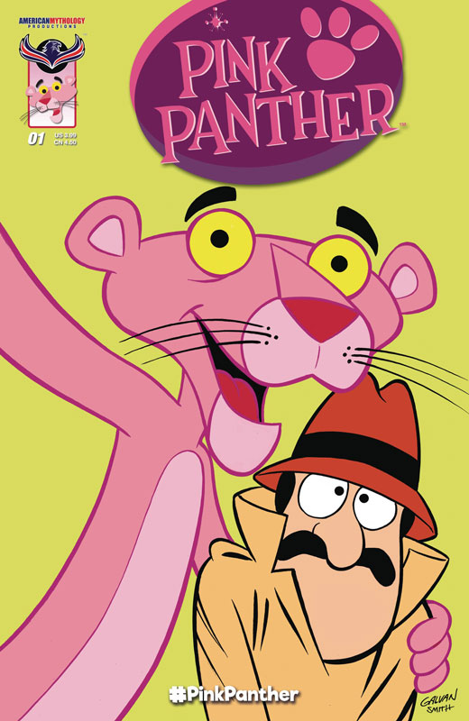
American Mytholody Productions Writers S.A. Check/Adrian Ropp/Warren Tufts, Artists Kris Carter/Bill Galvin & Inker Bob Smith/Adrian Ropp, Colorist Adrian Ropp
I love the Pink Panther cartoons and was excited to see this new comic based on the series and while it was enjoyable it was a little too simple for more than a young kid to read. I will give the creative teams on the new stories that they kept with the Pink Panther not talking and the stories were nearly silent. The first story is probably the best one by Check and Carter that is a sweet little story that is fun and has some nice humor. The only one that was lacking was the reprint story from 1978 where they have the Pink Panther talk that kind of kills the point of it all. All of the new stories are nice little self-contained and all have some really nice artwork for them.
Is this book worth your time and money? While I liked the book the problem is that it’s aimed at a very young audience and while the stories are cute overall the book will take you maybe five minutes tops to read and for $3.99 it’s a tough sell for an adult reader. The other issue is that while the stories are fine the book does lack the charm of the original animated series that worked so well. Overall the book is not bad at all I just didn’t think it was worth the cover price for such a quick read that is simply aimed at kids.
Lumberjanes/Gotham Academy #1
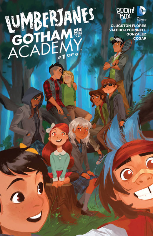
Boom! Box/DC Comics Writer Chynna Clugston Flores, Penciller Rosemary Valero-O’Connell, Inker Maddi Gonzalez, Colorist Whitney Cogar, Letterer Warren Montgomery
One of the wilder crossovers but Lumberjanes and Gotham Academy really do fit together quite well. The first issue gets off to a good start but has a lot of exposition to get through with setting up each of the universes and their respective characters. The basic set up get the book off to a good start that blends the two books together nicely. Flores script hits all of the right beats and all of the characters feel very natural and while the first issue may not bowl you over it does a nice job of setting thing up. There is a lot to get going on a crossover and I have to hand it to Flores for keeping the story moving along while setting up the overall arc of it. Valero-O’Connell and Gonzalez’s artwork is a bit too anime influence for my personal taste but they do a solid job with the artwork and the book does look nice. The only issue that I have with the art is that there are a lot of times where the backgrounds are pretty sparse and that was too noticeable throughout.
Is this book worth your time and money? There were a few minor gripes with the book but overall it was a fun little read that sets up the story nicely. The big key is the next issue that hopefully hit the ground running now that the exposition is out-of-the-way. It’s a nice blend of two really fun series that fit together quite nicely.
The Fix #3
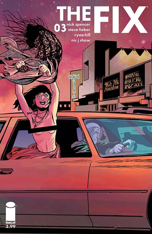
Image Comics Writer Nick Spencer, Artist Steve Lieber, Colorist Ryan Hill, Letterer Nic J Shaw
The fix has been quite a pleasant surprise and I did get a little worried while reading this issue that was a real departure from the first two issues but rest assured that by the time you get to the end of the issue it makes sense where Spencer was going with the story. I did like the turn that the story went this issue because it allowed the story to add a new angle to what had been established in the previous issues. Spencer’s dark sense of humor is really driving this book in a great and fucked up direction that is charming and appalling at the same time and that is why it’s working so well. Lieber continues to deliver some really great artwork and this issue really shines with a lot of dramatic elements that shows his great range as an artist.
Is this book worth your time and money? I am still loving this book and I liked that they could still surprise me with the direction that the story went this issue. It still kept all of the things that I loved about the book and yet going in a different direction really added to the story and flow of the series. This is becoming a must read book. VERY RECOMMENDED!
Wacky Raceland #1
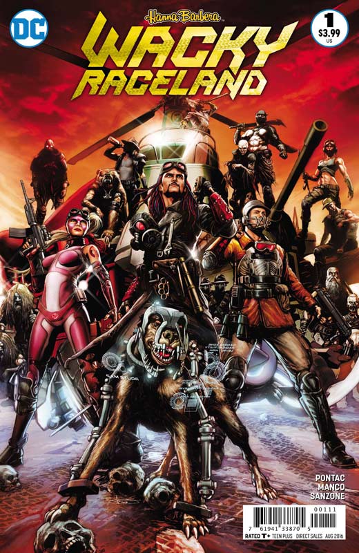
DC Comics Writer Ken Pontac, Artist Leonardo Manco, Colorist Mariana Sanzone, Letterer Sal Cipriano
Of all of the new Hanna-Barbera comics this was the one that took the concept of the original animated series and really went in a direction that seemed more Mad Max than goofy Saturday Morning series. It not only went out there but is even wilder than I thought it would be and I really liked it. I am a huge fan of the Wacky Races series but that version would not translate very well to the comics medium because there is little that a straight adaptation would bring to it. Taking the basic structure of the concept and then setting it in a post apocalyptic world actually really opens up the possibilities of this book. There is a lot to take in with this book and while there were a few times that Pontac may have jumped around a little too much he really went for it with the book and there is a lot to digest with the script. There is a lot of ground that Pontac covers here and while some would argue with the dark tone of this version I will give him huge props for actually finding a great balance with some great humor in the story. While a lot of people are really going to hate this book because of the tone compared to the original series should really give the book a chance. Deep down it still has the same DNA but just a different look at it. The artwork is a real visual feast and Manco really puts his heart and soul into it. From his layouts to the amount of detail that hit fits into every single panel is amazing. This book really needed an artist of his caliber to pull this off and Manco really delivers the goods here. This book is simply gorgeous!
Is this book worth your time and money? I knew that this book was going to be very unusual but Pontac and Manco have really pulled off a very impressive take on a beloved series that while it’s very different it still has a lot of spirit of the series just in a new and different light. Fans of the original series are going to hate this book just because it seems so far from the animated show but while it’s very different and very Mad Max I found the book to be a real blast and off to a very good start. RECOMMENDED!
Renato Jones The One% #2
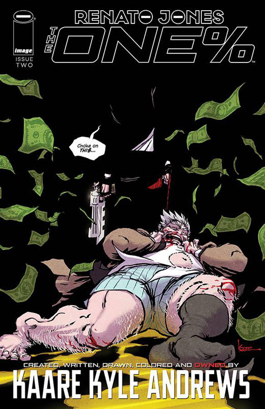
Image Comics Writer/Artist/Colorist Kaare Kyle Andrews, Letterer Jeff Powell
Renato Jones was a solid first issue and the second issue really seals the deal on this book. Andrews social and political take on the state of imbalance of wealth is not only topical but makes for a great comic that mixes both reality and fiction in a way that makes for a really impressive story that is shocking in all of the right ways. The first issue did a great job of setting things up and this second issue does a nice job of not only moving the story along but giving glimpses of the back story to Renato and how he came into this. Some would say that Andrews is trying to shock with the story and in fact he is but what makes the book fascinating is that the shocking part is that while it’s a work of fiction it’s sadly not far from the truth. The only minor complaint with the story is that the set up to the next issue is a little to cliché but I’m hoping that he is able to avoid too much of it with the story. His artwork is very impressive and while there is a heavy Frank Miller influence he does make it all his own with some really impressive layouts and taking some great risks with the art.
Is this book worth your time and money? This book is a great second issue and shaping up to be a solid series. Andrews does a lot of right things with the story in this issue that is leading to a good first story arc and I’m excited to see where he is going to take the book. VERY RECOMMENDED!
Midnight Soul #1
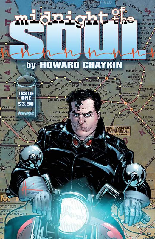
Image Comics Writer & Artist Howard Chaykin, Colorist Jesus Aburtov, Letterer Ken Bruzenak
I am a big fan of Chaykin and while there are some interesting ideas here the first issue of Midnight Soul gets off to a bit of a shaky start. It’s not to say that the book is a mess but it never quite grabs you like I felt that it should. The story has a lot of the trademarks of Chaykin and I will say that there are some good story concepts that the book has but the characters never really do much and seems to plod along without doing much to engage the reader. On the flip side the artwork is up to the usual fine standards that he always delivers and at least makes the so-so story look really good.
Is this book worth your time and money? I really wanted to like this book but while it’s certainly far from bad it never really quite goes anywhere. Chaykin does set things up but ultimately never really does anything with them. It’s a rare miss for Chaykin and I had really hoped for something better. SKIP IT!


0 Comments