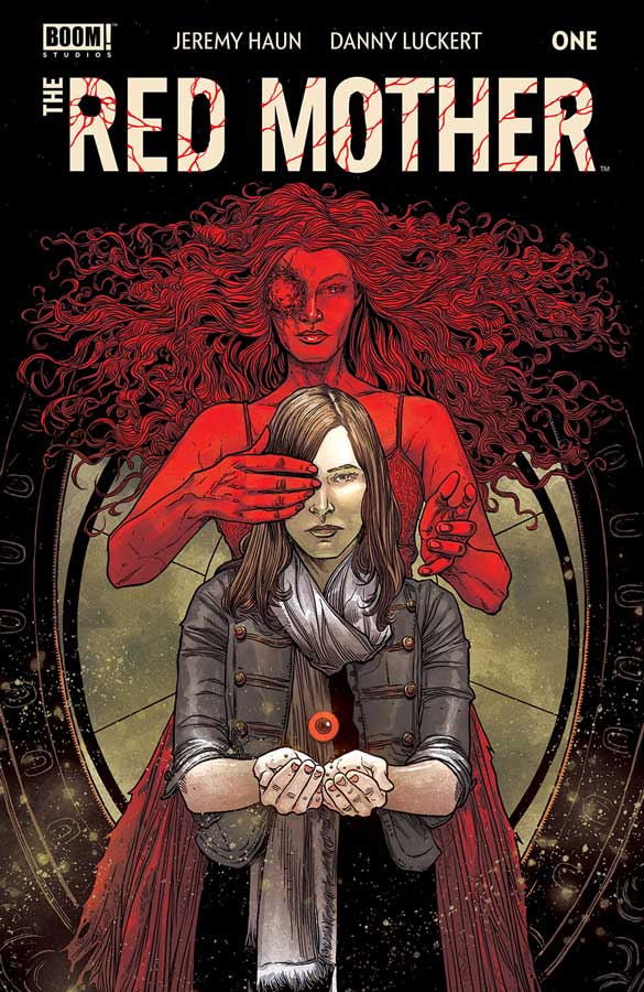
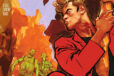
The Red Mother #1
Boom! Studios Writer Jeremy Haun, Artist Danny Luckert, Letterer Ed Dukeshire
Boom has been on a roll lately with some really strong books this year and finishes out the year with Red Mother that is a nice little surprise. Haun known for his Beauty comic script gets off to a very solid start in this first issue. He does a nice job of balancing the exposition and yet moves the story along with a breezy feel here that makes for a really great read out of the gate. He sets the story up well here but keeps the mystery at just the right level to keep you guessing as to what is going on with Daisy and what is happening to her. It also has one of the best cliffhangers for a first issue that I have read in quite a while. It’s one thing to have a great story but you need an artists that can pull the whole thing together and Luckert really makes this comic shine with his spot on artwork that captures all of the subtle emotions of the script perfectly. With quite a bit of dialogue here Luckhert is able to make you feel all of the emotions that Daisy is going through and makes it very relatable to the reader.
Is this comic worth you’re time and money? I am a fan of Haun’s Beauty comic but Red Mother really hits the ground running out of the gate and was a really fantastic read. It’s the type of story that grabs you right away but its the emotions of the characters that will have you coming back for more. With a great mystery to discover this is a comic that is well worth checking out. VERY RECOMMENDED!
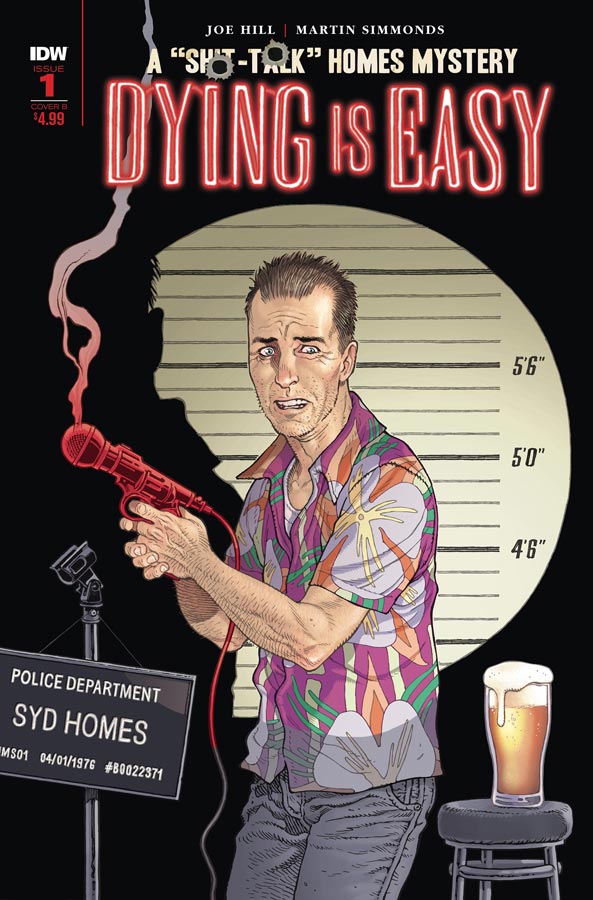
Dying Is Easy #1
IDW Writer Joe Hill, Artist Martin Simmonds, Color Assist Dee Cunniffe, Letterer Shawn Lee
This is one of those comics that has a good idea but stumbles out of the gate with its first issue. Hill makes some interesting concepts with this story of an ex cop that is now a comedian but the problem that I had with the story was that this first issues script really seem to be dragged out and by the time you get to the reveal at the end of the issue, I really didn’t care about Syd or what is going on. Its one thing to set up Syd as not a very likable character and I totally got that but that point was so drawn out that it became a real chore just to finish this first issue. I felt that the story could have a better impact if it didn’t meander along the way and was not so heavy handed. The one bright spot in the book is Simmonds gorgeous artwork that was the only thing that kept me going on this one. Not only is his line work really great but his coloring gave the book a great noir feel without over playing it. It’s really too bad that the story was nowhere as good as the artwork.
Is this comic worth you’re time and money? I really wanted to like this comic more but the pacing was simply terrible here and it also felt very dragged out to the point that it lost any interest that I had by the end of this first issue. I think that there are some decent ideas here but not enough to go any further. SKIP IT!
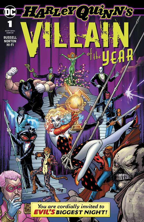
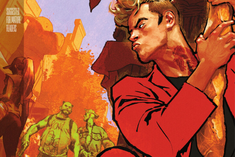
Harley Quinn’s Villain of the Year #1
DC Comics Writer Mark Russell, Artist Mike Norton, Colorist Hi-Fi, Letterer Dave Sharpe
I went into this with a lot of high expectations because I’m a huge fan of Russell’s writing but this fell a little flat for me. The ironic thing is that I felt that Russell underplayed a lot of the potential humor that should have been in the book but instead it never really quite takes off. There are a few bits here and there where the script shines but untimely it doesn’t quite come together as well as it should have. I think that the problem is that it ends up being to straight and should have been much more quirky and silly but instead it feels forced and by the numbers. The artwork by Norton does add some charm to the story as best he can pull off. The artwork is one of the things that helps lift this up better with the spot on characters facial expressions throughout the story.
Is this comic worth you’re time and money? The real shame here is that it feels like a totally missed opportunity here with this one shot. Russell has certainly written much snappier stories than this and one wonders what went wrong here. There are moments here and there that shine but overall it ends up being mildly amusing at best. It’s not a total train wreck but it certainly not worth the five bucks cover price. SKIP IT!
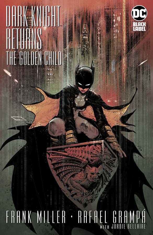
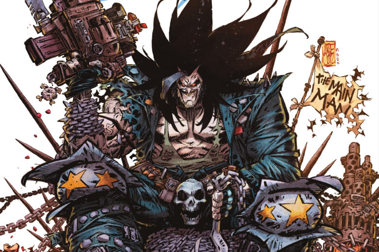
Dark Knight Returns: The Golden Child #1
DC Black Label Writer Frank Miller, Artist Rafael Grampá, Colorist Jordie Bellaire, Letterer John Workman & Deron Bennett
If something works once then why not keep going back to the well again. So here we have yet another attempt at Frank Miller attempts to recreate the success of the original Dark Knight Returns but this time he goes into the future that is more like the present. The story is a real mess here and yet there are some fascinating story elements that make it in a totally weird way an interesting read. I think that the big problem here is that he doesn’t balance political views with the superhero elements very well. Yes we all hate the current Cheeto in Chief but the problem here is that he uses the election as a backdrop and ends up not really saying much with it. On the film side this ends up being more of a Superman story than Batman and that made for a very strange read. The other issue is having Darkseid in the book and there is no expiration as to why (beyond that he wants to rule everything) he is even in the story. Neither him or the Joker are really fleshed out in the story that they have much of a point beyond being bad guys. There is also no real connection to Carrie who is now Batman as a character and what drives her beyond just being Batman. There are some really good parts to this book but it ends up being so disjointed and convoluted that by the end you’re just going WTF did I just read? The one thing that does work here is Grampá’s gorgeous artwork that is a feast for the eyes but is sadly wasted here on this over/under cooked story. The one thing that is impressive about about his artwork is the level of detail that he infuses into every panel of the artwork. There is not any space that is not used on both the big fights or the small dialogue scenes. As hard as it is to say this the artwork is so spectacular that it’s worth the six bucks cover price for this one.
Is this comic worth you’re time and money? Wow, where do I even begin on this one? While I enjoyed Millers Superman Year One recently this return to the Dark Knight universe is really a huge mess. I get why DC green lit this one because no matter what I or anyone else says this book is going to be a big seller. The problem is when you give a creator like Miller free reign it can either be a masterpiece or a real train wreck, in this case it’s totally the later one. But as with a lot of train wrecks there is at least some positives here and that lies squarely with Grampá’s artwork that is the only thing that saves this one. There is really no right or wrong answer to if you should buy this one but, just know going in that the story is a total mess but fascinating to watch it spiral out of control all at the same time.
Undiscovered Country #2
Image Comics Writers Scott Snyder & Charles Soule, Artists Giuseppe Camuncoli & Daniele Orlandini, Colorist Matt Wilson, Letterer Crank!
The first issue of this comic got off to a really good start and this second issue is a bit heavy on the exposition of the story but still a really good read. The story does move forward nicely but Snyder and Soule need to have that exposition of how the past is affecting the characters in the present and that is why this story is working so well. I like the fact that they are taking their time to unfold the story because it adds a richness to the characters so that you get involved with them in the story and as the stakes get raised as the story moves along and has a great shocking twist at the end of this issue that changes a lot of what you thought the story was going to do. The artwork by Camuncoli and Orlandini continues to impress as they do a great job of capturing the emotions of the characters. There is a lot of drama that has to come across with the artwork in this book and they capture it all quite well with the artwork.
Is this comic worth you’re time and money? I’m still very much enjoying this comic and this second issue builds nicely from the first and keeps things moving along well. There is a lot to digest with the story but Snyder and Soule do a great job of keeping all of the elements in a straight line that could have easily lost its way with less seasoned writers. I’m intrigued to see where they take it from here and continues to impress. RECOMMENDED!
The Dollhouse Family #2
DC Black Label/Hill House Comics Writer M.R. Cary, Layouts Peter Gross, Finishes Vince Locke, Colorist Cris Peter, Letterer Todd Klein
I was a bit mixed on the first issue of this second Hill House comic, I am very glad to say that this second issue dispels any doubts that I had about Cary, Gross and Locke delivering the goods. After reading this issue I now understand what Cary was doing with the story in the first issue was setting things up and there was a lot to the story as you will see in this second issue. What Cary does well with this story is blending the present and the past and you can see that they are going to be more important to each other as the story moves along. What is great about this issue is Alice and what has happened and what is happening with her and the dollhouse comes into focus here in this issue. There is a lot to take in here and the story is hitting its stride now. The artwork by Gross and Locke does a great job of capturing not only the underlying horror elements but the look and feel of both the present and the past. There is also a nice subtle change in the style of the artwork when Alice is in the dollhouse that struck me this issue and is a nice subliminal touch to the story. It’s the facial expressions of the characters that really shines here in the artwork and captures all of the emotions of the story to make for a very creepy comic.
Is this comic worth you’re time and money? I’m glad that this second issue built greatly from the first issue. Cary’s story is coming into sharper focus here and its a really good one. There is a lot going on here but Cary keeps it all on track quite nicely and when you have the strong artwork of Gross and Locke you have another win for the Hill House line. RECOMMENDED!


0 Comments