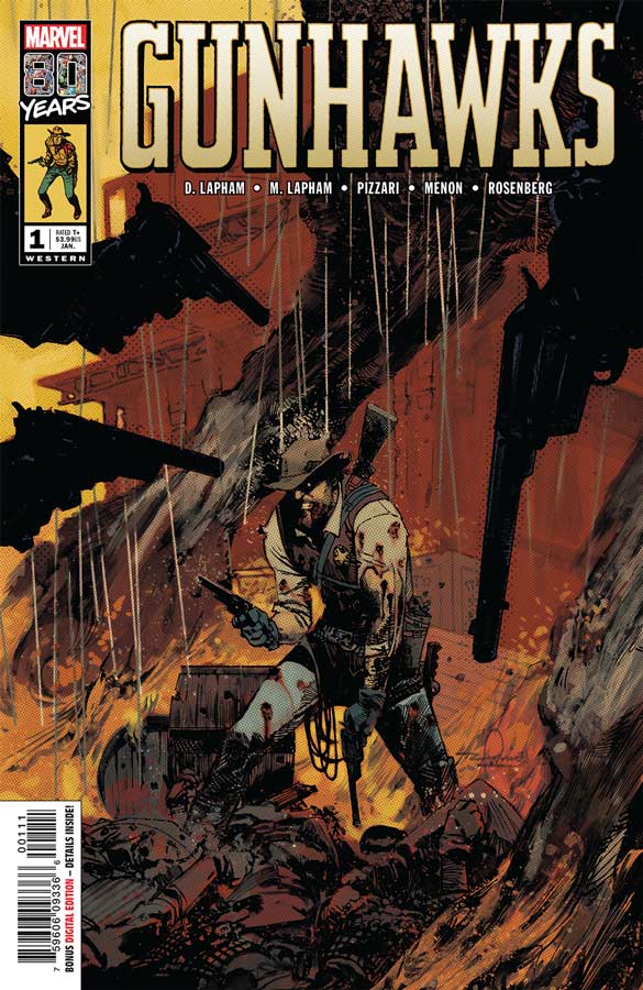
Gunhawks #1
Marvel Comics Writers David & Maria Lapham, Artist Luca Pizzari, Colorists Neeraj Menon & Rachelle Rosenberg, Letterer Travis Lanahm
So far these Marvel 80th one shot specials have been a little hit and miss but who doesn’t have a bit of a soft spot for a good old western comic and David and Maria Lapham deliver a trip back to the classic west. They cut right into the action of the story and keep is moving along at a nice pace throughout. They play all of the classic western trope cards as one would expect and while the story is not filled with any huge surprises it ends up being a nice little read. The only complaint that I have with the story is that it wraps up far too quickly. The conclusion to the story is very rushed and when you get to the end you wish there was more to the story but there wont be and I sadly felt a bit unsatisfied by it. The artwork by Pizzeri fits the story like a glove and has a nice classic 70’s/80’s vibe to the artwork that fits the tone of the script. Visually its a nice mix of comic art but has a great western cinema feel that was a nice touch. This is a really nice looking book and visually hits all of the right beats perfectly.
Is this book worth your time and money? While I was disappointed with the quick ending of the story, it was nice to see a classic western comic back on the stands even if its only one issue. While this comic is not going to be for everyone, but if you are like me and have a soft spot for western comics then this should do the job nicely and is well worth checking out.
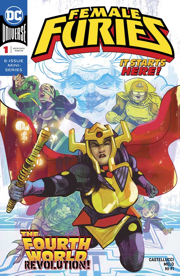
Female Furies #1
DC Comics Writer Cecil Castellucci, Artist Adriana Melo, Colorist Hi-Fi, Letterer Carlos Mangual
On the heels of the very well received Mister Miracle series comes another Kirby inspired mini series that takes a look at the underrated female Fourth World characters. Castellucci who did a very nice job on the Shade the Changing Girl/Woman series for the Young Animal imprint recently brings her sharp storytelling to this book that gets off to a good start. What I liked what she did with the story was how she blended the present with the past to tell some backstory that added to the history of Granny and how the past affects how she came to be. While some might find her take on the Fourth World a little off, I liked that she took some risks with the story and that is what makes it interesting to say the least. This first issue is a bit on the heavy exposition side but she does move it along pretty well and really plays up the battle of the sexes spot on here. Melo’s artwork is a little mixed here. I liked a lot of her work on the book but there were some noticeable inconsistencies where the artwork had a stiffness to it that distracted from it at times. This is not to say that her artwork is bad but in fact there is a lot to like here but her recent work on the Plastic Man mini series had some of the same issues. A good inker might have helped fix some of the roughness here.
Is this book worth your time and money? I like a lot here but there were also some frustrations at the same time. The story shows promise and the second issue will be the key here. Castellucci did set things up at the end of the issue so hopefully this will keep things moving along. Melo’s artwork is where the book struggles a bit and I hope that she is able to improve as the series goes along. While it’s a marginal recommendation here more so if your a fan of the Fourth World characters but it’s hard to call it on this first issue.
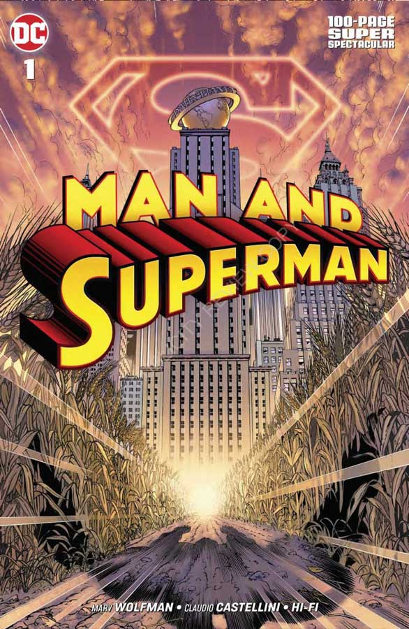
Man And Superman #1
DC Comics Writer Marv Wolfman, Artist Claudio Castellini, Colorist Hi-Fi, Letterer Tom Orzechowski
Long ago there was a title from DC called Superman Confidential that was a series that had stories by different creative teams that would tell story that would sometimes be just one issue to four issues. This story was originally intended for that series but the book was canceled before this story could be printed. The story never found a way to be published until now and I have to say it was worth the wait. Wolfman says that it’s the best Superman story he has ever written and that might be the case once you have read it. For the record, I think the best single story that he has ever written was Who is Donna Troy in the New Teen Titans. What I will say is that he really taps into what makes Superman great is not the Super part but the man part. It’s Clark that is the main reason that he works as such a great superhero because that is really is disguise and he has to play someone who he really isn’t and yet deep down inside that is who he really is because of how he was raised. Wolfman really gets that part of the story here and while the basic premiss of this story has been told many times before, I did find that Wolfman found a great new angle to tell it and that is why it feel so fresh. He take the time to tell Clark’s story here and that is why it works so well. There are many things that Wolfman draws inspiration from here and I loved the nods to the original 1978 Superman movie that was a very nice touch. But what really sells this story is the “human” aspect of both Clark and Superman and he very wisely developed them both perfectly here. For this story to work there needs to be an artist to capture the emotions of the characters and the subtle dramatic moments that really make it pay off and Castellini really puts his heart and soul into this book. While not comparing him but his artwork reminded me of Jose Luis-Garcia Lopez who to me is the Superman artist and Castellini does what he did so well over the years was to put very small character details into the artwork that really sink in visually as your reading the story. It’s the page of Clark sitting on a bench in the park writing the story but listening to all of the people talking around him and he is able to capture the frame of the moment so well that your able to visualize all of the other frames that fit in-between. That is what the difference between a good artist and a great one and Castellini is one of the best and this book proves it.
I this book worth your time and money? I have to agree with Wolfman in that this is one of the best Superman stories that I have read in quite a while. What makes it so good is that he is not trying to reinvent the wheel here. Sure it’s not original but it’s not trying to be either. What it does do is tell the story exceptionally well. With gorgeously stunning artwork that makes this book a great read but one that will stick with you. While some might shy away from the book because of the price, it’s really one hell of a deal because if DC had released it as a four issue book you would pay more than the $10 price here and there are no ads in the book just pure story and art. This book is one of those rare jewels that comes along not very often and those are the ones that you will really treasure and this one is a gold mine. HIGHEST RECOMMENDATION!
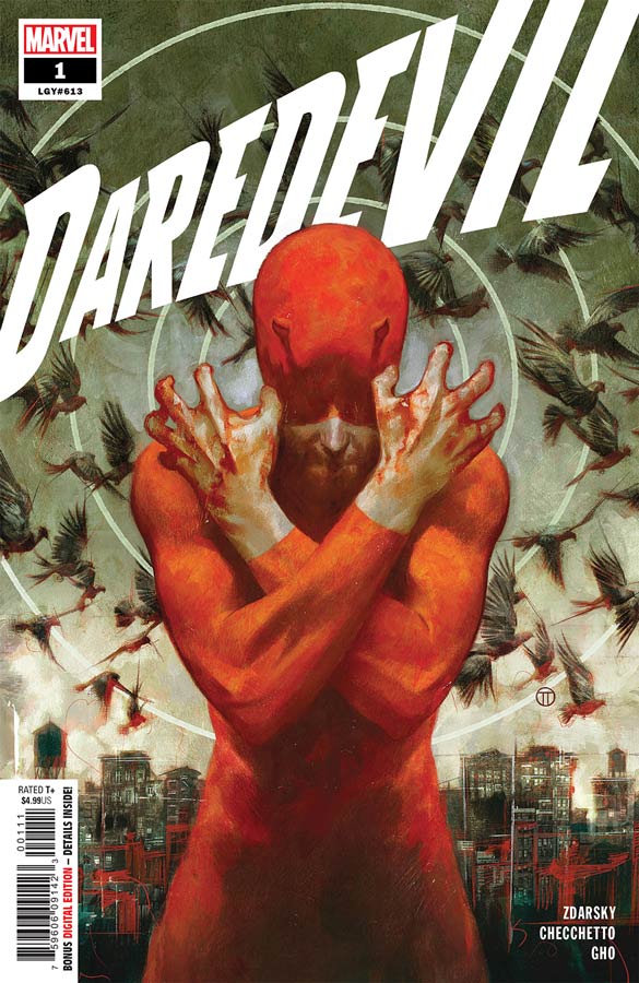
Daredevil #1
Marvel Comics Writer Chip Zdarsky, Artist Marco Checchetto, Colorist Sunny Gho, Letterer Clayton Cowles, Back Up Story Writer & Artist Chip Zdarsky
I’ll be really honest in that I haven’t been overwhelmed with Zdarsky’s work at Marvel so I was a bit hesitant to buy this book but as a fan of Daredevil I was willing to give it a try and I have to say that this is a huge improvement for Zdarsky. He has done a very wise thing here in that this first issue is great for both old and new readers. I haven’t read a daredevil comic since the Mark Waid run a few years back so all of the recent event means I had no clue to the plot threads going into this book. Zdarsky wisely gives new readers enough dialog along the way to cover you so you never feel lost and that is a huge plus for this first issue. He also delivers great flashbacks to the past that play well in the present and fits them together nicely in this first outing. The one thing that worked very well in this first issue was that Matt was not quite ready to get back to the devil so soon and that part of the story gave it a great vulnerability to him that fleshed out his character nicely. Another win for this book is Checchetto’s wonderful artwork that brought a grounded gritty look to the story that complements the script very well. He is able to capture both the action and the more subtle dramatic elements of the story with ease and gives the book a nice visual mood that helps sell this story.
Is this book worth your time and money? While I wouldn’t say that this book is ground breaking in any way it was a solid read and for a Marvel comic that is really saying a lot in its current state. Zdarsky really tries to get both new and old readers onboard here and for a first issue he delivers that quite well here. The story has promise and hopefully the story will keep this first issue pace up as it continues. Checchetto’s artwork seals the deal in bringing a nice visual flare to the book. It’s worth reading this week.
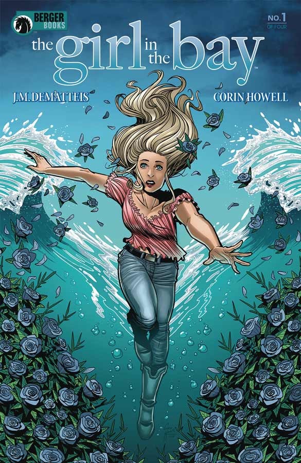
The Girl in the Bay #1
Dark Horse Comics/Berger Books Writer J.M. DeMatteis, Artist Corin Howell, Colorist James Devlin, Letterer Clem Robins
This comic is one of those that I liked but not sure what is really going on. DeMatteis script is not necessarily confusing but its as if not much actually happens in the story. This is entire first issue sets things up and is heavy in exposition but you never really feel a hug connection with Kathy the main character as you should be. The story is certainly not ba but never really drew me into it. The “shocking” ending was a bit too cliche for my taste but I’ve certainly seen worse. I think the problem is that the book just kind of sits there and you don’t really care whats going on here. On the plus side Howell’s art is quite nice here. She does a really nice job of pulling off the drama of the script quite well and made it a much better read because o the visuals that she delivers here.
Is this book worth your time and money? I liked some of the ideas that Dematteis put into he story but by the end I was pretty board and didn’t really care what was going on and that is where the problem lies within this comic. It’s not a total wipeout and could turn the corner in the next issue but for me there is very little incentive to come back for more. Too bad because I really liked Howell’s artwork on the book. It’s not bad just underwhelming.
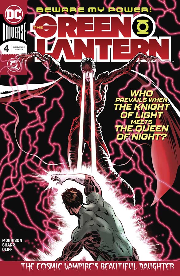
Green Lantern #4
DC Comics Writer Grant Morrison, Artist Liam Sharp, Colorist Steve Oliff, Letterer Tom Orzechowski
This is one of those rare comics that just keeps getting better and better and were only at the fourth issue. What I love that Morrison is doing here is playing with the morality of what a superhero is and can be. The comic still has all of the classic elements in place with the action and good vs evil but what he infuses is that large grey area between right and wrong , and good and evil to show that everything is not always clear and cut and dry. I also am loving that he is using more obscure and new Green Lantern Corps characters to be with Hal. Most writers use the same old supporting cast but not Morrison who has one member with an exploding head that is mind blowing (pun very much intended here). I also liked that when you start reading this issue, your a bit taken back as if you have missed something from the last story in the way that he sets thing up here. It’s not that you feel lost but he tells the story in a roundabout way that has you very curious as to what is going on so when things are revealed it’s not that he is trying to shock you but the entire story floods back to you and you get it and that is what is making this book so damn good. How do you finds way to continue to praise Sharp’s artwork. This guy is really putting his heart and soul into the this book and it really shows. The thing that continues to impress me the most is that the level of detail is far beyond what most artists would do here. It’s the small little things that Sharp brings to each panel, each facial expression, each large scope battle that is making this book work in all of the right ways. The blending of the collaboration of Morrison and Sharp is one of those very rare things in comics. They are so seamlessly tied together that you are never taken out of the story but are pulled in deeper because of it.
Is this book worth your time and money? It amazing in such a short time this have become on of the must read comics. It’s both classic superhero comics and at the same time transcending the genre and taking it to a whole new level. It not only works for seasoned readers but is great for new readers to jump in to see what comics really can be. This is simply the best superhero comic out currently and if your not reading then you are missing a classic. HIGHEST RECOMMENDATION!
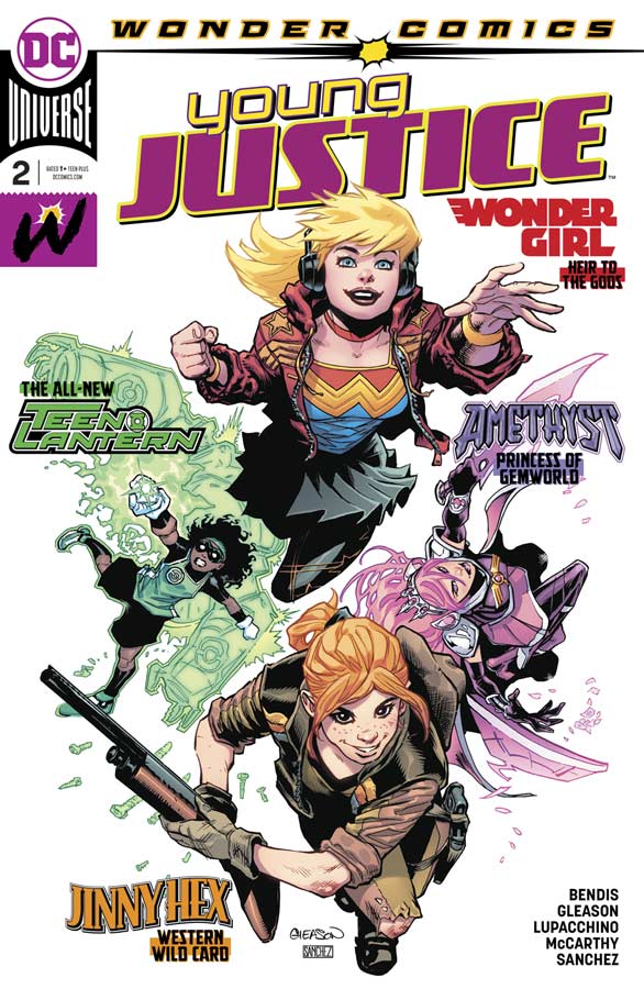
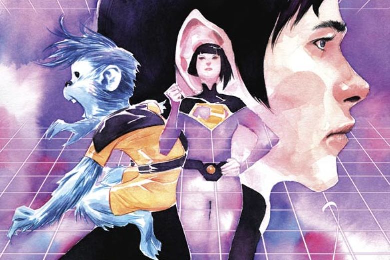
Young Justice #2
DC Comics Writer Brian Michael Bendis, Artists Patrick Gleason & Emanuela Lupaccino, Inker Ray McCarthy, Colorist Alejandro Sanchez
I really enjoyed the first issue of this new series but was a little disappointed in this second outing. Bendis is still setting up the team and that is a good thing, but the problem is that there is very little forward motion to the plot here and that is frustrating because it’s great that he is taking the time to set each of the team members up but by the end of this issue the cliffhanger has very little payoff and really wanted more story here than what Bendis delivers. Gleason and Lupacchino deliver on the artwork side of things and makes for a nice looking book but I’m puzzled by that fact that Gleason was only able to do one full issue without having another artist come in. This is a pattern that is slowly happening over at DC and its really frustrating that a new series cant keep an artist for more than one issues. It really isn’t helping the visual continuity of a new comic either. The good news is that the two different styles are not hugely far apart here and it is a nice looking comic and thankfully isn’t jarring to the reader.
Is this book worth your time and money? I was disappointed in some ways with this second issue but it’s not that its bad because setting up the cast is very important to a continuing series but Bendis did drop the ball a bit with not moving the plot forward that much so hopefully he will get things back on track with the next issue. The artwork is still good but I hope that at least one of the artists stay on the book for more than an issue as the comic goes along. Still worth reading but not a much as the first issue.

Batman #64 (The Price)
DC Comics Writer Joshua Williamson, Artist Guillem March, Colorist Tomeu Morey, Letterer Steve Wands
It seems that the Batman/Flash crossover is a yearly event and as you know event comics are both a blessing and a curse depending on how you look at it. Williamson story here sets thing in the story up but I didn’t really find an emotional connection to the story. Sure it’s a decent read but there really wasn’t anything new or compelling here. Williamson moves the story along and it does the job but by the end of the issue the cliches end up building up here too much. I am getting tires of these event mysteries that is plaguing comics now. When you compare this to this weeks Green Lantern you will see how it should be done and then look at this to see how it shouldn’t be done. I did like March’s artwork on the book but there is little that he is able to do with the mediocre story that he has to work with here.
Is this book worth your time and money? This comic is not terrible but it’s just average and not very original and that might be fine for some but I simply expect better. I get that every comic is not going to be a winner but I would at least appreciate a little effort by the writer to at least try to do something different and sadly that is not the case here. SKIP IT!


0 Comments