DC Comics Convergence lands this week and gets off to a shaky start.
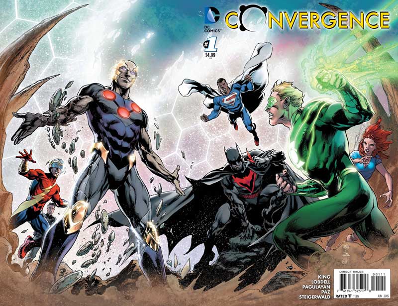
Convergence #1
DC Comics Writers Jeff King & Scott Lobdell, Penciler Carlos Pagulayan, Inker Jason Paz, Colorists John Starr & Peter Steigerwald, Letterer Travis Lanham
Let’s be honest, last weeks Convergence #0 was a huge train wreck and one would think that it had nowhere to go but up. Well so much for wishful thinking. While this issue is marginally better than the last issue, it still has a lot of the same problems. The story by King and Lobdell is mostly just a rehash of the last issue and you would think with 60 pages of story so far you would actually have a clue to what the point of this story is and get going with it, NOPE. King along with Lobdell waste another 30 pages rehashing the story from issue #0 but with more heroes from different universes. But we do learn one thing is that the basic premise of the story is that each world must play a Russian roulette with each other and the last world standing will survive. So in 60 pages it takes you that long to get a story going? I am a huge DC fan but whomever green lighted this book at DC needs to be fired. I get having the 2 month fill in issues because of DC’s east coast to west coast move but the main Convergence title is one of the worst book I have nearly read. Pagulayan and Paz do their best with the art to try to make the book look good. While the art is not as good as issue #0 is still a hell of a lot better than the writing on this mess of a book.
Is this book worth your time and money? I was willing to forgive DC for the issue #0 last week but this book is a complete waste of money and time. DC has really lost it this time and while I am still looking forward to the new books in June after this I have a bit more skepticism about that. At this point once bitten twice shy. This is the last issue of the Convergence series for me. DON’T WASTE YOUR MONEY ON THIS BOOK!!!!
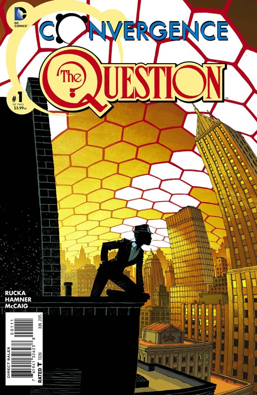
Convergence Question #1
DC Comics Writer Greg Rucka, Artist Cully Hamner, Colorist Dave McCaig, Letterer Cory Breen
The good news is that it appears that the stand along batch of Convergence titles will be on their own meaning that you can skip the train wreck main series and just pick up the ones you want. Rucka and Hamner re-team from their Detective Comics run and bring back Rucka’s fan favorite Question. The basic set up of each Convergence book is that they are trapped in their world but each book is its own story. Rucka is really good at two things, female characters and gritty mysteries. Thankfully he gets to do both in this book. He also brings along Huntress and Batwoman to the story and throws in Two-Face to add to the mix. Rucka’s run on Question was really good and is really great to see him jump right back into the character. The thing that I loved about the story was that he could have done the standard super hero trapped and the villain has to be stopped, but instead he does a more psychological story of how Convergence affects the normal and changes the rules. Hamner is a really great choice to do the art on the book. He does a great job of capturing the mood of Rucka’s story and give the story the visual look that it needs to work so well.
Is this book worth your time and money? After the regular Convergence series reading the back of a candy wrapper would be great. But in this case the book stands solidly on its own. Rucka and Hamner bring back what made the Question book good in the first place, solid story and good art. It’s a really simple thing to do and they do it very well here. RECOMMENDED!
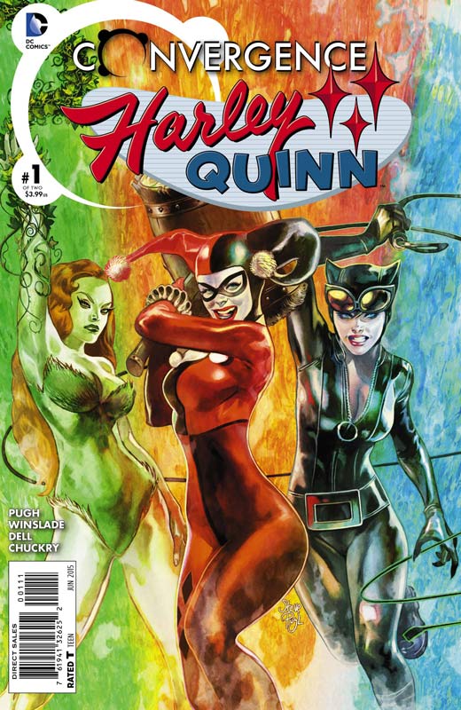
Convergence Harley Quinn #1
DC Comics Writer Steve Pugh, Penciler Phil Winslade, Inker John Dell, Colorist Chris Chuckry, Letterer John J. Hill
I am a huge fan of the new Harley series by Palmiotti and Conner but still hate the hooker outfit that they have her in so it was nice to go back to visit the original Harley that we all fell in love with. Pugh sets up the story as a sort of What If Harley tried to go back to her former self as a psychiatrist and having a normal life with the police officer she injured. But as with any time you try this you can’t change what she really is. Pugh has a lot of fun with having Harley doing the “normal” thing but having here subconscious sneaking up on her. He also keep the light and fun tone that has always made Harley such a great character. By the end of the issue the full trio of Harley, Ivy, and Catwoman are back together and it seems the fun is just beginning. Winslade’s art is a real treat here and visually doing a great job of bringing back the Harley that we loved and missed so much. He really put a lot of detail into the artwork and I have always been impressed with the way that he captures the subtle facial expression of the characters.
Is this book worth your time and money? The classic visual Harley that we love is back and Pugh and Winslade do a great job of capturing the feel of the original Harley. This is a fun book that does a nice job of balancing the story of Convergence but still making the book feel just right. If you are a Harley fan then your going to get a kick out of this book. RECOMMENDED!
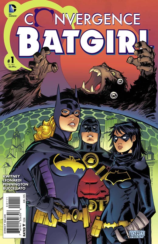
Convergence Batgirl #1
DC Comics Writer Alisa Kwitney, Penciller Rick Leonardi, Inker Mark Pennington, Colorist Steve Buccellato, Letterer Dezi Sienty
Well they all can’t be winners. While Batgirl is not a train wreck like the regular Convergence series the biggest problem with this one is just being kind of blah. Kwitney script is has some fair ideas going for it and there are a few time where it worked pretty well. When she told the average day under the dome part of the story it actually was pretty good but the problem is that as an overall story it becomes very pedestrian in the end. Some of the dialog is pretty laughable and the line “one of them punched me in the mammary gland” is simply awful. That is one of the problems with it is the constancy of the script. I will give the book looks really good thanks to the ever talented Leonardi who brings some really nice art to the book that it’s a shame that he is stuck with a mediocre script to work with.
Is the book worth your time and money? There are some good ideas in the book but overall it just is very average story that has some focus problems. I loved the artwork by Leonardi but in the end you are not missing much if you skip this one.
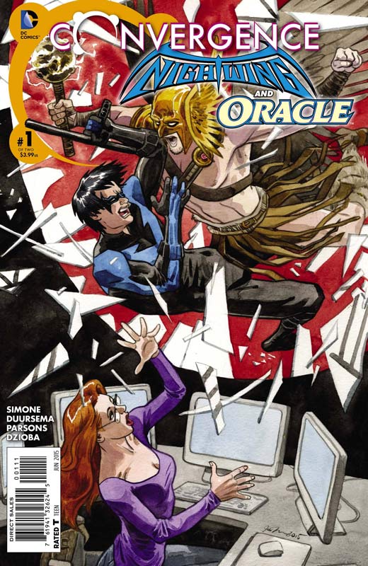
Convergence Nightwing and Oracle #1
DC Comics Writer Gail Simone, Penciller Jan Duursema, Inker Dan Parsons, Colorist Wes Dzioba, Letterer Carlos M. Mangual
Nightwing and Oracle does make for a good read for this weeks Convergence books. Simone is sometimes up and down and fortunately this is one of the up ones. At first you’re not sure what is going on with Hawkman and Hawkwoman but things become clear as the story moves along. Probably one of the best parts of the story is when Mister Freeze actually gives up the heist because there is no sport in it anymore. Simone does a nice job with the emotional side of the story and that is where the book really shines. She also does a nice job with the ending of the story and the underlying plot threads of it. The art side is beautifully done by Duursema and Parsons and is one of the best looking books for this weeks Convergence titles. She really put a lot of great detail into both the action scenes and the dramatic ones also. This is a great looking book.
Is this worth your time and money? I did like this book quite a bit. Simone put a lot of character into the story and that really pays off in the end. The pacing of the story was quite nice and makes you want to pick up the next issue to find out what is going to happen. Putting the book over the top is the really wonderful artwork by Duursema and Parsons. RECOMMENDED!
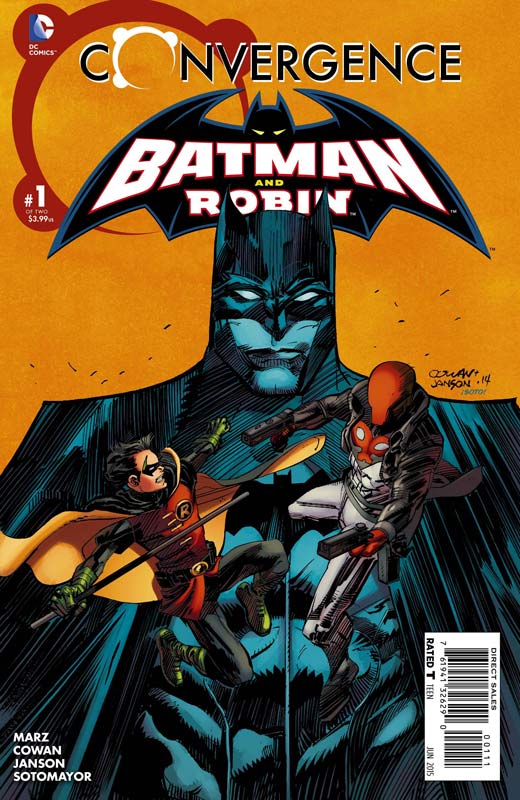
Convergence Batman and Robin #1
DC Comics Writer Ron Marz, Penciller Denys Cowan, Inker Klaus Janson, Colorist Chris Sotomayor, Letterer Rob Leigh
This is another one of those average Convergence books. The script by Marz is pretty standard super hero stuff that while not bad but, you have read this story a million times before. The love I mean conflict between Batman, Robin and Jason seems rather forced and flat. The book is not bad but it just very average story in the end. I will give Cowan and Janson do a really great job on the artwork and give the book a great visual mood. It’s just a real shame that their artwork in far better than the story.
Is this book worth your time and money? Another Convergence title that fall in the average pile. The story is what kills the book in the end because it never tries to take the story in a unique direction. The artwork on the book is really nice but not enough to save it in the end.
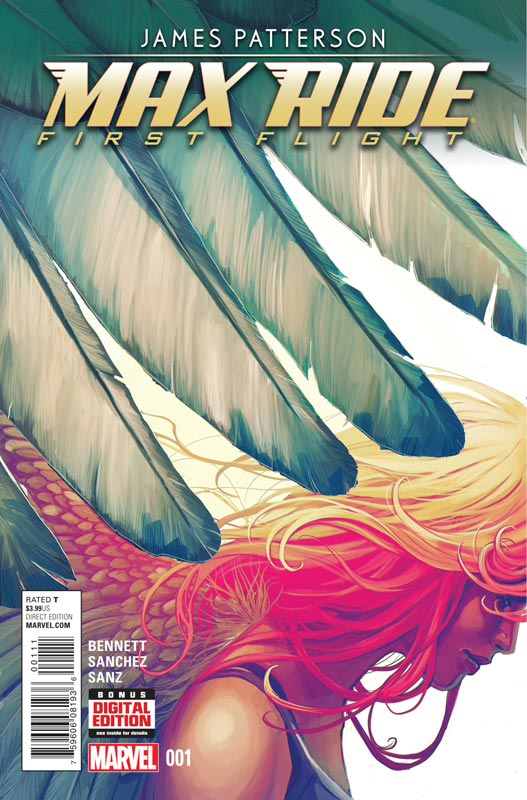
Max Ride: First Flight #1
Marvel Comics Based on the novel written by James Patterson, Writer Marguerite Bennett, Artist Alex Sanchez, Colorist Esther Sanz, Letterer Travis Lanham
I have never read the novel that this book is based on so I went into the book fresh. The script by Bennett does a nice job of introducing the characters and setting up the concept of the story of the world. There were two thing that did nag me a little. One was that the story felt a little too close to the X-Men and while they are not mutants but the kids are genetically modified and just seem to similar. They are also attacked by Erasers that seemed way too close in theme to the Sentinels. The second thing is that the issue is over far to quickly and while you do want to find out what happens in the next issue the book might have worked better as a double sized issue that contained both issues 1 & 2. I just couldn’t shake the X-Men thing and hopefully the next few issue will breakaway from that. Sanchez artwork is really nice but there were a few inconsistent panels but overall the book looked really nice.
Is this book worth your time and money? I did enjoy the book but do hope that the story breaks a little out of the X-Men mold and go in a different direction than it currently seems to be. The book was over too quickly to make a hard call on it yet but I will say that I will give the second issue a try to see where it’s going to land.
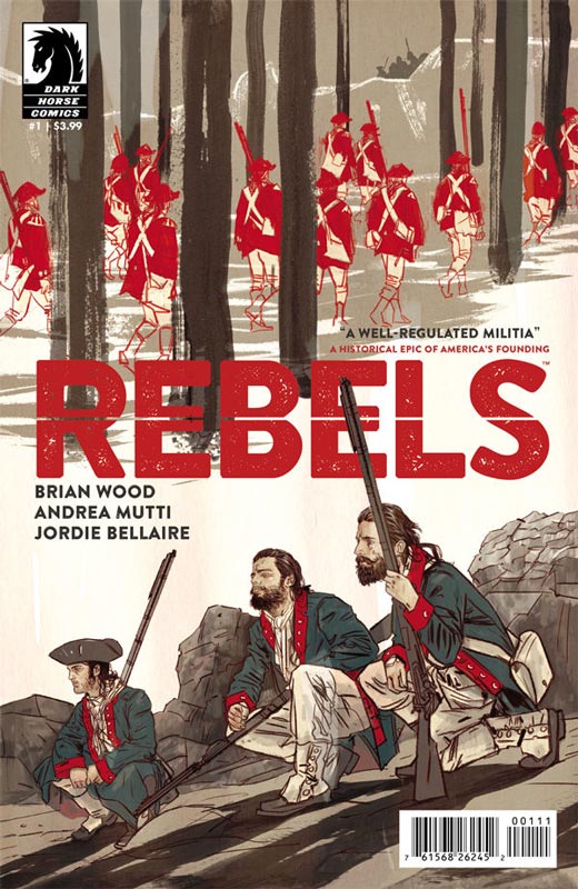
Rebels #1
Dark Horse Comics Writer Brian Wood, Artist Andrea Mutti, Colorist Jordie Bellaire, Letterer Jared K Fletcher
Wood is a really good writer and I was very intrigued with the concept of this book. It’s noted in the front inside cover that the story is fiction but based on some historical events that have been mixed into the story. The one thing that Wood really nails is that the feel of the story is perfect. While I am not an expert on the American Revolution I really felt transported to the period when I was reading it. The key to the story working so well is that he has created characters that you can relate to and what they are going through at the time. I loved that the story was more than just battles that these type of stories tend to focus on. The other thing that I loved was that it didn’t deal with the big stories of the American Revolution but on the average person who just wants to live there lives. Mutti really nails the feel of the period in her artwork and really brings the story to life. She give the book such a great down to earth feel that makes reading it that much more emotional.
Is this book worth your time and money? I really loved this book and hope that people will pick the book up and not be turned off by the subject matter. With Wood doing a fiction story based on historical events really opens the door to tell a very interesting story. Add the wonderful Mutti artwork and this book is a real winner. VERY RECOMMENDED!
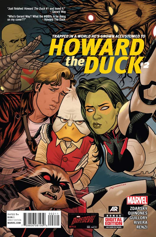
Howard The Duck #2
Marvel Comics Writer Chip Zdarsky, Penciler Joe Quinones, Inker Joe Rivera, Colorist Rico Renzi, Letterer Travis Lanham
The second issue of Howard the Duck I had hoped would alleviate some of the concerns that I had with the first issue of the book. The biggest problem with the book is that it’s just not Howard the Duck just a sad imitator that they should say Trapped in a Comic That He Never Made. Zdarsky unfortunately seems to have missed the whole point of Howard that Steve Gerber did with the character. Howard should feel somewhat out-of-place in the story. Zdarsky makes him just another character in an average superhero book that is so far from satire that it’s just becomes sad. The story is just basic and average that you could insert any other character into Howard’s place and the book wouldn’t change a bit. Quinones’s artwork seems to have really taken a dive with this issue. It’s very flat and lacking much detail beyond the main characters. There are moments where it does look good but overall it’s very inconsistent.
Is this book worth your time and money? A lot of people seem to like this book but I would bet good money that they have never read the original books. It’s a real shame that this incarnation of Howard the Duck has turned into the thing that the character was an originally satire and now has itself become a joke. I’m done with the book at this point and would suggest to buy the original Steve Gerber and Val Mayerik version and forget this ever happened.
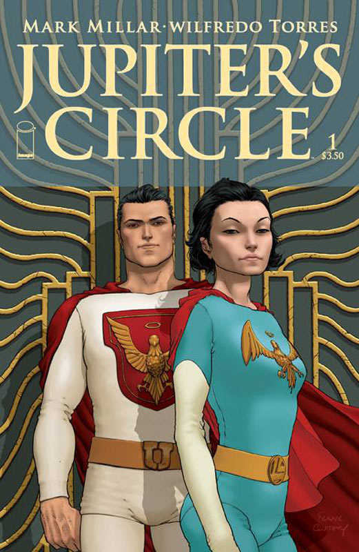
Jupiter’s Circle #1
Image Comics Writer Mark Millar, Artist Wilfredo Torres, Colorist Ive Svorcina, Letterer Peter Doherty
I honestly don’t remember reading Jupiter’s Circle so I’m going into this fresh and I have to say I did really like the concept of the book. While there are definite shades of Watchmen overtones to the concept I think that Millar has some fun play with the 1959 period that the story is set in. It feels like the period but with a modern take of the times. The idea of a gay superhero is not new but throwing it in the past does bring up interesting possibilities. The story moves along at a nice pace and Millar does a nice job of setting the series up and has a very nice cliffhanger to this first issue. Torres’s artwork really captures the style of artwork that you would see from the period. He really captures the period and the tone of the story’s setting perfectly,
Is this book worth your time and money? I rather enjoyed this book and honestly Millar’s books of late have not really bowled me over. He does a nice job of playing with history and then adding some modern twists to the story. when you add in Torres’s great artwork you have a good start to the series.
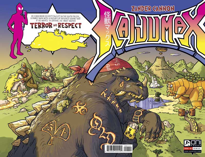
Kaijumax #1
Oni Press Writer and Artist Zander Cannon
Probably best know for his work on the Alan Moore comic Top 10 Cannon brings his unique style and vision to his new book Kaijumax. If you are a fan of Godzilla then this book is right up your alley. What a great concept of giant monsters being sent to a maximum security island as punishment for destroying cities. It’s like mixing Destroy All Monster with Orange is the New Black and it works really well. While the book could have been a light and breezy story Cannon infuses a lot of emotional impact to the story that really impressed me. The first issue does a really nice job of setting the concept up and by the end of the issue he really caught me off guard with the direction that he took the story. This is definitely not a book for young readers but that being said that it could be for teenagers and up. Cannon’s art is perfect for the story. While one would think of a manga style for the story I think that Cannon’s style fits the emotional core that the story has. While on the surface the artwork may seem simple, it has quite a lot of subtle detail to it.
Is this book worth your time and money? I was really impressed with this book. A really impressive concept that has a lot more emotional impact than I thought it would be. I really enjoyed this book and I am looking forward to where Cannon is going to take the story. There is a lot of great possibilities to this book and can’t wait to see where he take us. VERY RECOMMENDED!
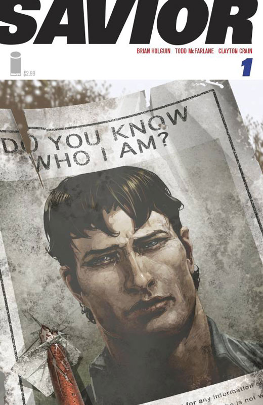
Savior #1
Image Comics Story Todd McFarlane and Brian Holguin, Artist Clayton Crane, Letterer Tom Orzechowski
I almost didn’t pick up this book but my local comic shop had it on sale this week and I thought I would give it a chance. I will be honest that McFarlane is not a very good writer and that is why I was not going to pick this book up.McFarlane is a good idea man but his scripts leave a lot to be desired. Luckily Brian Holguin is probably the reason that the book actually works pretty well. The concept while certainly not original does play out pretty well in this first issue. The only hesitation is that will the story elevate over it’s tried and true concept that lacks originality. The story does the beats of the story well and sets up the book with at the very least seeing where the second issue goes with it. The real savior of the book is Crane’s stunning artwork. The two page spread of the airplane crashing is spectacular. He really elevated the story to a better level. He is probably the main reason that the book works as well as it does.
Is this book worth your time and money? Cranes artwork is the main draw of this book. He really delivers the goods and make the book worth picking up. The big question is whether the story is going to rise above the predictable plot that the series sets up. I’m not holding my breath but willing to give the book at least another issue to see if the story can rise to the level of the great artwork.



0 Comments