Lots of books this week with a surprisingly strong showing from Marvel Comics. So let’s get to this.
Renato Jones The One % #1
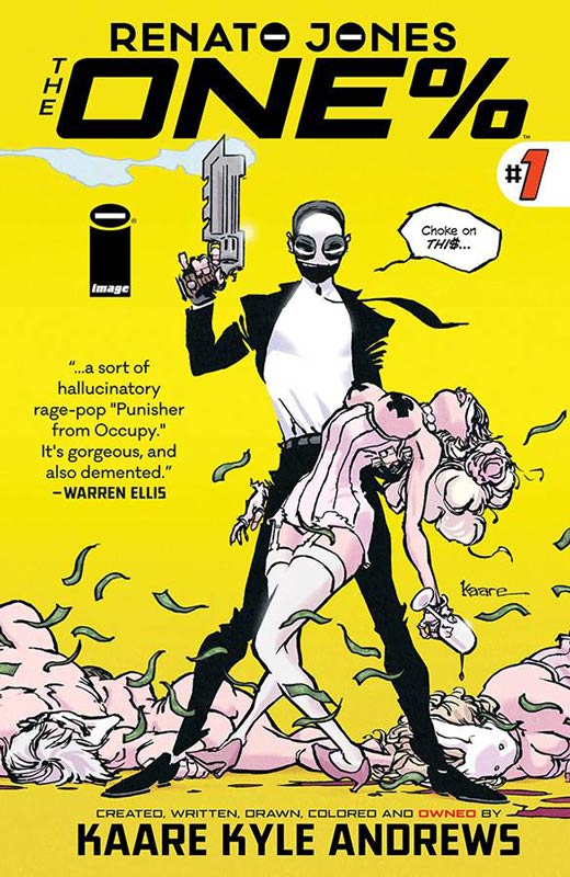
Image Comics Writer/Artist/Colorist Kaare Kyle Andrews, Letterer Jeff Powell
Renato Jones is a title that on the surface has an odd visual style at first glance but once you start to reading the book you soon discover that it quite smart and snappy. Andrews does a very nice slow build up in the first issues story by doing a great job on the set up exposition of the premise and blending an exciting kick off to the series. Not only is the story timely with the divide between the 1% and the rest of us but to spin it as a vigilante superhero is quite genus. What impressed me with his script is how by the end of the issue you are completely taken with the book and you don’t realize how much it wins you over until the end of the issue. It really washes over you and gives you an amazing feeling afterwards. His art style is quite impressive with a wonderful blend of different influences but very original and fresh. The blending of the flashbacks within the story are very seamless and his use of color is quite remarkable. His artwork has a rare noir quality that you rarely see in comics today and gives the book a wonderful mood that really draws you into the story. The use of the fake Renato Jones advertising in the book is a stroke of brilliance and quite amusing. Is this book worth your time and money? In a sea of sameness Renato Jones The One % is a real breath of fresh air that not only entertains but weaves in topical current social and political elements that makes for not only a great read but makes you think at the same time and that is very striking. He blends everything together so effortlessly that the story just flows so well while your reading it that is just breezes by and leaves you wanting more. This is a book that has a lot to say and a must read comic this week. HIGHEST RECOMMENDATION!
The Punisher #1
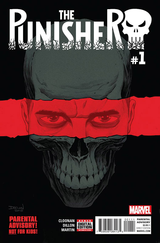
Marvel Comics Writer Becky Cloonan, Artist Steve Dillon, Colorist Frank Martin, Letterer Cory Petit
The Punisher is back and off to a pretty good start. Cloonan has done her homework with the script with the influence of the Garth Ennis run for the tone of this new series and it’s a wise choice. While the story doesn’t break a lot of new ground here in this case that is not a bad thing. Wisely she didn’t try to reinvent the wheel here and her script put the Punisher back on track with a good first issue. The story hits all the right beats for new and returning readers that does assume that you at least have previous knowledge of who the Punisher is. Getting previous Punisher artist Dillon does add a nice touch to the book. Other than Mike Zeck is probably one of the best artist to ever draw the Punisher and he brings a gleeful zest to the book in both the dramatic and the bloodbath that are a key element of the book. He is the perfect artist for the book and gives it a strong visual punch that is very much-needed for the character. Is this book worth your time and money? While the first issue is good Cloonan does miss an opportunity to give this new series a new or different voice. The big key for the book is where the story is going to go. While it’s good it never challenges or surprises the reader. It does suffer from a been there and done that set up that hopefully will change as the series goes on. If you’re a fan of the Punisher then your going to buy this book and if you’re not then it’s worth getting for Dillon’s art alone but there is little new ground here with the story. Hoping for a stronger second issue but was a decent read.
4001 A.D. #1
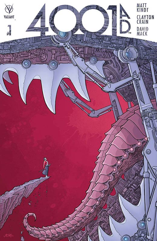
Valiant Entertainment Writer Matt Kindt, Artists Clayton Crain and David Mack, Letterer Dave Lanphear
This new summer mini series from Valiant offers new readers a good starting point to get into the Valiant Universe. Kindt script does a nice job of setting up the event book with an interesting concept but there was a little nagging feeling that as a new reader I was missing a bit of the back story while reading the book. It does give you a nice three page back story with gorgeous artwork by Mack to get new readers up to speed and that really helps. While this first issue is mostly set up and not a lot happens in the book I will give Kindt’s script does a good job of keeping you interested with all of the exposition going on. The real win here is the beautiful artwork by Crain who gives very lavish painted artwork that really makes the book shine. He really helps move the story along with some great layouts and really brings Kindt’s script to life. Is this book worth your time and money? While the book is pretty enjoyable it does suffer a bit from being an “EVENT” comic that is a good read but didn’t wow me like it should have. I will give it that there is enough here to bring me back to give the second issue a shot to see if it comes together. It does suffer from being not super new reader friendly that has really plagued Valiant books but I have to hand it to Kindt that he does his best to give new readers a chance to jump on board. It’s a book that I liked but didn’t wow me either. I’m willing to give the book a second issue because there is promise to the book and I hope that they can pull it together a little better. Still worth checking out.
Rough Riders #2
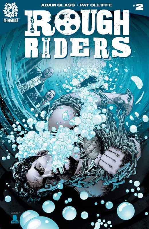
Aftershock Comics Writer Adam Glass, Artist Patrick Olliffe, Colorist Gave Eltaeb, Letterer Sal Cipriano
I really enjoyed the first issue of Rough Riders and I’m glad to say that the second issue does a nice job of keeping the book moving along nicely. Glass continues the set up with the introduction of Houdini, Edison, and Oakley into the team mix. While I would have liked a little more story arc elements, Glass does allude of things to come. There is mostly exposition again this issue but he does give a nice amount of dramatic elements and action to it to help move things along. While the concept is not totally original Glass give the book a nice spin with giving a new angle to these well know historical figures but still retaining what makes them beloved in the first place. I really love Olliffe’s artwork on the book that gives it a very grounded style that few artist could have pull off as well as he did. His old school style is really refreshing to see an artist that understands draftsmanship and puts in lots of great detail to the art that fits perfectly with Glass’s script. Is this book worth your time and money? This book is becoming a great little read and wisely doesn’t try to be more than it is. Glass wisely keeps things simple and on track that made for a very enjoyable read and now with the cast in place the next issue is one I really look forward to. Glass and Olliffe have created a fun little book here that may not knock your socks off, it will win you over with its simple and to the point charm. RECOMMENDED!
A-Force #5
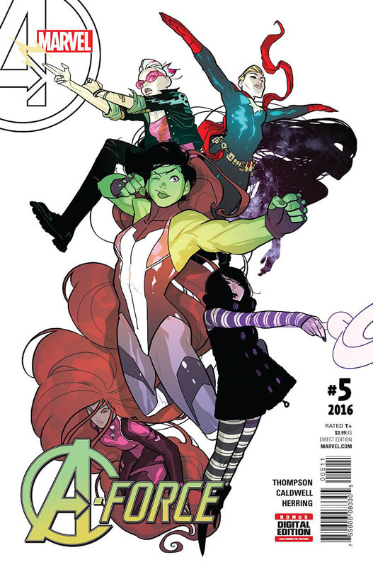
Marvel Comics Writer Kelly Thompson, Artist Ben Caldwell, Colorist Ian Herring, Letterer Cory Petit
I was very disappointed with A-Force when it first came out during the Secret Wars fiasco. It felt stale and forced and didn’t win me over. With issue five there is a new creative team on board and it’s a huge improvement over the previous team. I have to give Thompson props for injecting the one thing that was missing which was simply fun. She really did a wonderful job of balancing the drama, action and humor to give the book a really nice blend. She also really infused the cast with some great personality and great characterization that makes you care about them and less two-dimensional than the previous incarnation of the book. I also love the fact that she is willing to make the book fun and entertaining that really sets it apart from a lot of standard superhero books that fill the shelves. The main reason I bought the book was for Caldwell’s artwork. His recent stint on Prez was simply amazing and is becoming one of my favorite current artist. He really goes to town on this book and delivers some truly refreshing take on a superhero team book. What you notice first is the fact that his use of layouts give the book a really vibrant and fresh feel. He also picks up on the fun that Thompson’s script brings and simply nails it with the character expressions that are sometimes truly priceless. Is this book worth your time and money? Talk about bringing a book back to life. Thompson and Caldwell have injected new life into this book and have elevated it to a must read status in just one issue. They really bring both the story and art with their A game and made a fun and enjoyable book with strong female heroes that are desperately needed in mainstream superhero comics. HIGHLY RECOMMENDED!
Beast of Burden: What the Cat Dragged In One-Shot
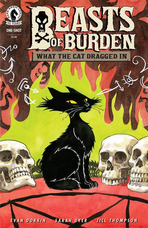
Dark Horse Comics Writers Evan Dorkin and Sarah Dyer, Artist Jill Thompson, Letterer Jason Arthur
A new Beast of Burden story is alway a nice surprise to see and this one-shot is a great addition to the ongoing mythology. Dorkin and Dyer script is a simple yet very satisfying story that tells a solid tale that is simply perfect. Rarely does a book come along that continues to tell stories that simply nail it every time. What I love about the script is that they keep it simple and to the point and yet tell an epic tale in just 23 pages that is very impressive. Thompson brings her usual great painting style to the book that really elevates the book to a whole new level. Her classic storybook style draws you into the story in a way that hits every emotional beat of the script perfectly to life. Is this book worth your time and money. Rarely do I say that a comic book is perfect but in this case as in all of the issues to date have been an absolute joy to read and experience. Dorkin, Dyer and Thompson never fail to deliver a really strong and moving story with each book when they come out. They are a real treat that can truly be cherished. HIGHEST RECOMMENDATION!
Scooby-Doo! Team Up #16
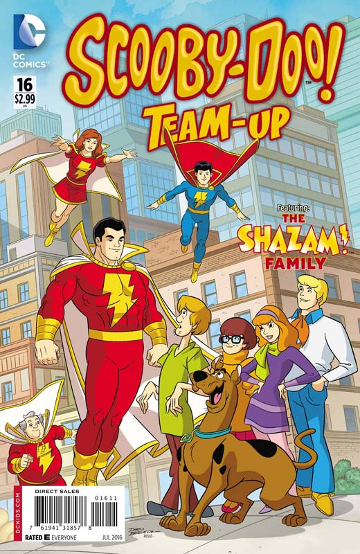
DC Comics Writer Sholly Fisch. Artist Dario Brizuela, Colorist Franco Riesco, Letterer Saida Temofonte
I have been a fan of this book from day one and while they have all been very good there are some that really stand out and this issue is one of those. Featuring the classic Shazam family is a team up made in heaven. I have always had a soft spot in my heart for the classic Marvel Family and Fisch throws all of the beloved characters into a fun and bursting at the seams with nearly every character from the Shazam universe. Fisch always delivers a story that works for both kids and older DC comic fans when he does these classic team ups and this one did not disappoint. It was simple and to the point story that was nice a refreshing little read and hit all of the right beats. Brizuela does a great job of drawing a ton of character this issue and does the Shazam family proud with a nice mix of animation style but a nice nod to creator C.C. Beck at the same time. Is this book worth your time and money. This book is always a winner each issue but this one was a perfectly simple Shazam story that had a lot of charm and fun while your reading it. VERY RECOMMENDED!
King’s Quest #1
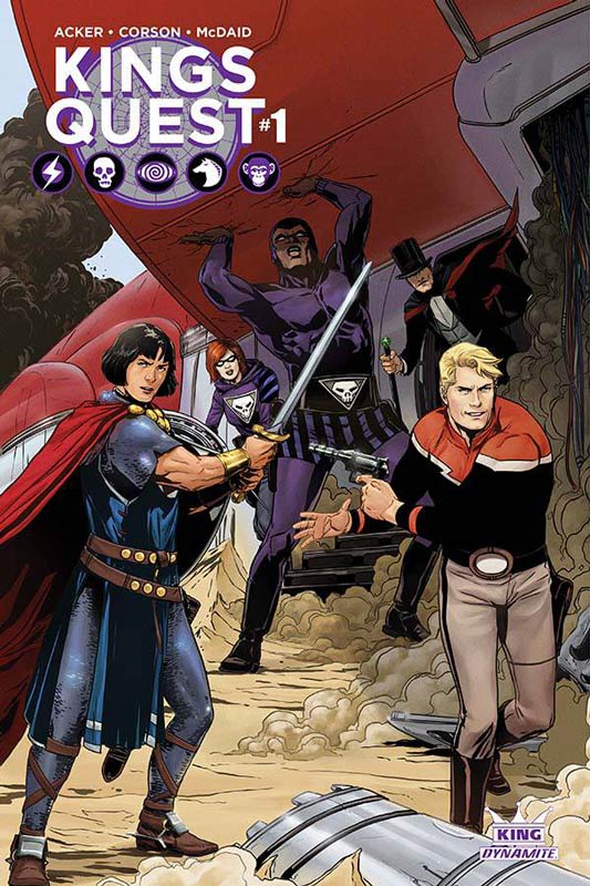
Dynamite Writer Ben Acker & Heath Corson, Artist Dan McDaid, Colorist Omi Remalante, Letterer Simon Bowland
I am a huge fan of the King Features characters but Dynamite’s incarnation of them have simply been terrible and sadly this new one is no better than before. Acker and Corson’s script has a lot going on with lots of action but it never really adds up to much substance. The characters are dropped into the story that seems to have already started. The dialog is flat and uninspired and overall the story doesn’t really go anywhere. None of the characters really feel like their classic incarnations and for new readers there is not much here for them to understand what the hell is going on because there is no back story or character development. The artwork is simply terrible. I really hate to say that because I know that drawing in not easy and not everyone can do it but McDaid’s perspective and human anatomy is just not good and there are times where the characters in the background simply have two dots and a line for facial features that is embarrassing. Is this book worth your time and money. Dynamite really needs to stop putting out these crappy King Features books if they are going to continue to get creators that simply can not grasp the characters or artist that can’t draw. This book is just bad and not worth the paper it’s printed on! AVOID THIS BOOK!
Moon Knight #2
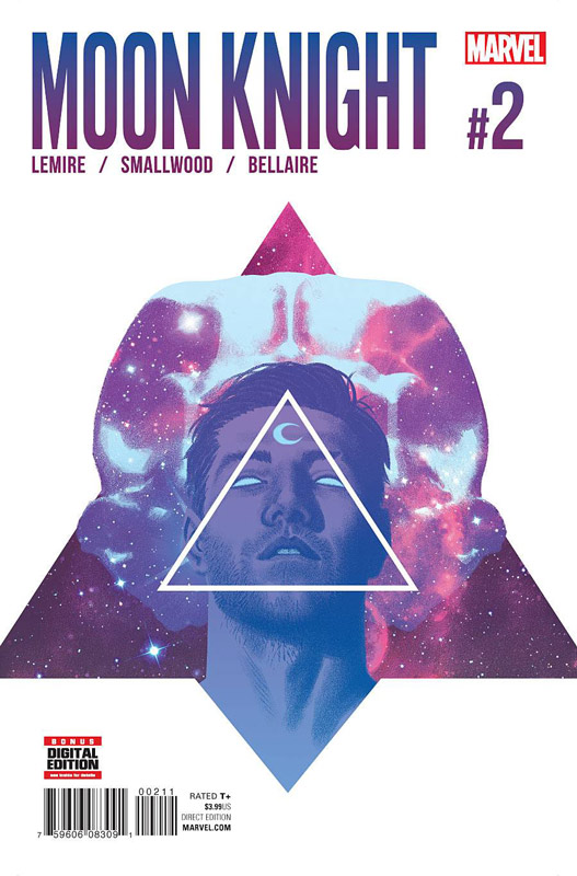
Marvel Comics Writer Jeff Lemire, Artist Greg Smallwood, Colorist Jordie Bellaire, Letterer Cory Petit
Moon Knight continues its slow burn set up and it continues to be very intriguing and moving nicely forward. Lemire is creating a nice mystery and building a nice mythology along the way with this second issue. It leaves you with a nice sense of what is real and what might be imaginary. It’s rare to get a slow burn superhero book in the mainstream and I have to give Marvel props for letting Lemire tell the story in his style that is why it’s working so well so far. There are a lot of layers to Lemire’s script and he is setting up a lot here and throws a very nice ending to the cliffhanger at the end. Smallwood’s artwork continues to impress with his ability to use different styles depending on the story elements He also brings a great mood to the story that is well complemented by Bellaire’s wonderful color work on the book that gives this book a great visual style that is really working well. Is this book worth your time and money? This book is not going to be everyone’s cup of tea but if you’re looking for a very story driven superhero book that is taking it’s time to tell then you should definitely pick this book up. Solid story and art are making this book a really pleasant surprise. RECOMMENDED!




0 Comments