Week two of DC Comics second wave of Convergence titles land this week and while I have given up on the main Convergence series I have been picking up some of the regular titles. Because there are so many I will keep those reviews a bit more brief than a full review for time sake for us both.
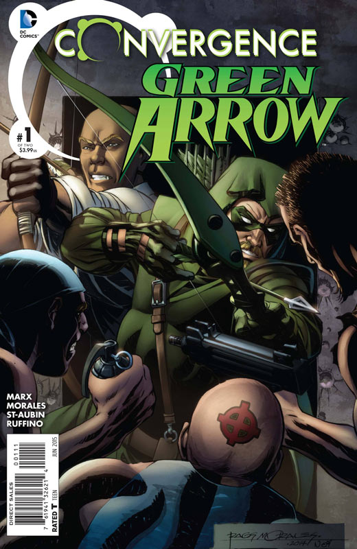
Convergence: Green Arrow #1
Writer Christy Marx, Penciller Rags Morales, Inker Claude St-Aubin, Colorist Nei Ruffino, Letterer Travis Lanham
This weeks book has everyone trapped in Metropolis except Superman it seems like and Green Arrow just happens to be hanging out there. The story by Marx is an average story that ends up just being OK. It’s very much by the numbers plot and story ideas that ends up being meh in the end. Morales and St-Aubin do a nice job on the artwork for the book but they can’t save an average story. In the end there is not much compelling me to pick up the second issue of this one. SKIP IT.
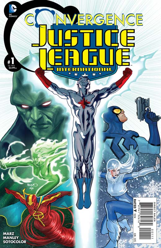
Convergence: Justice League International #1
Writer Ron Marz, Artist Mike Manley, Colorist Soto Color, Letterer Tom Napolitano
Boy I wish that this had been the fun book of the good old days of JLI when the book was goofy fun. Marz brings us an average superhero team story that hits all of the predictable beats that the story requires but none of the fun. He tries to inject some minor humor but it doesn’t really stick. Manley’s artwork is pretty standard stuff here. He gets the job done well but nothing flashy. This is sadly one of many Convergence books this week that ends up being just OK. SKIP IT.
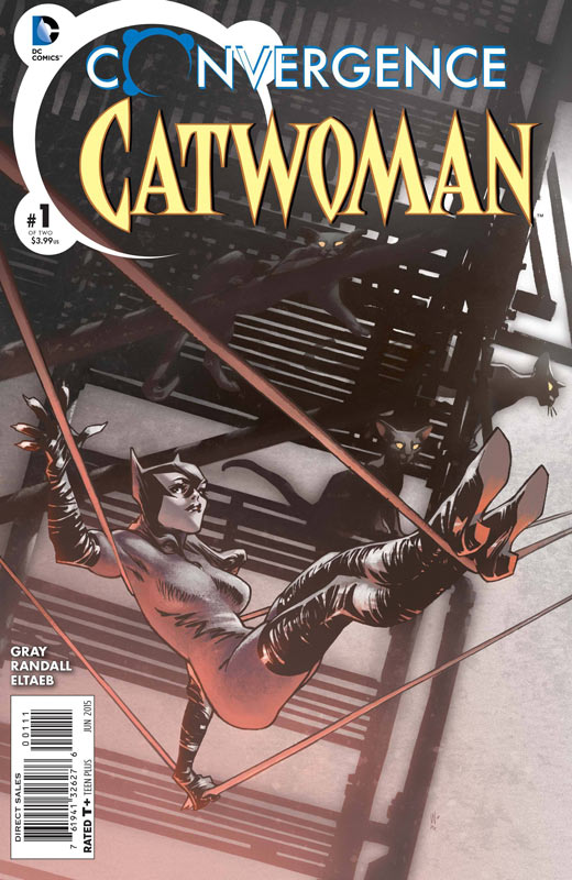
Convergence: Catwoman #1
Writer Justin Gray, Artist Ron Randall, Colorist Gabe Eltaeb, Letterer Pat Brosseau
Catwoman is almost the winner by default this week quality wise because it’s marginally better than a lot of the average Convergence books this week. Grey make a wise choice of just keeping Catwoman as herself instead of being either pre or post New 52. He keeps her as not necessarily good or bad but as a defender of the weak. Randall’s artwork is a nice look back at a the good old days art of the pre New 52 and Jim Lee era of comics. He does a nice job of making the book look really good and solid. The story while not overwhelming is a decent read and with the nice art it was a pleasant read. It might be worth checking out if you like Catwoman.
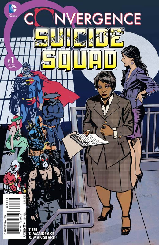
Convergence: Suicide Squad #1
Writer Frank Tieri, Artist Tom Mandrake, Colorist Sian Mandrake, Letterer Dave Sharpe
The Suicide Squad has always been a neat idea of have a super villains team. The mistake that Tieri makes is that he spends so much time setting up who is going to be in the squad that there is very little that actually happens in the first issue. We know what the concept of the book is just get on with it. There is so much exposition that bogs this book down that it’s a bit of a pain to read. I am a huge fan of Mandrake’s work but the artwork on this book is pretty bad. There is a lot of inconsistent art throughout the book and some of it is just plain awful. I was very disappointed in this. SKIP IT.
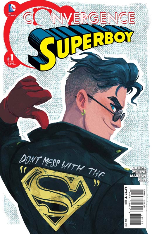
Convergence: Superboy #1
Writer Fabian Nicieza, Penciler Karl Moline, Inker Jose Marzan Jr., Colorist Hi-Fi, Letterer Travis Lanham
Nicieza script for this book is a real paint by numbers affair. The first half is sad Superboy has lost his powers the second half is Superboy is back and fighting the other heroes. The overall story really doesn’t do much and ends up being pretty boring. Moline and Marzan bring a nice if uninspired artwork to the book. It looks nice but nothing special. Another standard book that I won’t be picking up the second issue of. SKIP IT.
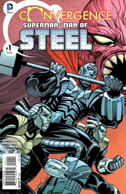
Convergence: Superman: Man of Steel #1
Writer Louise Simonson, Penciler June Brigman, Inker, Roy Richardson, Colorist John Rauch, Letterer Dave Sharpe
Simonson was one of the writer of the original Steel book that came out after the Death of Superman story line and while she does a decent job at the book and it does feel right. In the end the story is just OK. The story gets pretty weak when the niece and nephew jump into their own Steel suits that they have built and it pretty much goes downhill from there. The only thing that made the book worth reading was the appearance of Gen 13 from the Wildstorm Universe. Brigman and Richardson do a good job on the visuals for the story but this book is another victim of the average story that has plagued this weeks Convergence books. SKIP IT.
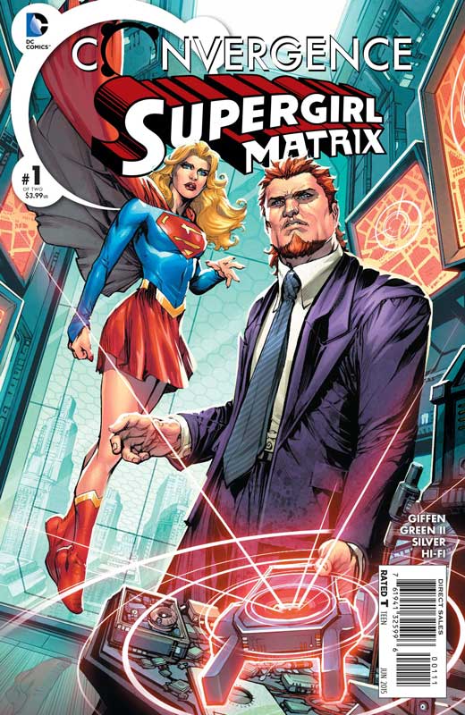
Convergence: Supergirl Matrix #1
Writer Keith Giffen, Penciler Timothy Green II, Inker Joseph Silver, Colorist Hi-Fi, Letterer Cory Breen
Where do I start with this one. Giffen does funny superhero books very well like Lobo and the Justice League run back in the day. It really falls flat here and ends up being joke in the end. I guess I just don’t see Supergirl as a tounge in cheek sort of character. The story ends up falling flat on its face and while the appearance of Ambush Bug at the end was great, it was too little too late at that point. Green and Silver’s art is a very interesting style that is good but there are many times where it comes off a bit unfocused and the lack of backgrounds is very noticeable. Giffen would have been a better choice for the JLI book this week instead of this mess. SKIP IT.
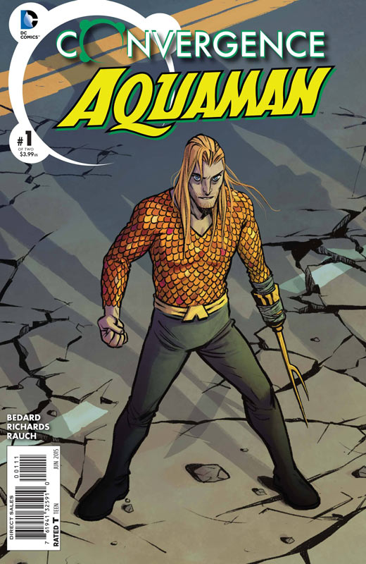
Convergence: Aquaman #1
Writer Tony Bedard, Artist Cliff Richards, Colorist John Rauch, Letterer Dave Sharpe
I can’t really explain why but of all the Convergence books I read this week this was my favorite one. While this is not the most stunning book that you will read this week, I did enjoy it the most of all of the Convergence titles. Bedard’s story really make the most sense of Aquaman being in Metropolis and not just showing up like the rest of this weeks everyone visited Metropolis before the dome landed lack of reason. I also enjoyed the way that he portrayed Aquaman and the frustration of being stuck under the dome. He wisely didn’t fall for the tropes that the other writer used of here comes the other heroes at the end of the issue. He really sets the stage for the next issue and it felt very natural. Richards art on the book is really nice and does a great job of complementing the story. There is a lot of very nice detail to the work and looks really good. This is the only Convergence book that I can RECOMMEND this week.
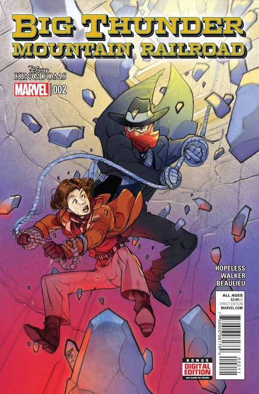
Big Thunder Mountain Railroad #2
Marvel Comics Writer Dennis Hopeless, Artist Tigh Walker, Colorist Jean-Francois Beaulieu, Letterer Joe Caramagna
I was not overwhelmed by the first issue of this new Disney Kingdom series but there were some interesting ideas that the book introduced so I was willing to give at least the second issue a try. Hopeless story hits the right beats of an old fashion western story but it ends up not really adding up to much. It’s not that there is not much going on but at this point in the story the reader should have some clue of the point of where it’s going. Sadly the story is just plodding along and while there is still some fair ideas, in the end I really just didn’t care what was happening with the characters. The one thing that I do like about the book is the artwork by Walker. It’s not sup[er flashy but really fits the mood of the story and visually the book looks very good.
Is this book worth your time and money? The direction of the story is what has doomed the book for me. I just wish that Hopeless had pulled the book in a better direction with the second issue and sadly that didn’t happen. So this is the end of the line for this book. SKIP IT!
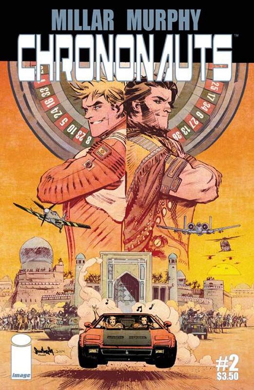
Chrononauts #2
Image Comics Writer Mark Miller, Artist Sean Gordon Murphy, Colorist Matt Hollingsworth, Letterer Chris Eliopoulos
I was really disappointed in the first issue of this book because it reminded me way too much of the 1960’s Time Tunnel series and beyond that there was very little characterization to any of the cast of the story. Well the second issue has changed direction and it has become Bill & Ted’s Spoiled Rich Boy’s Adventures Through Time. Some might find the story cute or humourous but this book is what a kid would think was a great story. There is no weight to the story and quite honestly comes off as very amateurish work. Millar can be a good writer but this book is pretty bad. The only thing that it has going for it is Murphy’s artwork that is really great but simply wasted on this book. I’m sure that some studio will fall over themselves to make this mediocre book in to an over stuffed big budget blow out.
Is this book worth your time or money. I might be th minority but this book is really bad. Sure it’s a crowd pleaser in some respects but really sloppy writing. I didn’t care for the first issue but really hated the second issue. I found it a waste of $3.50 and 10 minutes of my valuable reading time I wont get back. SKIP IT!
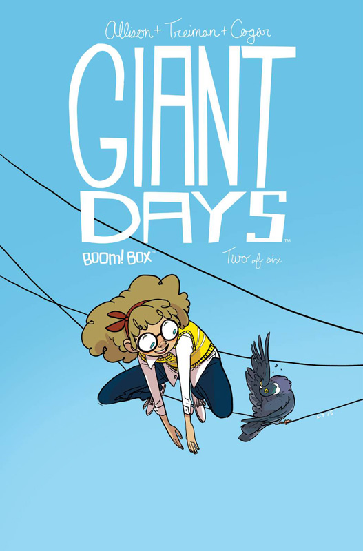
Giant Days #2
Boom Box! Writer John Allison, Artist Lissa Treiman, Colorist Whitney Cogar, Letterer Jim Campbell
I was quite enamored with the first issue of this lovely book but has a few issues with the story by Allison with that I had with his Bad Machinery web comic that was collected. The story in the first issue was really jumpy and became a bit distracting. The second issue still has a few of those too but thankfully to a lesser degree. The big improvement story wise was the focus on a single story line of the girls getting sick and then following each story in and out. This was a really solid story and the time jumps did work in the books favor this issue. The thing that I love about the book is the tone that he has for the characters and how they are so relatable. Of course I’m partial to Daisy because she is the nerd of the group and her goofy nature is a lot of fun in the book. Treiman continues to really impress me with her artwork on the book. She has such a wonderful style of art that brings the book to life and captures the whimsical tone that the story has. Keep an eye out for her in the future because her artwork is amazing.
Is this book worth your time and money? I liked the first issue but really have fallen in love with this second issue. Allison has focused the story and has made a huge difference to the book. The narrative of the story really is kicking in on the book and can’t wait for the next issue. Add in Treiman’s beautiful artwork and this book is a real winner. VERY RECOMMENDED!
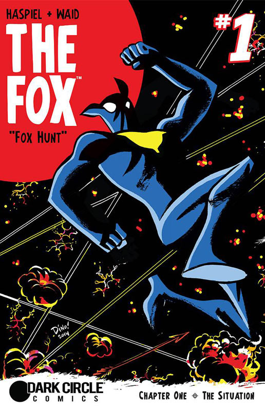
The Fox #1
Dark Circle Comics Writers Dean Haspiel and Mark Waid, Artist Dean Haspiel, Colorist Allen Passalaqua, Letterer John Workman
I was a huge fan of the first Fox series that came out last year and was very much looking forward to what Haspiel and Waid had in store for us in this follow-up series. Thankfully all of the old school charm that the first series had is back in this one. The first issue story is a little more straight forward to the wacky off the wall approach to the first series. Don’t worry there is still the weird stuff but a smart move by the team to ease new readers into the book. The great thing that Haspiel and Waid do is a nice short recap to get new readers up to speed but go right into the story. They also have a great set up to this series story line at the end of the issue that will get you excited to read the next issue. Haspiel’s art is a real treat and has a great feel of comics from the classic golden and silver age comics that you rarely see today. While I’m sure there are some that are not going to get it, I in fact love it and he really captures the tone that the book strives to hit. It’s a lighter tone than the current Black Hood reboot but that is what I really love about this book is the campy and classic superhero fun that is sorely missing in most superhero books today.
Is this book worth your time and money. If you are looking for a fun superhero book then you have come to the right place. This is a book with really solid storytelling and great stylized art that make it a real treat. If you are looking for something that is both different and fun you have come to the right place. RECOMMENDED!
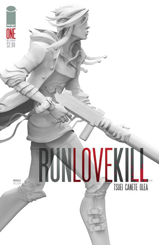
RunLoveKill #1
Image Comics Writers Jon Tsuei and Eric Canete, Artist Eric Canete, Colorist & Letterer Leonardo Olea
The key to a successful comic is getting off on the right foot to get readers to come back and continue to read your book. Unfortunately Tsuei and Canete missed that memo when doing this book. The story is not bad but it every cliché dystopia future story that brings absolutely nothing new or fresh to the genre. The other big flaw of the story is that they spend 26 pages and you learn nothing about the main character and very little to what the point of the story is going to be about, it just sits there. The only thing that I did like about the book is Canete’s artwork that has a very nice look to it but is absolutely wasted on a story that has no point. The artwork is very nicely complemented with Olea’s color work on the book.
Is this book worth your time and money. NOPE! The story (what little is there) does nothing to introduce or for that matter care about the main character in the story. While the book looks great that can not make up for the pointless story. This book is running eight issue and I really doubt that anyone will bother to pick up another issue of this book. I know I won’t be. SKIP IT!
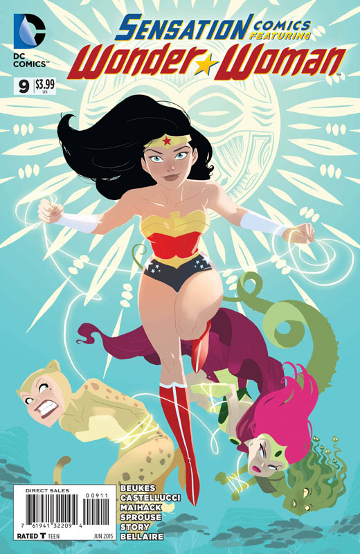
Sensational Comics: Featuring Wonder Woman #9
DC Comics Writers Lauren Beukes/Cecil Castellucci, Artists Mike Maihack/Chris Sprouse (Pencils) & Karl Story (inker), Colorist Jordie Bellaire (Girl’s Day Out), Todd Klein (Girl’s Day Out)
One of the lone non DC Convergence books that simply blows them all away with a simple thing STORY! It really shouldn’t be that hard but at DC lately it seems to be quite the problem. There are two stories in this issue The first one “The Problem With Cats” is simply one of the most adorable and best stories that I have read in a long time. It’s a great take on the imaginary stories kids come up with while playing with toys. The heart of the story is that we all have a superhero within us and when the time comes we are able to use it. This story was simply beautiful. Beukes really nails this story of capturing the heart and feel of kids playing with toys perfectly. With a great story like this you need an artist to capture it and Maihack brings the story to life with such perfection that very few could have achieved. This is one of those rare comics where the writer and artist are perfectly matched to craft a perfect story. So how so you follow-up the perfect story? Well Castellucci, Sprouse and Story bring us Girl’s Day Out with Wonder Woman and Lois Lane and while it may not be as adorable as “The Problem With Cats” it’s the perfect story to complement it. Castellucci does a very nice job of mixing humor with classic super heroics action with a great balance to both. The real key to the story success is the capturing both sides of her as Wonder Woman and Diana and how we see those sides. Sprouse and Story deliver the art for the story and do an amazing visuals that capture both the great action of the story and the subtle drama scenes in the story. I really loved the way that they did the interview at the beginning of the story that was just perfect.
Is this book worth your time and money? This by far is the best DC book this week and will probably be better than all of the Convergence books combines. Sure you could say that it’s easy to do these type of out of continuity stories for a book like this. I say that they are harder because you have to convey all the emotions of the story in 10 and 20 pages respectively and they are vastly superior to books that “higher profile” creators. The key is that you must have a great story to tell and both of these stories are simply that great. This is the rare instance where two different creative teams with different types of stories blend together to make a perfect comic reading experience. This is the winner of the best book this week hands down! HIGHEST RECOMMENDATION!
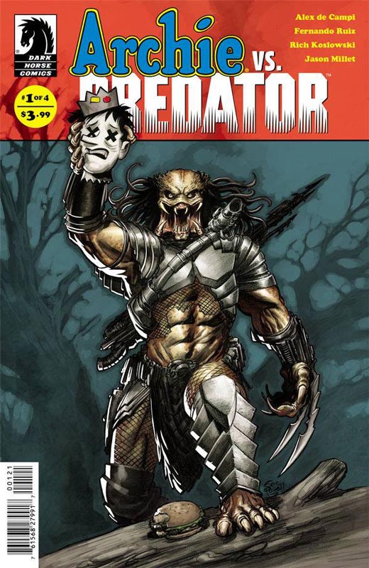
Archie Vs. Predator #1
Dark Horse Comics Writer Alex de Campi, Penciler Fernando Ruiz, Inker Rich Koslowski, Colorist Jason Millet, Letterer John Workman
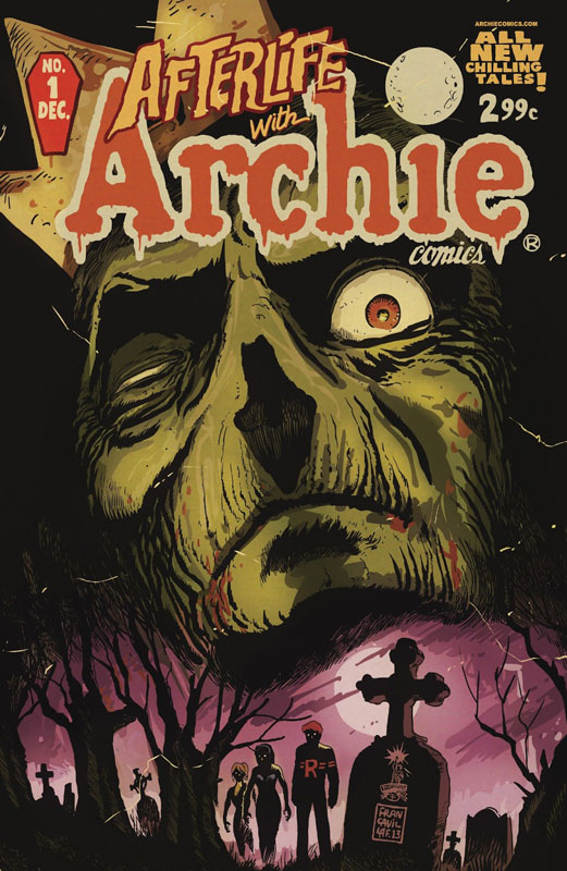
The winner of the best AvP story ever. Except this is Archie and not Aliens. One of the strangest crossovers ever in comics also is one of the most satisfying. de Campi wisely sets the story in the Archie universe and plays it straight. By adding Predator to the universe make the whole story in a very strange but believable way. He pulls no punches with the kills that the Predator make in the story and that is why the story works so well. He took the elements of both universes and mixes them together without changing either one. He also wisely sets up the story to prominently feature the Archie gang and establishes that universe first so when mixing the Predator in it actually feels very natural. The first issue is a great set up to the story. It establishes the connection that is needed to combine the two universes. While there is not much interaction between Archie and Predator yet, de Campi handles the tone of the book with a nice balance of fun and horror that is going to be tough. It does seem from the set up that he is able to do this very well. Ruiz and Koslowski keep the art style in the Archie universe and that is a very smart move. While Afterlife With Archie works well outside the usual Archie style but this book needed to stay with it. With the story rooted in the regular Archie universe the art needs to match it. But they also make sure that the Predator is by no means cute and cuddly either.
Is this book worth your time and money? While some readers might be put off by the regular Archie art style for this series after you read it you will understand why they did it that way. If they had gone the non Archie style the story would have never worked as well. The first issue gets off to a solid start and can’t wait to see when the Predator wreaks havoc in Riverdale. This book is a blast and is a must buy this week. HIGHLY RECOMMENDED!




0 Comments