Another week of new comics have arrived and the flood of DC Villains 3-D lenticular covers week 2 hit and so I am trying to review as many as possible so lets get to it.
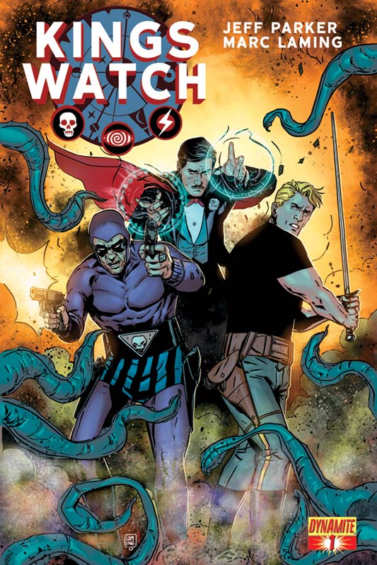
Kings Watch #1
Dynamite Writer Jeff Parker, Artist Marc Laming, Colorist Jordan Boyd, Letterer Simon Bowland
Dynamite continues its licensed characters line and instead of just one hero they decided to have three heroes in one book. The plot is, Panic spreads across the world. Strange phenomenon fills the skies. Millions have nightmares of wild lands filled with horrible creatures… then wake to find the monsters are real. What are three men willing to sacrifice to save us all? The first issue starts off by introducing each character The Phantom, Flash Gordon and Mandrake the Magician and shows off a little of their abilities but they do not actually meet each other in the first issue. The story by Parker is tough to judge at this point because the issue is all set up but, it’s a decent read but too early to call yet. Laming’s artwork is a nice step up from the usual Dynamite book that tend to be average in the art department. Laming’s has some really nice visuals and does a nice job on the characters and thankfully he does really nice backgrounds that are so often missing in books like this. Boyd color is nice and solid.
Is this book worth your time and money? I would say yes as a first issue it’s a good read but the second issue is going to be a make or break it. The story while intriguing does need to go somewhere. There is a bit of standard stuff here but seeing these classic King Feature Syndicate heroes in comics again is welcomed.
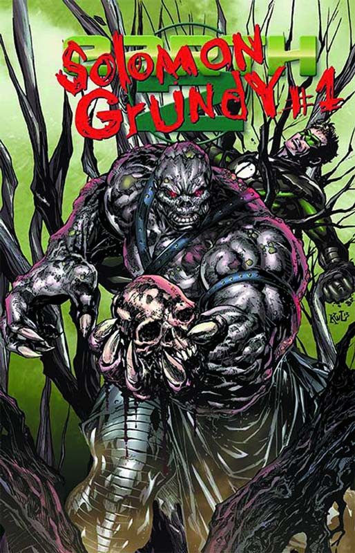
Solomon Grundy #1 (Earth 2 #15.2)
DC Comics Writer Matt Kindt, Pencils Aaron Lopresti, Inker Art Thibert, Color Michael Atiyeh, Letterer Travis Lanham
After reading some of this weeks DC Villains months books, it seems to be that a lot of them are stand alone “origin” stories. So for the most part it’s a done in one type story. Solomon Grundy originally started as a Green Lantern villain. DC plot synopsis is Grundy hates green. He hates life, and he hates Green Lantern most of all! So what made Grundy this way? Find out in the secret origin of Solomon Grundy! While DC “description” list that he hates Green Lantern the person who wrote that obviously didn’t bother to read the issue. There is no reference to Green Lantern in the book at all. It tells the Origin of Solomon Grundy starts off in 1898 when a young couple Pinney and Solomon are trying to farm but they have to work at the local slaughter-house to make a living. After Pinney was sexually attacked by the Forman she kills herself and we discover that this is a flashback to how Solomon came to be. And in the present day he is destroying a city. Solomon’s touch kill anything living. The story is serviceable for an origin story. Lopresti art is the real winner of this book. His art has a nice clean style and fits the mood of the story very well.
Is this book worth your time and money? A solid if not inspired story with nice art makes it a decent purchase. It’s not going to knock your socks off but we have all read worse books. The lenticular cover for the book has OK depth to it and the artwork is OK but not as good as the interiors.
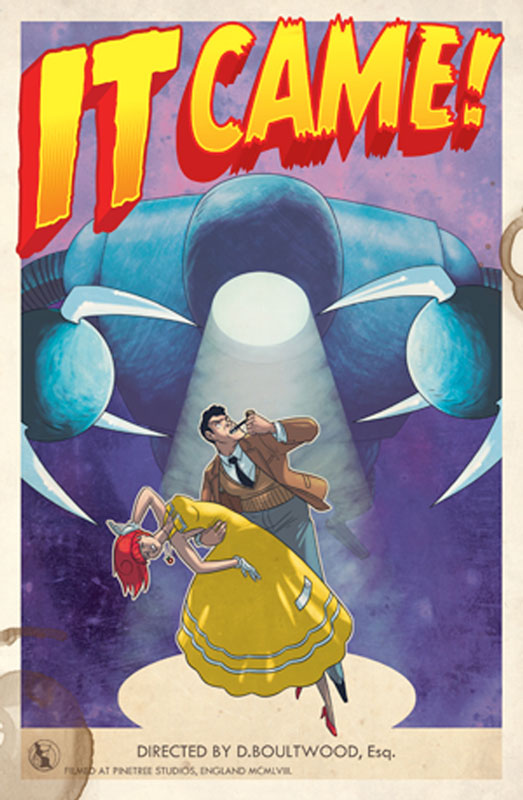
IT CAME! #2
Titan Comics Written and Illustrated by Dan Boultwood
My previous review of the first issue of this book really impressed me. The second issue is just as fun the story is, The alien robot GRURK has been waylaid by bunting, but its inexorable march towards London cannot be stopped! At Trumpington Abbey, space scientist Dr. Boy Brett and his assistant Doris Night (a lady) welcome reinforcements from the British Army – but do the soldiers herald a heightened level of competence… or a right royal Carry On? And what part does a field-full of mouldy turnips have to play in the enfolding cosmic drama?! The story is still a blast and I can’t praise Boultwood’s art is just fantastic. The story definitely get the mystery going even deeper than the first issue but Boutlwood wisely still keeps many cards close to his vest. And that I am really the thing I am loving about this book. It’s unfolding very nicely.
Is the book worth your time and money? This book is a real pleasure to read and the story is going along quite nicely. If you grew up on campy 50’s type science fiction movies then this book is for you. It’s well worth the $3.99 cover price. Very recommended
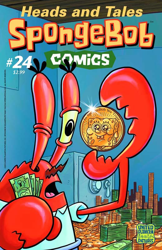
Spongebob Comics #24
United Plankton Pictures Written and Drawn by Various Creators
Spongebob Comics is a real treat every other month that it comes out. The best way to describe the book is that Stephen Hillenburg creator of Spongebob Squarepants call a bunch of indy creator to gone wild with the Spongebob comic and each issue has different writers and artist each issue. This issue has two main stories and four one and two page stories. That allows creators latitude to do what they want. This issue starts off with “The Money Tree” written and drawn by Graham Annable. It’s the story of a customer paying for his food in a treasure map to Mr. Krabs and of course the dollar signs in his eyes out weigh the cents in his head. So he drags Spongebob to carry a very large backpack filled with Krabby Patties for the long journey. Let’s just say they find something that is one thing and turns out to be another. The next story “Land Scapegoats” is written and drawn by Corey Barba and is a visual story with no words. Spongebob and Patrick convince Squidward to manicure his lawn and of course the boys are in over there heads. “Squidmund Visits” is written by Scott Roberts and drawn by Vince Deporter and is the story of Squidward’s cousin Squidmund coming over for a visit and Squidward is freaking out that Spongebob and Patrick will ruin their “intelligent company”. Squidward is in panic mode in getting the house ready and notices that his cousin is late. Squidmund finds a couple of new friends along the way and it’s not a big surprise as to who they are. James Kochalka does a one page gag strips and the final story by writer Dani Michaeli and art by Aaron Renier is call the “Three Second Rule” and involves food hitting the floor and Spongebob explaining to Patrick the three second floor rule. The thing I love most about Spongebob Comics is the diverse talent that is in each issue and this issue is no exception. Each writer and artist give each story their own feeling but in the end it’s still the Spongebob that we all know and love.
Is the book worth your time and money? You could spend $2.99 on other things but I guarantee that they wont bring a smile to your face and a good laugh too. If you’re a fan of Spongebob and comics then this is a match made in Bikini Bottom heaven.
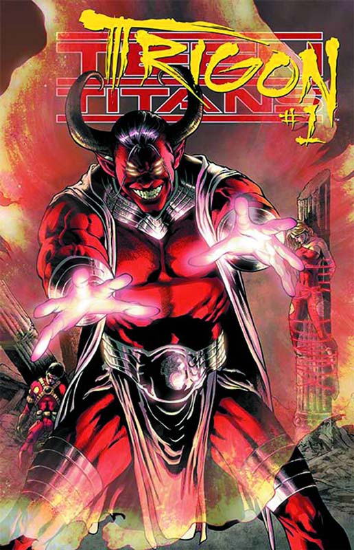
Trigon #1(Teen Titans #23.1)
DC Comics Writer Marv Wolfman, Artist Cafu, Colorist Jason Wright, Letterer Steve Wands
It makes a lot of sense if you are going to tell Trigon’s origin you get the man who co-created (with George Perez) the character to write it. The plot from DC is, He is the ruler of six kingdoms of pain, suffering and agony—but the one world that evades Trigon is Earth. Trigon’s influence has been spread across worlds by his sons, but it wasn’t until he conceived a daughter of Earthly origin that the monster finally had an heir who could aid his quest. Now, with all the world’s heroes missing—is this the final victory of Trigon? To be honest the revamped New 52 version of the Teen Titans has been pretty pitiful and one has to wonder what has been keeping this sinking boat afloat for so long. Well the good news is a least for this issue it brings back some of the old New Teen Titans magic. This is a done in one story that while we know the story of Trigon and Raven this story is set before that and explains the real origin of Trigon. While not earth shattering this is a really solidly written story by Wolfman and he does a really nice job of a great back story. The big win for this book is Cafu’s art. It just oozes with detail and mood that while it’s a dark story it really fit what it needs to be. It’s not just dark to be dark like most of the New 52 books try to be, there is areal reason for the book to be that way. Also Wright’s color work is really fantastic and compliments Cafu’s art very nicely.
Is this book worth your time and money? Well it maybe old school with Wolfman at the helm but old school mopped the floor with New 52 school on this one. Solid story and great art make this well worth reading. Maybe DC should let Wolfman write the book again. It can’t get any worse than the current creative team and this issue is proof of that. So far one of the better Villains books this month. The lenticular cover is not too bad with some nice art.
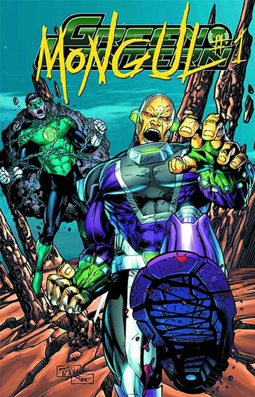
Mongul #1 (Green Lantern #23.2)
DC Comics Writer Jim Starlin, Artist Howard Porter, Colorist HI-FI, Letterer Carlos M. Mangual
Old school week continues with Starlin coming back to one of DC better villains he created in the 1980’s (along with Len Wein) and a real rival to Superman. DC’s plot description, Deep in space, an unstoppable force is committing genocide on a galaxy-wide scale, and only the strongest will survive! Be warned, because nothing can prepare you for an all-new Warworld under the absolute rule of the tyrant called Mongul! Let’s face it Mongul is just flat-out evil and Starlin creates his origin story while not super detailed it gets straight to the point. While the story has obvious Darkseid overtones it’s a really cut to the chase type that really does trim the fat. Porter’s art is nice and solid and he handles the scope of the story very nicely.
Is the book worth your time and money? Starlin always write very epic type stories and this is no exception. They can be a little heavy-handed at time but this one is short and sweet. Solid story and nice art this is a pretty decent read. The lenticular cover art is pretty awful so don’t base the book on that please.
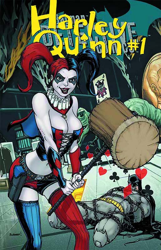
Harley Quinn #1 (Detective Comics #23.2)
DC Comics Writer Matt Kindt, Artist Neil Googe, Colorist Wil Quintana, Letterer Taylor Esposito
I will be honest I really can’t stand Harley Quinn’s new hooker costume for the New 52. I really miss the fun Harley that was created for Batman the Animated Series and then brought into the DC Universe. So with that in mind here we go. The plot from DC is, If Dr. Harleen Quinzel wasn’t crazy when she fell for The Joker at Arkham Asylum, she sure was messed up afterwards! Find out more from Harley’s time with her beloved Mr. J. and see what got her into so much trouble that she was “recruited” for the Suicide Squad! There is a little new back story to Harley’s origin but it pretty much the same. Kindt’s story is OK in the parameters that the new Harley Quinn is stuck in. The problem is that it really need to have that not so serious touch that is sorely missing. She just comes off as a twisted girl gone bad and trying to be fun but that just got sucked out and your left with an annoying brat. Googe’s art is solid and has some really nice facial expressions and gives the book a very nice visual touch.
Is the book worth your time and money? If you are looking for fun then you’re in the wrong place. You need to go and pick up last weeks Batman Black and White and see how Harley Quinn should and needs to be done. This whole “badass hooker thing” needs to go. DC has ruined another good DC character with the New 52 reboot. While this is not an awful book by any means it’s pretty uninspired. The lenticular cover is ok but the artist made it look like Batman’s legs have been cut off at the knees and that looks pretty stupid.
Riddler #1 (Batman #23.2)
Story by Scott Snyder & Ray Fakwes, Writer Ray Fawkes, Artist Jeremy Haun, Colorist John Rausch, Letterer Taylor Esposito
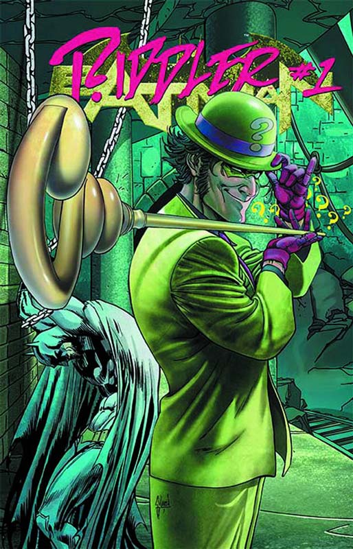
This is one of the first villains books that seems to be a regular story instead of an origin one. The plot from DC, With The Dark Knight out of the picture, The Riddler engages in an epic game of wits. Learn what maddening early moments led a young Edward Nygma to evolve into Gotham City’s Prince of Mischief! And see how events of ZERO YEAR continue to affect The Riddler today! The story is a basic revenge story that overall I was just pretty bored by it all. While Fawkes story is not bad for me it just didn’t really go anywhere. The whole you pushed me once and so now I’m pissed story feels a little contrived. The art by Haun is nice and fits the story well.
Is this book worth your time and money? I wasn’t impressed and I’m guessing you won’t be either. You’ve read this revenge + trapped in a building with the bad guy story a thousand time before and I have read a lot more inspired ones than this. Save your $3.99 for a better book. I will give the lenticular cover is one of the better ones. So that could be the reason for the good cover to hide the mediocre interiors.
Mr. Freeze #1 (Batman the Dark Knight #23.2)
DC Comics Writers Justin Gray and Jimmy Palmiotti, Artist Jason Masters, Colorist Dave McCrig, Letterer Jared K. Fletcher
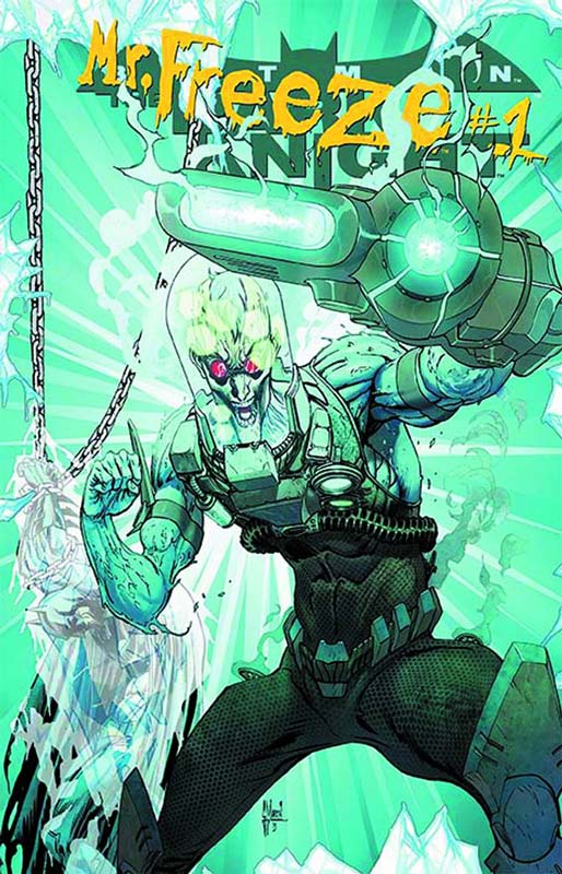
Mr. Freeze has been a so-so character in the Batman comics but once the Batman the Animated Series got ahold of the character they transformed him into a great tragic villain. The plot from DC, Mr. Freeze takes his obsessions over the line when he sets his sights on his newfound family and getting revenge on Batman! While this is an origin story Palmioitti and Grey wisely don’t change what is not broken. They really capture the obsessiveness that the character is and add a slight variation to it. The story is pretty straight forward but also very solid. Master’s art captures the ice and atmosphere quite well. While the mohawk hair is a little silly and he looks a little to pretty boy the art otherwise is really good.
Is the book worth your time and money? I found the story to be solid and Palmiotti and Gray capture the singular nature of Mr. Freeze quite well and add a bit of new spin on his origin. Solid artwork is nice to see on this book too. While this is not going to blow your mind by any means if you like the character of Mr. Freeze then you will be happy to learn that he thankfully has not changed very much from the one we love. For DC lately that’s a pretty good thing. Not a bad book for $3.99 and the lenticular cover has a nice effect too.
Lobo #1 (Justice League 23.2)
DC Comics Writer Marguerite Bennett, Artist Ben Oliver with Cliff Richards, Colorist Daniel Brown, Letterer Sal Cipriano
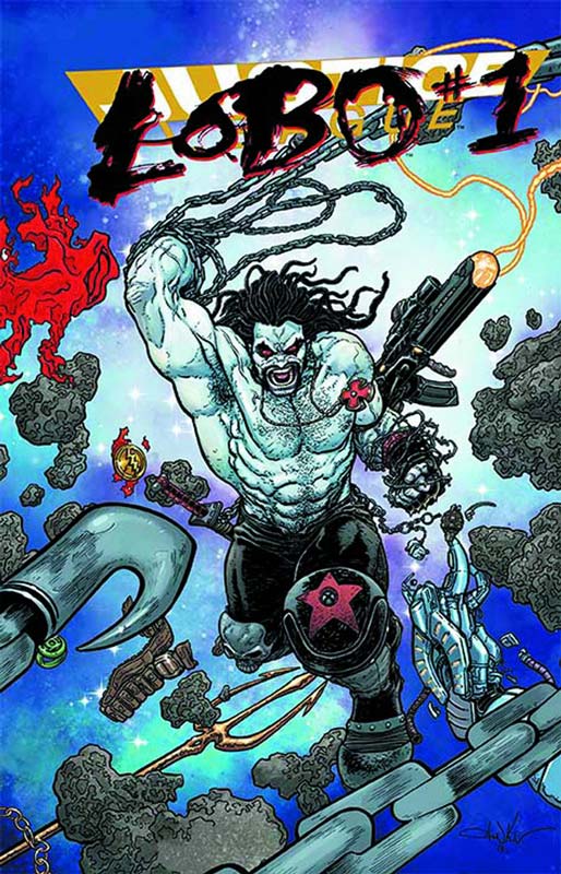
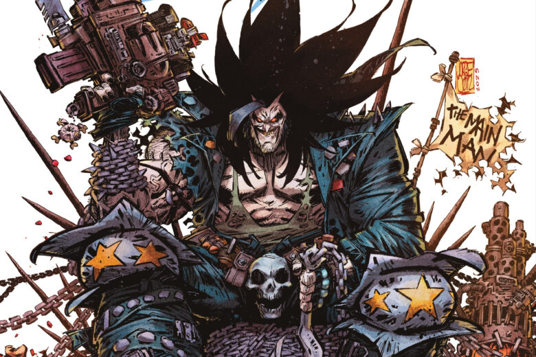
There has been a lot of talk about the new “Emo” Lobo and well it’s not as bad as I though but I’m not totally sure of what to think of the new look. The plot for DC, Deep in the dark corridors of space lives a black-hearted being of unimaginable power. He’s witnessed horrors beyond description and committed unparalleled evils. In all of history, no being has ever been capable of as much chaos and terror as this lone individual. This is the story of the man called Lobo. He’s coming. And he’s bringing all of hell with him. So is still the same Lobo that we all knew and loved because he was just a total badass. Well kind of. He seems to be a more straight forward bounty hunter with somewhat of a mean streak. Bennett seem to try to make him feel like Lobo in the dialog with semi smart ass remarks but it just seems to not work very well. I think that part of the problem is that you can’t take this Lobo serious as a smart ass face smasher when he looks like a fashion model from a runway. The story is a pretty much by the numbers affair.Oliver’s art is pretty good considering the visual change that is very obviously been thrust upon whomever had done the artwork. The real problem is that at the end of the story they try to say that this Lobo is the real one and the one we all know and love is an impostor. Well I just don’t buy this poor mans Lobo for a second.
Is this book worth your time and money? If you even remotely know Lobo then move along there is nothing to see here. It all feels like a bad dream. The problem is that the “impostor” is this New 52 Lobo and not the bastich we all know and after reading this book is very much missed. The story is very standard fare and is just kind of there for the most part. There are some decent action scenes but over all it’s just warmed up leftovers instead of a home cooked meal. And To add insult to injury the cover has classic Lobo on the lenticular cover. Go figure. Save your $3.99 for a better book.




0 Comments